


![]() Internet Explorer Logo PNG
Internet Explorer Logo PNG
The designers proposed a lowercase “e” logo for Internet Explorer because it is rounded and easily associated with the globe. The line surrounding it is the orbit of the allegorical movement of the search engine in the browser, symbolizing the worldwide scope of coverage. To make the blue-on-blue visible, the authors removed a portion of the glyph, leaving an empty segment.
Internet Explorer began in the early 1990s, when Microsoft engineer Thomas Reardon studied the Mosaic browser code created at the U.S. National Center for Supercomputing Applications. In December 1994, Microsoft licensed code from Spyglass, Inc., paying $2 million upfront, plus quarterly fees and revenue share. A team of six developers led by Reardon then built Microsoft’s own browser.
Internet Explorer 1.0 was released on August 16, 1995, as part of Microsoft Plus! for Windows 95. It was free for Windows users, while Netscape Navigator, then holding about 90% of the market, was sold commercially. IE 1.0 was slower, had fewer features, and had poorer site compatibility, but Microsoft moved quickly. IE 2.0 followed in November 1995 as a free Windows 95 update.
In August 1996, IE 3.0 arrived with scripting support and an early implementation of CSS. Microsoft later paid Spyglass $8 million over royalty disputes. The major shift came in October 1997 with IE 4.0, which was built directly into Windows. Microsoft also made deals with PC makers and internet providers, including AOL, to keep IE as the default browser. Netscape’s share fell from 72% in 1997, while IE reached about 80% by 1999 after the release of IE 5.0.
In May 1998, the U.S. Department of Justice and 20 states sued Microsoft over tying IE to Windows and restrictive contracts. After IE 6.0 in 2001, when IE reached 95% market share, development slowed for years. Security flaws and weak standards support hurt the browser. Mozilla Firefox arrived in 2004, followed by Google Chrome in 2008. Chrome passed IE in 2012. Microsoft introduced Edge in 2015, and Internet Explorer 11 was retired on June 15, 2022.
Meaning and History
![]()
The iconic “e” icon did not appear overnight: it first appeared in 1996 as part of the browser logo of the time. However, today it has become one of the most recognizable worldwide, so few people remember what preceded its creation. And before it, two more visual identity options did not represent anything significant. They were full of different details, which is why it was difficult to remember. In total, eight logos were designed.
What is Internet Explorer?
Internet Explorer is a web browser created by Microsoft for the Windows operating system. At first, it was an additional package, and later it became an independent program. Its launch was in 1995. In 2022, the developers stopped supporting the browser.
1995

The earliest logo consisted of the name “Microsoft Internet Explorer,” arranged so that the words grew larger. The initial part of the phrase was small, and the final part was large. To the left was a large translucent orb shrouded in a gray shadow. The color palette included blue and green. Additionally, gray, black, and white were used.
1995 – 1996
![]()
The second version of the debut logo was businesslike and practical. It contained the same inscription, but in a different format: all the words were large and clear, regardless of letter thickness. The font was a mix of uppercase and lowercase. In the circle was the classic Windows flag, consisting of multicolored rectangles: red, green, blue, and yellow. A bold black ring outlined it.
1996 – 2001
![]()
This is a very significant logo – for the first time, an icon with the letter “e” appeared in it, which later became the main emblem. But at first, the symbol was supplemented by the inscription “Microsoft Internet Explorer,” typed in the same font as in the previous version of the visual identity. These were bold sans-serif glyphs.
1996 – 2006
![]()
But the arch’s real era of the blocky “e” started in 1996. She accompanied Internet Explorer 4.0. The designers removed the program’s name and increased the size of the letter that previously appeared at the end of the inscription. The glyph was light blue, wide, lowercase, and half surrounded by an arch with thin ends.
2001 – 2006
![]()
This logo is still used today; it appears on the Internet Explorer help page. In addition, an icon accompanies PowerPoint 4053 Build. The developers added volume, creating a sense of three-dimensionality. The correct distribution of shadow and light played the primary role, serving as the basis for the gradient. In turn, he changed the logo’s style, turning it from flat to convex.
2006 – 2010
![]()
The seventh and eighth versions of Internet Explorer were complemented by an “e” in dark blue. She was very expressive, bright, and distinct. To do this, the designers chose a glossy, three-dimensional effect. A shading line ran along the edges of the glyph, and at the bottom, a highlight brightened it. The arched stripe was painted yellow and began to resemble a flat orbit. Due to the color difference, it was visible. The developers removed the thin segment behind the letter, so the arcuate strip was not connected. At the same time, the word “Microsoft” disappeared from the name, and “Windows” appeared.
2010 – 2022
![]()
Browser versions nine through eleven were accompanied by an icon with a two-dimensional and light “e.” Her dark shadows and bright highlights disappeared – only a purely blue color with a slight gradient around the edge remained. The letter was outlined with a thin blue border. But on the golden arch, located diagonally, light spots appeared. They were concentrated on the central part of the curved band.
2011 – 2022
![]()
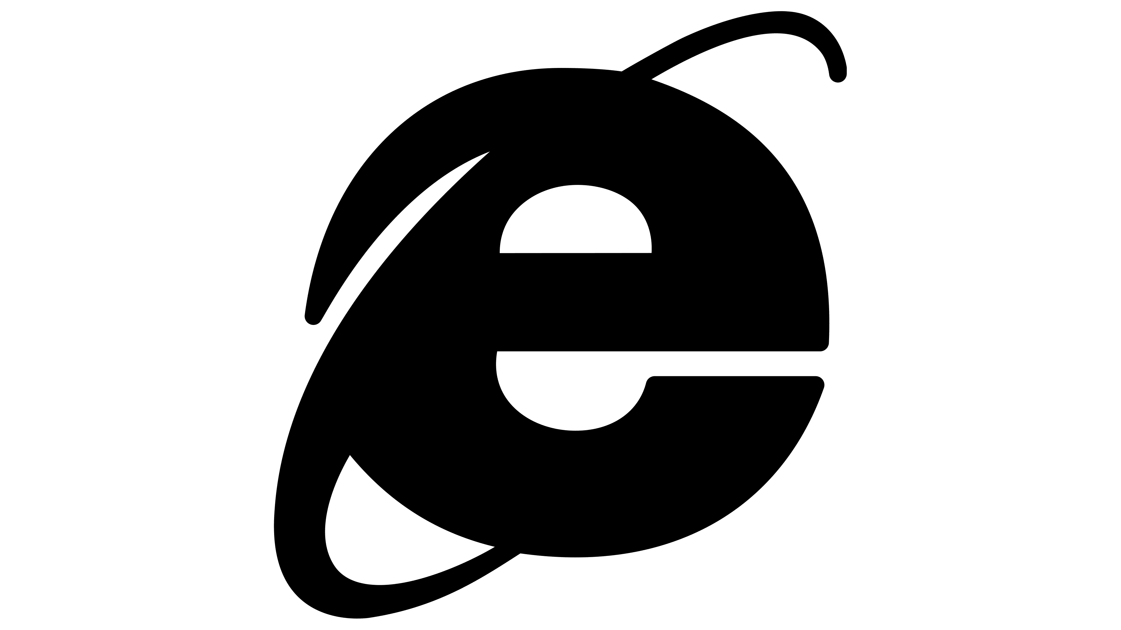
After the rebranding, a new logo appeared, and the word “Windows” was removed from the name. It was designed to be visible on any media and adapted well to displays of all sizes. Shadows, highlights, and reflections were removed from it, and only the block “e” remained in its pure form. The diagonal line was preserved but received a blue color.
The history of the Internet Explorer logo ended in 2022, when the browser was no longer supported. Microsoft has discontinued it. The program’s emblem has remained static, a two-dimensional sky-blue “e” crossed out by a diagonal arch.
Font and Colors
The full text was present only in early versions. For it, a bold, chopped lowercase font was used. The exception was the first characters from the program name, which were capitalized. In 1997, the inscriptions disappeared, and only the lowercase “e” remained.
The emblem’s palette has always been predominantly blue, though in different shades. Azure, celestial, cornflower blue, and sapphire remained prevailing for a long time. At first, green and black were also present. The background was white.