


![]() Amino Logo PNG
Amino Logo PNG
The communication service supports an atmosphere of openness and friendliness, so its logo looks informal. The Amino logo unusually embodies the designer’s idea. It symbolizes the close connection between the interlocutors.
Amino began with Ben Anderson and Yin Wang, two Northeastern University graduates who noticed the energy around Anime Boston in 2010-2011. Anderson had studied art design, while Wang held a PhD in computer science and was interested in anime. Their idea was to bring the feel of a fan convention into a mobile app, where people could gather around specific interests every day.
Narvii Inc. launched its first niche apps in late 2011 and early 2012, including Pets Amino, Virtual Space Amino, and Anime Amino. In 2012, apps for K-pop fans and photography users followed. Unlike Facebook or Twitter, Amino was built around themed communities with their own rules, moderators, and cultures. Optional anonymity made it easier for users to discuss interests they avoided on mainstream social networks.
Narvii, Inc. was formally registered in January 2014. In July 2014, Amino raised $1.7 million from Union Square Ventures and Google Ventures. By then, it had 15 apps and half a million downloads. Series A brought $6.5 million in 2015, followed by a $19.2 million Series B in 2016. Communities grew around K-pop, Harry Potter, Game of Thrones, Pokémon Go, Doctor Who, BTS, and anime.
In June 2016, the separate apps were merged into a single app, Amino. Series C added $45 million in 2018, bringing total funding to $72.4 million, while downloads passed 100 million. Amino Stories appeared in 2019. Its main rivals were Discord and Reddit, though Amino focused more narrowly on mobile teens and young adults. MediaLab AI acquired Amino in January 2021, after which Anderson and Wang left and later sued the buyer. In December 2025, Amino shut down.
Meaning and History
![]()
In the short time the application has been in operation, there have been three logos. All of them were made in a fairly minimalist style, without unnecessary elements. Also, several icons were developed for displaying on mobile devices.
What is Amino?
At a minimum, it is an opportunity to communicate, even when a person is lonely. The convenience of the online application is that it is not difficult for a person to find a topic of interest among hundreds of thousands of options.
2013 – 2014
![]()
Perhaps the first version of the Amino logo was the friendliest and most positive towards the target audience. The right side of the logo featured the app’s name, while the smiling monkey’s head was on the left. It looks positive and aims to create an atmosphere similar to that of Amino users. Because the primate is looking directly at the screen, we can assume he is looking for eye contact with the users. Perhaps everyone will find something unique in this image. The monkey is entirely blue and white. Bright shades only add to the positivity. The animal’s big eyes deserve special attention.
The verbal inscription was made in a classic style with rounded and oval shapes. They also convey the logo’s friendly tone. The color blue was also used in the name, which is associated with communication.
2014 – 2015
![]()
The first redesign resulted in a much simpler logo. It became more concise and minimalistic. It is primarily about removing the image of a monkey, which users liked. The friendly, rounded corners were also removed. Instead, the traditional lettering style was used. Also, the color was changed from blue to green.
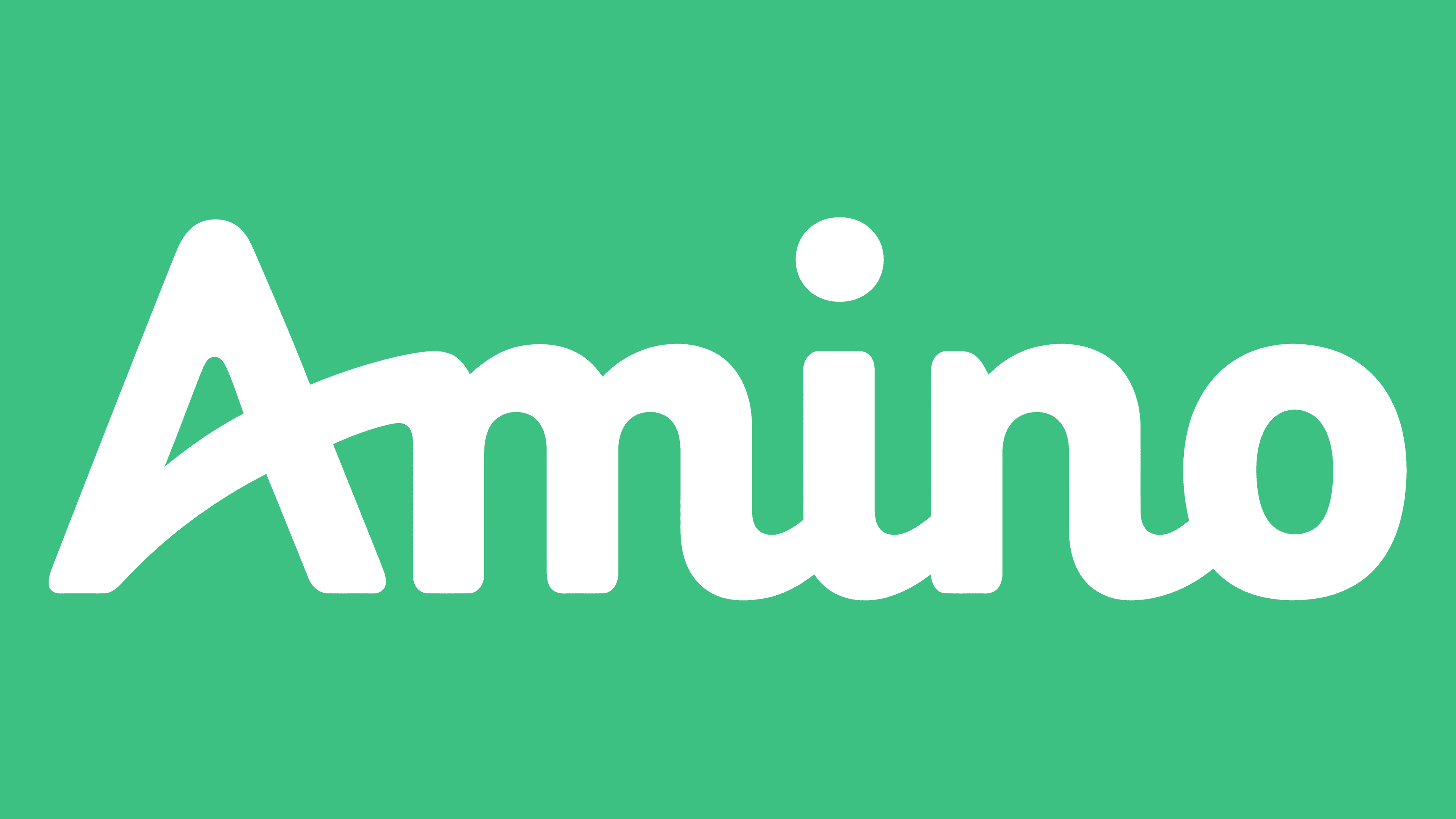
2015 – today
![]()
The latest redesign has solved the main problem and the negative feature of the previous version: modesty and a lack of originality. This was done in italics. The horizontal stripe in the letter “A” became diagonal, gradually rising and connecting the character to “m.” All letters became narrower but also more user-friendly. Also, unlike its predecessor, only the “A” is capitalized here. Also, note that the dot over the “i” is relatively high. The monkey, beloved by many, is not back.
Icons
![]()
Amino used to have many different apps, one for each community. Everything changed in 2016 when Narvii, Inc. united them, creating a centralized portal. The online service is available on different operating systems, so its icon is familiar to many users. It looks like an LED sign: a white “A” glowing against a dark background.
2015 – 2019
![]()
Given that Amino is an online app, one of the company’s assignments was to create a mobile icon. The first version was the letter “A,” identical in style to the last logo variation except for the color. It was a gradient of pink and orange that positively affected the user. The letter was set against a square background with rounded corners and an outline matching the letter’s color palette. The letter’s background was light green, with white rays that created a sense of fantasy and light.
2019 – today
![]()
This version of the icon is darker than the previous one. It is a gray letter “A” with a glow at the ends. It is inside a dark blue circle with several contours of varying thicknesses, three of which are depicted as blue gradients. Outside the last outline are several small purple and blue circles. The frame is a square with rounded corners.
Font and Colors
The main “chip” of the Amino online application is the classic italic font with an unusual lettering style. Thus, it gives the impression that the inscription is handwritten, which is extremely important when many people feel disconnected from society and lack attention.

Throughout the app, a bright color palette was used to create a positive mood. We are talking about blue and light green colors. Thus, Amino stood out from the competition, fostering a peaceful atmosphere for communication. The software creators tried to attract the attention of millions of users by creating the necessary working environment.