The SAP logo demonstrates progressive thinking and the development of machine intelligence. Software development from scratch, a new approach to accounting, and database management characterize the company and are reflected in the emblem.
SAP: Brand overview
| Founded: | 1972 |
| Founder: | Dietmar Hopp, Hans-Werner Hector, Hasso Plattner, Klaus Tschira, Claus Wellenreuther |
| Headquarters: | Walldorf, Baden-Württemberg, Germany |
| Website: | sap.com |
Meaning and History
The software company has grown remarkably over the past half-century. Her identity has evolved with her – visual symbols that help identify SAP in the service market. The very first trademark logo was as striped as the IBM graphic because, at that time, horizontal lines were associated with computers. The design was developed by Peter Leyh, one of the five founding engineers of SAP. Colleagues gathered together in the kitchen of Juergen Hachenberger to watch the traditional Friday football match. And then Leyh, sitting at the kitchen table, drew what became the debut logo: a black square with a white brand name.
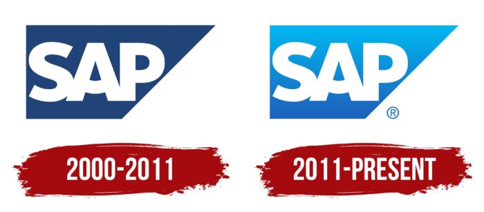
Later, a triangle was added to the quadrilateral, making the geometric figure look like a rectangular trapezoid. After numerous experiments with colors (within the blue palette) and textures (a solid fill replaced the stripes), the current version of the logo appeared. In the course of evolution, the square and the triangle merged because, in 2000, the dividing line between them disappeared. A year earlier, the horizontal stroke of the letter “A” became arcuate. This is how the “brand smile” of SAP appeared.
2000 – 2011
The software developer has moved into the new millennium with an improved logo. It was a clear and understandable “SAP” lettering inside a dark blue trapezoid. White letters took up almost all the space, but there was not enough space for them, so there were no spaces between “S,” “A,” and “P.” The designers made it so that “A” smiled affably, demonstrating the company’s friendly attitude towards customers.
2011 – today
In 2011, the base changed to light blue, with a trendy gradient at the time. In 2014, SAP executives attempted to get rid of the trapezoid and make the inscription orange, but the experiment failed. The public did not accept the radically new image, so the company was forced to return to the 2011 design, which continues to be used to this day.
SAP: Interesting Facts
SAP SE is a big company in Europe that makes software for businesses. It’s important because it helps businesses run better.
- How It Started: In 1972, five people who used to work at IBM started SAP in Mannheim, Germany. They wanted to make software that could process data in real-time.
- First Product: SAP’s first big product was a system for financial accounting called R/1. It was special because it processed data right when entered, making businesses work faster.
- Product Evolution: SAP made new versions of its products over time, ending up with R/3 in 1992. R/3 worked on different computer systems and helped even more businesses.
- SAP S/4HANA: In 2015, SAP released S/4HANA. It’s a super-fast system for managing business resources using a new SAP HANA technology.
- Global Presence: SAP works in over 180 countries and has over 440,000 customers worldwide.
- SAP HANA: Launched in 2010, SAP HANA is a database that works quickly and can do real-time analytics. This is a big reason why SAP has grown so much.
- Caring for the Environment: SAP tries to improve the world by focusing on sustainability and responsibility.
- Growing Through Buying Other Companies: SAP has bought companies like SuccessFactors, Ariba, and Qualtrics to offer more services and strengthen its market position.
- Community Network: SAP has a community network where users, developers, and partners can share knowledge and work together on SAP stuff.
- Moving to the Cloud: SAP is adding more cloud services to make its customers’ lives more flexible and efficient.
SAP has played a big role in changing how businesses manage their work, focusing on new technology, taking care of the environment, and helping businesses everywhere improve.
Font and Colors
SAP’s experience proves that brand recognition is impossible without a conservative approach to identity. Almost all software vendor icons share a common structure. The only time the designers changed the traditional shape of the emblem and repainted the inscription in orange was met with dissatisfaction from shareholders, customers, and employees of SAP. Therefore, returning to the old style turned out to be the only right decision.
The typography of the logo is based on the classic bold sans-serif. But the developers have made it a “flavor” by modifying some of the strokes. They arched the straight horizontal line in the middle of the “A” to make the arc resemble a smile and make the “S” smoother.
Although the lettering is almost always white, SAP’s favorite color is blue. The trapezoid is either dark blue or light blue in the latest logos, with a gradient currently used.
SAP color codes
| Deep Sky Blue | Hex color: | #00b7f1 |
|---|---|---|
| RGB: | 0 183 241 | |
| CMYK: | 100 24 0 6 | |
| Pantone: | PMS 312 C |
| Spanish Sky Blue | Hex color: | #05a4e5 |
|---|---|---|
| RGB: | 5 164 229 | |
| CMYK: | 98 28 0 10 | |
| Pantone: | PMS 801 C |
| French Blue | Hex color: | #1773c8 |
|---|---|---|
| RGB: | 23 115 200 | |
| CMYK: | 89 43 0 22 | |
| Pantone: | PMS 285 C |
| Denim | Hex color: | #1d62bd |
|---|---|---|
| RGB: | 29 98 189 | |
| CMYK: | 85 48 0 26 | |
| Pantone: | PMS 285 C |


