Although the Intuit logo looks very simple, there’s a reason for it, as it symbolizes the straightforward financial solutions offered by the corporate software developer. Its design is associated with the intuitiveness and ease of use of the company’s products.
Intuit: Brand overview
Meaning and History
Over more than forty years of development, Intuit has become a successful corporate software manufacturer. Not only has it significantly expanded its range of business applications, but it has also refined its system of visual symbols. Its logo has evolved, turning from a red inscription with a roughly executed drawing into an elegant wordmark in blue. It looks very simple and contains no abstract images, yet it holds great significance for the software developer.
What is Intuit?
Intuit is a U.S. company specializing in the development of business applications. It owns Mailchimp, an automation service for marketing; Credit Karma, a financial management platform; QuickBooks for accounting software; and other web products designed for organizations. Founded in 1983 in Palo Alto, its main office is now located in Mountain View, California. There is also a Canadian division of Intuit with offices across the country.
1983 – 2008
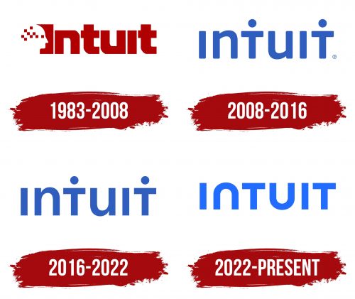
The emblem introduced in 1983 features a red inscription “Intuit.” The word is in bold font with many straight angles. On the left side of the letter “I,” there are smooth indentations forming the outline of a human face. The head is depicted in negative space, with a red square for the eye. Behind it stretches a “pixel” pattern made up of similar geometric figures. It symbolizes thoughts and intuition – what helps organize information and make the right decisions.
2008 – 2016
In 2008, the design firm Lippincott simplified the Intuit logo and repainted it in blue. The brand name is now in a thinner font than the original version. All letters are aligned in height, despite different cases: “I” and “T” appear as uppercase, while “u” and “n” are lowercase. Circular dots above both “T” s make the glyphs resemble silhouettes of people with arms outstretched. This reminds us of the brand’s main goal – to offer programs useful for humanity. The softened edges of the letters create a sense of care and safety.
2016 – 2022
After the redesign, the wordmark looked more confident as the developers corrected the roundings into full angles. The only circular elements remained the dots above the two “T” s. They are perceived as heads positioned above improvised bodies.
2022 – today
In 2022, the company updated its visual identity to reflect its years of achievements in financial technology. It released a modern logo with a regular inscription, where the “T” letters no longer resemble human figures. The dark blue color was replaced with a light and bright shade. The shape of “N” and “U” became universal: now they resemble both uppercase and lowercase at the same time, correcting the “jumping” case. Otherwise, the design remained almost the same.
Font and Colors
The Intuit wordmark is styled in a font that closely resembles IDroid Regular by Pixel Sagas. It’s recognizable by the distinctive “N” letter: it looks exactly like an inverted “U.” This achieves visual balance.
The refreshing blue color emphasizes the modernity and innovation of the company producing business applications. The new shade, adopted in 2022, best conveys these qualities.

