


Numerous pizza brands vie for consumer attention, each boasting its unique blend of flavors, toppings, and crust styles. Notable names such as Domino’s and Pizza Hut come to mind for many, but local establishments also carve out their own niches. These businesses focus on offering distinct varieties to cater to specific customer preferences.
Pizza is a perennial favorite among the world’s most beloved foods. Annual estimates suggest that people globally consume approximately 5 billion pizzas, each customized with diverse toppings and styles. The dish’s undeniable popularity has led to intense competition among pizza providers.
In such a competitive arena, brand identity is crucial for capturing customer loyalty. Pizza companies invest significantly in developing a compelling image through various marketing strategies. These include promotional campaigns and the creation of recognizable and inviting brand insignia.
Visual elements, such as logos, become particularly vital in this context. These symbols serve as a quick reference point for customers, instantly conveying a brand’s essence. Whether the bold red, white, and blue colors or intricate designs hint at Italian origins, each element is meticulously chosen to evoke specific emotions and associations.
Examining various iconic symbols in the pizza industry can provide insights into effective branding and marketing strategies. This knowledge can benefit consumers who want to make informed choices and business owners who aim to carve out their unique space in this bustling market.
Blaze Pizza
![]()
Emerging in 2011 under the leadership of Rick and Elise Wetzel of Wetzel’s Pretzel fame, Blaze Pizza quickly set its sights on the pizza industry. Based on Chipotle’s expertise, the brand has become a proponent of an order-to-order strategy, allowing diners to customize their pizza with each ingredient in mind. Its reputation attracted many pizza lovers and high-profile investors, including basketball icon LeBron James.
Blaze Pizza’s unique offering sets it apart from its competitors. Customers have unprecedented freedom to create their pizzas, choosing each topping, sauce, and cheese to create a flavor profile that meets their tastes.
One of Blaze Pizza’s most well-known aspects is its formidable oven. The high-quality ovens deliver efficient performance and ensure that every slice of pizza is flawless in both flavor and texture. In warm orange, the logo radiates warmth, passion, and innovation. The sleek sans-serif font gives it a modern look. At the same time, the central motif of a blazing flame underscores the rapid baking process, ensuring each pizza is baked to perfection in record time.
California Pizza Kitchen
![]()
Founded in 1985, California Pizza Kitchen has carved out a unique niche in the casual dining sector. The brand specializes in California-style pizza and pioneered the culinary art form, offering diners across the United States a fresh take on traditional pizza.
The restaurant chain’s brand identity is embodied in a memorable logo, carefully crafted with a modern twist. The emblem uses bright colors and vibrant typography to create an eye-catching image. The choice of a yellow diamond brings sunshine, a subtle hint of California’s sunny climate. At the same time, including a palm tree image in the logo pays homage to the state’s iconic flora.
The font used in the logo is noteworthy for its bold, assertive characteristics. It conveys a sense of self-confidence and modernity, which aligns well with the brand’s forward-thinking ethos. Integrating these visual elements keeps the logo intriguing and resonates with California’s lifestyle and cultural characteristics.
Chuck E. Cheese
![]()
Chuck E. Cheese was founded in 1977 as a unique combination of a pizza restaurant and a family entertainment center. Today, its logo stands out prominently among American pizza brands.
Chuck E. Cheese’s dual nature as a food service establishment and an entertainment center is well reflected in its iconic logo. The brightly colored letters blend seamlessly with the playful image of the brand’s mascot. This character is not just a decorative element; it plays a key role in the brand’s marketing strategy, attracting young people’s attention.
Combining the cheerful mascot with a bright sans-serif font creates an impression that lasts. This thoughtful design strategy makes the brand memorable, especially among families looking for delicious pizza and exciting entertainment under one roof.
CiCi’s Pizza
![]()
Often referred to as “CiCi’s” by fans, this restaurant blends Italian and American culinary traditions, particularly in its pizza. With a presence in nearly 23 states, CiCi’s Pizza has established itself as a renowned buffet-style food company.
The innovative way CiCi’s Pizza serves food sets it apart from many of its peers. Instead of waiting for freshly made pizza to be delivered to the table, CiCi’s diners can select their desired slices from pre-prepared options immediately after paying the bill.
The logo, rendered eye-catching orange, exudes energy and zest. The tagline “Beyond Pizza” complements it, suggesting the brand offers an experience beyond just eating pizza. The emblem, originally designed using interlocking triangular shapes, is a subtle allusion to the establishment’s various pizza options.
Domino’s
![]()
Domino’s, a globally recognized pizza brand, has adopted the minimalist logo design trend. Since its inception in 1960, this multinational restaurant chain has expanded exponentially, consolidating its position in the international market. According to impressive figures, by the end of 2018, Domino’s was present in 83 countries and had 15,000 outlets.
The brand’s signature is its emblem, a stylized domino figure in blue and red. In this visual, the number of dots on a traditional domino is skillfully considered: one dot on the red side and a couple on the blue side. Such design solutions are not just aesthetic decisions; they echo the brand’s identity and historical roots.
The company’s name has an interesting backstory. It was not the result of a high-level marketing brainstorm but the brainchild of a conscientious employee, Jim Kennedy. He suggested the name after a pizza delivery incident inspired by a classic game piece. This terminology blends seamlessly with the company’s logo and resembles the packaging used for delivery.
Donatos Pizza
![]()
Founded in 1963 by Jim Groth, Donatos Pizza has carved a niche as a franchised pizza delivery service in 11 states in the United States. The founder’s commitment to unparalleled customer service was established, and his vision was to create a brand that emphasized treating every customer with respect. This customer-centric principle is reflected in the brand’s succinct tagline, “Every Detail Matters,” which succinctly expresses the company’s core principle.
The company recently presented a new logo designed to modernize it while remaining true to its core principles. The new visual identity features a modern wordmark in a sans-serif font. This font choice emphasizes the brand’s unwavering commitment to professionalism and focus on the modern customer who values quality and efficiency. The logo’s use of red for the word “Pizza” emphasizes the brand’s quick-service restaurants and underscores its focus on high-quality, fast food. Through thoughtful design and color schemes, Donatos Pizza effectively communicates its commitment to high-quality customer service and professional integrity.
Godfather’s Pizza
![]()
In 1973, Godfather’s Pizza established a strong niche in the pizza industry. Today, the company has approximately 453 specialty outlets across the United States and operates in major Minit Mart and Speedway malls, expanding its reach.
The brand’s nostalgia-inducing emblem is indelibly etched in visitors’ minds. The emblem is in vibrant red, a color often associated with pizzerias, conveying the brand’s bright, passionate approach to its offerings. The emblem depicts a cartoon hand confidently serving a tray of freshly made, appetizing pizza.
With its vibrant branding, Godfather’s Pizza subtly combines retro charm with the appeal of freshly prepared delicacies. Its widespread distribution and unique branding make it a recognizable and respected brand in many pizzerias.
Hungry Howie’s
![]()
Founded in 1973, Hungry Howie’s Pizza & Subs has become the 11th-largest pizza chain in the United States, with more than 550 locations nationwide. In addition to traditional pizza, this brand diversifies its menu with calzone subs and specialty pizzas featuring flavorful crusts.
Hungry Howie’s unique offering, the flavorful crust pizza, is highlighted in the company logo, which features a dynamic font in vibrant shades of yellow and blue. These colors are not just a design choice; they convey an air of energy and zest designed for young customers.
In addition to the lively word mark, the brand’s mascot is an energetic young boy. This young character adds a sense of relatability, helping children entering the establishment recognize a familiar face. This further enhances the family-friendly atmosphere Hungry Howie’s strives to create.
Jet’s Pizza
![]()
Emerging in a Detroit suburb in 1978, Jet’s Pizza has steadily climbed the ranks to become one of the best-known pizza brands in the United States. The company’s history is rooted in Michigan, founded by the Jet brothers, John and Eugene. While Michigan remains the company’s primary operating base, Jet’s Pizza’s influence has spread beyond its borders, with a presence in 19 states and 390 franchises.
The company’s name is a tribute to its founders, ensuring that the legacy of John and Eugene Jetts resonates in every slice served.
The Jet’s Pizza logo perfectly blends a modern aesthetic with Italian motifs. Noticeably different from the previous all-red wordmark, the current logo pays homage to Italy, a country synonymous with pizza. The brand name “Jet’s” is adorned in the bright hues of the Italian flag, green, white, and red, while the word “Pizza” is highlighted in a strict black font.
LaRosa’s Pizza
![]()
LaRosa’s Pizzerias was founded in 1954 by a consortium of business partners under the name Papa Gino’s. After another business acquired the name, a rebranding effort was initiated. Today, LaRosa’s is a well-known name in the pizza industry, serving various communities across the United States.
The logo, in banner format, features a complex serif font adorned with brightly colored decorative elements. This stylish presentation is not just aesthetic; it serves a functional purpose, instantly attracting attention. The red, white, and green palette subtly highlights the Italian culinary influence behind the menu, appealing to the senses and introducing the culture.
The tagline “Family Pizzeria ” is a strategically important element of the brand’s communication efforts and a critical part of its identity. It succinctly conveys LaRosa’s core marketing message: This is where families, the main target audience, can come together and enjoy a meal in a cozy environment.
Little Caesars
![]()
Emerging in the United States in 1959, Little Caesars successfully carved out a niche in the global pizza arena. This revered brand ranks third in total sales within the United States, just behind industry giants Domino’s and Pizza Hut.
The intriguing history of the brand’s name stems from a personal anecdote. “Little Caesars” is believed to have originated in co-founder Marian Ilitch’s affectionate nickname for her partner, Mike. This personal approach gives the brand a unique backstory and adds a human connection that resonates with many.
In the competitive fast food sector, distinctive brand imagery is paramount, and Little Caesars did not disappoint. The company’s logo prominently features a playful Julius Caesar, animatedly doling out a slice of pizza slung on a spear. The predominant use of bright orange hues in the visual elements and typography exudes a lively spirit.
The strategic use of mascots, as with Little Caesars, can give brands a distinct personality. Such memorable characters form a deeper relationship between the brand and the customer.
Marco’s Pizza
![]()
Marco’s Pizza is a prominent American pizza chain, named after founder Pasquale Giammarco. Founded in 1978, the brand has been widely recognized and praised. With hundreds of locations across the U.S., Marco’s Pizza has further enhanced its reputation by ranking No. 10 in Pizza Today’s 2016 rankings.
Marco’s Pizza utilizes a combination mark that reflects a playful yet refined approach to food preparation and service. The centerpiece of the design is a large, rounded letter “M” that represents the brand name “Marco’s.” This letter includes an artful illustration of a pizza with a missing slice, adding subtle culinary context. Beneath this eye-catching graphic is the word “pizza,” which completes the logo design.
Modern typography and vibrant colors contribute to the logo’s eye-catching appeal and leave a lasting impression. Through its visual style, Marco’s Pizza conveys its commitment to providing quality and vibrancy to its restaurants.
Mazzio’s
![]()
Founded in 1961, Mazzio’s has expanded its presence in Italian cuisine as a separate brand and as a single entity overseeing several Italian-themed establishments. One of the company’s notable ventures is Mazzio’s Pizza Company, which originated as a humble pizzeria.
Over time, the company has expanded its culinary lineup and now boasts a diverse menu featuring a wide range of Italian specialties. From classic sandwiches and hearty pasta dishes to specialty pizzas and occasional unique dishes, Mazzio’s is a haven for Italian food lovers.
Logos play a crucial role in branding, and Mazzio’s does not disappoint. Their logo is quirky and memorable. The font used in the emblem radiates energy, and the letters are positioned at different angles, giving the entire design dynamism.
An astute observation reveals that the letter “o” in Mazzio’s is not just a letter. It is creatively shaped to resemble a tomato, a must-have pizza ingredient.
MOD Pizza
![]()
Entering the market in 2008, MOD Pizza has quickly gained notoriety despite being a relatively new entrant in the pizza space. Originally from Washington, D.C., the company has seen exponential growth: in just a few years, it has opened more than 500 outlets across the US and Canada.
The acronym “MOD” reflects the brand’s core philosophy of “Made on Demand.” This distinctive feature underscores the brand’s commitment to aligning with customers’ tastes and preferences. Visiting a MOD outlet allows you to immerse yourself in the holiday atmosphere. Guests can take an active part in creating their pizza, watching the assembly process firsthand, and changing the ingredients to suit their taste.
The MOD logo embodies this concept. It exudes self-confidence: strict white letters are set against a shield background. The shield motif is not a random design element. It symbolizes the brand’s unwavering commitment to quality and a frank approach to customer communication, ensuring consistent taste and the authentic flavor of its dishes.
Papa Gino’s
![]()
Founded in 1961 in Massachusetts, Papa Gino’s has established itself as a niche pizzeria in the United States, specializing in thin-crust pizza, appetizers, and salads. While the brand is not as widely known as some larger chains, it has approximately 81 locations across various regions.
The brand originally began its culinary journey under the name Piece O’ Pizza. The rebranding created a warmer and friendlier atmosphere, leading to the current name, Papa Gino’s. The brand’s name, which prominently features in the logo, has a whimsical twist: the apostrophe in “Gino’s” resembles a slice of pizza. This design element emphasizes the brand’s core proposition and gives it a playful and modern feel.
Papa John’s
![]()
Founded in 1984, Papa John’s has become a formidable name in the American pizza arena and currently ranks as the fourth-leading delivery chain in the country. Although the company’s roots are in the United States, its operations are not confined to national borders. It has successfully expanded its culinary services to 49 countries worldwide, cementing its place as the third-largest pizza delivery company.
The origin of the brand name “Papa John’s” is deeply personal and rooted in history. It pays homage to the company’s founder, John Schnatter. The inspiring story behind the brand’s creation is that Schnatter started his pizza venture by installing an oven in a rather unconventional space, a modest broom closet in the back of his father’s tavern.
Papa John’s chose a wordmark that combines simplicity and whimsy. The glowing red hue is eye-catching and symbolizes the passion and warmth closely associated with the brand’s values. The font is executed skillfully, giving the impression that the letters playfully protrude from the surface. This clever design makes the brand instantly recognizable and gives it the zest and enthusiasm of Papa John’s restaurants.
Papa Murphy’s
![]()
Founded in 1995 by merging two well-known pizzerias, Murphy’s Pizza and Papa Aldo’s Pizza, Papa Murphy’s has become a formidable name in the pizza industry. This merger resulted in a new name and a colossal chain with around 1,300 outlets across the United States, the UAE, and Canada. This massive expansion went unnoticed, and the brand subsequently cemented its position as the fifth-largest pizza chain in the US. It currently operates under MTY Food Group.
In pizza branding, there is a tendency toward playful, youthful designs, but Papa Murphy’s signature style deviates from this beaten path. The minimalist yet impactful design strategy underscores their branding approach. The logo is set against a strict white background, with a bold red banner prominently featuring the brand’s name. The tagline “Take ‘n’ Bake Pizza” then complements it, signifying the brand’s unique selling proposition.
The choice of typography plays a key role in expressing the brand’s essence. The typeface has a contemporary style, but its subtle artistic accents convey creativity and grace. It balances modern sophistication and artisanal craftsmanship, reflecting the brand’s ethos of offering modern pizza solutions with a touch of tradition.
Pizza Hut
![]()
Founded in 1958, Pizza Hut has deep roots in the pizza industry, alongside giants like Domino’s. Known for its signature pan pizzas, the company offers a variety of dishes to suit all tastes, from crispy breadsticks and desserts to savory pasta.
Pizza Hut’s scale and influence are undeniable. The chain has approximately 17,639 outlets, making it the most widely distributed pizza brand by number of locations.
A peculiar branding detail catches the eye when examining Pizza Hut’s corporate identity. One can notice subtle differences in the brand logo across regions. However, amidst these regional nuances, one distinctive feature remains the symbolic roof of the “hut.” This design, unchanged across all regions, serves a dual purpose. On the one hand, it echoes the brand’s terminology. On the other hand, it reflects the architectural aesthetics of numerous Pizza Hut outlets, many of which feature just such a roof design.
Pizza Inn
![]()
Originating in 1958, Pizza Inn has one of the most vintage logos among pizzerias. Originating in Texas, the brand has since expanded to more than 250 locations across the United States. In addition to its core business, the company has spawned another quick-service restaurant concept, Pie Five Pizza, known for making pizza in just five minutes.
The Pizza Inn logo is not just an emblem but a reflection of the brand’s personality. It includes a whimsical wordmark, complemented by an eye-catching figure: a man in a pointy red hat deftly spinning pizza dough above his head.
The logo’s overall visual impact aims to convey the brand’s spirit, rooted in tradition, while catering to younger generations’ preferences.
Pizza Ranch
![]()
Founded in 1981, Pizza Ranch has carved out a niche in the fast-food industry, particularly in the Midwestern United States. With a diverse culinary repertoire that includes pizzas, juicy chicken dishes, and fresh salad bars, the chain has earned loyal customers at its more than 200 locations nationwide.
What sets Pizza Ranch apart is its founding principle, rooted in Christian values. The company’s vision emphasizes “glorifying God,” which is not just a statement but evidence of a deep commitment to certain values and beliefs.
If one delves into the company’s branding, one will notice a deliberate effort to reflect its rich history and connection to Midwestern traditions. Pizza Ranch’s logo stands out primarily for its glowing yellow wordmark against a banner background that evokes classic Western design aesthetics. This design choice emphasizes the company’s deep roots. Including a horseshoe in the design is a subtle but effective reminder of the company’s Midwest roots.
Round Table Pizza
![]()
Known mostly in the western United States, Round Table Pizza is a testament to the evolution of pizza businesses. This organization’s distinctive feature is its two-format operation. The regular restaurant offers a wide range of pizzas, refreshing salads, and a variety of beverages. On the other hand, the Clubhouse elevates the restaurant’s status by turning it into an entertainment center. This segment expands the culinary offerings to include craft beer and incorporates leisure activities, such as children’s games and sports programs, to reach a broader audience.
For its milestone 60th anniversary, Round Table Pizza undertook a comprehensive rebranding. The rebranding was not superficial; it focused on creating a story, resulting in the slogan “Round Table Pizza.” Adopting a symbolic logo further reinforced that story. The emblem, adorned with brightly colored shields, subtly alludes to the legendary story of King Arthur and the camaraderie of the Round Table.
An integral component of the rebranding is a color palette teeming with hues combined with thoughtful typography that serves a dual purpose. The typography embodies the brand’s essence and has an innate ability to capture potential customers’ attention, making it a visual and strategic triumph.
Sbarro
![]()
Emerging in 1956, Sbarro introduced pizza lovers to New York-style signature slices. The brand, which pays homage to founders Carmela and Gennaro Sbarro, quickly became prominent in the Italian fast-food niche. In 2008, it was recognized as the leading fast-food company in Italian cuisine.
Sbarro’s visual presentation is modern yet uncluttered. A prominent triangular motif points to the company’s signature dish: a slice of pizza. This design choice captures the essence of the offering and resonates with consumers eager to try that particular slice.
A textual representation of the brand showcases its name highlighted in capital letters. This design choice radiates authority, emphasizing the brand’s confident position in the competitive fast-food restaurant landscape.
Toppers Pizza
![]()
Since its founding in 1991, Toppers Pizza has expanded to different regions of the United States. The brand’s establishment and rapid growth are attributed to its understanding of its target audience, which includes college students and young adults who crave quick, customized pizza.
Before starting this now-popular chain, its founder gained experience and expertise working for the famous Domino’s Pizza franchise. This experience undoubtedly influenced and shaped Toppers Pizza’s unique trajectory.
Toppers Pizza’s corporate identity is embodied in its distinctive and memorable logo. The emblem boldly represents the company’s name using strict block letters. Not only does the boldness attract attention, but the playful dynamism as well. The letters are arranged whimsically and appear to move, giving the emblem a lively, energetic character. A crown at the top of the logo symbolizes excellence and perfection. This symbol is used by businesses across industries to signify a commitment to unrivaled quality and service.
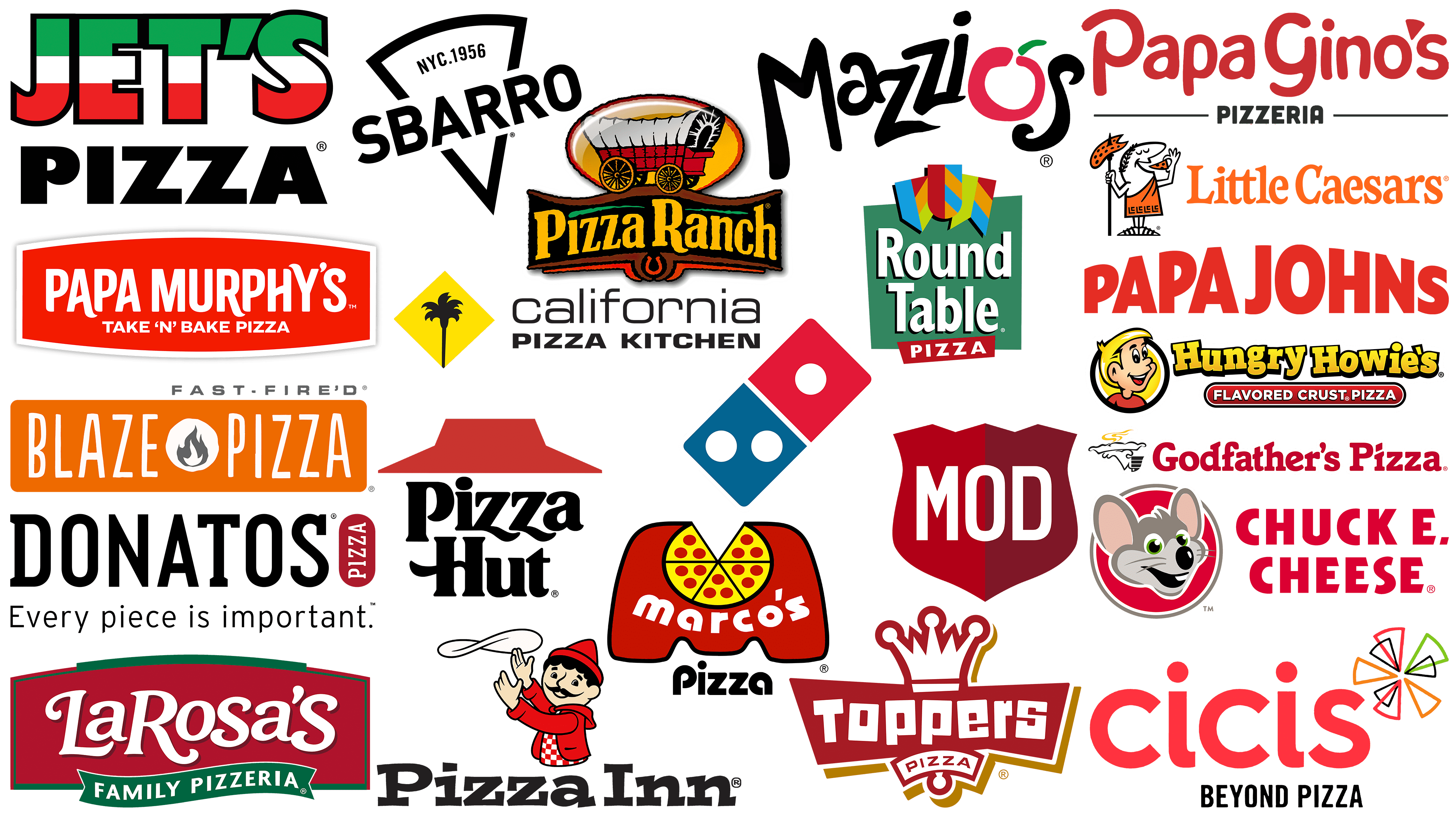
Exploring famous pizza companies
The expanse of the American food industry proudly displays the logos of many pizza companies, each striving to create its own unique identity. Some brands have achieved universal recognition, while others still fight for the right to be in the spotlight. Despite all the diversity, the discerning eye can spot some commonalities in these logos.
Many logos are dominated by bright, playful fonts that often hint at the zest and flavor of the pizza box. In addition, ingredients that are the essence of classic pizza, such as tomatoes and cheese, are often featured in logos, demonstrating the authenticity of the products.
Logo color schemes often include green, red, and white. These colors certainly reflect pizza’s Italian heritage but also emphasize the freshness of the ingredients, conjuring up images of basil leaves, juicy tomatoes, and cream cheese.
Many pizza brands creatively incorporate their brand names into their logos. Examples include the domino tiles in Domino’s logo and the distinctive shack structure in Pizza Hut’s logo. Such design elements provide instant brand recall and reinforce the brand identity in consumers’ minds.
Start-up restaurants and catering businesses can draw inspiration from these design strategies to create a visual identity that resonates with their audience and sets them apart in a crowded marketplace.