


![]() Popeyes Logo PNG
Popeyes Logo PNG
The Popeyes logo promises the opportunity to gather around a round table in pleasant company and enjoy delicious chicken dishes. The emblem’s delicious aroma of fried fillets attracts customers.
Popeyes is an American fast-food restaurant chain serving fried chicken. Its current name, obtained in 2008, is Popeyes Louisiana Kitchen, Inc. The old ones are Popeyes Chicken & Biscuits and Popeyes Famous Fried Chicken & Biscuits. The chain was founded in 1972 in Arabi, a suburb of New Orleans, Louisiana, and is headquartered in Miami, Florida. It is owned by Toronto-based Restaurant Brands International, which has made it its subsidiary. The Popeyes system includes 3,102 establishments operating in 30 countries worldwide and more than 40 states and districts in the United States. Of these, 30 restaurants are owned by the firm itself; the rest are franchise services.
Popeyes, a United States fast-food chain specializing in Louisiana-style fried chicken, began operations in 1972. That year, Al Copeland opened the first restaurant, Chicken on the Run, near New Orleans, Louisiana. Despite a rocky start, Copeland didn’t give up. He quickly revamped the restaurant into Popeyes Mighty Good Fried Chicken, setting the stage for a fast-food empire.
By the mid-1970s, Popeyes had expanded to 500 locations, thanks to its juicy, spicy chicken flavored with Louisiana spices. The 1980s saw continued growth for Popeyes, both in the United States and internationally, with the opening of the first store in Canada. The company recognized its widespread appeal and updated its name to Popeyes Famous Fried Chicken.
Under new ownership, the 1990s and early 2000s were transformative years for Popeyes. In 1991, America’s Favorite Chicken Company, Inc. (AFC) acquired Popeyes for $392 million. AFC embraced the brand’s New Orleans heritage by adding Creole dishes to the menu and rebranding it to Popeyes Chicken & Biscuits. This move helped Popeyes solidify its position in the fast-food industry.
In 2017, a new chapter began when Restaurant Brands International (RBI), which owns Burger King and Tim Hortons, purchased Popeyes for $1.8 billion. Under RBI’s leadership, Popeyes launched a chicken sandwich in 2019 that quickly became a sensation, sparking intense competition among fast-food chains and significantly boosting Popeyes’ sales and brand visibility.
Popeyes operates over 3,700 restaurants worldwide, demonstrating remarkable growth in domestic and international markets.
Meaning and History
![]()
The idea of creating a fast-food chain serving chicken dishes originated with the American entrepreneur Alvin Copeland. He opened his first establishment in the summer of 1972, hoping to compete with the popular Kentucky Fried Chicken (KFC). The businessman named the restaurant Chicken on the Run, but it failed and went bankrupt within a few months. Four days later, he opened another catering establishment, Popeyes Mighty Good Chicken.
In 1975, the company was named Popeyes Famous Fried Chicken, and a year later, the owner switched to franchising. He began in Louisiana, covering neighboring states and Canada, where he came in 1984. In 1985, the restaurateur opened his 500th fast-food outlet. However, in 1990, there was a default, and the network had to pay off the debts it had taken on itself after buying Church’s. The litigation led to the emergence of AFC (America’s Favorite Chicken), which later became the parent company of Popeyes and Church’s. In 2004, AFC sold Church’s to Arcapita, retaining Popeyes.
The brand name on the emblem is partly inspired by the cartoon character Popeye. The firm sponsored the children’s show Popeye & Pals in the early stages, so the sailor was on some packages. However, Alvin C. Copeland said he was referring to detective Jimmy “Popeye” Doyle, the protagonist of the 1971 film The French Connection. But in any case, the name is written with the ending “s” without an apostrophe. The restaurant owner joked that he was too poor even to afford an apostrophe. According to English grammar, Alvin meant direct competitors to McDonald’s and Hardee’s, with apostrophes at the ends of their names.
Later, the network nevertheless bought the rights to use the name of the brave sailor Popeye for marketing purposes. She used it for 35 years, then terminated her contract with King Features Syndicate. Therefore, the connection with the cartoon character is now really lacking. In 2020, a restaurant revival began, with global expansion. At the same time, the designers changed the institution’s image and corrected the colors. There are four logos in Popeyes’ arsenal.
What is Popeyes?
Popeyes is the name of a fast-food franchise. She owns about 30 establishments; the remaining 3450 objects are owned by others. It was founded in 1972. The main dish is fried chicken.
1972 – 2001
![]()
Despite the frequent name changes, the company remained faithful to its debut identity. She used it before the transition to the new millennium. It was a text mark made up of the restaurant’s name. Initially, the letters were depicted as “jumping,” arranged chaotically rather than systematically. But despite this, the word “Popeyes” still reads well. Some characters were slanted to the left (first P, Y, S), while others were slanted to the right (O, P, both E). The top of the “P” had serif-shaped protrusions. The rest of the letters did not have them. An individual uppercase font was chosen for the inscription. The exception was “E,” which was lowercase. The word was colored crimson.
2001 – 2008
![]()
A redesign occurred at the beginning of this period, after which the text emblem was updated. The designers made the letters slightly larger and thinner, creating enough internal spacing to improve legibility. The developers enlarged the first “P”, making it look larger than the others, as if it were a capital letter. In addition, they changed the tilt of the center “E” and “Y,” so the lettering seemed almost even. The authors also worked with color, replacing crimson with burgundy.
2008 – 2019
![]()
Starting in 2008, the characters in the word “Popeyes” began to “jump” in different ways. If earlier they seemed to swing left and right, then, in this case, they jumped up and down. Both “E” went beyond the lower border, and “O,” “Y,” and “S” went beyond the upper one. However, the signs retained their original shape, while the designers placed all the letters vertically in the restaurant chain’s name. Another important innovation of this period is the golden yellow color. It is typical for chicken dishes, so the developers chose it.
2019 – today
![]()
The current emblem features perfectly straight orange lettering, as the company has ditched its fun-loving style in favor of a down-to-earth approach. This is due to the revitalization of efforts to expand the franchise worldwide. For such a start, the brand needed a new logo that did not resemble the old one yet remained recognizable. The designers just changed the font.
Font and Colors
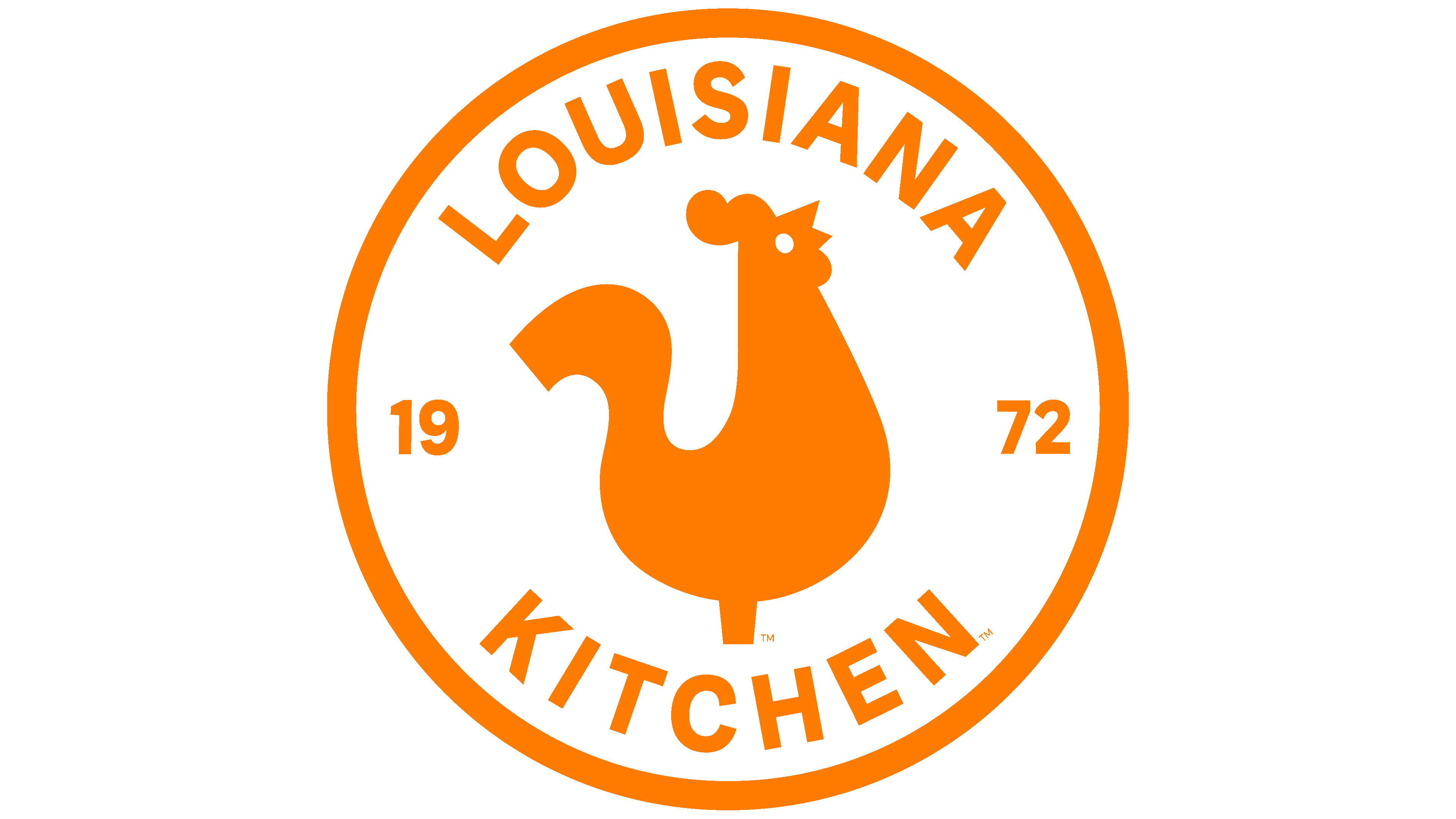
In the modern version, the corporate inscription is complemented by a round stamp depicting a golden rooster, a symbol of a variety of chicken-based dishes. To the right and left are the years the Popeyes fast-food restaurant was founded. It is divided into “19” and “72”. Above and below, the head office location and the type of establishment are listed: “Louisiana” and “Kitchen.” Together, they form the network’s new name, which appeared in the 2008th year.
The restaurant names are in an individual “jumping” font with no analogs. The modern version vaguely resembles the Bold Regular typeface, with short legs at “Ps” and an oblique cut at the “e” end. For the phrase “Louisiana Kitchen,” the designers chose a typeface close to Belizio Black.
The corporate palette has changed several times. The early versions of the logo were crimson and burgundy, while later versions were yellow-gold and orange.
FAQ
What font is the Popeyes logo?
Popeyes has a special “Chicken Sans” font made just for them. Colophon, a type foundry, worked with the creative agency JKR to create this font to make Popeyes’ brand look fresh and new. This new font is part of a larger plan to align Popeyes’ brand with its Louisiana roots and modern direction.
Popeyes also received new menu photos taken by Alex Lau for Bon Appétit and new packaging as part of its brand update. These changes help showcase Popeyes’ signature orange color and emphasize big flavors and filling food. Chicken Sans makes Popeyes stand out by distinguishing it from the usual fonts used by fast-food places.
Why is the Popeyes logo orange?
Popeyes uses orange in its logo because it holds special meaning for the brand. This orange hue pays homage to their famous marinade, highlighting the chicken’s rich, flavorful taste. It also pays homage to New Orleans, where Popeyes is from. New Orleans is known for its lively streets, vibrant colors, and a mix of cuisines that make the city special. The orange color in the logo brings out this lively, colorful vibe of New Orleans.
Using other bright colors alongside orange helps to show the variety and flavor that Popeyes is all about. These colors are chosen carefully to make Popeyes stand out regarding the food it serves and its appearance to the outside world.
Can I order Popeyes online?
Yes, you can order Popeyes online to get their famous Louisiana-style fried chicken and other items without leaving home. You can do this through the Popeyes app on your smartphone. With the app, browsing the menu and picking what you want is easy. You have two options for getting your order: pick it up from a Popeyes near you or have it delivered.
Popeyes also has an app feature that helps you find the closest restaurant. This is great for determining where to pick up your food or how long delivery might take. The idea behind online ordering is to make it as easy as possible to enjoy Popeyes’ food wherever you are.
What does the Popeyes logo symbolize?
The Popeyes logo tells a story about where the brand comes from and what it stands for. The main part of the logo was a rooster inside a circle, a shout-out to their famous chicken sandwich. This rooster shows Popeyes’ boldness and the rich flavors they’re known for. The rooster’s design even looks like a weather vane, hinting at how Popeyes keeps up with what people like to eat and leads the way in the fast-food world.
When Popeyes opened, its logo featured ’19’ and ’72,’ which pay tribute to the brand’s long history in the fast-food industry. Earlier logo versions showed two fleur-de-lis symbols, linking to New Orleans, where Popeyes first opened. The fleur-de-lis is a big deal in New Orleans, representing the city’s French background and lively culture. Popeyes uses this symbol to nod to its beginnings and how much New Orleans’ food and culture have shaped its menu.
Why did Popeyes change its logo?
Popeyes updated its logo to keep up with modern times while retaining what makes it special. They noticed their old look was all over the place and didn’t help them stand out or stick in people’s minds. They wanted to ensure that when you saw their logo, you knew it was Popeyes, with all the good food and feelings that come with it.
They also knew that a brand’s appearance is a big deal. People like things that look good and feel current, but have a soft spot for brands with a rich history. Popeyes aimed to hit that sweet spot: keeping the charm and warmth they’re known for while giving it a fresh, clean look. They especially wanted to attract younger folks without pushing away those who’ve loved them for years. The new logo and design they created do just that. They simplified things to make their brand stronger and easier to recognize across their stores and online presence.
What is the Popeyes tagline?
Popeyes has always been known for its delicious chicken and catchy slogans, such as ‘Love That Chicken from Popeyes,’ ‘Love that Chicken!’ and ‘Party with Popeye’s.’ These phrases have helped make the brand a favorite, capturing customers’ hearts with memorable words and highlighting the unique charm of Popeyes’ food.
In 2008, Popeyes introduced a new slogan, ‘Louisiana Fast,’ alongside a fresh logo. This slogan was a major change from earlier ones, focusing more on the brand’s roots than on just celebrating the taste of its chicken. ‘Louisiana Fast’ reflects the influence of Louisiana’s culture and cooking on Popeyes’ menu. It’s a quick way of saying Popeyes offers the best of both worlds: fast food still packed with the rich flavors and warmth of a meal cooked in Louisiana. This slogan works as a link between Popeyes’ long history and its future ambitions.
What does Popeyes’ name mean?
The name “Popeyes” comes from an interesting place, not the cartoon sailor many people think of, but a movie character. Alvin C. Copeland, who started Popeyes, named it after Jimmy “Popeye” Doyle, a detective in the 1971 movie “The French Connection.” Doyle was tough and determined, and Copeland liked that for his brand. This name was a big shout-out to a popular movie of the time.
At first, the name had nothing to do with Popeye the Sailor Man. That connection came later, when Popeyes saw an opportunity to make its brand more memorable. They received permission to use the Popeye cartoon to promote their food, making the sailor an official part of their brand. This move was smart because it made people love Popeyes even more, thanks to the fun and nostalgia the sailor added.
Why is Popeyes named after Popeye Doyle?
Alvin C. Copeland, who started the Popeyes restaurant chain, named it after a character from the movie “The French Connection,” Jimmy ‘Popeye’ Doyle. He liked the character’s tough and unique style. Doyle, played by Gene Hackman, is a hard-hitting detective who doesn’t back down and plays a big part in solving a drug case in the movie. Copeland saw something in Doyle’s character that he thought would be perfect for his restaurant’s image. Copeland’s interest might also have come from his love of crime thrillers or from the book by Robert Lowell Moore Jr., on which the movie is based.
The decision to name the restaurant Popeyes was smart. It used the fame and appeal of Doyle’s character to help make the brand well-known. This choice has helped Popeyes become a big fast-food name known for its great chicken.
What is Popeyes’ mascot?
Popeyes, the famous fast-food chain, has a mascot that perfectly matches what it excels at: making fried chicken. Their current mascot is an orange rooster named Poppy. This choice makes sense because the first Popeyes restaurant was called Chicken on the Run, which shows they’ve always been about chicken. Having a rooster as a mascot is a fun way to remind people of that.
At first, Popeyes used the cartoon character Popeye the Sailor Man as its mascot. They even got permission to use him in their ads, which helped make Popeyes more popular. However, in 2012, they stopped using Popeye and introduced Poppy the Rooster instead. This change introduced a new look and aimed to ensure the mascot was directly tied to Popeyes’s products. Poppy represents the brand’s focus on serving tasty chicken dishes, upholding its tradition and quality.
When did the Popeyes logo change?
In 2019, Popeyes decided it was time for a new look and began changing its logo, a major project that began in the last months of 2018. They wanted a design that would look good everywhere, from social media to billboards, so they asked the creative agency Jones Knowles Ritchie for help.
The update made a few important changes. First, they lightened the orange, a big part of their old logo. This made the logo easier to fit with different styles and places. They made the letters in the logo clearer and easier to read. Since people see the logo on everything from huge signs to their phone screens, it was important that everyone could read it easily, regardless of size. They wanted their logo to catch your eye and make you think of Popeyes immediately, whether you were walking past a store or scrolling on your phone.