


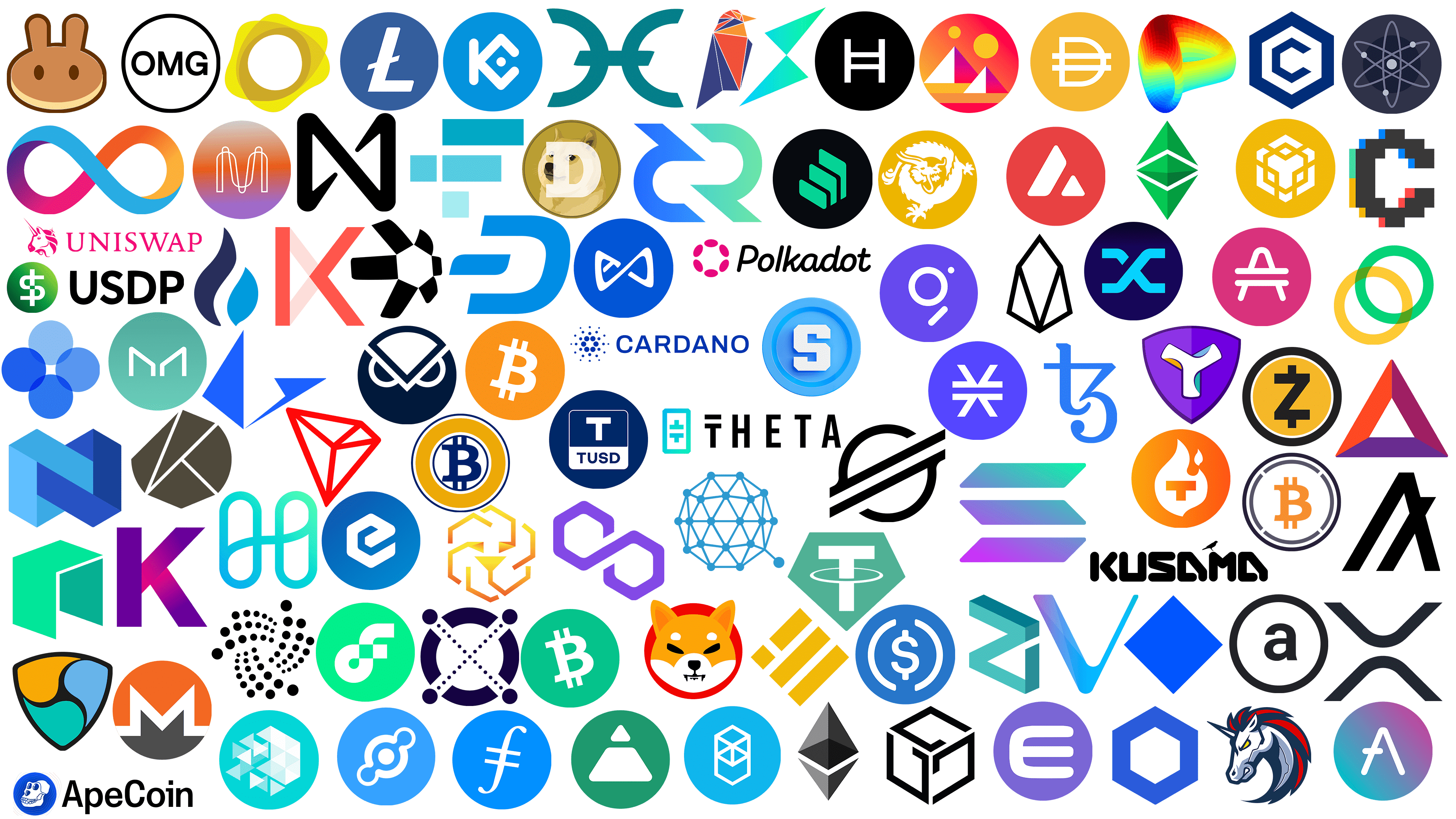
Cryptocurrency is a unique phenomenon in the world of finance. It lacks a centralized payment system, as it consists of units recognized by the majority of holders. It serves as an alternative to physical currency circulating in tangible reality, taking root in the virtual realm that emerged with the advent of digital technology. The emergence of electronic money was inevitable, as it supports the full life of the “parallel universe” in which each person immerses themselves when they turn on their device.
This currency has no issue: it is neither printed nor controlled by any authority. However, it circulates, constantly replenished with new types of cryptocurrencies. There are so many of them that it is easy to get confused because the appearance of coins sometimes resembles one another. Their only physical representative is a customized logo that helps them stand out from their competitors. We suggest taking a closer look at these symbols and following the major trends to see how confident creators are in their currency, whether they see it as connected to the physical world, and how recognizability affects value. The list is compiled without reference to the timing of digital money.
1inch Network logo (1INCH)
![]()
The decentralized exchange aggregator chose an angry unicorn as its logo. Cryptocurrency traders will immediately recognize the logo by its red-and-blue mane, horn, fierce gaze, and furious expression. It is also full of sharp edges and barbs. However, the impression of unapproachability is smoothed out by the round shape in which the mane is inscribed. Around the edges of the horse is a bold stripe. In addition to red and blue, the color scheme includes white, light blue, and yellow, balancing the dark shades.
Aave logo (AAVE)
![]()
The peculiarity of the logo of this digital coin lies in the unusual letter “A.” The first letter of the name is created by a unique design and is not written but drawn. Its clear shape resembles a shalash or an arrow pointing upwards. The small horizontal line on the left foot has a double function. First, it indicates the belonging to the monetary units. Second, the line serves as an incomplete crossbar. This style gives the emblem an innovative touch. All the ends of the glyph are rounded. The white letter looks good on a purple background with a gradient transition from barely visible pink to transparent blue. The mixture in the middle forms a lilac hue. The background is a circle with a solid fill. Overall, Aave has a well-designed, recognizable sign that effectively conveys the idea of a decentralized money platform.
Algorand Logo (ALGO)
![]()
The Algorand logo is designed in an abstract style with an encrypted letter “A.” The figure looks like three smooth lines connected in a certain way. Two of them are tall. They lean against each other, forming an inverted triangle with an open bottom. One is of medium length. This strip is located separately but also crosses the right side of the neighboring geometric design and runs parallel to the left element. One of its ends is pointed. Thus, the designers have formed two allegorical letters, “A,” resembling a tent. All components of the sign are arranged diagonally. Despite the absence of other elements, the emblem looks powerful and confident.
Amp logo (AMP)
![]()
Stylization can be very successful, even conceptual. A striking example is the Amp cryptocurrency logo, where the letter “A” plays a dual role. It represents the abbreviated name of the digital coin and serves as its identifying mark. In fact, the capital letter is horizontally crossed by two lines, resembling two objects: a hat (above) and a bench (below). The glyph is depicted as a medium-width line with smooth, rounded corners. The absence of sharp corners indicates the token’s safety and reliability. The background is a red-and-crimson circle.
ApeCoin logo (APE)
![]()
The cryptocurrency ApeCoin uses a logo with a monkey’s head or skull. The drawing is cartoon-style and features blue eye sockets, a nose socket, and strong teeth arranged in two rows, with a strong emphasis on powerful fangs. The face is directed to the left and seems to be formed from negative space. Thin lines are drawn around the skull to mimic its shape. They surround the head, but their number varies by position: the maximum is five, and the minimum is two. The sign is a blue circle. To the right of it is the name of the virtual currency, typed in a strict, even font. The letters “A” and “C” are uppercase, and the rest are lowercase. The glyphs are colored black and have no serifs, except for the letter “i,” which is complemented by a square serif, the same as the top element.
Arweave logo (AR)
![]()
The simple Arweave logo doesn’t seem easy. It features a bold ring with a large “a” in the center. All elements are colored black and applied in broad lines. Only the white background provides some visual balance. The letter is lowercase, printed, and in block. Such a symbol of cryptocurrency indicates its stability, confidence, and reliability in the decentralized market of electronic money. Overall, it effectively conveys the concept of well-protected data for long-term coin storage.
Avalanche Logo (AVAX)
![]()
The visual identity of the Avalanche coin has a geometric shape and is stylized to resemble the Adidas brand symbol. It really resembles its logo, with wide, slanted stripes of varying heights. Only in this case are there two, not three. The smaller element is shaped as an isosceles triangle with rounded corners. The second segment looks like a trapezoid turned on its side. But in fact, these are not just geometric figures but an improvised letter “A.” The letter is white, large, and wide, and the capital occupies the entire central area of the red circle. Despite the small number of elements, the emblem proved integral.
Axie Infinity logo (AXS)
![]()
Another unclosed infinity symbol, resembling a flattened eight on the side, is used by the Axie Infinity virtual currency unit. This symbol is represented in its logo and name, directly indicating the presence of infinity and the vastness of time or space. It is believed to be a visual improvisation on the theme of the letter “X” from the cryptocurrency’s short name. However, this is unlikely, as the glyph does not stand at the beginning of any words. Rather, the unconventional emblem plays off the word “Infinity” in an interesting way. It is also a direct reference to the stylization of the axolotl – the main character of the game of the same name. The unique animal is originally depicted in the sign in a geometric, laconic style. The upper-left and lower-right lines are not connected to the center, which adds some mystery to the logo. The feeling of unusualness also arises from the symbol’s diagonal arrangement. The pleasant cobalt color and round background keep it well-balanced.
Basic Attention Token logo (BAT)
![]()
The symbol of this cryptocurrency stands out with its simple form. It has no complex elements, but the negative space repeats the outer geometric figure. It is a miniature, white, isosceles triangle. All its faces are equal. Another large, voluminous, and three-colored triangle outlines it. Its tops, although narrow, are slightly rounded. The right edge is colored in pink and lilac, the left in carrot-red, and the bottom in dark purple. They signify creativity and energy.
Binance USD Logo (BUSD)
![]()
The Binance USD logo is diamond-shaped. At the same time, it is a symbolic element encoding the US national flag. The symbol consists of four parts: three rectangles and one square. Two of the figures are the same length, and the others differ in size. All stripes have the same thickness; between them, there are white lines. Each fragment occupies a diagonal position, and the small rhombus repeats the large one, of which it is a part. Such geometric rigor speaks of discipline, demonstrating the seriousness and practicality of cryptocurrency. The emblem is colored in a dark gold shade, which speaks of its value in the virtual market.
Read more about the Binance logo here.
Bitcoin Cash Logo (BCH)
![]()
In this case, the iconic logo is colored in a pleasant shade of green, the color of money, harmony, development, and balance. It is used to visually identify one of the most popular cryptocurrencies, so it looks exactly like the “mother” coin. Its key link is a circle with a solid fill, which denotes not only the background but also classic money, hinting at the dollar. This information is encoded in the first letter of the name. The letter “B,” complemented by short and bold strokes at the top and bottom, occupies a vertical position with a slant to the left. It has powerful serifs and two “pockets” in the negative space. These are the inner holes of the glyph located on the side.
Bitcoin Gold logo (BTG)
![]()
The Bitcoin Gold logo visualizes the name: it refers to Bitcoin, from which it originated, and to the golden color that resembles gold. The symbol resembles a classic rondel with an emphasized center and concentric circles. In the center is the first letter of the cryptocurrency’s name, which has two pairs of vertical strokes at the top and bottom. Two thin blue-and-white lines surround it. A wide golden band with the same double border on the outer edge follows them. The color palette focuses attention on the maximum value of the digital coin.
Bitcoin Logo (BTC)
![]()
The most famous logo of the digital currency is an orange circle with a solid fill. In the center is a diagonal letter “B” with serifs and two protruding bars at the top and bottom of the letter. These lines allude to the dollar ($) symbol, which has one vertical line, or the euro symbol, which has two vertical lines. Users associate this cryptocurrency with American banknotes, which they consider more trustworthy than virtual money. Another psychological factor is the color. It is bright, energetic, progressive, but not as threatening as red. The white color chosen for the slanted uppercase glyph provides a great balance.
You can learn more about the Bitcoin (BTC) logo here.
Bitcoin SV logo (BSV)
![]()
In a drawing style, the complex, obscure design of the Bitcoin SV coin evokes a mythical dragon characteristic of Eastern folklore. Regardless of who honors him as the supreme deity, he is a generous giver of wealth and happiness. Therefore, his presence on the cryptocurrency’s logo is quite logical. According to the designers’ idea, the magical animal endows the owners of this electronic money with independence, energy, luck, and leadership. Its appearance is close to the classic: snake body, demon eyes, deer horns, camel head, cow ears, tiger paws, and eagle claws. Although the carp’s scales are not visible on the body, its approximate outline protrudes in the form of sharp spikes on the beast’s back. This image conveys the emblem with a sense of stability and power, which aligns with the concept of the blockchain platform. The dragon also symbolizes the global nature of the decentralized network, which can provide large-scale, reliable services to users worldwide. It is painted white and located at the center of a golden circle.
BNB Logo (BNB)
![]()
There is more gold in the BNB logo. It is a more complex geometric pattern formed by arrows pointing in different directions. In the center are three wide ones, around them three small ones, and the same long ones. Oblong rhombuses separate them. White elements on a yellow mustard background look bright and expressive, creating a “magical” pattern. In general, the figure resembles a hexagon. The base is a perfect circle, symbolizing a coin. The ornament has depth and versatility, as it is formed by yellow stripes cutting through two white hexagons. The resulting labyrinth looks very progressive.
Cardano Logo (ADA)
![]()
The uniqueness of this cryptocurrency’s logo lies in the intricate composition of two elements. On the left is a graphic symbol resembling the sun, consisting of dots of different sizes. In the center are six large spheres that form a disproportionate ring. From it, in different directions, scatter small dots, located as if a dotted line. There are two of them in each ray. They are made in cobalt color so that the emblem looks refined and bright. On the right is the name of electronic money, written in straight letters without serifs. Capital bold geometric font perfectly complements the composition.
You can learn more about the Cardano (ADA) logo here.
Celo logo (CELO)
![]()
The Celo cryptocurrency logo consists of rings superimposed on each other. They intersect in two places, forming an ellipse with pointed ends and crescents in the free space. The upper element is green; the lower one is gold. This combination of colors symbolizes cryptocurrency, as it is associated with finance: the first represents dollars, and the second represents one of the world’s most precious metals. Overall, the emblem is simple and conveys overlapping interests, stability, growth, and trust.
Chainlink Logo (LINK)
![]()
Simplicity can be a marketing tool that works well visually and surprises. A prime example is the Chainlink logo. This cryptocurrency chose a polyhedron to symbolize the versatility and importance of virtual money. A hexagon is used as an identifier. The dark blue geometric figure has a wide contour that forms at the center of the second hexagon and is clearly visible in negative space. This element has another important meaning: it represents a link in the chain, which is consonant with the coin’s name. The color of the sign represents hope, grace, and truth.
Compound logo (COMP)
![]()
The logo creates a sense of visual depth through the sequential arrangement of miniature and large objects. In a row of overlapping green rectangles, the smallest figure is in the foreground, and the largest is in the background. Because the objects are not densely arranged, they appear three-dimensional. This impression is created by the black separating bars, which merge with the background.
Convex Finance logo (CVX)
![]()
The Convex Finance logo conveys dynamism in the best possible way: the capital letter “C” is rendered in a cubist style, creating an impression of mobility. This effect is created by the letter’s double contours, as the gray layer, which is the main one, hides the second, multicolored one. It includes red, yellow (in the lower half), and mint-green, blue (in the upper part). Such a composition gives the emblem exclusivity and volume, which is perceived as stereoscopic. This color scheme is associated with creativity, stability, depth, and trust.
Cosmos Logo (ATOM)
![]()
The emblem of this cryptocurrency fully justifies its name. It represents a model of space. It shows three orbits surrounding the central “planet,” a large silver-colored dot. Three smaller dots are drawn on elliptical lines that intersect each other. The drawing is also reminiscent of another classical model, the electron-motion scheme around the atomic nucleus. The oval, elongated stripes are colored a barely noticeable violet. But it is still noticeable against the dark background formed by a coal-black circle in the center and a black-gray mantle at the edges. This gives the icon a sense of mystery but exactly matches its two names, Cosmos and ATOM.
Cronos Logo (CRO)
![]()
Another example of a hexagonal logo is the symbol of the cryptocurrency Cronos. However, in this case, it is not minimalist but rather multistructured. However, it is not characterized by diversity, as the main symbol consists of a single geometric figure, repeated in various forms. The largest hexagon forms a border frame. It has a blue color. Next comes a white curved band that forms a hexagon in the negative space. In the center is an unfinished hexagon with no right side. The facet has been removed to resemble the initial “C” in the digital coin’s name. The shade of blue is very vibrant and bright – almost cobalt blue.
Curve DAO Token logo (CRV)
![]()
A more colorful and innovative cryptocurrency logo has never been seen before. The Curve DAO logo resembles an interstellar tunnel composed of a distinctive “grid” of small squares. It looks like a glyph lying on its side with an open gate and a cave-like entrance. All its sides are rounded and streamlined, indicating the digital coin’s safety. In addition, the glyph is painted in all the colors of the rainbow. Like a gradient, they harmoniously transition into one another and belong to the neon palette. The top of the stylized letter has several shades of red; the sides are orange, yellow, and a bit of green, and the bottom is sky blue. Overall, it is a well-designed and recognizable emblem that effectively conveys the token’s value.
Dai Logo (DAI)
![]()
The Dai coin is thematically related to money. Its design is reminiscent of Bitcoin as it contains similar elements. It is an orange circle with two pairs of stripes at the top and bottom of the glyph, and a capital letter in bold white font. However, there are some differences as well. For example, in this cryptocurrency emblem, there are no serifs, the orange color is not as saturated, the letter “D” is straight, and most importantly, the lines are completely crossed. If you look closely, you can see that the glyph resembles a pocket depicted sideways. This is directly related to electronic money and makes the logo thematic.
Dash logo (DASH)
![]()
The stylized letter “D” is designed to surprise and attract users’ attention, and it succeeds, as its unique configuration fascinates. The capital letter is depicted in the form of a dragon’s mouth with the tip of the tongue sticking out. That is, the right part of the glyph is fully represented and has the form of an incomplete semi-oval, and the left part is missing instead of a vertical bar – a short horizontal stroke with pointed ends. This design makes the badge modern and innovative. The emblem is painted in a pleasant sky-blue color, symbolizing infinity, sublimity, truth, and grace.
Decentraland logo (MANA)
![]()
The Ethereum token Decentraland has a modern, bold logo. It depicts two pyramids, with the right side colored dark purple and the left side white. The separation between the colors runs right in the middle. The near triangle is small; the far triangle is large. The one in the foreground slightly overlaps the figure in the background. Above their tops are orange circles, symbolizing the sun. At the bottom of the sign, there are three stripes of the same width but different lengths: the first is orange, the second is peach, and the third is red. All elements are enclosed in a circle with gradient coloring. This futuristic style fits perfectly with the blockchain platform, making it instantly recognizable.
Decred logo (DCR)
![]()
Decred’s logo has an abstract style. It is based on an arrangement of two geometric shapes of unconventional design. They are simultaneous “D,” “C,” and “R,” the silhouettes of which are visible in the mirrored elements. The left part of the logo is blue; the right part is light mint, almost emerald. This combination of colors means growth, stability, freshness, and high potential. The symbols are drawn in wide stripes with a harmonious balance of sharp angles and roundings, which speaks of confidence and superiority.
Dogecoin Logo (DOGE)
![]()
The designers reproduced the classic shape of the coin – a round symbol. But thanks to its unique design, it does not evoke thoughts of money; rather, it resembles a medallion with a portrait of a cherished creature. In this case, the circle depicts a Shiba Inu dog. The dog looks with curiosity, as if looking into the soul. The drawing is arranged so that the animal seems to emerge from the golden background. This effect was made possible by the original color scheme: the dog’s color blends into the background on the sides, and only the light face, with black eyes, nose, and mouth line, is clearly visible. The image is overlaid with a translucent glyph of the cryptocurrency’s first letter. It is large, blocky, and bold, with serifs. A thin, dark beige ring outlines all elements.
eCash logo (XEC)
![]()
The stylized “e” symbol turns an ordinary logo into an extraordinary one. The logo is round and blue, symbolizing truth, grace, and the harmonious union of opposites. This shade conceals depth and infinity, for example, the possibility of acquiring and using cryptocurrency to multiply. The central place is given to a hexagon, made by a wide white line. But the geometric figure has an interesting feature: none of the strips are connected. They are bent inward. This design technique made it look like a lowercase letter “e” from the word “electronic.” Almost all the corners of the figure are rounded. The only exception is the ends: one is sharpened like a pencil lead, and the other is cut diagonally. Inside the letter, in the negative space, there is a blue hook resembling an umbrella handle.
Elrond logo (EGLD)
![]()
Among the visual identification of cryptocurrencies, there are not only unusual but even extraordinary emblems with deep meanings expressed through simple forms. A striking example is the Elrond logo, which, at first glance, has nothing to do with digital money platforms. It has a futuristic design in which circles and semicircles of different sizes play a key role. Let’s start with the center. Here, a single miniature dot contains several identical elements arranged diagonally. They look like crossed dotted lines in the shape of the letter “X.” At each of the four ends, a medium-sized circle formed from a segmented ring extends beyond the boundaries of the unifying band. The largest circle is depicted in negative space and serves as a field for crossed cross-shaped lines of dots. Such a symbol conveys the basic idea of the blockchain network: scalability, diversity, and close interconnectedness. The color scheme is simple, consisting of dark blue and white.
Enjin Coin logo (ENJ)
![]()
The Enjin Coin logo consists of a stylized letter “E.” The large white letter is placed in a purple circle, taking up almost the entire space. At the same time, it is strongly elongated, making it look like a fork without a handle. The glyph is in block font, uppercase. Both ends and corners are rounded, making the logo appear friendly and unobtrusive. Purple color is traditionally associated with luxury and wealth. Such a symbol stands out effectively in the oversaturated cryptocurrency market.
EOS logo (EOS)
![]()
The theme of flawless geometry is well reflected in EOS’s visual identity. This cryptocurrency is characterized by an original icon featuring multiple figures. At first glance, there are only three of them: a diamond (in the center) and two triangles (right and left). However, if you shift the line visually, you will find several more geometric designs, including a trapezoid and two slightly curved rectangles. The creators of the blockchain platform with the customized coin wanted to show its hidden possibilities, which can be discovered endlessly. Together, they demonstrate simplicity and accessibility, which align with the mission of this project. The extended bottom part indicates e-money’s stability, suggesting a solid, reliable foundation. The emblem is made of bold, flowing lines in black. The monochrome fits perfectly into the concept and complements the visual image favorably.
Ethereum Classic Logo (ETC)
![]()
The diverse structure of this logo testifies to the value of cryptocurrency, its high security, and its broad demand across various spheres. Its basis is the original Ethereum design, which is a double pyramid. It is assembled from a set of triangles. Geometric figures are colored in several shades of green, which makes the composition deep and volumetric. Some elements are dark, as if shaded; others are light, as if under direct rays. A horizontally elongated rhombus is in the center, between two arrows pointing up and down. A white stripe separates it.
Ethereum Logo (ETH)
![]()
The Ethereum emblem’s style is abstract. It consists of geometric figures of strict shape. The basis is made up of six triangles, which, due to the shadows, form a cone. The deep areas of the pyramid are painted black; the surface areas are less dark; and the edges are gray. Thus, the designers formed a 3D object that has no parallels, just like the currency. That is, the creators sought to distance themselves from real money and to create a unique symbol that bears no resemblance to physical monetary units. This logo represents confidence and superiority. It also features a negative space with a curved white stripe. This stripe represents an arrow pointing downwards.
You can learn more about the Ethereum (ETH) logo here.
Fantom logo (FTM)
![]()
There are many competitors in the cryptocurrency industry. To stand out and attract attention, creators of digital coins use various techniques, including visual ones. Fantom’s logo is a direct proof of that. It is bold, unusual, and even provocative, although it is based on simple straight lines. It’s all about their combination: the stripes are arranged in such a way that they form a multi-structured element, which, depending on the chosen angle of view, can be perceived as flat or volumetric. At first glance, it is a hexagon divided into four triangles, one rhombus, and a wide arrow at the bottom. If you look closely, you can see a cube on top and a hexagon below it. The background is a blue circle. Combined with the white geometric figure, this palette speaks of clarity, security, and trust.
Fei USD logo (FEI)
![]()
A large trapezoid and a small triangle are the visual identity of the Fei USD coin to be issued in 2021. The geometric figures are colored white and are placed one above the other at some distance. Together, they should form a large triangle. All their corners are rounded and smoothed, so they look soft. The background is a circle of noble emerald color.
Filecoin logo
![]()
The visual style of the Filecoin virtual coin is simple and professional. It consists of a blue circle with a slightly slanted letter “f” in the center. The symbol’s design combines the graphic representations of two real currencies: the dollar (stylized as $) and the euro (two short lines in the middle). The choice of such a font gives the emblem solidity and hints at the stability of crypto money, which is extremely important for a decentralized digital network. The letter is composed of smooth lines with soft, rounded ends. The cross stripes running parallel to each other look sharper. The blue color on which the white glyph is placed has a light shade, evoking trust and security.
Flow logo (FLOW)
![]()
The Flow logo is intricate and complex. At first glance, it is so intricate that it is hard to make out, but upon closer inspection, you can see the letters “F” and “L.” They are arranged uniquely and fluidly, taking on one another’s outlines. This design approach has created a unique visual identity that is closely related to the name but difficult to replicate. The center elements are a broad line that seamlessly transitions from one level to the next. At the point of intersection is a light green square, contrasting with the identical white figure next to it. The lower part is formed from a circular loop, thus creating a classic monogram. It is placed within a coin circle, symbolizing the digital coin of the blockchain.
FTX Token Logo (FTT)
![]()
“Decrypt me!” this is how the FTX token logo is perceived. After all, it consists of unusual glyphs that appear in geometric characters. They are distributed in such a way that they do not look like classical letters but are perceived as chaotic sets of squares and rectangles. But it is in them that the abbreviation is encrypted. First of all, the capital letter “F” catches the eye: it is neatly composed of one long rectangle, one short rectangle, and two squares. There is no vertical stem, but it is visually outlined in figures aligned on the right edge. In this case, the brain simply does not perceive the gaps between them but “fills” them with shape and color. Another letter is “T.” It is hidden within one short rectangle and two squares that form its cover (the upper crossbar). All elements are colored in different shades of blue.
Gala logo (GALA)
![]()
The geometric shape of the Gala logo is striking because it consists of the first letter of the cryptocurrency’s name. The glyph is enlarged and stylized to resemble the facets of a large cube. From the logo’s perspective, three facets, depicted by bold lines, are visible. This design is intended to convey the stability, strength, and steadfastness of digital currency. The figure’s faces are smooth and even, but one stripe does not reach the end, representing the bottom “G” element.
Gnosis logo (GNO)
![]()
The futuristic bird fits perfectly into the round shape of this e-coin, as the owl has long symbolized wisdom and knowledge. It is depicted with simple lines forming two triangles (the beak and the frontal lobe of the head) and two semicircles (the eyes). White stripes on a dark blue background create a great contrast and present the cryptocurrency in a favorable light. The concise design suggests the simplicity of acquiring and using digital money.
Harmony logo (ONE)
![]()
Everything about the Harmony logo speaks of a delicate balance. Color, shape, airiness, roundness, and fluidity are just a small part of what hints at a sense of simplicity and weightlessness. There are two main elements. They are ovals arranged vertically and intersected diagonally by a wavy band, which evokes the capital letter “H” in the cryptocurrency’s name. It is perfectly stylized, making complex concepts easy to grasp.
Hedera logo (HBAR)
![]()
Sophistication and traditionality are what catch the eye of the Hedera logo. It is a practical symbol with nothing superfluous, so it is well executed from a professional point of view. It concentrates on two key points: money and minimalism. These factors are so harmoniously combined that the emblem is easy to perceive visually. Everything about it is simple, from the classic shape characteristic of coins to the abbreviation turned into a personal designation. The black background shows a white letter “H” with a double crossbar, which is usually found in real currencies such as ₴ (hryvnia), € (euro), ₱ (peso), and many others. However, in this case, the parallel lines do not extend beyond the sides, forming a kind of two-step ladder.
Helium logo (HNT)
![]()
The Helium (HNT) logo reflects confidence in the capabilities of the digital cryptocurrency it represents. Although the coin’s name is not present on the logo, this does not affect its relevance: it has been circulating on the decentralized wireless network since 2013 and has taken an active position. The coin’s design is simple. It represents a stylized image of three large spheres connected by short lines. The leading position is occupied by a white circle in a blue frame, smoothly passing into two side circles. All elements are outlined by a wide white line repeating the contours of the central part. The main background is a large cobalt-colored coin.
Holo logo (HOT)
![]()
The visual identity of this cryptocurrency has a familiar outline of the euro sign (€). The logo is a combination of two symbols: they are arranged with their concave sides facing the center and united by a horizontal line that is diagonally dissected at the ends. This strip reinforces the emblem’s similarity to one of the world’s coolest currencies. The fact that the line is so wide that it seems double. According to the developers’ idea, this structure is an artistic reinterpretation of the capital letter “H.” That is, the personal mark is designed to look simple, modern, and easily recognizable.
Huobi Token logo (HT)
![]()
Restraint and dynamics are two incompatible concepts that designers managed to combine in Huobi Token’s visual style. Graphically, the logo is a flame made in cold colors. The right side of the flame is colored in blue, and the left side is colored in purple. This combination makes the sign unique, as such a combination is rarely found in the emblems of cryptocurrencies. Between the tongues of flame passes a small white stripe. The fire has smooth contours, making it look neither scalding nor dangerous but light and unobtrusive.
Internet Computer logo (ICP)
![]()
Infinity signs are often present in the logos of cryptocurrencies. This is not accidental because every creator of electronic coins wants them to last as long as possible, ideally indefinitely. The Internet Computer logo is no exception: it contains the classic image of an inverted eight, consisting of two large loops. It is depicted as a wide ribbon painted in different colors: the front part is blue, and the rest is purple, pink, orange, and yellow, harmoniously alternating. The ends of the stripes at the bends are pointed. The emblem looks progressive thanks to its multiple colors and bold lines, and its bright colors make it eye-catching.
IOTA logo (MIOTA)
![]()
This cryptocurrency’s logo has no inscriptions. Its uniqueness lies in the large number of dots arranged in a fan shape. They are collected in three groups, reminiscent of propeller blades. Each part consists of three curved bands formed by dots of different sizes: small in the center and large at the edges. There are six elements in each row, but due to the specific visual effect, they seem to be more than that. In the center (in the negative space) is a triangle resembling a shield. The emblem’s palette is simple, consisting of two colors: black (painted in spots) and white (as the background). This combination speaks of transparency, trust, and security.
IoTeX logo (IOTX)
![]()
A large polyhedron composed of individual fragments perfectly symbolizes the decentralized network and the immense potential of cryptocurrency. Several shades of light blue, transitioning into white and azure colors, embody brand values such as forward-thinking and innovation. The geometric shape testifies to the limitless possibilities of modern technology. The hexagon is composed of miniature triangles and sits at the center of a circle.
Kadena logo (KDA)
![]()
The letter “K” glowing from within surprises with its simple geometry and complex palette. The edges of the letter are dark purple, but the closer you get to the middle, the lighter they become. At the point where the legs join, a soft pink light appears. The memorable design conveys the decentralized coin’s desire for security, stability, accessibility, and harmony.
Kava logo (KAVA)
![]()
The Kava logo contains a futuristic letter “K.” The capital letter is divided into two parts, which are placed separately. Between them are two diagonal pink stripes colored in red. This palette stands for energy, development, simplicity, and transparency. The sans-serif uppercase font looks harmonious as two more characters appear in the negative space, “X” or the Roman numeral “IX.”
Klaytn logo (KLAY)
![]()
The unconventional form of the Klaytn logo testifies to its uniqueness. Thus, the emblem consists of several geometric figures arranged in a mosaic-like pattern. Each figure is a triangle of a certain shape. There are four in total: two sharp and the same number of rectangular. Some have rounded edges; others have straight edges. It depends on the arrangement of parts in the compositional structure, as it represents an incomplete circle. It lacks a part on the left. All elements are separated by thin white strips that imitate their contours. Due to the features of the cut line, the lower fragment resembles a disproportionately flattened rhombus. The icon is colored dark brown, which indicates the seriousness of the cryptocurrency.
KuCoin Token logo (KCS)
![]()
This emblem has an unusual configuration. It strikes a unique sign reminiscent of an ancient Greek symbol or even a Japanese hieroglyph. This impression is created by the central element of the logo, set within a blue circle that resembles a real coin. In the center is a design that combines two capital letters from the cryptocurrency’s name: “K” and “C,” taken from the word “KuCoin.” The left bar is vertical. From its center, two equally wide lines diverge up and down at an angle. At the top, they curve to form a fancy letter “C” in the form of a rhombus with an unclosed part. The letters are bold, white, and typed in sans-serif font. Inside their gap, a large dot is drawn, not connected to any of the surrounding elements. This unusual sign structure indicates the token’s high maneuverability in the decentralized money market. The blue color symbolizes calmness, confidence, truth, and hope.
Kusama logo (KSM)
![]()
Kusama’s cryptocurrency logo is very cute. This feeling comes from the smooth curves, rounded ends, and a lone bird standing calmly on the letter “A.” This letter is stylized as a house with a single-sloping roof, hinting at the possibility of experimentation by digital coin holders. The rest of the glyphs have recognizable outlines, although they have undergone slight changes. For example, the “U” is rectangular in shape and resembles an inverted table. Bold lines, a unique design, and monochrome make the emblem an unusual sign with an individual style.
Litecoin Logo (LTC)
![]()
This digital coin has one of the most stylish and professional logos. It hints at brevity (there is nothing superfluous or distracting in it), strictness (straight and geometric lines), and thematic relevance (the emblem consists of the first letter of the name). The last point also implies orientation to the financial theme, as the symbol resembles the traditional designation of the monetary unit. This is the letter “L” with a diagonal crossbar. The crossing line has a pointed right end. The glyph is italicized, bold, and white. This configuration instills confidence that the cryptocurrency will remain stable under any circumstances. The symbol is placed within a solid blue circle.
Loopring logo (LRC)
![]()
The minimalistic design of the emblem conveys the simplicity and efficiency of a blockchain platform with a decentralized protocol for exchanging electronic assets. It has clear lines, smooth edges, sharp corners, and unusual shapes. The visual composition includes two elements of different types. On the left is an isosceles triangle, slightly turned sideways. Theoretically, the second part is its shadow. However, it is an independent figure and does not repeat its contours. The right part looks like an arrow folded in half. The abstract logo’s color is a deep blue, approaching a cobalt shade.
Maker logo (MKR)
![]()
The logo shows the first letter of the cryptocurrency’s name stylized as two brackets. They look like mirror images as they are placed opposite each other. The lower sides are closer to the center, while the upper sides are farther away. Thus, the likeness of two curved elements of one letter is created. Outside, all the curves are rounded, and inside, pointed, which gives the emblem dynamism. The unique symbol is colored in white, and the space around it is in emerald. This combination creates a positive impression of the digital coin by avoiding aggressive shades.
Mina logo (MINA)
![]()
The Mina logo is two capital letters “M” drawn in thin lines. They are superimposed, so they look like the outline of a bold letter. The tips extend well beyond the glyph, as does the bottom element in the center. This structure represents continuous dynamics, as it resembles a graph of the cryptocurrency’s rise and fall. The mark is inside a circle colored with a brown-red-purple gradient.
Monero Logo (XMR)
![]()
The elegant Monero logo is naturally round, as the cryptocurrency’s name translates from Esperanto as “coin.” It stands out among competitors’ logos for its uniqueness, consisting of a stylized letter “M” with several modifications. One of them is orange, rounded, and located first. Another is white, blocky, and has the clear shape of a classic letter with horizontal branches reaching to the edge of the circle. The third is dark gray, with sharp tops on both legs and a round bottom. That is, in fact, the glyph is repeated three times in different forms. All elements are harmoniously combined, so the sign looks strict and professional.
NEAR Protocol Logo (NEAR)
![]()
In this case, the infinity sign is rendered almost classically as a figure eight flattened on the sides, positioned horizontally. But the lines are not completely closed: the two opposite ends (upper right and lower left) do not reach the center. They seem to hang halfway and are directed towards the center. At the same time, this unusual symbol is the first letter of the name of the NEAR Protocol cryptocurrency, and if you look closely, you can see a clear letter “N” with diagonal serifs. All its corners are rounded, and it is square-shaped. The emblem is monochrome, businesslike, and strict.
NEM logo (XEM)
![]()
NEM cryptocurrency relies on bright symbolism that can impress anyone. Its base is a classic triangular shield. Inside it are three elongated “drops,” reminiscent of the yin-yang sign, reflecting the initial stage of cosmogenesis. They follow each other, symbolizing the endless movement of matter, passing from state to state. The timeless circulation model applies to financial transactions involving digital coins. Overall, the logo has traces of the infinity sign, as each element contains the initial shape of a circle. The logo is colored blue, emerald, and gold, symbolizing innovation, growth, and prosperity.
Neo Logo (NEO)
![]()
One of the most unconventional logos in the digital coin world is Neo’s. It is simple yet meaningful. It is based on complex geometric shapes: a trapezoid turned on its side and two parallelograms connected to form an arrow. Visually, they create a passage and an invitation to enter, as if it were an open portal to another dimension. The elongated corners make it look like a three-dimensional object, effectively communicating the values and mission of decentralized cryptocurrency technology.
Nexo logo (NEXO)
![]()
The infinity sign is not uncommon among cryptocurrency symbols. Another interesting example is the Nexo logo. It carries a double meaning. The first is an improvised infinity sign, and the second is a stylized letter “N.” The letter fits perfectly into this format. To depict the unique emblem, the designers used two triangles connected in the middle. In the upper part, the line of the left figure overlaps the right one, and in the lower part, the strip from the straight figure is above the left one. The sign is colored in shades of blue from dark cobalt to soft sky blue. With this, the developers emphasized the harmonious connection of opposites and the hope for success.
OKB logo (OKB)
![]()
The eccentric, futuristic logo of this cryptocurrency consists of four translucent circles of equal size. They have a cruciform shape, one on each of the right, left, top, and bottom. Each element is colored in shades of blue from saturated cobalt to soft light blue. The edges of the disks overlap slightly, forming ellipses with pointed ends. As a result, a miniature rhombus with concave edges appears in the center, in the negative space.
OMG Network logo (OMG)
![]()
The OMG Network logo is very simple. It is a white circle outlined with a black border. Inside it is the digital coin’s short name, in bold uppercase. This design is intended to show the transparency of cryptocurrency transactions and their accessibility for everyone.
PancakeSwap logo (CAKE)
![]()
Quirkiness and playfulness are also characteristic of cryptocurrency branding. An example is the PancakeSwap logo. Its design meets these criteria, as the logo resembles a smiling rabbit. It conveys token availability and the ease of acquiring them. The head of the friendly animal is drawn in cartoon style and consists of a horizontal oval and two vertically elongated elements. A bold, solid brown strip outlines them. The animal’s eyes have the same shade. The combination of dark beige and light beige colors serves as a mouth. Its border in the form of an inverted crescent moon gives the impression of a welcoming smile. At the same time, it is a freshly cooked, high-quality frying pancake. The dual interpretation of the image reflects the essence of the digital coin and conveys the positivity of its purchase.
Pax Dollar logo (USDP)
![]()
The dollar theme is clearly visible in the Pax Dollar cryptocurrency logo, which contains a traditional sign recognized worldwide. It represents the letter “S” with a single vertical line running through the middle. It is as if it divides the glyph into two mirrored halves, each with a half-circle and a horizontal flat strip. That is, the curve of the letter is very deep and wide, and both lines (upper and lower) are long. At the intersection’s center, there is a green rectangle. It is miniature and harmoniously fits into the sign’s structure. The background of the sign is a green gradient-filled circle. The right side of the stylized coin is lighter than the left. Next to it is the digital currency’s abbreviated name, “USDP.” It is made in a bold sans-serif font with optimal character spacing. The letters are large, geometric, and black. They are comparable in size to “$”: their height corresponds to the length of the longitudinal stripe.
PAX Gold logo (PAXG)
![]()
A wavy ring made up of three translucent elements is how this logo can be characterized. It effectively reflects the dynamics inherent in the fluctuations of any cryptocurrency’s exchange rate. The stripes are uneven, wavy, and light-colored. They overlap, creating an interesting color combination. In the center is a dark-gold segment, followed by a light-gold segment, and the composition is completed by a yellow segment. Such a palette perfectly conveys the high importance of electronic money and corresponds to its name.
Polkadot Logo (DOT)
![]()
Playful and carefree are how we can characterize this logo. It consists of two parts: graphic and text. It is a circle formed by six miniature ovals arranged in a chain with a small distance between the links. Moreover, they resemble wheat grains. All elements are colored bright pink (fuchsia) and form a wreath. On the right is the name of the cryptocurrency, in italics, mimicking a handwritten style. The word “Polkadot” is semi-coherent (the letters “P,” “o,” “l,” and “t” are not connected), bold, and calligraphic. The background is white. Thus, simple geometric figures and a simple inscription created a well-recognized symbol.
Read more about the Polkadot (DOT) logo here.
Polygon Logo (MATIC)
![]()
A double polyhedron is what can be distinguished in the Polygon logo. It has a distinct shape, curved and diagonal. The unusual arrangement of the complex geometric shape gives the emblem originality. It has a slope to the right and pointed ends that do not join in the center. All the corners of the hexagons are rounded. The structure is designed to resemble an infinity sign or a honeycomb. The symbol does not have a colorful background; it has a bright hue. It is a soft purple color that symbolizes luxury and wealth. It is also a symbol of opposites, as it combines fundamentally different colors: blue (relaxing) and red (energetic).
Qtum logo (QTUM)
![]()
The main objective of the Qtum logo is to convey a sense of innovation in the world of blockchain technology. And it succeeded perfectly, as the cryptocurrency’s sign is futuristic. It consists of many bold dots connected by thin lines, in which you can distinguish various geometric shapes: trapezoids, parallelograms, rhombuses, and triangles. The unusual design is a typical “Q,” as evidenced by its proximity to the round shape and the traditional “tail” in the right part of the glyph. Since it is the first letter of the coin’s name, the designers have effectively anchored it visually. The symbol resembles a plasma ball in which internal reactions are actively taking place.
Quant logo (QNT)
![]()
Here it is: the most unusual cryptocurrency emblem. The Quant mark resembles a flower with six petals arranged sideways. Because of this viewing angle, which makes the image convex, it resembles the design of a soccer ball. It’s all about the center element: a clear hexagon is visible in the negative space. It is large, flat, and simple. Around it are rectangles of different sizes: the near ones are massive, resembling bricks, and the far ones are small and narrow. There are also two diagonal rhombuses. These elements convey the project’s mission as effectively as possible: uniting different blockchain networks, ensuring clear communication, and fostering ongoing interaction. The symbol’s color palette is monochrome, which speaks of its businesslike, serious, and practical nature.
Ravencoin logo (RVN)
![]()
The bird theme is evident in the Ravencoin icon. It is a geometric figure whose straight lines form clear contours of the head, beak, tail, body, and folded wings. The abstract composition consists of sharp triangles of different sizes. Each is assigned a separate color to prevent it from merging with the adjacent figure. Mainly, blue, red, and orange colors are used. In addition, all elements are separated by thin white lines. Such a logo conveys precision, flexibility, and a focus on the safe, fast transfer of assets.
Shiba Inu Logo (SHIB)
![]()
The name of this cryptocurrency matches its logo: it depicts the Shiba Inu, a hunting dog originally bred in Japan. The large head is depicted on a red circle, evoking the national flag of the Land of the Rising Sun. The ears of the animal are raised, as in combat readiness, and go far beyond the borders of the background. The almond-shaped eyes are narrowed. Above the eyes, there are two white spots and sharp fangs sticking out of the mouth. The upper part of the head is colored orange, and the lower part is white, which makes the black nose visible.
You can learn more about the Shiba Inu logo (SHIB) here.
Solana Logo (SOL)
![]()
The emblem of this cryptocurrency has a futuristic character. It includes several parallelograms that form a three-level composition. This structure is not accidental: geometric figures are not arranged proportionally but with a slight offset, which allows you to distinguish the capital letter “S.” This is the first letter of the name, so the designers fixed it visually. The upper and lower elements have a rightward slope, and the middle one has a leftward slope. This arrangement forms a wave-like silhouette of the glyph. Parallelograms lie horizontally, so they appear very wide. Their color is also interesting. The brightest figure is the first, azure blue. The second part is painted in a gradient of azure and violet. A magenta-pink element occupies the third row.
Stacks Logo (STX)
![]()
Now is the well-forgotten old. In this case, this proverb confirms it as well as possible, with the only difference that the “old” is not forgotten at all. We are talking about the sign of the Japanese yen, which is similar to the logo of the cryptocurrency Stacks: it looks like a halved symbol ¥, positioned in a mirror image of the other identical part. The emblem consists of its top part in a regular shape, inverted. However, it is a stylized letter “X” with transverse lines. It is shaped like a flag with neatly trimmed ends. White elements are located in the center of a blue circle, symbolizing security and trust.
Stellar Logo (XLM)
![]()
Surprisingly, the claimed star quality is absent from this digital coin’s logo. But there is an improvisation on the theme of the first letter of the name. It is arranged diagonally, slanted to the left, and divided into two parts. Two mirror-identical fragments represent an arc connected at one end with a straight line. Together, they resemble the outline of a dollar ($). The difference between them is the presence of two intersecting lines rather than one, as in the original. Otherwise, one can notice a clear resemblance to the “S” divided into two segments. The ends of the center lines are pointed. The round sign is painted in black, which sets up a serious mood. Diagonal stripes give it dynamics and create a sense of infinity.
Symbol logo (XYM)
![]()
The Symbol logo features a triple element resembling a propeller. Although all the “blades” are white on top, their lower parts are colored in different shades: blue, green, and yellow. The first symbolizes safety and reliability, the second symbolizes growth and development, and the third symbolizes profit and wealth. The background is an unusual element, a heraldic shield, visually divided into two parts: the left one is purple, and the right one is cobalt.
Synthetix logo (SNX)
![]()
Two opposing “C’s” forming an “X” form the basis of the Synthetix logo. At the same time, it is a stylized letter “S” that mimics a chart of the cryptocurrency’s exchange rate. The letter is turned sideways, fitting perfectly into the idea of the graph. The main element is colored light blue and placed in the center of a dark blue circle. The emblem is memorable due to its clean lines, smooth transitions, unique shapes, and simplicity.
Tether Logo (USDT)
![]()
The emblem of this cryptocurrency looks like a portal from which the block “T” appears. The first half of the glyph is above the oval, and the second half is below it, creating the feeling of passing the letter through a narrow space. The sign is as simple as possible: embossed, bold, geometric. A horizontal oval outlined by a white elliptical line divides it into two halves. Both elements are placed in an inverted pentagon standing on its apex. It is colored in dark turquoise, creating an atmosphere of reliability, confidence, and security.
Tezos logo (XTZ)
![]()
This cryptocurrency has a very intricate logo. Its originality stems from its similarity to a monogram, which uses only two characters from the name. The letters “t” and “z” are used in it. The letters are lowercase and bold, with smooth transitions. The first glyph is well recognizable, as it has a clear shape, and the second is visible on the bends, turning into the number “3”. This choice gives the emblem a minimalist and modern feel, echoing Tezos’ mission as a blockchain platform. The two-tiered emblem is colored blue and placed on a neutral white background.
The Graph logo (GRT)
![]()
At first glance, the logo of this cryptocurrency is a chaotic set of random components haphazardly scattered on the surface. However, the logo conveys the intention to support a blockchain indexing protocol available to anyone. Inside the blue-purple circle, reminiscent of a classic coin, are three elements colored in white: a ring, a dot, and a diagonal stripe. They are not distributed exactly at the center, which emphasizes the network’s decentralized nature. The shapes are drawn with a wide line and contain no sharp corners; all sides are smooth and soft. The combination of dark blue and lilac colors implies trust, hope, constancy, luxury, and wealth.
The Sandbox logo (SAND)
![]()
The visual style of “Sandbox” is stylish and austere. Its basis is a traditional coin, usually round. At the same time, it is unusual because it has an inner dark stripe that makes the logo appear three-dimensional. It has depth as if it were a bowl with a flat bottom and the letter “S” in the center. It is solid, blocky, in a geometric style, with cut corners, which gives it a resemblance to the number “5”. This design is usually characteristic of sports team logos. The color scheme is unified and restrained, with a smooth transition of shades of blue. The emblem looks simple and clear, which is a key factor for a decentralized cryptocurrency network.
Theta Fuel logo (TFUEL)
![]()
The Theta Fuel cryptocurrency uses a dynamic, energizing sign. It features a red-orange circle with a white tongue of flame inside, with a red letter “T” in it. This design conveys the digital content founders’ confidence in the possibility of high-speed transactions within a decentralized network.
Theta Network logo (THETA)
![]()
The Theta Network logo is light, businesslike, and futuristic. This combination is evident in the minimalism and simple lines. On the left is a rectangular icon with mirrored “T” letters. They are short and turned towards each other, their caps forming two perpendicular figures. The letters are in bold emerald lines. The frame of the vertical rectangle is colored in the same shade. To the right is the name of the cryptocurrency, typed in block capitals. Above the first glyph, there is a short crossbar, which makes the cap of the letter “T” double, adding solidity to the logo. The rest of the letters are tall. They are at a considerable distance from each other because the designers created a wide inter-character space.
THORChain logo (RUNE)
![]()
The emblem of this cryptocurrency is consonant with the name of the god it honors. This is a representative of Germanic-Scandinavian mythology, commanding thunder and lightning. Therefore, the emblem depicts the zigzag motif, with the stylization of two connected lightning bolts forming sharp triangles. Their tips are directed in opposite directions: only the side corners are connected. The first figure is directed sharply upward to the right, and the second downward to the left. The color scheme, reflecting superiority, energy, reliability, and strength, features a blue gradient that harmoniously blends blue and mint.
TRON Logo (TRX)
![]()
One of the most unusual logos among digital coins is TRON’s. If you didn’t know it was a cryptocurrency symbol, you could definitely mistake it for something from geometry. It resembles a three-dimensional figure depicted on a two-dimensional plane. What this means: It has depth and volume, but it is drawn with simple straight lines. Only their special arrangement turns them into a complex geometric structure resembling a pyramid. Depending on the angle of view, it has two tops: one points down, and the other points left. Except for the polyhedron, there is nothing else on the emblem. The red color gives the emblem boldness and uniqueness.
TrueUSD logo (TUSD)
![]()
The shape of the road sign is what makes the TrueUSD cryptocurrency logo surprising. Indeed, it is a rectangle with rounded corners divided into two halves. At the top, in the dark blue space, there is a lone letter, “T.” It is the first letter of the digital coin’s name and resembles a crossroads with right- and left-turning arrows. This site has the largest area. At the bottom, on a white background, is the inscription “True” in a smooth sans-serif font. All glyphs are uppercase and of equal height. This part is half the size of the first one. A thin, light stripe outlines a vertical rectangle, clearly visible on the dark blue background. The base of the money sign is a circle – the classic coin shape.
Uniswap Logo (UNI)
![]()
The mythical Uniswap logo represents the head of a unicorn with a waving mane. The creature is looking to the left and is depicted in profile. Its left eye, powerful, sharp horn, and one ear are visible. The silhouette is emphasized by the color concentrated on the nose and the upper part of the muzzle. The horn is formed by two lines of different lengths and is drawn diagonally, pointing to the emblem’s upper-left corner. The mane is neatly arranged and consists of three curls, with a playful curl on the left. On the right is a four-pointed star. Next to the unicorn is the name of the coin, written in a thin uppercase font. The letters are stylized with serifs and arranged freely. All elements are colored in a bright shade of fuchsia.
UNUS SED LEO Logo (LEO)
![]()
The abstract, futuristic design creates a feeling of unreality because, in front of us, it’s not just a set of curved lines but a lion’s head. The nose of the lion is a large triangle pointing downwards, and the eyes are two skewed trapezoids. The rest of the brackets do not have this design; their ends are flat and smooth. Each geometric element has a curved structure and consists of three segments of different lengths. They are arranged in such a way that they form the likeness of a circle and, at the same time, resemble the shaggy mane of a lion. At the same time, the uneven lines resemble a whirlwind “moving” counterclockwise. The symbol is made in a golden gradient on a neutral white background.
USD Coin Logo (USDC)
![]()
The USD Coin emblem has a visual connection to the dollar. This is evidenced by the two short strokes at the top and bottom of the letter “S,” which resemble the classic dollar symbol or cipher, which has two vertical lines. The letter is symmetrical, white, uppercase, bold, and smooth. To the right and left of it are drawn two arcs, giving the impression that the glyph is enclosed in improvised brackets. The lines of all elements have the same thickness. The background is a blue medallion shaped like a coin. This color solution evokes a sense of reliability and security – incredibly important qualities for cryptocurrency.
VeChain logo (VET)
![]()
The designers abandoned the classic coin shape, so they didn’t use a round sign. Instead, they turned the first letter of the cryptocurrency’s name into a unique and easily recognizable element. The symbol is blue, symbolizing confidence, stability, trust, and hope. All corners of the glyph are rounded, neither inside nor outside, and there are no sharp recesses or protrusions, which speaks about the friendliness of the emblem. The right side of the letter “V” is narrow, and the left side is wide. The difference in the color palette is explained by the fact that the two opposite parts have different shades of blue: the bold stripe is slightly darker than the thin one. The background of the logo is neutral white.
Waves logo (WAVES)
![]()
In the symbolism of Waves, there are no intricate images. It includes a single sign: a rhombus formed by a blue square. Its arrangement and proportions represent stability, steadfastness, and the ability to balance and hold on despite opposition. The color symbolizes the desire to rise above, to inspire hope, to adhere to the truth, and to reconcile opposites.
Wrapped Bitcoin Logo (WBTC)
![]()
The logo of this digital currency is based on the original Bitcoin logo. In its design, you can distinguish a large letter “B” with two pairs of short lines at the top and bottom. They extend beyond the borders of the letter and visually resemble the dollar sign “$.” The only difference is that the double stripe does not cover the central part of the single glyph. A double frame surrounds the symbol: the inner intercept, consisting of four arc-shaped segments, and the outer solid, representing the classic ring. The first is colored dark gray, and the second is black. Against this background, the orange letter looks very bright and attractive. Unlike the original version, the letter “B” in this emblem is located vertically, not diagonally.
XRP Logo (XRP)
![]()
The XRP coin has a minimalist yet stylish logo that directly relates to the cryptocurrency’s name. It repeats the shape of the initial letter “X.” The letter is divided into two halves, located at some distance from each other, which, however, does not interfere with the recognition of the glyph. The symbol resembles a boomerang or an arch, with the convex parts brought together and the ends of the opposite sides directed up and down. Both elements are identical and mirror images of each other. Despite the monochrome and fairly wide lines, the emblem is airy and light. The ends of the futuristic letter “X” are pointed.
Zcash Logo
![]()
If you strive for austerity, look at the emblem Zcash. It is made in a simple but recognizable style, perfect for digital currency. The key element is the letter “Z,” with two short strokes protruding from the top and bottom. They give the letter a resemblance to a dollar sign or a bitcoin symbol, adding a sense of solidity and professionalism. The black glyph is located on a golden circle with a white outline. This is the inner line; it is thin and neat. On the outer side, another stripe forms a bold black border. This combination is classic and perfectly emphasizes the logo’s monetary orientation. It symbolizes the protection of cryptocurrency from any risky situations.
Zilliqa logo (ZIL)
![]()
The Zilliqa logo is a three-dimensional letter “Z” with an elongated right side, resembling a large serif. The letter has a side curve and is drawn with wide, flowing lines. At the points of the curves, rather than at the corners, it has smooth cuts. However, the inner part retains its sharpness. To give the glyph volume, the designers painted some parts in a darker color, achieving optimal imagery. For example, the top and side stripes are colored dark blue, while the rest of the elements are colored emerald. This conveys a sense of the growth and security of blockchain technology.