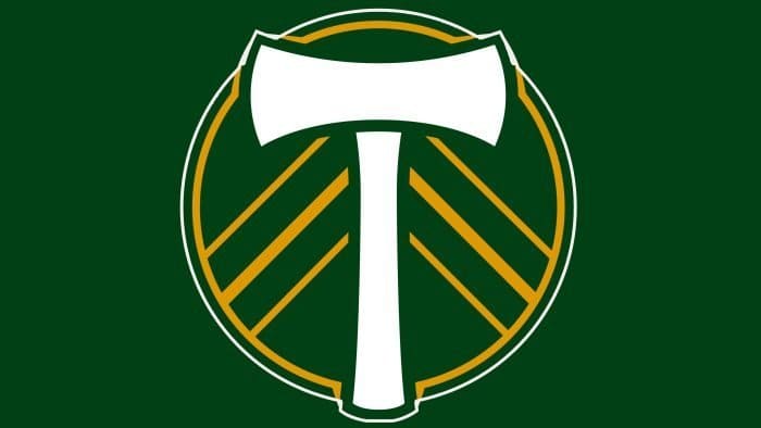
The symbolism of the three stripes on the “Portland Timbers” logo refers to the club’s participation in three leagues. The main symbol is the axe, a tribute to the club’s history; at the same time, it’s a stylized representation of the letter T, the initial letter of the second name. The circle symbolizes unity, integrity, and the pursuit of perfection.
Portland Timbers: Brand overview
| Founded: | March 20, 2009 |
| Founder: | Merritt Paulson |
| Headquarters: | Portland, Oregon, U.S. |
| Website: | timbers.com |
The “Portland Timbers” is an American professional soccer club competing in Major League Soccer (MLS) as a member of the league’s Western Conference. Since 2011, the “Timbers” have played their home games at Providence Park. The history of the “Portland Timbers” began in the spring of 1975 when the original “Timbers” club joined the North American Soccer League. The team disbanded at the end of the 1982 season as player salaries exceeded team revenues. Three years later, the sports organization returned under the name FC Portland Timbers and formed the Western Soccer Alliance (from 1986 – Western Soccer League).
In 1989, local businessman Art Dixon took control of FC Portland and renamed it “Portland Timbers.” In 1990, the WSL announced a merger agreement with the American Soccer League. The new league was called the American Professional Soccer League, but the team spent only one season there: in 1991. Team owner Art Dixon closed it after losing over $500,000 over two years of ownership.
The team’s next return was in 2001, and it played in various leagues, including the USL First Division and the USSF Second Division Professional League. On March 20, 2009, Don Garber, the commissioner of Major League Soccer, announced Portland as the eighteenth MLS team. Its owner became Peregrine Sports, LLC, led by Merritt Paulson.
The owner had long aspired to join Major League Soccer, which required reconstructing PGE Park. The football club’s nickname remained the same. The name was chosen on March 8, 1975, from over 3,000 entries in an open contest. The word “timbers” is related to the logging that supported Portland’s economy in the 19th century.
Meaning and History
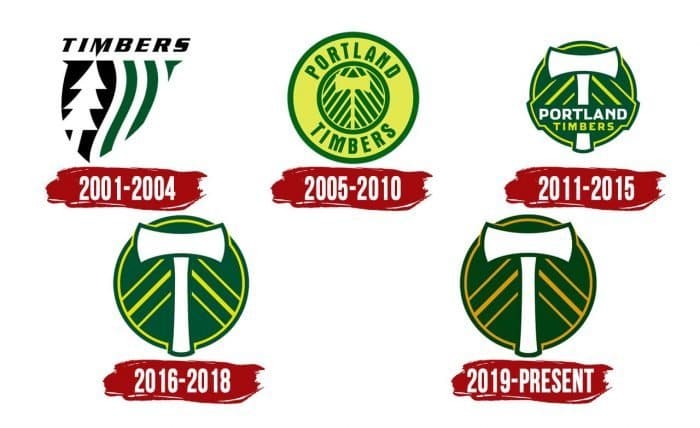
From 1975 to 1982, the NASL team used various logos featuring an axe inside a large circle. After moving to the second tier of the American soccer pyramid in the early 2000s, they introduced a new logo – triangular, with vertical green stripes and a white pine on a black background. However, it was short-lived: in 2005, the logo returned to its roots.
What is Portland Timbers?
The “Portland Timbers” is an American soccer team consisting of professional players located in Portland, Oregon. It is a member of the Western Conference and an MLS participant, acting as an expansion franchise since 2011. The club was founded in 2009. Its home stadium is Providence Park. The club is managed by Peregrine Sports, with the controlling stake owned by Merritt Paulson.
2001 – 2004
The team marked its entry into the second American division with an updated logo. If all the graphic symbols of the “Portland Timbers” were circular (a classic that has persisted to this day), the early 2000s were dedicated to experiments with a triangular shape. As a result, a logo appeared in the form of a heraldic shield with three sharp angles. However, it was not solid but consisted of disjointed wavy stripes and elongated geometric figures. On the left side was a pine – white on a black background. The right side was white and green. Above the shield was the club’s name: the word “TIMBERS,” written in italic font with a uniquely designed letter “M.”
2005 – 2010
The triangular emblem did not find support among fans, so they warmly welcomed the new version of the graphic symbol – a circle with an image of a double-sided axe. This was an interpretation of one of the old logos of the “Portland Timbers,” used from 1975 to 1982. This marked a return to the roots – albeit in a different color scheme. The circle became pale yellow, and the decorative elements, contours, and inscriptions were muted green.
2011 – 2015
The MLS “Portland Timbers” logo incorporates elements of the former USL “Portland Timbers” emblem design. The circular shape symbolizes unity, integrity, and the pursuit of perfection. The white axe pays tribute to the Pacific Northwest’s timber industry, as loggers traditionally used axes to cut trees. The three chevrons resemble a pine.
The axe extends beyond the circle – the lower part of the handle hangs over the club’s nickname, where all letters are uppercase. The word “Portland” is larger than the word “Timbers.” This is done specifically to demonstrate a reference to the region. The “Timbers” logo also reflects the team’s colors – ponderosa green and moss green, symbolizing Oregon’s forests.
2016 – 2018
The soccer team updated its logo in 2015 when it won the MLS Cup. Designers removed the inscription from the circle on the “Portland Timbers” logo – only the axis remained, made in the shape of the letter “T.” This refers to the word “Timbers.” The diagonal stripes still stretch towards the axe. Their placement changed: they moved lower and became continuous. A series of stripes (three on each side) symbolizes the franchise’s membership in three leagues: NASL, USL, and MLS. The color palette of the current “Portland Timbers” logo is the same as that of the previous one.
2019 – today
In 2019, another redesign was carried out, resulting in the yellow stripes becoming orange. The green color also acquired a new shade: now it seems warmer. The arrangement of elements, shapes, and proportions remained unchanged.
Portland Timbers: Interesting Facts
The Portland Timbers are a soccer team with a long history and many fans who care. They started in 1975, even before joining the Major League Soccer (MLS) in 2011.
- Their Beginning: The Timbers have been around since 1975, showing they’ve loved soccer for a long time.
- Home Games: They play at Providence Park, an old stadium from 1926 that’s been renovated to be great for soccer today.
- Fans: Their fans, called the Timbers Army, are super passionate. They make big banners, sing a lot, help the community, and make games exciting.
- Big Win: In 2015, they won the MLS Cup, proving they’re a top team.
- Rivalries: They have big games with Seattle Sounders FC and Vancouver Whitecaps FC, creating awesome matches that many people get excited about.
- Cool Tradition: Every time they score, Timber Joey, their mascot, cuts a piece of wood from a log, and the player who scored gets it as a trophy.
- Soccer Love: Portland is called “Soccer City, USA” because people there love soccer, and the Timbers add to that love.
- Helping Out: The team does much for the community, such as supporting kids and schools and keeping the environment clean.
- Green Efforts: The stadium and the team try to be eco-friendly, reducing waste and saving energy, which fits with Portland’s green vibe.
- Worldwide Attention: The Timbers also play games with teams from other countries and have players from all over, making them known worldwide.
The Portland Timbers are more than just a soccer team; they’re a big part of their city, bringing people together through sports, community work, and environmental efforts.
Font and Colors
Both when the team entered the North American Soccer League and after joining Major League Soccer, it had perfectly round emblems (except for the transitional period from 2001 to 2004). All of them essentially symbolized the same thing. The circle means unity and the pursuit of perfection. The diagonal lines symbolized the forest in the city of Portland and its suburbs; their shape resembled the pyramidal crown of a pine. The axe, another mandatory element of the logo, served as a reminder of the timber industry that supported the city’s economy for many years.
Apparently, the creators of the “Portland Timbers” emblem decided that inscriptions would be superfluous, and a simple drawing with a circle and an axe would be sufficient for the club’s visual identification. They were right: this symbol has long been associated with the Portland club and does not need textual additions.
Designers preserved the unique design of the emblem, experimenting only with colors. The last time they updated the palette was in 2019: they used green with a yellow tint for the inner part of the circle and gold (#D69A00) for the other elements.
Portland Timbers color codes
| Evergreen | Hex color: | #00482b |
|---|---|---|
| RGB: | 0 72 43 | |
| CMYK: | 100 0 40 72 | |
| Pantone: | PMS 3425 C |
| Goldenrod | Hex color: | #d69a00 |
|---|---|---|
| RGB: | 214 154 0 | |
| CMYK: | 0 28 100 16 | |
| Pantone: | PMS 130 C |
