Pos Indonesia: Brand overview
In the 18th century, during Dutch colonial rule, Indonesia’s postal service was born, serving mainly the Java and Sumatra areas. However, after the country’s independence in 1945, the remnants of the Dutch postal system gave way to the independently established Indonesian postal system, PN Postel.
In the following decades of the 1960s and 70s, the postal service was expanded to cover the country’s many remote islands, allowing for a wider communications network. Significant changes occurred in 1995 when the government decided to overhaul the existing postal structure, creating a state-owned enterprise, PT Pos Indonesia, to modernize and improve the country’s postal service.
By 2009, Pos Indonesia was operating under a state-sanctioned monopoly, although this exclusive control was lifted in 2012, allowing for market competition. The company did not stop at traditional services but, over time, introduced various offerings such as expedited mail, logistical support, and financial support.
Having joined the Universal Postal Union in 1977, Pos Indonesia occupies an important place in the country’s communications landscape. With more than 27,000 employees and a network of more than 6,000 post offices across the country, the company remains central to Indonesia’s communications infrastructure. Despite the decline of traditional mailing, Pos Indonesia intends to continuously improve and revise its offerings to meet the country’s dynamic delivery and communication requirements.
Meaning and History
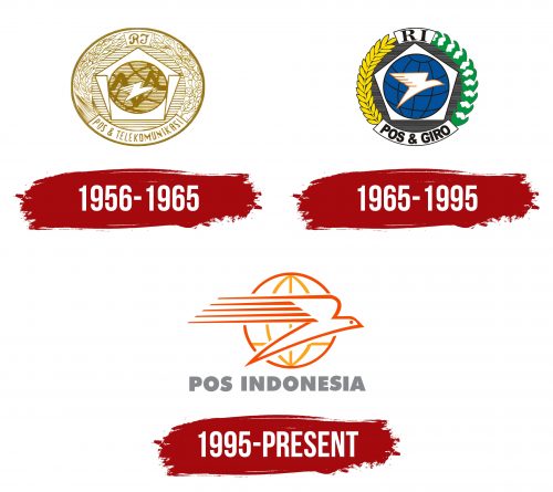
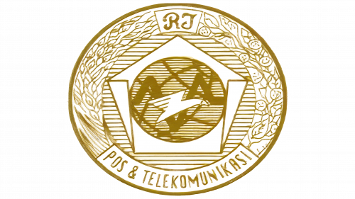
1956 – 1965
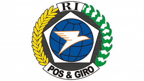
1965 – 1995
1995 – today
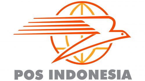
In the foreground of the logo, a bird soaring to the right, a dove, is soaring, which has long been the primary symbol for postal services due to its historical role in message delivery. The dove is designed with an elongated and pointed body, giving it a sleek appearance. Its wing features five long stripes that resemble speed lines, transforming the static image into a symbol of swift movement and dynamism.
Behind the dove, the logo incorporates an image of the Earth, depicted with a grid of meridians and parallels that suggest global connectivity. The internal lines of the globe are orange, while the outer ring is red, creating a striking contrast and adding depth to the design.
Beneath this imagery, the postal company’s name is written in an ultra-bold font. The gray text provides a subtle yet strong base for the logo without using serifs, which adds to the design’s modern and straightforward appeal.
This logo effectively communicates the essence of the postal company – speed, reliability, and global reach. In conjunction with the detailed globe, the dynamic dove highlights the company’s commitment to connecting people worldwide efficiently and precisely. The choice of a strong, sans-serif font for the company name underscores the reliability and modernity of the services offered, making the logo a powerful representation of the company’s identity and mission.
