


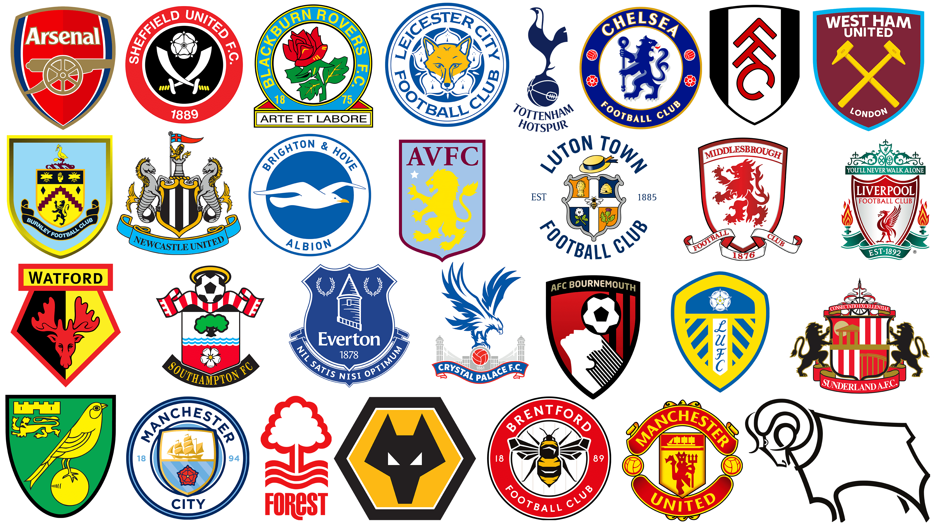
For British soccer fans, the emblems of Premier League teams are more than just familiar visuals. These emblems serve as a branding and a beacon of unity and inspiration for ardent Premier League supporters.
Each team showcases its unique identity through its emblem, which typically includes distinctive colors, iconic symbols, and thoughtful design. These elements are not just aesthetically pleasing; they inspire the players on the pitch and lift the spirits of loyal fans.
The design language of Premier League emblems has undergone noticeable shifts over several seasons. While modern design principles have influenced these changes, many emblems have retained their foundational elements. Often, these elements point to significant historical events or the cultural heritage of the region they represent.
The emblems of English Premier League teams, like those of educational institutions, have a rich history. This pedigree evokes deep feelings of pride and loyalty not only among the UK’s local population but also among fans worldwide.
EPL emblems represent more than just the development of a soccer team; they encapsulate the essence of entire communities. These emblems weave together historical references, local lore, and the competitive spirit that defines each club.
Like iconic brand logos, Premier League team badges serve a dual purpose. First, they are distinctive markers that identify each team in a league characterized by talent and ambition. Second, they are designed to form a deep bond, an intangible connection between the players on the pitch and the sea of fans supporting them.
Passion and affection for these emblems manifest themselves in many different ways. It is not uncommon for fans to proudly show their devotion by choosing bright hair colors that echo the emblem of their favorite team or even go a step further by getting tattoos based on the emblem of their chosen EPL team.
Arsenal
![]()
Arsenal Football Club has been a name in English soccer for over a century, since its founding in 1886 as Dial Square. The club has 13 league titles, an unbeaten league record, and an impressive collection of 14 FA Cups. This impressive record places Arsenal third in the hierarchy of achievements in English soccer.
Arsenal’s reputation is renowned not only domestically but on every continent. The club’s influence extends beyond England, making it one of the most recognized and revered soccer institutions worldwide.
The emblem, dominated by a shield motif, paints a vivid picture using colors that reflect the essence of the Arsenal community. In the center of the emblem, the word “Arsenal” is printed in white lettering, providing instant recognition.
One of the emblem’s most distinctive features is the cannon image, which evokes the club’s early days. This cannon symbolizes the team’s firepower and determination and is rooted in the Arsenal’s official coat of arms from its founding years in the 1800s. In its coat of arms, Arsenal Football Club seamlessly blends its storied past with an ambitious vision for the future, all while maintaining its unique identity.
Aston Villa
![]()
Aston Villa Football Club, situated in the heart of Aston, Birmingham, boasts a rich history dating back to 1874. This illustrious club has been crowned Football League Division One champions seven times. The club’s reputation is not limited to England; soccer fans worldwide recognize and respect “Villa” for its contributions to sports development. Fierce rivalries with neighboring club Birmingham City have further cemented its place in local and national folklore, driven by the two teams’ emotional rivalry.
Aston Villa’s emblem consists of the distinct letters “AVFC.” Next to these letters is a star, reminiscent of the team’s European Champions Cup victory in the 1980s. The most striking element of the emblem is the regal lion, a legacy from the era of Scottish manager George Ramsay and the influential William McGregor. This lion reminds us of the club’s proud heritage and the indomitable spirit it represents on the soccer pitch.
Bournemouth F.C
![]()
Founded in 1875 and originally known as Bournemouth Rovers, Bournemouth Football Club has established a notable presence in the annals of British soccer. Over time, the club earned the affectionate nickname “Poppies” from its loyal fans. This nickname became an indispensable attribute of the team, evoking a profound response from fans and the broader society.
The emblem of the soccer club Bournemouth immediately strikes a dominant red-and-black hue, the corporate colors in which the team proudly dresses during matches. The emblem’s circular shape is often associated with unity and integrity.
The emblem incorporates the club’s name, further emphasizing its uniqueness. But what stands out are the visual elements that pay homage to the team’s nickname, “Maki.” The characteristic slogan subtly hints at this nickname. On the sides of the emblem are two red-and-white flowers that emphasize the connection to the poppy theme. The central place in the emblem is occupied by a drawing that evokes many to think of a poppy. The black circle in the center of the emblem, bordered by bright red and white stripes, reinforces this association, further enriching the emblem’s meaning and linking it to the club’s cherished nickname.
Brentford
![]()
Brentford Football Club is based in the Brentford area of west London, England, and is deeply rooted in the local soccer community. Founded in 1889, the club, affectionately called “The Bees” by its ardent fans, has achieved commendable success, rising to the top echelon of the Premier League in the 2020-2021 season, a testament to its skill and growth in the sport.
Brentford Football Club’s emblem incorporates thoughtful elements that reflect the team’s spirit and heritage.
At the center of the emblem is a bee whose carefully calibrated image echoes the club’s well-known nickname. This is not just a decorative detail but a testament to the club’s identity and connection to the community. Additionally, the club’s rich history is subtly incorporated into the emblem, including its founding year.
Brighton & Hove Albion
![]()
Brighton & Hove Albion Football Club, founded in the early 1900s, has cemented the name “The Seagulls” in the hearts of many. This nickname is not just affectionate. It signifies the club’s deep connection to its seaside roots, which is elegantly depicted on the emblem as a seagull in flight.
Unlike the intricate, ornate logos on the emblems of some Premier League teams, Brighton & Hove Albion’s emblem is more subdued and minimalist, a refreshing change. Despite its simplicity, this emblem has a deep meaning. The gracefully soaring seagull represents Brighton’s spirit and essence, paying homage to its maritime links with the south coast of England.
Throughout the club’s existence, its players have predominantly worn uniforms in shades of blue and white. The Brighton & Hove Albion logo, like several of its peers, features the club’s full name, fostering a sense of unity and loyalty among fans and players.
Burnley
![]()
Burnley Football Club, a well-known English soccer club, has a logo rich in symbolism and history. It is a visual testament to the club’s rich past, reflecting both its origins and the city it represents.
The original emblem of Burnley Football Club, founded in 1882, featured three red roses intertwined in a shield. This symbol underwent several changes, adapting and evolving alongside the club. Between December 1887 and 1895, the royal coat of arms was displayed on the team’s shirts, a practice that was briefly resumed for notable events such as the 1914 FA Cup final.
A significant change came after Burnley won the First Division in 1960, when the team was granted the right to wear the city’s coat of arms. Between 1969 and 1975, the letters “BFC” appeared on the team’s shirts. In 1975, the horizontal gold cipher “BFC” was adopted as the team’s official logo.
In the 1970s, the current emblem emerged, incorporating several elements significant to the town of Burnley and the soccer club. In particular, the logo features the number 1882, which signifies the year the club was founded. The lions symbolize royalty and draw inspiration from the city’s coat of arms. The bee, the emblem of industry, points to the local area known as the Beehole end of the ground, while the knight’s helmet refers to two knightly families with longstanding links to Burnley: the Townleys and the Shuttleworths of Gawthorpe.
The logo also features a shuttlecock, symbolizing Burnley’s cotton industry heritage and linked to the Shuttleworth family crest. The hand in the logo symbolizes the town’s motto, “Stick to the Truth,” a principle deeply rooted in local culture and dating back to the Townley family motto, “Tenez le Vraye.” The stork holding the Lacey knot pays homage to the de Lacey family, the medieval owners of Burnley.
The rich tapestry of symbols intertwined in the Burnley FC logo is more than decoration. It is a carefully crafted representation of the soccer club and the town of Burnley.
Chelsea
![]()
Among the pantheon of prominent EPL emblems, the Chelsea Football Club emblem holds a special place, radiating a rich history of triumph since its foundation in 1905. Chelsea has left an indelible mark on English soccer, winning six domestic league titles. Their achievements on the international stage are also commendable: the only English club to have won three major UEFA trophies.
The emblem’s design draws on the heritage of the Chelsea Metropolitan Borough coat of arms. The centerpiece is a commanding lion, borrowed from the coat of arms of the Viscount Chelsea, who held the high office of club president. This graceful and fierce lion clutches a staff in his hands, a symbolic reference to the Abbots of Westminster.
Each element of the Chelsea Football Club emblem carries both historical significance and contemporary relevance. It serves as a testament to the club’s historic past, current achievements, and promises of future glory, embodying the pride and passion of its fans worldwide.
Crystal Palace
![]()
Crystal Palace Football Club, based in the Selhurst area of Croydon, South London, is distinguished by its striking emblem, featuring a dynamic eagle in flight. This eagle adorns the emblem and reflects the team’s affectionate nickname, ‘Eagles.’
The modern and original Crystal Palace logo intertwines the club’s history and location. Below the soaring blue eagle is an architectural image of a palace. This symbolizes the club’s name and pays a subtle homage to its roots in Croydon. What also adds to the emblem’s uniqueness is that the eagle holds a vintage red soccer ball, symbolizing the club’s deep passion for the sport.
In a league where emblem designs range from traditional to modern, the Crystal Palace emblem easily stands out among the many logos of the English Premier League.
Everton
![]()
Emerging from an era that honors tradition, Everton Football Club’s emblem is a testament to its rich Premier League heritage. Founded in 1878, this historic club has demonstrated remarkable consistency, having played in the Football League’s top division for 118 consecutive seasons. The club ranks third in terms of all-time points scored, something few can rival.
The Everton emblem is filled with meaning. Central to the emblem is the image of Everton Castle, a structure that has remained synonymous with Everton since the 18th century. This iconic building, situated in the heart of Everton, serves as a strong link between the club and the local community.
The club’s name, Everton, is prominently displayed to preserve its heritage. A banner is unfurled beneath it, on which the club’s motto is written in Latin: “Nil Satis Nisi Optimum,” which translates to “Nothing but the best is enough.” This phrase encapsulates the club’s unwavering commitment to excellence on and off the pitch.
Fulham
![]()
Fulham Football Club, founded in 1879, boasts a rich heritage as London’s longest-running professional soccer team. Throughout its existence, the club has consistently demonstrated exceptional skill, competing in the top division of British soccer for an impressive 27 seasons. The team is also active in the renowned Premier League, further enhancing its reputation.
Loyal fans affectionately refer to the club as “The Cottagers” and “The Whites.” These nicknames are deeply rooted in the club’s history and tradition. The epithet “Whites” probably comes from the dominant white shade in their home uniforms, which symbolizes their identity.
Fulham’s emblem is a masterstroke, capturing the essence of the club. It is a shield with black-and-white stripes, reflecting the team’s heritage and values. The centerpiece of the shield, on the widest white stripe, is the acronym “FFC,” which stands for Fulham Football Club and is rendered in contrasting red. This shade, albeit with slight nuances, is present in the team’s official playing uniform, emphasizing the unity of the club’s symbol and its representation on the pitch.
Liverpool
![]()
The Liverpool emblem is one of the Premier League’s most iconic symbols, instantly recognized by soccer fans worldwide. Initially, the emblem resembled Liverpool’s coat of arms, which featured the Roman god Neptune as its central figure.
Like many symbols that have stood the test of time, the emblem has changed to resonate with its audience. The coat of arms depicts a bright red, feathered bird gracefully set within a pronounced shield. This bird, deeply connected to the city’s history, has become synonymous with the soccer club.
On either side of the shield is the “eternal flame,” which vividly reminds the club of its unwavering spirit and dedication. Below this majestic emblem, the banner proudly displays the year of the club’s foundation, emphasizing its historical significance.
Above the shield is the motivating phrase “You’ll Never Walk Alone.” This slogan has become not just words but the club’s anthem, reminding players and supporters of the shared journey, camaraderie, and undying spirit that defines Liverpool Football Club.
Luton Town
![]()
Founded in 1885, Luton Town Football Club has one of the most distinctive logos in the Premier League. Many refer to it as ‘The Hatters,’ a tribute to Luton’s rich hat-making heritage, a heritage the club has fully adopted. The club’s emblem features a hat, a testament to the historic craft that once flourished in the area.
The club’s emblem, which draws on Luton’s rich hat-making heritage, is a beacon of local pride. In addition to the hat, the emblem incorporates elements of Luton Town Club’s official crest, emphasizing its deep history. Notably, the emblem includes the year of the club’s founding, allowing fans and observers to appreciate its long history in soccer.
The design may seem classic, but it has an undeniable charm. With its unique and striking appearance, the Luton Town Football Club emblem stands out among the many Premier League logos.
Manchester City
![]()
Manchester City, which originated in the 1880s as St. Mark’s, has since developed into one of the top teams in the Premier League. The club’s prominence in the league is underscored by its rich history, as evident in the various modifications to its emblem over the decades.
Manchester City’s emblem has undergone several transformations throughout its existence. Each of them sought to embody the essence and history of the hometown. The current design subtly yet effectively reflects Manchester City’s heritage. It prominently features the famous coat of arms.
The current emblem features a circular structure with a shield at its center. Around the central shield on the white perimeter is the soccer club’s name. If you look at the details of the shield, you can see the image of a majestic golden ship. This ship symbolizes Manchester’s rich maritime history. The ship is complemented by the iconic red rose of Lancashire, which adds a touch of local culture and history to the emblem. These elements comprise a story of tradition, pride, and soccer excellence.
Manchester United
![]()
Manchester United Football Club, based in the Old Trafford area of Greater Manchester, is a distinct and formidable figure in the world of soccer. Although they share a geographical origin in Manchester, the two clubs are distinct, each with its own rich historical legacy. Manchester United, colloquially known as the Red Devils, dates back to 1878, when it was known as Newton Heath LYR Football Club.
Manchester United has risen to prominence among the elite, winning 20 league titles. This feat puts them at the pinnacle of English soccer, and they share the joint record for the most league wins.
Delve into the symbolism of the Manchester United emblem. You’ll find that its design elements are deeply connected to the club’s local history and heritage. The coat of arms of Manchester City Council inspired the emblem. However, various elements of the original design have changed over the years, and the ship under full sail remains unchanged, a testament to Manchester’s maritime heritage. The ship is complemented by an image of a devil, representing the club’s enduring nickname. This nickname, chosen over time, has become synonymous with the club and is embedded in Manchester United’s identity. The emblem embodies the pride, history, and aspirations of a club that continues to inspire legions of fans worldwide.
Newcastle United
![]()
Newcastle United Football Club, founded in 1892, is based in Newcastle upon Tyne. This iconic club has been involved in Premier League competitions for almost its entire existence, conceding only three times. The club has won four honorary league titles and the FA Cup six times in its illustrious history.
The Newcastle United badge is not just a design but a symbol with a deep history. Inspired by the 14th-century Newcastle coat of arms, it is a testament to the region’s rich heritage and cultural tapestry. Each intricately carved element of the emblem tells its own story.
The presence of a lion holding a flag is not just a decorative detail but an echo of strength and leadership. At the same time, the golden shield with alternating black-and-white stripes echoes the club’s iconic jersey color and reinforces its uniqueness. The twin seahorses on either side of the shield are significant, perhaps symbolizing Newcastle’s maritime history and connection to the River Tyne.
The Newcastle United logo stands out among the pantheon of Premier League emblems, each telling its unique story. Its complexity, detail, and depth of meaning make it instantly recognizable and deeply revered among soccer fans and historians alike.
Nottingham Forest
![]()
Nottingham Forest Football Club holds a special place in the English Football League as the oldest professional soccer club. This venerable status is reflected in the club’s emblem, which differs from the common design in modern soccer.
The team, often called “Forest” or affectionately nicknamed “Tricky Trees,” is active in the EFL Championship. The nickname is a casual reference and a deep connection to the club’s essence and roots.
The emblem of Nottingham Forest Football Club demonstrates its inherent simplicity and directness. The central element is a bright red tree, which alludes to the club’s nickname and its resilience and vitality. Underneath the tree is a tasteful word mark, further emphasizing the club’s identity and heritage. These elements combine to create a timeless emblem reflecting the club’s rich heritage.
Sheffield United
![]()
Having secured a place in the Premier League after an outstanding performance in the 2022-2023 EFL Championship, Sheffield United has established a firm place in professional soccer circles. Often referred to as ‘the Blades,’ the name provides a glimpse into the club’s symbolism.
The Sheffield United emblem confirms its nickname and features an eye-catching design. At the center of the emblem are two intertwined sabers, whose blades form the letter X, set against the contrasting cloth of a deep black circle. A rose is next to these powerful martial symbols, a symbolic image often associated with the United Kingdom’s deep heritage.
The origin of the Sheffield United symbol dates back to the city’s coat of arms, reflecting the club’s deep connection to the city. The emblem’s design underwent a dramatic change after Jimmy Sirrel joined the club’s management. Featuring the iconic Yorkshire rose, a striking red-and-black color combination, and symbolic double blades, the updated crest was the creative calling card of Jimmy Hagan, a former player at the club.
Tottenham Hotspur
![]()
Tottenham Hotspur Football Club is an enduring testament to the history of soccer. The club’s emblem, located in the bustling Tottenham district of London’s heart, symbolizes a distinctive rooster perched confidently on a soccer ball. Below him is the inscription “Tottenham Hotspur,” which adds a touch of personality to the emblem.
Since 1921, the emblem of Tottenham Hotspur has consistently featured the same cockerel, underscoring the club’s commitment to tradition and its rich history. “Hotspur” was inspired by Harry Hotspur, renowned for his tactical prowess on the battlefield. During battles, he would usually spur his horse by quickening his stride, which was the basis for his nickname.
The term “spurs” reveals an interesting connection to fighting roosters. These birds, known for their vigor and tenacity, explain the choice of the club’s emblem.
West Ham United
![]()
West Ham United, based in Stratford, East London, has over a century of history. The club was founded in 1895 as Thames Ironworks. In its more than 125-year history, West Ham United has made soccer history by winning the FA Cup three times and participating in two major European finals.
West Ham United’s emblem is closely linked to its origins. It was inspired by the flag of the Thames Ironworks team, signifying its founding. Complementing the rich history symbolized by the flag, the emblem also includes two golden hammers. These hammers are not just decorative; they symbolize the club’s widely known nickname, “The Hammers.” This nickname is associated with the shipbuilding heritage of Thames Ironworks, where craftsmen used hammers to construct ships.
The emblem’s shield-shaped design reflects the spirit of tradition and heritage that characterizes many EPL logos. It provides continuity with the club’s rich past and unites West Ham United with other clubs in the English Premier League, maintaining a collective sense of identity and heritage.
Wolverhampton Wanderers
![]()
The Wolverhampton Wanderers club emblem is distinctive. Unlike the usual symbols and motifs for many soccer clubs, the “wolves,” as they are popularly called, chose a less beaten path.
Founded in 1877, this venerable soccer club has an emblem depicting a sharp, detailed wolf’s grin set within the straight lines of a hexagon. This design starkly contrasts the heraldic motifs on the emblems of many of the EPL’s top league teams.
A closer look at the emblem’s color scheme reveals an interesting story. The striking combination of gold and black is not just an aesthetic choice but a reference to the city’s cherished motto: “Out of darkness comes light.” Even in the design, the club emphasizes its deep connection to local culture and tradition.
Blackburn Rovers
![]()
Blackburn Rovers Football Club, founded in 1875, has a rich history marked by its significant role as a founding member of the Football League and the Premier League. This illustrious club currently enjoys a successful run in the EFL Championship.
The Blackburn Rovers club emblem is a striking representation of a rich heritage deeply rooted in English soccer. Central to the emblem is the emblematic Lancashire rose, a symbol deeply rooted in the region’s history and pride. The club’s name is prominently displayed, complementing the rose that adorns the badge. An inspirational motto in Latin, which translates to “Through skill and labor,” adorns the emblem, serving as an eloquent reminder of the club’s ethos and commitment to excellence both on and off the field.
Derby County FC
![]()
Derby County Football Club, founded in 1884, is a significant player in the Championship, the second tier of English soccer. The nickname “The Sheep” has influenced the club’s symbolic representation in the English Premier League.
The league has many emblems, each with its own history and design elements, but the Derby County emblem stands apart. Its appeal lies in its simplicity, cleanliness, and appeal. The emblem features an elaborate silhouette of a ram, symbolizing the team’s mascot. The emblem’s design exudes a refined, contemporary aesthetic.
Leeds United
![]()
Leeds United is a strong testament to its soccer heritage. Although this club, founded in 1919, may seem relatively recent compared to its contemporaries, it has undoubtedly left an indelible mark on the English soccer scene.
Based in the bustling city of Leeds, this team has survived all the twists and turns of the soccer world. A model of resilience, the club climbed from the EFL Championship to the Premier League in the 2019-20 season, further cementing its reputation on the national stage.
Leeds United’s emblem is a beacon of identity for its loyal fans. It is a harmonious combination of yellow and blue, forming a shield that radiates a sense of tradition and modernity. In the center of the shield, the abbreviation “LUFC” appears in a smooth, cursive font. A striking element of the logo is the white rose of York, an emblematic symbol that reflects the region’s rich history and pride.
Leeds United’s emblem is a visual narrative. It weaves together the club’s journey, connection to the city of Leeds, and an unwavering commitment to footballing excellence.
Leicester City
![]()
The Leicester City badge is a fascinating story that reflects the club’s evolution. Founded in 1946, the club’s emblem features a fox image that is deeply resonant with its roots and local traditions.
Leicester City’s emblem, especially in the English Premier League era, is a harmonious blend of simplicity and modernity. It stands out, encased in a rich, circular blue design. The club’s name is embossed around the circle and depicted in a hue that seamlessly complements the background.
The emblematic fox is an aesthetic choice deeply connected to Leicester’s local ethos. This animal has become synonymous with the area, as it has a thriving fox population and a long tradition of fox hunting. Gradually, this association became embedded in the club’s identity, earning it the affectionate nickname ‘The Foxes’.
The emblem is given additional significance by the cinquefoil on which the fox sits majestically. This design element closely resembles the one on Leicester’s official coat of arms. Every nuance of the emblem, from the cute fox to the emblematic cinquefoil, tells an interesting story.
Middlesbrough
![]()
Middlesbrough Football Club, from the North Yorkshire town of Middlesbrough, is a beacon in professional soccer. Their ambitions and talents are currently being tested in the second tier of English Football. A notable moment in the club’s history was becoming one of the first Premier League teams in 1992.
The emblem of Middlesbrough Football Club testifies to its rich history. The coat of arms, designed as a shield, clearly displays the club’s name at the top and bottom. A majestic red lion is at the center of the symbolism, evoking pride and history. This lion is similar to those that adorn the England national team crest, reflecting a shared heritage and passion for the sport.
Norwich City
![]()
Norwich City Football Club, based in Norwich and colloquially known as “The Yellows” or “The Canaries,” has a rich history dating back to 1902. The club has achieved numerous victories on its footballing journey, including its recent promotion to the Premier League in the 2021-22 season. Additionally, it won the League Cup twice and finished an impressive third in the Premier League the previous season.
Norwich City Football Club’s emblem draws inspiration from the city’s historic association with the breeding of canaries. This age-old association with canaries influenced the team’s nickname and determined the club’s official colors of bright green and yellow. The emblem features a canary, symbolizing Norwich’s history and the spirit of the soccer club.
Southampton
![]()
The emblem of Southampton Football Club is a testament to its deep history and cultural significance. Founded in 1885, the club has grown and evolved, and with it, its symbolism.
Initially, Southampton players took to the pitch without an emblem adorning their shirts. Instead, they relied on the city’s coat of arms, a symbol reflecting the area’s essence and rich heritage. This emblem was a logo, a nod to the city’s past, and a symbol of its enduring spirit.
Over time, the club needed a clearer, more recognizable logo that better reflected its identity and aspirations. Drawing inspiration from its past, the club’s updated emblem incorporates elements of the original Southampton coat of arms. The centerpiece of the updated emblem is a soccer ball surrounded by a golden halo, a subtle allusion to the club’s nickname, “The Saints.”
The emblem now features a scarf, a common soccer-fan accessory, symbolizing their unwavering support and passion. Alongside this is the club’s full name, “Southampton Football Club,” which confirms its identity in the competitive world of soccer. With its bright colors and clear design, the emblem is not just a badge but a beacon of pride that unites players and fans.
Sunderland
![]()
The association soccer club Sunderland, founded in 1879, occupies a worthy place in the annals of English soccer. The team, which plays in the third tier, League 1, has a rich history and has won several championships in the top league. The club’s achievements include winning the FA Charity Shield in 1936.
The emblem of Sunderland Football Club has a deep tradition and draws inspiration from the city’s coat of arms. Although the city’s official symbol was a black cat, the soccer club decided to develop this symbolism. The lone black cat was artistically reinterpreted into two majestic lions. This transformation lends the club’s emblem a distinctive character, embodying the team’s strength and unity on the soccer field.
Watford
![]()
The English Premier League team Watford’s emblem is unlike the others. It does not repeat their popular nicknames: “Hornets” or “Yellow Army.” This long-established club proudly represents its hometown of Watford, Hertfordshire.
The emblems of Watford Football Club reflect the enduring influence of the town’s symbolism on the club. The current emblem intriguingly depicts a stag’s head framed by a geometric diamond-shaped pentagon. The club’s name, Watford, is displayed above the emblem in large, sans-serif uppercase font.
This modern visual identity is designed to be memorable and distinctive. This design strategy allows Watford to maintain a unique position among the many EPL teams.
Conclusion on Premier League team logos
The Premier League, known worldwide, boasts logos that have become iconic symbols resonating with fans globally. These emblems represent each team. They are not just designs but deeply rooted symbols that carry the club’s history, heritage, and aspirations. Each soccer club’s entry into the Premier League changes the squad and adds to this tapestry of iconic emblems that fans hold dear.
Even when teams move from one league to another, the essence and meaning of these emblems remain the same. As the new season arrives, fans year after year seek to purchase the latest variations of their favorite team’s emblems. Wearing jerseys, scarves, and other paraphernalia with these logos, fans express their unwavering devotion by painting stadiums in bright colors and team symbols. This ritual, almost sacred to many, emphasizes these logos’ integral role in English soccer.