 Preston Logo PNG
The Preston logo is explosive and extraordinary, like its owner, who plays Minecraft on his channel. The extravagant sign reflects his determination to overcome obstacles, heroically cope with difficulties, and even burn bridges behind him. An avid gamer cannot do without these characteristics, for he is immersed in a dynamic world where raging energy reigns.
Preston Blaine Arsement was born on May 4, 1994, in Dallas, Texas. He first planned a career far from YouTube, playing paintball seriously from age 11 and later entering college to become a surgeon. After graduating from Travis Academy of Fine Arts, he left college. He returned to his small channel, TBNRFrags, short for “The Best Never Rest,” which had about 200 subscribers.
TBNRFrags was created in 2010 and began with Call of Duty videos. The channel gained attention from Machinima, whose partnership helped Arsement reach a wider audience. In 2012, he registered PrestonPlayz, with the first video appearing in January 2013. After trying games such as Castle Crashers and Far Cry, he moved toward Minecraft, which became the main base of his online growth.
In 2014, Arsement and MrWoofless launched the Minecraft server CosmicPvP, offering Factions, HCF, and KitPvP modes with paid access and in-game purchases. In January 2017, he signed with Night Media. The same period brought new channels, including PrestonGamez, PrestonCosmic, PrestonShorts, PrestonCartoonz with NewScape Studios, and PrestonReacts.
Forbes ranked Arsement sixth among the highest-paid YouTubers in 2019 with estimated earnings of $14 million, and again in 2020 with $19 million. His income relied heavily on Minecraft servers, unlike creators such as MrBeast or PewDiePie, who were built around broader audience scale. In 2020, he reached 10 million subscribers on Preston, appeared on Nickelodeon’s All That, and later made cameo appearances in Sonic the Hedgehog 2 in 2022 and DreamWorks’ Ruby Gillman, Teenage Kraken in 2023.
Meaning and History
The appearance of Preston Blaine Arsement on YouTube was a search for himself and experiments that succeeded. After finishing school, the young man intended to pursue a serious specialty (surgery), but adolescence provoked an internal rebellion. The young man got confused, fell in with bad company, and ran into trouble. Then he decided to return to his channel, TBNRfrags, started shooting a lot and publishing, until Machinima noticed him and offered sponsorship. Then the parents realized their son makes money by doing what he loves. And they supported him.
Preston seriously delved into the online business after receiving internal (from himself) and external (from relatives) approval. He opened several more thematic channels (as of 2023, he had eight in addition to the main one), invented his logo, and developed an original greeting. The old introduction was “Ladies and gentlemen, welcome to…”, the new one is “Hello/Welcome beautiful people, today…”. His emblem is emotional because he has raging internal passions that break out in various YouTube content.
What is Preston?
Preston is a young, popular YouTuber from the USA who runs eight channels of various themes. He mainly posts videos of pranks, challenges, and game content across several platforms, including Minecraft, Fortnite, Roblox, and more. The vlogger’s full name is Preston Blaine Arsement. His location is Dallas, Texas. He began his career on YouTube in 2012.
2012 – today

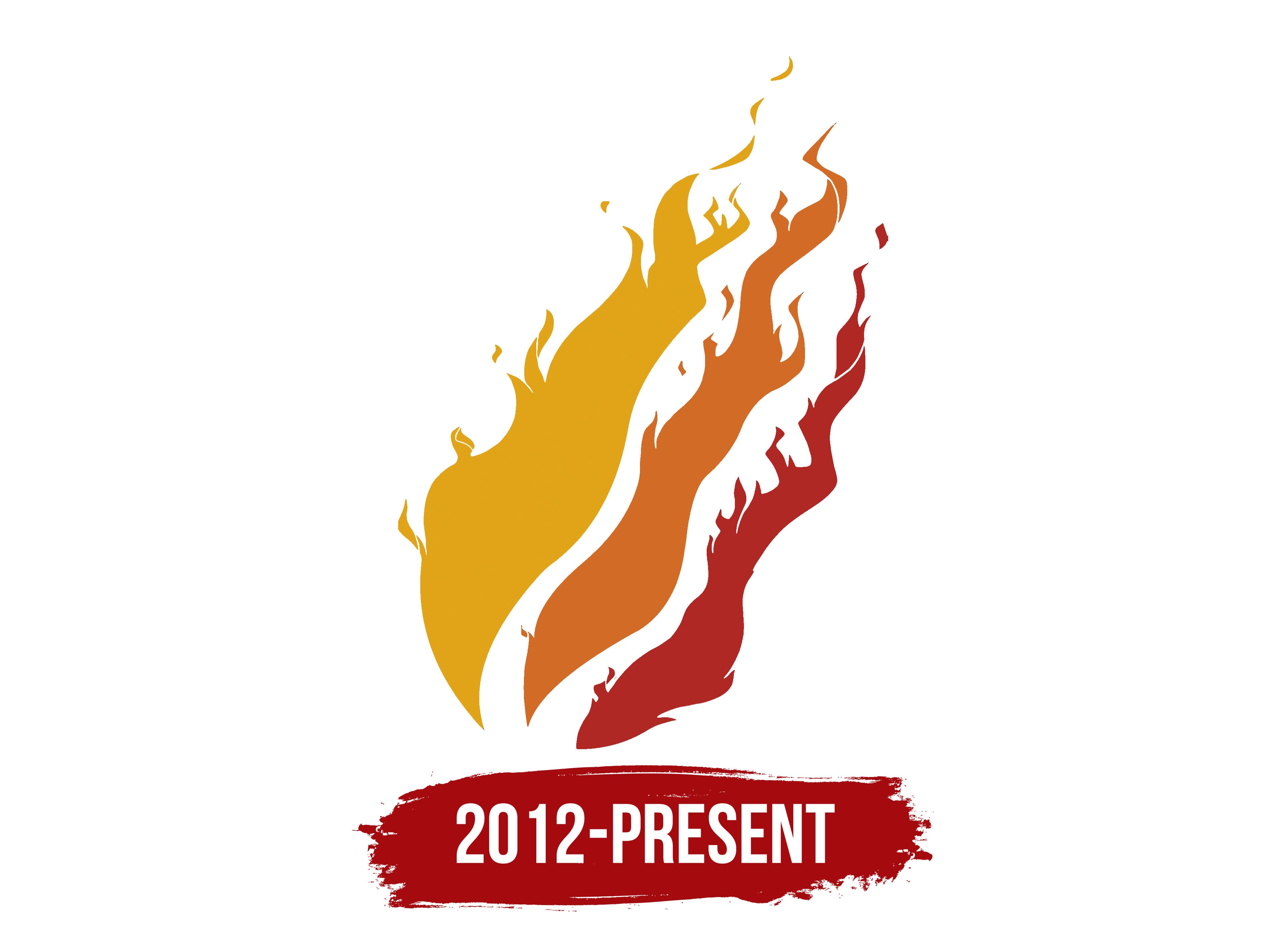
The logo features three tongues of flame positioned diagonally. They are elongated upward, with a wide base and a narrow top. Additionally, these elements strongly resemble fiery dragons or blazing salamanders descending from the heights. The detail on the left is the longest; the one on the right is the shortest. All have wave-like and uneven edges with small, chaotic protrusions. The first flame is yellow, the second orange, and the third red. It’s visible that they are striving towards a single point, to form a unified whole.
Font and Colors

This is a graphic logo: there is no text in it. The YouTuber decided to express his individuality through a picture and color; hence, the hues in his emblem are much more significant than anything else. The palette predominates in red, orange, and muted yellow shades. They symbolize energy, dynamism, peak emotionality, positivity, joy, and fullness of life. People who prefer such a combination are goal-oriented individuals who strive for self-assertion.