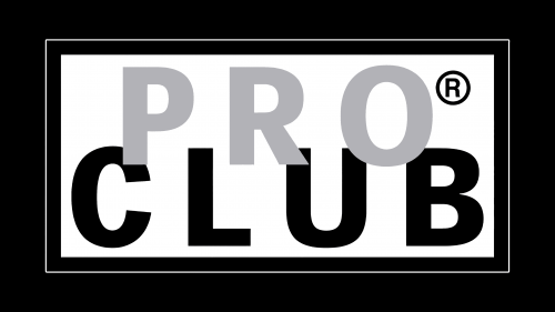
PRO CLUB logo is stylish and elegant. The confident symbols of the emblem read as convenience and comfort. The brand’s clothing allows for the creation of one’s own style and enjoyment of freedom of movement.
PRO CLUB: Brand overview
In 1986, nestled in the heart of Los Angeles, California, the Choi family, South Korean immigrants with a vision, laid the foundation of Pro Club from the confines of their garage. Starting with the simple yet ambitious goal of selling high-quality, durable blank t-shirts at a fair price, they tapped into a niche that would soon see their venture flourish beyond their wildest dreams.
The buzz around Pro Club’s offerings grew organically, powered by the brand’s reputation for producing resilient, functional sportswear. It wasn’t long before the youth and hip-hop communities on the West Coast adopted Pro Club’s t-shirts and fleece as essential components of their daily and artistic expression, embedding the brand into the cultural tapestry of the era.
Riding the wave of emerging fashion trends among the youth, Pro Club cleverly broadened its product line. The brand ventured into creating fashionable athletic tops and hoodies without compromising the high standards of quality and durability that had become its hallmark. This strategic expansion solidified Pro Club’s status in urban fashion circles, a feat achieved with minimal reliance on traditional advertising avenues.
More than three and a half decades since its inception, Pro Club has become synonymous with the quintessential West Coast lifestyle apparel, outliving fleeting fashion trends with its timeless collection of heavyweight tees, reversible jackets, and hoodies designed for longevity. The brand’s appeal spans generations and is cherished by a loyal following that values the blend of comfort, style, and affordability Pro Club guarantees.
Meaning and History
The store’s first product was Pro Club T-shirts. The main feature was the pleasant-to-skin materials and increased resistance to wear. When the business expanded, the first visual sign appeared, and a store opened in California.
What is PRO CLUB?
An American youth clothing brand specializing in the production of casual and comfortable sports-style clothing. Founded in 1986 in California, it grew from a family business selling durable T-shirts to a large range of products for men, women, and children.
1986 – today
The emblem is designed as a transparent rectangle with black edging. This choice resembles:
- A glass boutique showcase.
- A tag on new clothing.
The edging indicates a limited circle of customers who belong to the elite. The brand’s products are intended for sporty and stylish individuals.
The brand emphasizes quality, conciseness, and classic forms. In the emblem, this approach is reflected in the absence of bright and unnecessary details, a strict combination of tones, and sufficiently bold lines.
The words PRO CLUB are placed on two levels, indicating sets of tops and bottoms. Most models include tops, T-shirts, sweatshirts, and pants. The letters slightly intersect in the center to emphasize a strict look and decent cut of clothing without flashy ultra-short items.
The name echoes the Pro Club created by Phil Knight in 1975. Its members could receive free modern equipment for playing basketball. The brand’s products are also durable, reliable, and of high quality, like the products for Nike Club members. They are perfect for sports, walks, and everyday wear.
Below the edges of the rectangle, the brand’s main mission and purpose are indicated – to provide comfortable yet stylish clothing. This is why the focus of the products is on sporty style. Sporty style doesn’t restrict movement, and in Pro Club’s view, it looks very dressy.
Font and Colors
Gray and black speak to simplicity. The brand’s clothing should primarily be comfortable for movement. The palette emphasizes dirt-resistant colors and muted shades that don’t stand out. The company’s items are suitable for everyday wear.
The bold uppercase letters emphasize that the clothing is intended for self-confident customers who attract people with their personalities, not bright outfits. The thick, straight glyphs are a prototype of the durability of the items.
