


 Professional Bull Riders Logo (PBR Logo) PNG
The robust, energetic logo of Professional Bull Riders (PBR) is a testament to restrained extremism. This emblem exemplifies man’s superiority over peak emotions as matadors dominate bulls. It captures an expression conveyed through all visual means: shape, color, style, lettering, and the theme of the depiction.
Professional Bull Riders began in April 1992 in a two-bed motel room in Scottsdale, Arizona. Twenty bull riders, including Ty Murray, Tuff Hedeman, Cody Lambert, Jim Sharp, Clint Branger, and Jerome Davis, each wrote a $1,000 check to create their own organization. Some borrowed the money from relatives or friends. Businessman Sam Applebaum became the first CEO, while the riders shaped the new company from inside the sport.
The move came from frustration with the Professional Rodeo Cowboys Association, where bull riding was only one part of a larger rodeo program. The founders believed their event drew the strongest crowds yet received too little attention and prize money. In 1993, PBR held its first events at Cowtown Coliseum in Fort Worth with Bud Light as sponsor. In 1994, the Bud Light Cup Series began with a purse above $330,000.
Growth accelerated after Randy Bernard became CEO in 1995. He built national sponsorships with brands such as Wrangler and Ford. He secured television exposure that took PBR beyond rodeo circles. CBS broadcasts gave the organization a broader audience. At the same time, the annual World Finals in Las Vegas, held at Thomas & Mack Center, became its main commercial event.
In 2007, Spire Capital Partners bought out the stakes of many retired founders, turning their original $1,000 stakes into major payouts. By the mid-2000s, PBR’s adult fan base had reached 18 million. In 2022, the Team Series introduced city-based teams, while Endeavor’s ownership of PBR linked it to a larger sports and media business. That year, the World Finals moved to Dickies Arena in Fort Worth.
Meaning and History
The bull riding organization began with a 20-person gathering in a hotel room in Scottsdale, Arizona. Although the founders were members of the PRCA (Professional Rodeo Cowboys Association) and the BRO (Bull Riders Only), they formed a new group to move away from traditional rules and make rodeo more engaging. Their target audience comprises fans ready to cheer for the best of the best. Hence, the Professional Bull Riders logo encapsulates two key images: a bull and a rider.
What is Professional Bull Riders (PBR)?
Professional Bull Riders (PBR) is the largest American bull-riding league. It was founded in 1992 by a group of individuals who set strict rodeo rules and created a union that included representatives from Brazil, Mexico, Australia, Canada, and the United States. These are the countries where cowboy competitions are held. Endeavor Group Holdings owns the union. The main management center is based in Pueblo, Colorado.
1992 – today
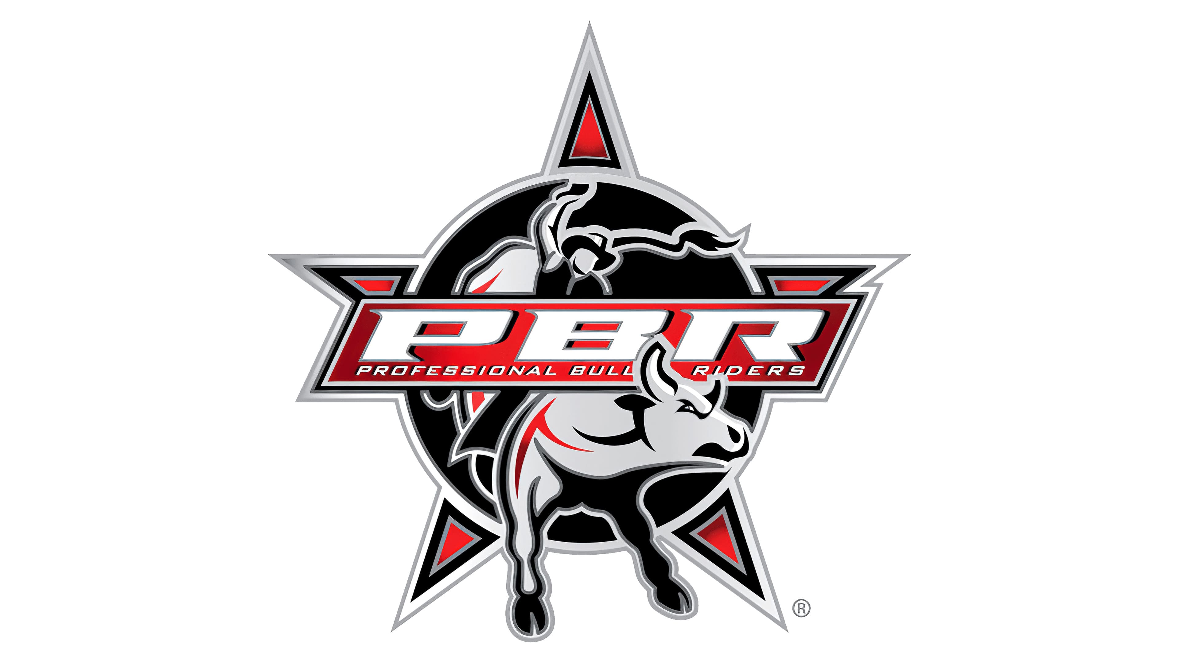
Upon its inception, PBR immediately focused on its identity, aiming to obtain a recognizable name and a professional emblem. The logo is crafted in red and black, colors that evoke intense emotion, creating a striking contrast. Yet the emotions are well balanced by the gray, which ties them together and softens their sharpness. The center circle is colored in black, the triangular rays in red, and the bull and the border in gray.
The logo’s foundational element is a sheriff’s badge with an enlarged central circle and five miniature rays. Such disproportion signifies that everything happening in the arena is a survival game. The show’s safety is conveyed by the blunted, flat-topped tips of the enraged animal’s horns. A rider trying to hold onto and tame the spirited bovine is depicted on the bull’s back. The rider is faceless since the main emphasis is not on a specific individual but on a collective image. That’s why the cowboy hat, whip, and boots with wide cuffs on the human figure are prominently visible.
In the foreground, there’s a plaque with the organization’s name in both its abbreviated and full forms. The abbreviation is large and chunky, with sharp notches at the top. The lower inscription, in contrast, is small and less legible. Their cursive style and white color unite both. The background parallelogram is red and bordered with a triple frame.
Font and Colors
The Professional Bull Riders logo uses two font types: bold and thin. The upper row consists of large, wide, italicized glyphs in block style. However, in uppercase letters, the bottom line is rendered in smaller and more delicate letters.
The official color palette consists of four colors: red (symbolizing emotional intensity and blood), black (indicating the tragedy of the events), white (contrasting well with any background), and gray (representing rigor, confidence, and compromise).