Protective Life: Brand overview
Protective Life was founded in 1907 in Birmingham, Alabama, by William Plummer. Initially, the company focused on those who wanted funeral insurance. By 1913, Protective Life switched to life insurance, which was a notable change in its offerings. This change was the basis for the company’s gradual expansion in the early 1900s.
In the 1930s, the company further diversified by adding annuities, accident, and health insurance to its services. The period after World War II was a watershed for Protective Life. Not only did the company expand its reach, but it also began to incorporate other insurance companies, extending its influence beyond the Southeast.
By the 1970s, Protective Life became a publicly traded company and took its place on the NASDAQ exchange. The assimilation strategy continued into the 1990s and 2000s, marked by several acquisitions to expand the product line and territorial presence.
2014 was pivotal in the acquisition of Protective Life by Japanese insurance giant Dai-ichi Life for $5.7 billion. As a result, Protective Life became a direct subsidiary under the broad umbrella of Dai-ichi Life. Based in Birmingham, Protective Life now has offices in all 50 U.S. states and over $100 billion in assets. Functioning under the umbrella of Dai-ichi Life, it is its primary U.S. affiliate.
Meaning and History
before 2012
2012 – 2021
2021 – today
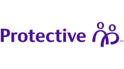
This financial and insurance holding company chose a logo that harmonizes text and graphics, with the latter replacing the second part of the name. The first part is used as it is, in written form. It is a bold font with clearly separated letters due to the optimal distance between them. The glyphs are not serifed. The letter “t” at the top has a diagonal cut, forming an acute angle. To the right of the text is a stylized illustration corresponding to the word “Life .”It shows two people who appear to be walking hand in hand. The emblem is colored in dark blue with a slight purple tint.
The sharp angle of the “t” gives the emblem a modern look, as if it is ready for action but not too flashy. The people in the illustration look like they are enjoying a simple but meaningful moment, which goes well with the word “Life .”The combination of dark blue and purple colors gives the impression of seriousness but not boredom, like a mystery novel that can’t be put off.
Protective Life color codes
| Indigo | Hex color: | #4c12a1 |
|---|---|---|
| RGB: | 76 18 161 | |
| CMYK: | 53 89 37 | |
| Pantone: | PMS Violet C |

