Prudential Financial: Brand overview
In 1875, The Widows and Orphans Friendly Society was founded by John F. Dryden in Newark, New Jersey. This organization was dedicated to offering life insurance solutions to working-class families. Just three years later, the company was renamed the Prudential Friendly Society, marking the beginning of its operations outside of Newark.
By 1896, Prudential had become the leading insurer in the United States, specializing primarily in life insurance and mutual funds. A significant event for the company was the opening of the landmark Prudential Building in Newark in 1912, signaling its strong financial position.
Throughout the 20th century, the company’s growth was consistent. During this period, Prudential expanded nationally and introduced many new financial instruments. In the 1980s, Prudential began dealing in stocks, bonds, and securities through its subsidiary Prudential Securities.
In 2001, a structural realignment led to the formation of Prudential Financial, with Prudential Insurance Company as its main division. The decade that followed was characterized by acquisitions, including real estate, retirement services, and asset management companies, further expanding Prudential’s service palette.
Today, Prudential Financial has an impressive portfolio of assets in excess of $1.5 trillion. Their comprehensive financial offerings include insurance, investment advice, and carefully crafted retirement planning strategies.
Meaning and History
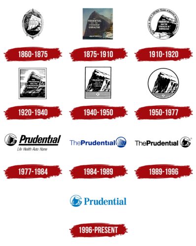
1860 – 1875
1875 – 1910
1910 – 1920
1920 – 1940
1940 – 1950
1950 – 1977
1977 – 1984
1984 – 1989
1989 – 1996
1996 – today
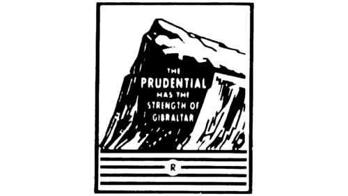
The American multiservice company specializes in providing insurance services, which is reflected in its logo. The logo depicts a part of the Rock of Gibraltar as a symbol of stability, strength, and resilience. The image, created by the New York advertising agency Walter Thompson, has symbolic elements: the mountain is depicted using only two colors, blue and white, in negative space. The mountain is surrounded and positioned in front of the company name, which is written mostly in lowercase letters. All letters are large and bold, with rectangular serifs and rounded edges.
The blue and white colors give the mountain a simultaneously powerful and calm appearance. It’s kind of like she is strong but, at the same time, calm. The circle around the mountain makes it look like a badge, a sort of seal of approval. It’s a simple way of saying, “We are reliable and strong.” The large letters in the company name seem strong and easy to read as if they want to say that they are here and that they are reliable.
Prudential Financial color codes
| Star Command Blue | Hex color: | #007ac1 |
|---|---|---|
| RGB: | 0 122 193 | |
| CMYK: | 100 37 0 24 | |
| Pantone: | PMS 7461 C |

