The Prudential logo is feminine and simultaneously confident. The emblem showcases the ability to conduct business flexibly and wisely yet assertively and actively. The symbol indicates that prudence has helped the company reach its pinnacle and assures the safety of deposits.
Prudential: Brand overview
| Founded: | 1848 |
| Founder: | M&G plc |
| Headquarters: | London, England, UK |
| Website: | prudentialplc.com |
Meaning and History
The company underwent rebranding as its name changed. The first firm, the foundation for the future Prudential, emerged in 1848. Several more companies followed after. Their emblems have not survived to this day. However, it is known that the image of the goddess of prudence has always been an integral part of the symbolism. In its logos, the company tried to associate its image with ancient figures and well-known objects. This drew parallels between these objects’ properties and Prudential’s capabilities.
What is Prudential?
A major international insurer. It comprises several divisions, mainly Prudential Europe, Prudential Corporation Asia, and Prudential UK Insurance Operations. In the USA, it operates through Jackson National Life Insurance Company. The company’s revenue stands at 21.5 billion dollars.
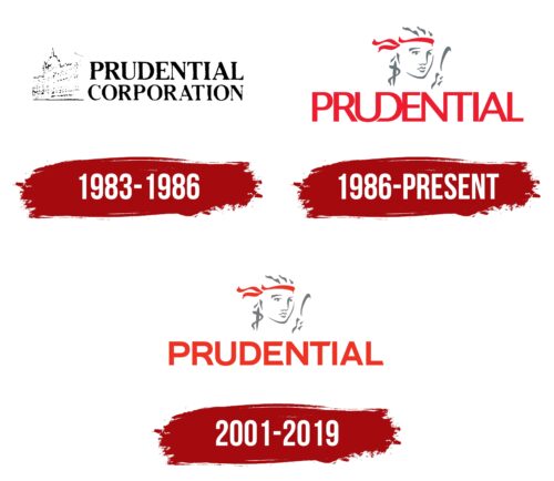
1983 – 1986
The corporation’s first emblem was an image of a building with an inscription. Prudential Corporation was established as a holding company in 1978. It brought together a diverse network of subsidiary enterprises, either acquired or established over its years of existence. The logo reflected this unity.
The image showcased the historic Holborn Bars building, constructed from terracotta (a fired mixture of red clay and water) produced by the renowned English manufacturer Gibbs and Canning of Tamworth. The Victorian-style building was designed by the English architect Alfred Waterhouse. The building’s name originates from the city of Holborn Bar, on whose border it stands. The building was commissioned specifically for Prudential. Construction spanned from 1876 to 1901, but the company moved into its quarters in 1879.
Holborn Bars was associated with the insurer for a long time, and even after relocating in 1999, the company retained ownership rights. In the UK, the building is listed as a monument of architectural significance and is protected by law.
Holborn Bars in the logo pointed to a storied past, invoking palaces, wealth, and beauty associations. It connected the pleasant impressions of the architectural masterpiece with the Prudential corporation.
Due to the delicate and light lines and the side-angle of the image, it appears as if the picture, much like the past, is fading against the backdrop of the present day. The company honors its roots and, building on its past, moves into the future, adhering to its mission and core values. The bold and clear letters of the inscription following the image affirm this notion.
The words are placed on two levels, with the upper part of “Prudential” highlighted in a bolder font. Over its existence, the company went through several names: The Prudential, Investment, Loan, and Assurance Association, then The Prudential Mutual Assurance, Investment, and Loan Association, and finally, Prudential Assurance Company Limited. Yet, the word “Prudential” remained constant in each name.
1986 – today
In 1986, the rapidly growing American firm Jackson National Life Company was acquired, facilitating Prudential’s flourishing and modernization. Subsequently, the company shifted its focus towards international expansion. This reorientation was mirrored in a rebranding.
The brand consultant, Wolff Olins, crafted the new logo. The emblem featured Lady Prudence’s image and a red futuristic signature. The designer successfully integrated the ancient legend and the corporation’s name into the logo, illustrating the company’s origins.
Prudence is the Greek goddess symbolizing wisdom and the ability to govern using intellect. She is regarded as one of the primary virtues, their foundation and cause. Her actions aim at the well-being and practical benefit of humans.
Prudence has been associated with the company since 1848, as her name became the foundation for the company’s name, and her face was depicted on the seal. In the emblem’s design, the outlines are very blurry, with only individual lines indicating the main attributes of the goddess. On one side, a mirror is visible, symbolizing self-awareness and the ability to understand oneself. To the left, a snake wraps around an arrow. The reptile represents wisdom, while the arrow signifies decisiveness.
Wolff Olins emphasized in the logo the company’s roots and its primary feature – the ability to act soberly and judiciously, based on reason.
The caption retains only the most recognizable word, “Prudential,” which is present in the names of all corporate divisions. The letters of the inscription are connected to highlight the unity of the organization. The continuous writing speaks of the support for depositors and care for their well-being.
2001 – 2019
In 2001, the emblem was modernized. The lady’s face remained, but the font of the inscription changed drastically. The letters of “Prudential” are uppercase, each symbol clear and easily readable.
Font and Colors
Gray and red are foundational in Prudential’s symbolism.
- Gray speaks of consistency, reliability, and a steady, calm approach to business. The shade embodies routine, clerical work requiring diligence, patience, and attention. The corporation is committed to its obligations and works daily on payment processing and deposit preservation.
- Red signifies growth and motion. It points to modernization changes following market demands. The company expanded its services to safeguard deposits to include real estate and investment. Prudential has overcome several global financial crises and wartime calamities thanks to its adaptability and resourcefulness.
The font of the inscription is confident and strong. It’s reminiscent of Bruta Pro Extended Bold but with the sharp edge of the L cropped. It emphasizes the company’s stable position in the market. Like an individual direction, each symbol contributes to the corporation’s overall success.
Prudential color codes
| Imperial Red | Hex color: | #ee1c2e |
|---|---|---|
| RGB: | 238 28 46 | |
| CMYK: | 0 88 81 7 | |
| Pantone: | PMS Bright Red C |


