![]() Quicksilver Logo PNG
Quicksilver Logo PNG
The Quiksilver logo conveys a spirit of freedom and energy characteristic of extreme sports. Its form is associated with a wave and a mountain, symbols of nature and strength.
In 1968, Australian surfer and wetsuit maker Alan Green worked with the founders of Rip Curl in Torquay, Victoria. A year later, with a $2,500 loan, he and John Law launched their own business, aiming to fix the limits of standard swimwear in surf conditions.
In 1973, they introduced boardshorts with a higher back rise, Velcro and snap closure, shaped leg openings, and quick-dry fabric. Green also created the wave logo inspired by The Great Wave off Kanagawa. The name Quiksilver was chosen by Barbara Green, with a modified spelling due to trademark costs.
In 1976, Jeff Hakman secured US distribution rights and partnered with Bob McKnight. The first batch sold out quickly. By 1983–1984, the brand expanded to Japan and Europe, later entering South Africa and Asia.
In 1990, Kelly Slater signed with Quiksilver. The same year saw the launch of Roxy, which was relaunched in 1992 with Lisa Andersen. Roxy later generated about 30% revenue. In 1998, Quiksilver went public.
In the 2000s, Quiksilver expanded beyond surf, acquiring DC Shoes in 2004 and Rossignol in 2005, and later sold them at a loss. Deals like Cleveland Golf weakened focus, while Billabong stayed within its niche.
Financial decline led to a 2015 Chapter 11 filing with $826M liabilities. Oaktree Capital Management took control. In 2017, the group became Boardriders Inc. In 2023, Authentic Brands Group acquired it. In 2025, Liberated Brands closed all US stores.
Meaning and History
![]()
The company was founded in 1969 by surfer Alan Green in Torquay, Australia. It’s a surfing hub, and the demand for comfortable clothing was very high. Following the Australian wave, athletes from around the world took the factory’s first products to their home countries. Within a year, the company opened its representations in the USA and Europe. In the early 2000s, the head office moved to the USA, and since 2017, it has been based in Biarritz, France. The company’s factories are located in China, France, the USA, and Australia.
The company’s name, Quiksilver, translates from English as “mercury.” It signifies movement and speed, and, at the same time, all the qualities of metal that very accurately reflect the brand’s philosophy.
The company’s logo was created by Alan Green himself in 1969 and has not changed since (except for the color). According to the creator, he was greatly impressed by the engraving of the Japanese artist Katsushika Hokusai, “The Great Wave off Kanagawa.” It depicted a historical event: a powerful storm off the coast of Kanagawa that destroyed the city. In the background is Mount Fuji, and the viewer may feel that the wave will engulf it. As the company’s products were related to surfing, Green conceived a stylized image of a wave engulfing a large mountain.
The original version was a white picture on a bright red background. In 1973, Alan Green changed the background to black, and the name’s writing also became black. In 2010, the Hurne Geometric Sans font shifted to a handwritten style; the letters, in varying sizes, followed suit.
Today, the black version is officially used on all models, except that the logo is red on those models. The labeling of snowboarding clothing and footwear includes a snowflake above the logo.
The Quiksilver emblem is one of the most respected and recognized in the sports world, symbolizing the brand’s impeccable quality and comfort.
What is Quicksilver?
It’s a brand of clothing, footwear, and accessories for extreme sports, including skateboarding and snowboarding. It originated in the Australian town of Torquay and now has its main office in Huntington Beach, California (USA). The owning company was founded in 1969 by Alan Green. In 2017, it became Boardriders, retaining the Quiksilver brand.
1969 – 1970
![]()
In the late 1960s, the Quiksilver brand emerged in Torquay, Australia, focusing on people who breathed surfing and lived by the free-spirited counterculture. During this early period, the brand used the original spelling “Quik Silver,” emphasizing its experimental beginnings with the phrase “ORIGINAL CREATIONS.”
The spirit of that era is reflected in the early logo created by designer Alan Green. The black-and-white image combines a bird-like symbol with an elongated neck, evoking associations with a goose or a swan. Within the shape, vague contours of a face or mask can be discerned, barely visible within the overall form.
Next to it, arranged in two lines, is the name “Quik Silver,” set in an unconventional typeface. The lettering appears rough, leaning toward a handwritten aesthetic. Beneath it is the phrase “ORIGINAL CREATIONS,” set in a narrower and more elongated typeface.
This slogan connects the logo to the company’s early days, when it produced small batches of clothing and gear for surfers.
1970 – 1983
![]()
When Alan Green and John Law created the iconic mountain-and-wave symbol, their inspiration was “The Great Wave off Kanagawa,” a Japanese woodblock print depicting a tidal wave against the backdrop of the legendary Mount Fuji. The image of the mountain and the wave became the foundation of the emblem, which would later become a popular symbol of the young Quiksilver brand.
The left side is designed as a stylized, powerful wave that rises smoothly upward and to the right. The line thickens and ends in a sharp point. The wave’s contours echo the Japanese motif, but without excessive detail, reduced to a clear silhouette.
To the right, a mountain with a snow-capped peak, its outline closely resembling that of Mount Fuji. The white summit is drawn with an uneven line, like real snow on a peak, while the lower portion is covered with black diagonal hatching. At the top of the composition are four circles that imitate air bubbles or droplets breaking away from the wave.
1974 – 1983
![]()
In September 1974, Quiksilver added the QUIKSILVER wordmark beneath the wave-and-mountain symbol, giving the emblem a finished appearance. The symbol itself did not change, remaining faithful to the Japanese-inspired imagery of a large wave and a snow-capped peak, recognizable in the style of “The Great Wave off Kanagawa.”
The brand name was placed below the symbol. It was set in bold uppercase letters, using an unusual sans-serif typeface inspired by late psychedelia and retro-futurism. The letters are rounded, tightly spaced, and vertically elongated.
The overall image became minimalistic, infused with retro aesthetics and the natural symbolism of mountains and ocean waves, organically connecting the emblem to imagery familiar to surfers. In the 1970s, this style reflected the mood of youth culture, drawing inspiration from simple forms and natural motifs.
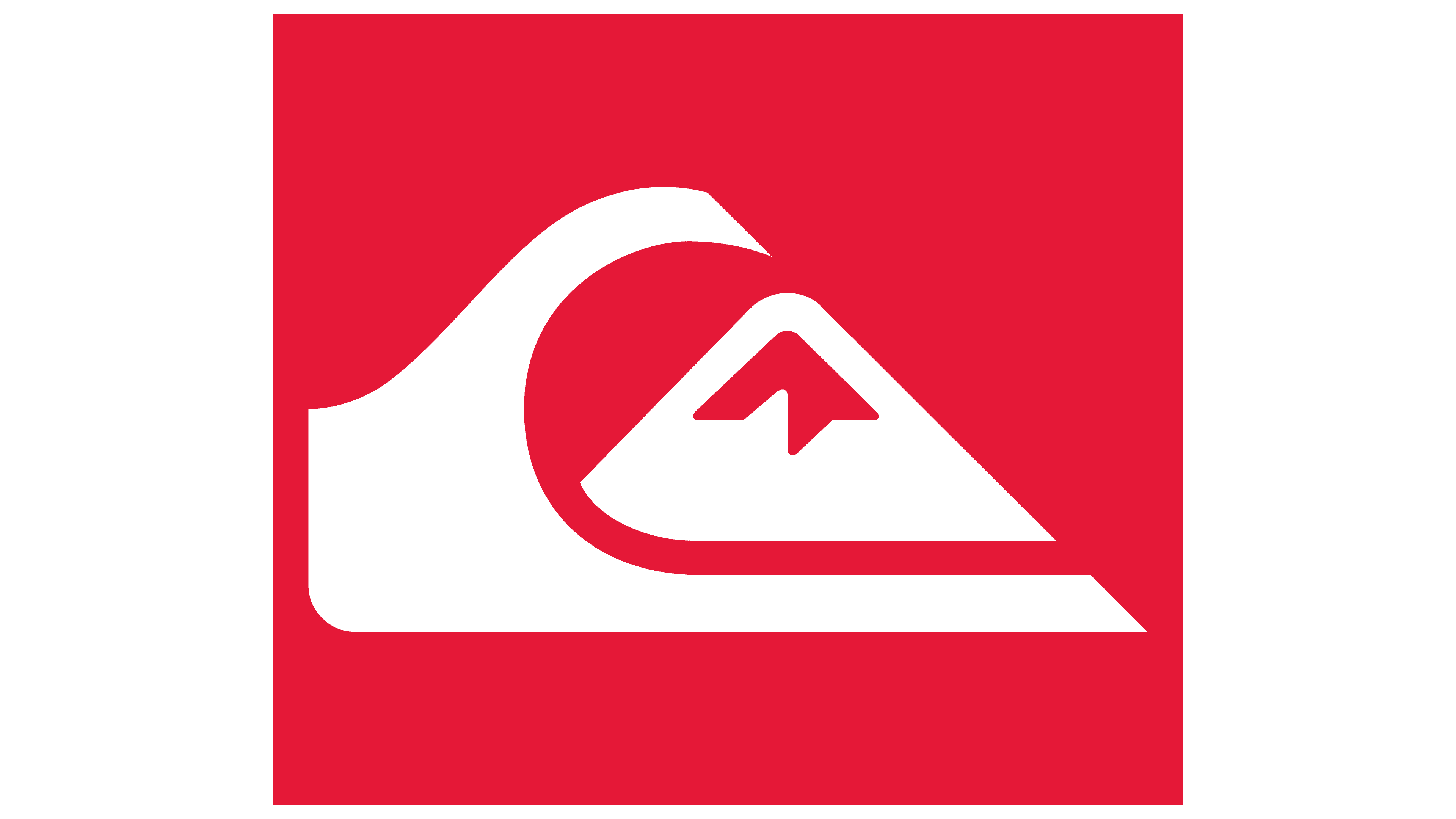
1983 – today
![]()
In May 1983, the Quiksilver logo was given new life by designer Rick Smith. The updated symbol maintained a connection to the previous style while reinterpreting its key elements, the wave and the mountain.
On the left is a powerful curved line that imitates a wave, rising upward and to the right. Its contour thickens, becoming more massive and gradually narrowing toward a sharp end. With its curve, the wave embraces the mountain figure, rendered as a black triangle. The mountain peak is highlighted in white, evoking a layer of snow.
The image is based on the famous Japanese print featuring a wave and Mount Fuji, but it was reworked in a more modern style befitting the 1980s. Although Quiksilver later changed its primary logo, this version still appears on the company’s apparel and serves as a reminder of the brand’s history and its connection to surf culture.
1983 – 1997
![]()
In 1983, the brand introduced another version of the mark, adding a fresh approach and new colors.
The upper half retained the symbol composed of the wave and the mountain. This time, however, the symbol was rendered in bright red. Below, the brand name “QUIKSILVER” appeared in black type. The letters are sans-serif, heavy, rounded, and arranged in an unconventional manner characteristic of the era’s techno style. The individuality of each letter stands out while still maintaining overall visual harmony.
1997 – 2002
![]()
In the late 1990s, the logo was updated with a focus on typography, showing how the brand’s character could be expressed clearly and confidently through type alone. The new logo consisted of a concise wordmark and familiar symbolism, placed within a horizontal red block with rounded corners.
The name Quiksilver was set in the elongated Clicker typeface. It appears strict, light, and modern. The letter strokes are thin, evoking associations with digital and technical typefaces such as DIN. The only exception is the letter “I,” designed with serifs on both sides in accordance with typographic standards, which becomes a small detail that draws attention.
To the right of the text sits the familiar company symbol, a wave covering a stylized Mount Fuji peak. This combination remained unchanged from earlier logos. The logo’s background is bright red, while the lettering and symbol are white.
2002 – 2009
![]()
With this updated logo, the brand signaled a new approach. The wordmark appears as if painted with quick black brushstrokes, like graffiti on a wall or a skateboard, complete with visible brushstrokes and irregular edges. Each letter looks different. Some strokes are sharp, others thin or broken. The text expands from smaller to larger characters, as if receding into perspective, creating a sense of depth.
Next to the lettering stands the Quiksilver logo. The symbol is enclosed in a red square, maintaining the visual language of previous years.
The entire composition feels uneven. An aggressive, messy hand-drawn script sits alongside a strict and orderly symbol. The lettering style is associated with street culture, skateboarding, youth rebellion, and creative protest. All elements, both attracting and repelling, together set the logo apart from other brands and provoke mixed reactions.
2009 – 2015
![]()
The company changed direction again, focusing on simplicity and solidity. The new logo was presented as black lettering paired with the symbol in white and red tones.
The brand name is written in uppercase letters. The typeface is straight and bold, with dense, heavy letterforms and no serifs. The Quiksilver symbol remains next to the name, placed inside a red square.
2015 – today
![]()
The current Quiksilver logo is rendered in a restrained black-and-white palette. The brand remains faithful to its wave-wrapping-around-a-triangular-mountain symbol. This mark has remained unchanged since 1983. Its recognition extends far beyond the brand’s core audience.
Below the symbol is the name “QUIKSILVER,” set in strict uppercase letters. The typeface is sans-serif and large. In form, the wordmark is close to geometric typefaces such as Eurostile Bold or Gotham Bold, adapted to the brand’s visual language.
The symbolism conveys the spirit of Quiksilver, its connection to surfing and snowboarding, and reflects a lifestyle familiar to fans of street culture. The wave and the mountain evoke active recreation, nature, and freedom, conveying what the brand stands for.
Font and Colors
The logo’s creators selected several fonts for the rebrand, based on the location and year of use. The most popular is Clicker, which decorates the emblem and the office sign. Hurne Geometric Sans 4 and Xephyr were also used. Another option is handwritten, imitating hasty handwriting or chaotic waves. The brand palette consists of black, white, and red colors.