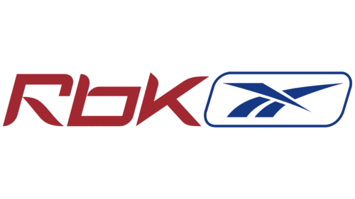
The RBK logo appears creative and original. It stands out with a bright and unique color scheme that defines its elements while retaining its association with the renowned global company, Reebok.
The identity aligns with a sports theme. It is dynamic and expressive, pointing to the brand’s core focus. Importantly, the visual mark emphasizes that this brand specializes in sports apparel production for NFL and NBA teams.
The emblem design reflects accents of beauty and uniqueness, complemented by minimalist motifs in the background. Equally significant are the vibrant color choices, which enhance its perception. This unique identity has become a symbol familiar to anyone interested in sports and competition.
RBK: Brand overview
RBK’s story began in 2005 when Reebok decided to launch a separate product line aimed at a younger, more fashion-forward market. RBK was intended to be a sub-brand that blended streetwear with athletic apparel.
Reebok created this line to compete with brands like Adidas and Puma, which successfully merged streetwear and athletic wear while strengthening its position in the youth fashion sector.
The brand introduced its first clothing, accessories, and shoe collection in 2005. The line had a more modern style and bolder color schemes than the traditional Reebok range, appealing to a younger audience.
One key element of the strategy was collaborating with famous athletes and musicians. 2006, the company partnered with rapper 50 Cent to launch the G-Unit shoe line. This collaboration helped establish the sub-brand’s presence in streetwear and hip-hop culture.
That same year, the company also teamed up with high-profile athletes, such as basketball star Allen Iverson, which attracted new customers while staying true to its athletic roots.
2007 marked the business’s global expansion. The products became available in stores worldwide, increasing visibility and brand awareness.
However, by 2008, Reebok began to reconsider its strategy. It became difficult to maintain the strong reputation of the original Reebok brand while building this new identity.
As a result, in late 2008, Reebok decided to gradually phase out the sub-brand and integrate its best elements into the main Reebok line. This move aimed to unify marketing efforts and streamline the company’s structure. Some design elements and concepts continued to be used in select Reebok collections, particularly those aimed at younger consumers.
Although the sub-brand’s time as a standalone entity was short, it had a lasting impact on Reebok. The experience of developing and marketing this line helped Reebok better understand the preferences of a younger audience and adjust its products and marketing strategies to evolving trends in sports and fashion.
While the sub-brand no longer exists as a separate entity in 2023, its influence can still be seen in some Reebok designs combining streetwear and sportswear elements.
This brief history shows how large companies experiment with sub-brands to reach new markets and adapt to changing consumer preferences. Although it never fully gained momentum, its legacy continues to shape Reebok’s strategy and style today.
Meaning and History
What is RBK?
This well-known sports footwear and apparel brand has influenced street culture and sports worldwide. Originally founded in the United Kingdom, the brand became recognized for its advanced sportswear in CrossFit, running, and fitness areas. Its recognizable emblem can be seen on a wide range of products, from stylish footwear to athletic gear. The brand continually pushes the boundaries of sports design, incorporating innovative technologies such as the Pump cushioning system. In addition to sports, the brand has successfully entered the fashion world, collaborating with designers and celebrities to create trendy streetwear.
2005 – 2008
The RBK logo attracts with its dynamism and modernity. It consists of two key elements: the text component and the brand symbol, creating a harmonious composition. A notable aspect is the rich red color of the text, which gives the emblem brightness and energy. Red is associated with passion, movement, determination, and a sporty spirit, aligning with Reebok’s brand concept, emphasizing sports and an active lifestyle.
The text element “RBK” is crafted in a unique font, where the letters appear as if “assembled” from separate parts. This gives an unconventional look and a hint of innovation. Each letter appears dynamic, with slight angular curves symbolizing motion and progress. The logo conveys a sense of speed and ambition for success. The letters “R,” “B,” and “K” are designed as a single unit while remaining individually distinct, pointing to the brand’s unity, where every detail matters while also highlighting flexibility and creativity in approach.
To the left of the “RBK” abbreviation is Reebok’s symbolic brand mark—a blue geometric element. Known for its sharpness and clear lines, this symbol gives the logo a more technological and modern feel. The blue color of the symbol balances the red text, adding a sense of confidence and stability. Blue represents professionalism and reliability, and its contrast with red enhances the visual impact.
The symbol is framed by a blue border, making it more prominent against the overall background. White represents purity and simplicity, underscoring the brand’s clarity and openness. The frame around the emblem highlights the symbol, adding extra depth and a sense of composition completeness.
The symbol’s design, specifically its forward-pointing lines, represents movement and the pursuit of new achievements. This underscores the brand’s mission—to help people move forward and reach new heights in sports and active living. The symbol’s geometry resembles sports tracks or pathways, resonating with the brand’s core focus on athletic accomplishments.


