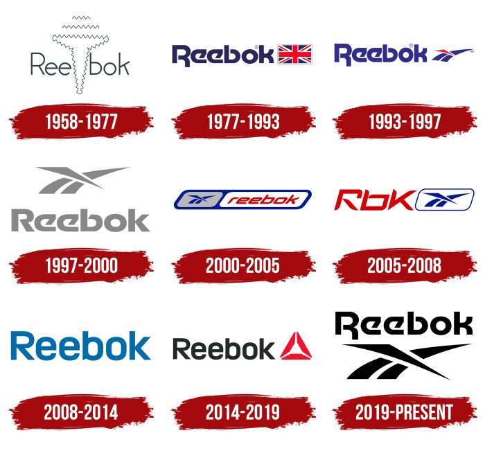
The Reebok logo, executed in a modern style, demonstrates the brand’s commitment to its roots. Its identity symbolizes development throughout the brand’s history, focusing on technologies and a direction reflecting the high quality and recognizability of the products.
Reebok: Brand overview
| Founded: | 1895 |
| Founder: | Joseph William Foster |
| Headquarters: | Boston, Massachusetts, USA |
| Website: | reebok.com |
Meaning and History
The brand’s logo has changed several times, reflecting shifts in its activities.
What is Reebok?
Reebok is a manufacturer of sports goods. The company was founded in the United Kingdom in 1958, and as of 2021, it became a subsidiary of Authentic Brands Group, so its headquarters is now in the USA. The international brand sells clothing and footwear for everyday use and various sports, including CrossFit, tennis, football, basketball, and running.
1958 – 1977
After launching the new Mercury shoe model in 1958, it was decided to rebrand – the company name changed to “Mercury Sports Footwear.” Unfortunately, this did not bring the desired results, so just two years later, in 1960, the Foster sons renamed the company “Reebok.” The name was not chosen randomly – the word “reebok,” meaning an African antelope, symbolized speed of movement. In the African language, the name was spelled as “reebok.” This name stuck and has remained to this day.
1977 – 1993
In the mid-70s, the company decided to conquer the American market. For brand recognition, the company logo changes. The emblem consists of the Reebok inscription, for which designers used the Motter Tektura font to highlight the brand’s uniqueness. In addition, next to the inscription appeared the flag of Great Britain, indicating the country where the brand was created.
1993 – 1997
In 1993, the emblem came with three stripes and the inscription “Reebok.”
1997 – 2000
The 1997 emblem version returned, only this time, the inscription is under the graphic symbol and applied in different color variations.
2000 – 2005
The rectangular emblem is divided into two parts. On the left are three blue lines; on the right is the italic inscription “reebok,” made in lowercase letters.
2005 – 2008
Designers made a red abbreviation “RBK” and a blue sign in a square frame. RBK is a shortened version of the full name Reebok.
2008 – 2014
The three stripes were removed. Only the Reebok inscription remained. The font of the inscription became more rigorous.
2014 – 2019
In 2014, a new delta-shaped sign appeared next to the word “Reebok.”
2019 – today
Returning the logo to its roots. The company returned the logo, first created in 1993. Throughout its history, the company has absorbed smaller firms, and Reebok has always maintained a focus on technology. That direction of development should be associated with a recognizable logo.
Reebok: Interesting Facts
Reebok, a big name in shoes and sports clothes, started in 1958 in England. It’s known for making cool stuff for working out and playing sports.
- Started in England: Two guys, Joe and Jeff Foster, started Reebok. Their granddad made some of the first running shoes with spikes. They named the company after a fast animal they read about in a dictionary.
- Big Move to America: In 1979, a man named Paul Fireman brought Reebok shoes to America, which helped make Reebok known all over the world.
- A Big Hit with Aerobics: In the 1980s, Reebok made the first shoe just for aerobics, which was a big deal back then. This made them super popular in the U.S.
- Cool Shoe Tech: In 1989, Reebok made a shoe called the Pump that you could pump up for a better fit. It was a big deal because no one else had shoes like that.
- Teaming Up with Stars: Reebok has collaborated with famous athletes and musicians, such as Shaquille O’Neal and Jay-Z, to create special shoes and clothes.
- Cool with Hip Hop: Reebok is also big in hip-hop and street fashion, working with artists and showing up in music videos and movies.
- Going Green: They’re trying to be good to the planet by making shoes from cotton and corn that can break down and not pollute.
- Loving Fitness: Reebok got involved with CrossFit and Spartan races to show they’re all about staying fit and tough.
- Ads That Inspire: Their ads tell people to challenge themselves and be their best in sports and life.
- Joining with Adidas: In 2005, Adidas bought Reebok, hoping to become an even bigger deal in sports. But in 2021, Adidas decided to sell Reebok to a new company, starting a new chapter in its story.
Reebok has gone from being a small English company to a big deal in sports and fashion worldwide. It is always coming up with new ideas and staying cool.
Font and Colors
The company used three symbols that were popular in different years. The first is the national flag of Great Britain because Reebok originated precisely in this country. The second is three tapering stripes, equivalent to the marks of Adidas and Nike. The third is the delta. It appeared in 2014 when the brand decided to change its focus to the CrossFit movement.
The Delta triangle consists of three red trapezoids. They reflect social, mental, and physical transformation. The brand symbol complements the black word “Reebok,” which comes from the name of the African antelope in the Afrikaans language: “rhebok.”
In the current version of the logo, the Motter Tektura font, which appeared in 1977, is used. All symbols are squat and wide, with open lines at “R,” “e,” and “b.” The first symbol is uppercase; the rest are lowercase. The legs of “k” and “b” correspond in height to the capital letter. The brand’s corporate palette includes blue shades from light blue to dark and gray, black, and red. Together, they represent the color of the flag of Great Britain, the country where the company originated.
Reebok color codes
| Black | Hex color: | #000000 |
|---|---|---|
| RGB: | 0 0 0 | |
| CMYK: | 0 0 0 100 | |
| Pantone: | PMS Process Black C |

