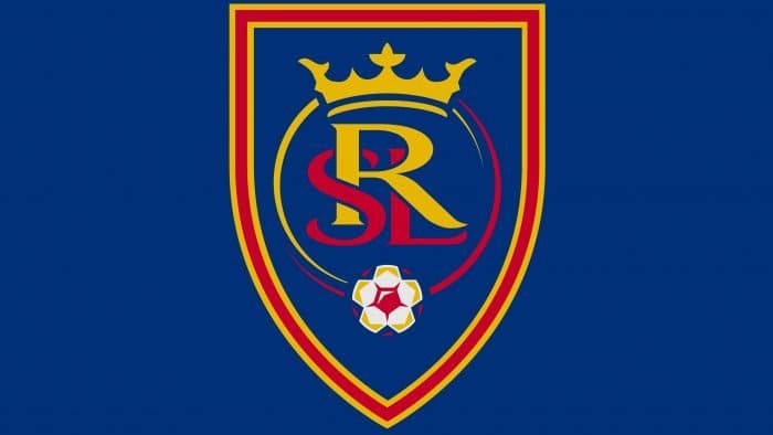
The “Real Salt Lake” logo demonstrated a commitment to the Spanish style of soccer. The club’s graphics reflected its “imperial” status and aspirations for high-class play. This special status was emphasized with a crown and a rich color palette.
Real Salt Lake: Brand overview
| Founded: | July 14, 2004; |
| Founder: | David S. Blitzer, Ryan Smith |
| Headquarters: | Sandy, Utah, U.S. |
| Website: | rsl.com |
Real Salt Lake is the 12th American professional soccer club, competing in the Western Conference of Major League Soccer (MLS) and representing Salt Lake City. On July 14, 2004, Major League Soccer officially transferred the 12th franchise to the SCP Worldwide owner group. Thus, Utah gained a professional club that joined MLS in 2005.
Dave Checketts, an American businessman and former president of the “Utah Jazz,” played a significant role in this. He convinced the league’s leadership to sign a franchise agreement with his hometown. Checketts, who had traveled extensively in Europe while leading NBA International and handling basketball marketing globally, admired Madrid’s “Real.”
The team conducted a poll in the Salt Lake Tribune, which showed support for “Pioneers” and “Highlanders.” Nearly 40% of locals chose the name Highlanders (2200 votes). Pioneers came in second, while Real Salt Lake was in the fourth position, only ahead of Alliance and Glory. This did not influence Dave Checketts’s decision: he sought permission from the management of Madrid’s “Real” to use the name.
The adjective “Real,” meaning “royal,” is characteristic of Spanish teams that have received patronage from the ruling monarch. However, fans did not appreciate this. Despite much criticism, in October 2004, the team was officially presented with its new name – “Real Salt Lake” at the “Rice-Eccles” Stadium.
The then-owner made another important branding decision: he included red and blue colors in the team’s jerseys – the same colors as the “Barcelona” soccer club. Salt Lake City was a place of intense soccer rivalry between the University of Utah (red) and Brigham Young University (blue). The team’s colors aimed to bridge this divide and make RSL a team for everyone.
In 2006, the owner considered moving the franchise to St. Louis since the authorities refused to fund the construction of a new stadium in Utah. However, the move did not happen. “Real Madrid” responded to Dave Checketts’s request and pressured the local authorities to build a stadium. Under public pressure, the authorities allocated funds to build the “Rio Tinto” stadium, and “Real” stayed in its hometown. In 2013, there was a change of ownership – Checketts sold his stake in “Real Salt Lake” to minority owner Dell Loy Hansen.
Meaning and History
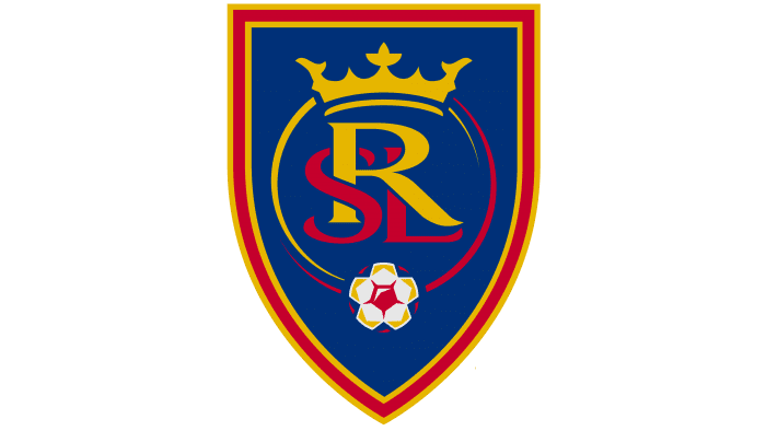
The soccer club has two logos. The Real Salt Lake logo emphasizes the royal status and reflects the official color palette borrowed from the “Barcelona” soccer club. Both logos have a similar design but differ in minor details. The second version of the “Real Salt Lake” logo features a silver star in honor of the MLS Cup won in 2009.
What is Real Salt Lake?
Real Salt Lake (abbreviated as RSL) is an American professional soccer team, part of the Western Conference and a member of MLS. It was founded in 2004 and is owned by businessmen David S. Blitzer and Ryan Smith. The club is based in Salt Lake City, Utah. Its home arena is called America First Field.
2005
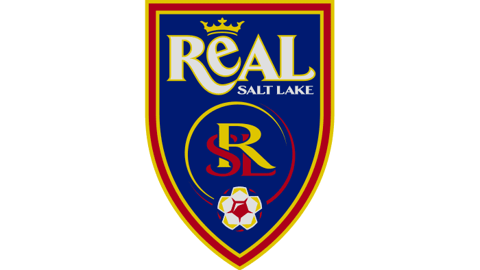
One year stands out in the club’s history when its debut logo did not contain elements of yellow. The graphic sign looked like a blue heraldic shield in a red-orange striped frame. Inside were symbols important to “Real Salt Lake”: a crown, a soccer ball, and a monogram of the letters “R,” “L,” and “S” in an open circle. The top third of the shield was occupied by the team’s full name, written in an unusual serif font.
2006 – 2009
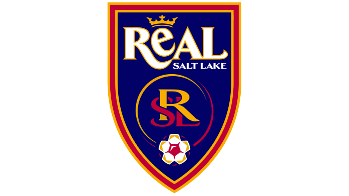
The debut logo of “Real Salt Lake” is executed as a cobalt-blue triangular shield with three outlines of claret-red and true gold colors. In the lower corner, there is a stylized soccer ball with geometric patterns of various colors. Above it is an outlined monogram, “RSL,” representing the team’s initials.
The word “Real” with a thin outline occupies the top part of the shield. The letters “R,” “A,” and “L” are uppercase, and “e” is lowercase. Their size on the Real Salt Lake emblem indicates the correct pronunciation of the Spanish word and eliminates associations with the English word “real.” Above the letter “E” is an imperial crown – a symbol of the soccer club’s special status. The inscription “Salt Lake” is located under the letter “AL”. The font of all inscriptions is serif.
2010 – today
After the team’s victory in the MLS Cup (in 2009), Dave Checketts decided to add a silver pentagonal star to the “Real Salt Lake” logo. While working on the logo, designers made minor adjustments to other details. They reduced the heraldic shield, and removed the phrase “Real Salt Lake” and the surrounding monogram “RSL.” The crown became larger and now sits above the letter “R.”
Real Salt Lake: Interesting Facts
Real Salt Lake (RSL) is a soccer team that has made a big splash in Major League Soccer (MLS) since it started in 2005. They’re known for their exciting history, strong team spirit, and cool accomplishments.
- Starting Out: RSL joined MLS in 2005, hoping to bring the same kind of royal flair that teams like Real Madrid have right to Utah.
- Their Stadium: They play in Rio Tinto Stadium, or “RioT” for short, in Sandy, Utah. It’s famous for the beautiful view of the Wasatch Mountains from there.
- Big Win: In 2009, they won their first MLS Cup by beating the Los Angeles Galaxy in a thrilling penalty shootout, becoming the first pro team from Utah to win a major championship.
- Champions League: In 2011, RSL reached the final of the CONCACAF Champions League, showing that it could compete with the best in North and Central America.
- Rivalry: They have a big rivalry with the Colorado Rapids called the Rocky Mountain Cup. The matches between these two are always super exciting.
- Young Players: RSL is into helping young players grow. They even have a high school for their academy players, and many of these kids have gone on to play professionally.
- Famous Players: Some well-known players, like Kyle Beckerman and Nick Rimando from the U.S., and stars like Javier Morales and Álvaro Saborío from other countries, have played for RSL.
- Helping Out: Off the field, RSL helps its community through the RSL Foundation, which focuses on health, youth soccer, and scholarships.
- New Owners: In 2021, the team got new owners, David Blitzer and Ryan Smith, who are all about bringing new ideas, helping the community more, and making the team even better.
- Traditions: Before every home game, fans sing an anthem called “Believe,” showing their unity and support for the team.
Real Salt Lake isn’t just about playing soccer; it’s about building a community, helping young players succeed, and bringing excitement to their fans on and off the field.
Font and Colors
The crown on the logo reflects the word “Real,” which translates from Spanish as “royal.” This exclusive nickname is given to all soccer clubs under the patronage of the Spanish monarch. However, the team from Salt Lake City decided to disregard such formalities: they took the name “Real” and boldly adorned the emblem with a golden crown, placing it directly above the monogram “RSL.”
In the first version of the emblem, the full club name was written in two separate serif fonts. The word “Real” looked regal. Especially original was the capital letter “R” with an extended diagonal leg and the lowercase “e” lying on its side.
Now the shield displays only the club’s initials: “R,” “L,” and “S” as a monogram. The letters overlap each other, but it is noticeable that the designers did not use a standard font but a specially created old font for the “Real Salt Lake” emblem.
The logo is executed in three colors, taken from the team’s official palette. The primary one is cobalt blue (#013A81). It creates a dark background for the crown, monogram, open shield, and ball. Some elements are red (Claret Red, #B30838), and the second is gold (Real Gold, #F5E700). These same two shades are combined in the shield’s border.
Real Salt Lake color codes
| Deep Carmine | Hex color: | #b30838 |
|---|---|---|
| RGB: | 179 8 56 | |
| CMYK: | 0 96 69 30 | |
| Pantone: | PMS 186 C |
| Dark Midnight Blue | Hex color: | #013a81 |
|---|---|---|
| RGB: | 1 58 129 | |
| CMYK: | 99 55 0 49 | |
| Pantone: | PMS 288 C |
| Teal | Hex color: | #f1cb00 |
|---|---|---|
| RGB: | 241 203 0 | |
| CMYK: | 0 16 100 5 | |
| Pantone: | PMS 116 C |
