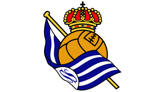
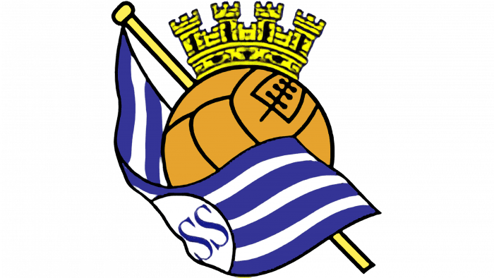
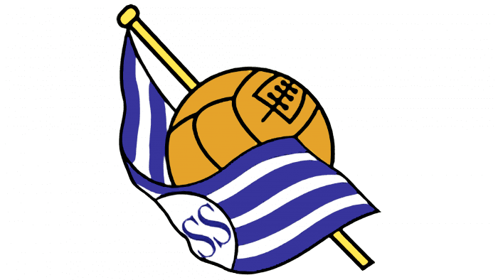
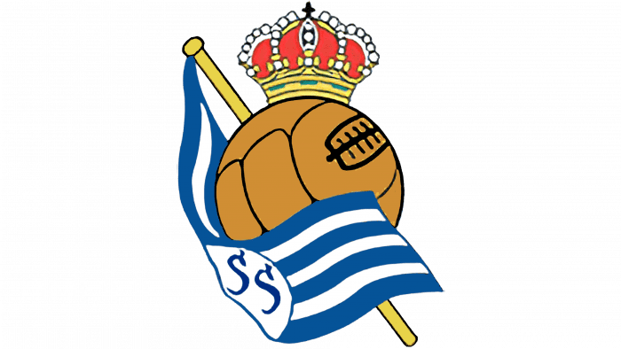
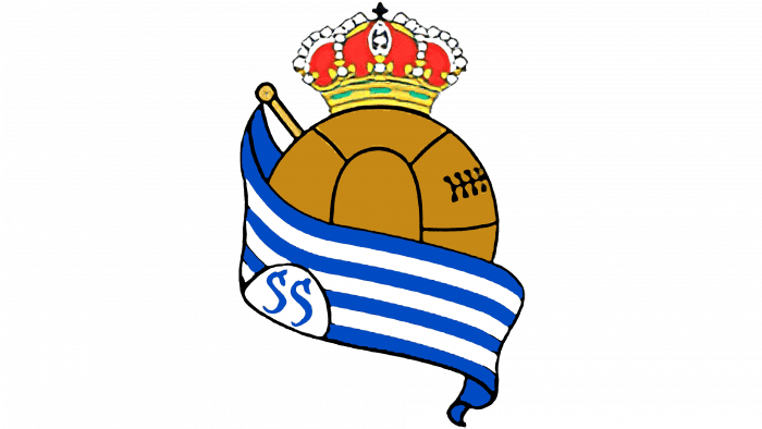
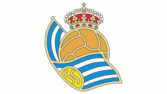
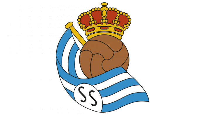
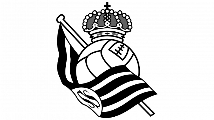
The Real Sociedad logo pays respect and homage to the ball. Football is not just a game for the team. This is a way to glorify your country. The patronage of the royal person, visible in the symbols of the emblem, endowed the club with such powers.
Real Sociedad: Brand overview
| Founded: | 7 September 1909 |
| Headquarters: | San Sebastián, Spain |
| Website: | realsociedad.eus |
The Real Sociedad Club was founded in 1909 as Sociedad de Fútbol and a year later acquired the patronage of King Alfonso XIII. He appeared in the Basque city of San Sebastian, which was the summer residence of the Spanish monarch. Therefore, the ruler, without hesitation, gave the resort his protection.
After receiving a royal warrant, the club was renamed Real Sociedad de Fútbol, which in English sounds like the “Royal Society of Football.” The official colors indicate the team’s affinity with San Sebastian, with their signature blue and white combination featured on the city’s flag.
Meaning and History
The Real Sociedad logo reflects the relationship with King Alfonso XIII. For this, the designers used a symbolic element – a crown over a soccer ball. Almost half of the space is occupied by a blue and white flag, lined with horizontal stripes. It features the letters “SS,” which represent the city of San Sebastian.
What is Real Sociedad?
Real Sociedad – a Basque professional soccer team from Spain. It was founded in 1909 and is based in the city of San Sebastian. The team has won 2 league titles and 3 Copa del Rey championships. The club is one of the founding members of La Liga.
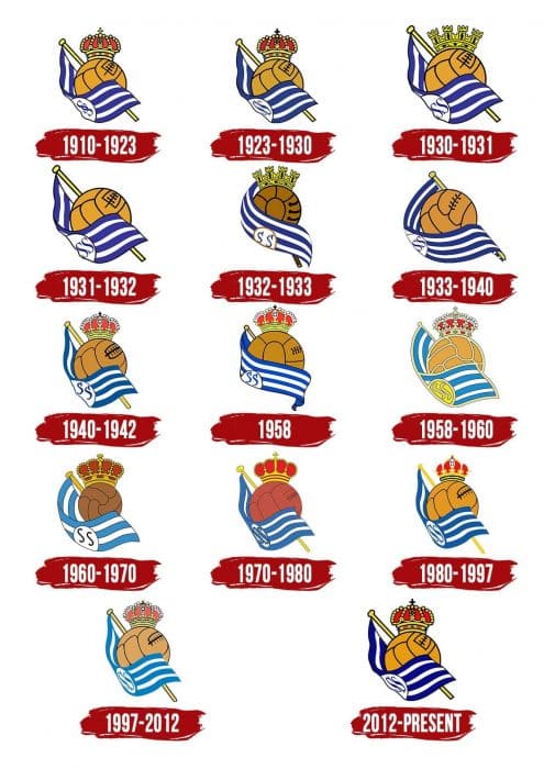
1910 – 1923
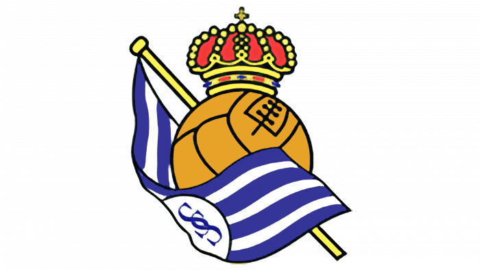
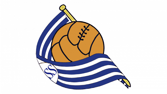
The first logo contains the King of Spain’s red and gold crown with a cross at the top. The lower part of the ball is hidden behind the flag cloth, which is bent upwards. The letters “SS” are in a white circle and are monogrammed.
1923 – 1930
In the early 1920s, the letters have split – now they are just the city’s initials with no decoration.
1930 – 1931
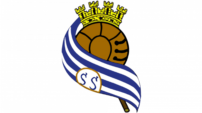
Above the soccer ball, there is a golden tower crown with four teeth. The same was on the coat of arms of the Second Spanish Republic’s historical state, which existed from 1931 to 1939.
1931 – 1932
In 1931 the club changed its emblem for political reasons: King Alfonso XIII was overthrown, so the crown was banned. At the same time, Real Sociedad was renamed Donostia Football Club.
1932 – 1933
The 1932-1933 logo again features the tower crown. The flag is directed downward; the flagpole is almost completely hidden behind the ball. At the same time, the ball itself is dark brown and looks completely new.
1933 – 1940
The classic soccer ball is back, but the stitching is slightly different. The end of the long flag is twisted against the bottom of the flagpole.
1940 – 1942
A year after the end of the Spanish Civil War, the club reinstated the Real Sociedad name and adopted the crown emblem. The end of the flag is pointing up again, and the blue color has become slightly lighter.
1942 – 1958
The designers changed the design of the ball, bringing it closer to the 1932-1933 version. The bottom of the flagpole is completely hidden behind the flag, the end of which hangs freely.
1958 – the 1960s
The side seam of the ball disappeared, but wide light outlines were dividing each segment. The same lines are used for the edging of the flag and its elements. The monogram “SS” is not blue but beige for the first time and is located in a yellow semicircle.
the 1960s – 1970s
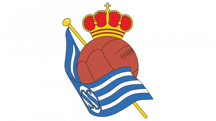
A large gold crown with burgundy inserts is worn on a small brown ball. Black letters “SS” are visible on a white background.
the 1970s – 1980s
This time the ball is dark red, and the monogram is blue. The crown is shown schematically. The bottom of the flagpole extends beyond the flag.
the 1980s – 1997
A small crown is positioned over a large light brown ball.
1997 – 2012
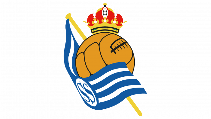
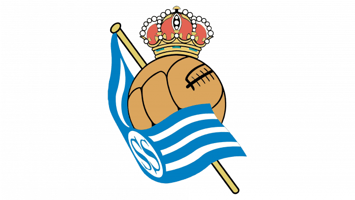
The appearance of the crown has changed: the designers have added many small details. The colors remain the same but are muted.
2012 – today
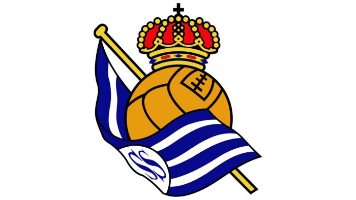
Continuing the experiment with the palette, the creators of the emblem chose bright and rich colors. They also changed the crown again by decorating it and adding a small black cross to the top. The soccer ball also has a new look, as does the flagpole, which is now exactly in the center.
Real Sociedad: Interesting Facts
Real Sociedad de Fútbol, or just Real Sociedad, is a soccer team from San Sebastián in the Basque Country of Spain.
- Start and Team Colors: They were created on September 7, 1909, and first wore blue and white stripes like the English team Blackburn Rovers. But in 1910, they changed to blue and white vertical stripes to match San Sebastián’s flag colors.
- Home Stadium: They play at Reale Arena, which used to be called Anoeta Stadium. It was renovated in 2019 to be nicer and bring fans closer to the action.
- Winning Big: They’ve won La Liga, Spain’s top soccer league, two times in a row (1980-1981 and 1981-1982), their best years.
- Copa del Rey: They’ve also won the Copa del Rey, a big soccer cup in Spain, a few times. Their latest win was in 2020 against their local rivals, Athletic Bilbao.
- Training Young Players: Real Sociedad is famous for training young soccer players at their Zubieta Training Facility. Many of these players have become big stars.
- Basque Players: Like their rivals, Athletic Bilbao, they used only to let players from the Basque region play for them. They stopped this in 1989 but still focus a lot on local talent.
- Champions League: In the 2002-2003 season, they made it to the semi-finals of the UEFA Champions League, which was a huge deal because it showed they could hang with the best teams in Europe.
- Big Rivalry: Their biggest rivals are Athletic Bilbao. Games between them are called the Basque derby and are a big event each season, showing off the area’s love for soccer.
- Women’s Team: They also have a women’s team, which is good. In 2019, they won the Copa de la Reina, Spain’s major women’s soccer cup.
Real Sociedad cares a lot about its community, training young talent, and supporting women’s soccer. This makes it a very special soccer club in Spain and Europe.
Font and Colors
Real Sociedad updated its image under the influence of political events. Having received the crown from King Alfonso XIII, he was forced to give it up when the government changed. A little later, the club returned its logo, placing it at the top of the logo. Over the years, the crown’s design has changed – it was either tower or open, with a red pillow inside.
In the same way, other elements of the emblem were transformed: a large soccer ball, a striped white and blue flag, and a flagpole deployed diagonally. Yet, they have not disappeared anywhere, so Real Sociedad can be called one of Spain’s most conservative clubs.
The authors of the logo did not use the usual fonts: they came up with their version of the antique typeface, depicting the curved letters “SS” with serifs. The flag’s traditional colors (white and blue) have never changed, except for experimenting with shades. In different periods, the ball managed to visit orange, light brown, dark brown, and even red. The palette of the current emblem is very bright: it contains white (#FFFFFF), blue (# 0067B1), yellow (# E4B630), gold (# D87722) and red (# E1061F).
Real Sociedad color codes
| Blue | Hex color: | #0067b1 |
|---|---|---|
| RGB: | 0 103 177 | |
| CMYK: | 100 42 0 31 | |
| Pantone: | PMS 285 C |
| Yellow | Hex color: | #e4b630 |
|---|---|---|
| RGB: | 228 182 48 | |
| CMYK: | 0 20 79 11 | |
| Pantone: | PMS 7409 C |
| Gold | Hex color: | #d87722 |
|---|---|---|
| RGB: | 216 119 34 | |
| CMYK: | 0 45 84 15 | |
| Pantone: | PMS 152 C |
| Red | Hex color: | #e1061f |
|---|---|---|
| RGB: | 225 6 31 | |
| CMYK: | 0 97 86 12 | |
| Pantone: | PMS Bright Red C |
