


![]() Realtree Logo PNG
Realtree Logo PNG
Realtree’s logo can be described as camouflage because it features many hidden elements. For example, deer antlers, fishing hooks, steel ice axes, sturdy harpoons, climbing hooks, and powerful dredges. The emblem’s focus on fishing and hunting confirms the company’s activities in manufacturing camouflage.
Realtree began in 1983, when Bill Jordan founded Spartan Archery Products in a back room of his father’s boat dealership in Columbus, Georgia. The company made T-shirts, head nets, caps, and archery accessories at a local factory. Margins were low, and Jordan sought a way to differentiate the business from mass-apparel production.
In 1984, Jordan visited the SHOT Show and saw Jim Crumley’s Trebark camouflage. In 1986, while sketching the bark of an oak tree in his parents’ yard, he added layers of branches and leaves to create a three-dimensional hunting pattern. He named it Realtree because it looked like actual trees.
Jordan presented the pattern at the SHOT Show in 1986. Representatives from Walmart, Bass Pro Shops, and Oshman visited his booth, while Eastbank Textiles became the first licensee. Instead of manufacturing clothing himself, Jordan built Realtree around licensing patterns to other companies. In 1988, he revised the original design with bark and leaf overlays, creating Brown-Leaf and Grey-Leaf.
In 1992, Jordan launched Realtree Outdoors, one of the early hunting TV shows, followed by Monster Bucks videos. In the 1990s, NASCAR champion Dale Earnhardt hunted with Jordan and appeared in Realtree advertising, helping take the brand beyond its core hunting market. Mossy Oak, founded by Toxey Haas in 1986, became Realtree’s main rival during the hunting camouflage boom. Jordan also created Advantage. In August 2024, he was inducted into the Legends of the Outdoors National Hall of Fame, while his son, Tyler, received the Legacy Award.
Meaning and History
![]()
Bill Jordan established an individual brand to support those passionate about hunting, fishing, spending time in nature, and leading an active lifestyle. But first, he opened Spartan Archery Products, and only then did he become interested in camouflage patterns, which he improved daily. He developed and revolutionized them by using modern techniques, including computer-based ones.
Eventually, this passion became the work of his entire life, or, more precisely, a business. It all started with a clever marketing move. The fact is that before opening the company, Bill drew camouflage. He depicted it in various forms, striving for a three-dimensional effect. Having achieved the desired pattern, the entrepreneur contacted manufacturers who transferred it to the fabric. Then, seamstresses sewed hunting clothes.
The innovator photographed each model and sent samples to potential buyers. And one day, they demanded such suits for themselves. But Jordan didn’t have them, which led to the speedy filing of another trademark. And since he adheres to the principle of constancy, there is only one logo in its history.
What is Realtree?
Realtree is an American trademark from Columbus, California. It offers clothing and accessories for extreme leisure enthusiasts. In particular, the company is engaged in sewing various camouflage patterns for hunting and fishing. The brand’s founder is Bill Jordan, who created it in 1986.
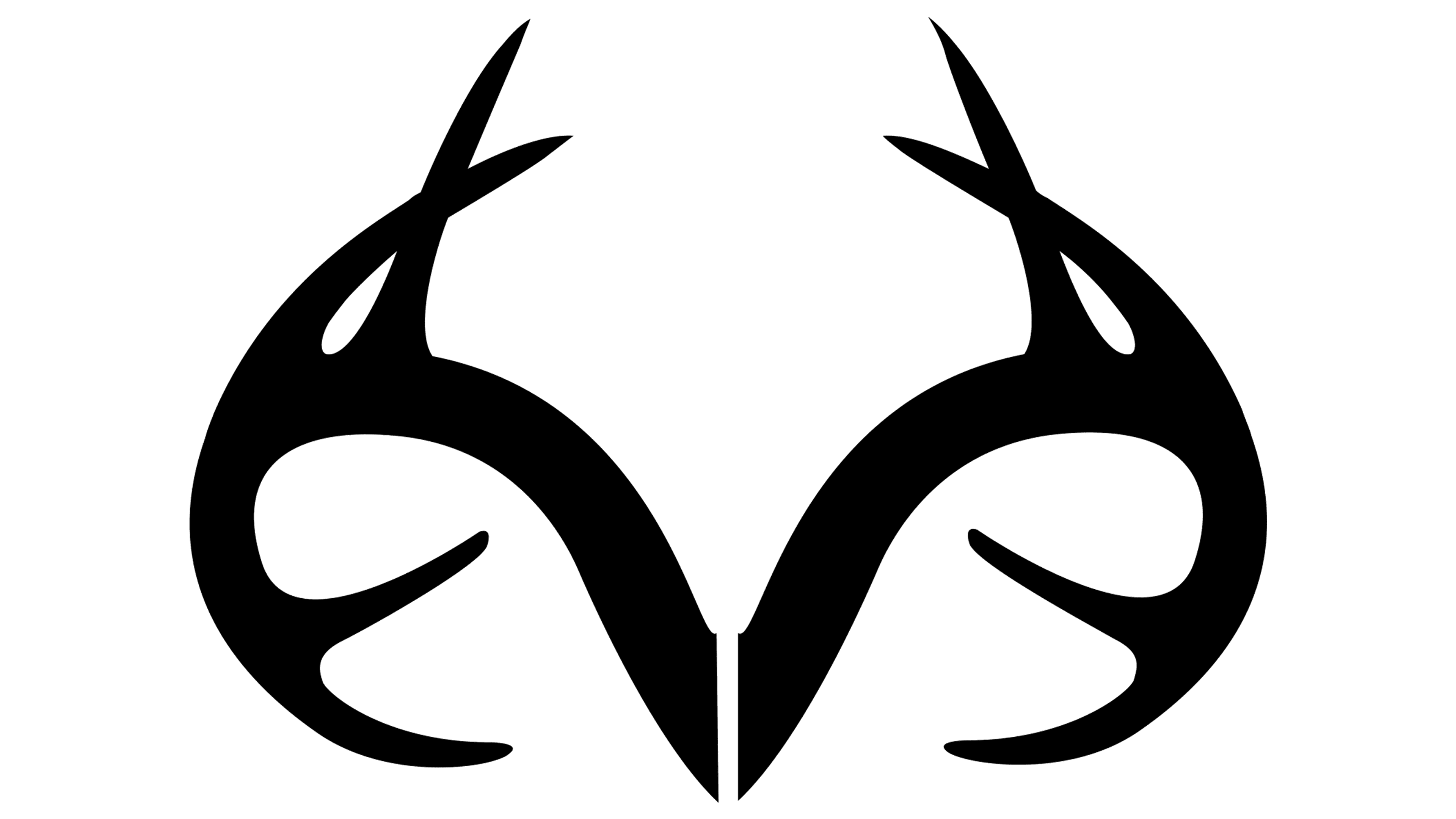
The designer wanted to combine all clothing-related activities into the Realtree emblem. Fishing, hunting, outdoor recreation, extreme sports, and an active lifestyle are some examples. They are abstractly reflected in the unusual logo. So, at a cursory glance, the icon appears to be a complex arrangement of curved lines.
However, its DNA of freedom and independence from external circumstances is encoded. You can see small fishing and massive climbing hooks in the original interweaving. Additionally, deer antlers and harpoon tips are visible.
The brand name is set in a strict font and placed below. The letters are powerful, uppercase, bold, and smooth. The inscription occupies one line and is centered. The legs of the glyphs have 90-degree angles, while curves are found only in the two “R”s. As a result, a business inscription is obtained that is strict and clear.
Since 1986, the Realtree logo has remained unchanged. In terms of shape and design, it aligns with the camouflage theme by “hides” several objects, reflecting the company’s core concept.
Font and Colors

The company’s logo features a bold, heavy typeface with solid, even strokes and precise geometric structure. The letters are dense, sans-serif, and tightly spaced, creating a visual impression of strength and reliability. Similar forms can be found in font families such as Microgramma Only Shadow Extd D Bold and Eurostile Unicase Pro Regular. However, the proportions and details reflect a distinctly custom style. The use of this typeface conveys a sense of seriousness and determination.
The logo is rendered black, adding a sense of power and discipline. Black is perceived as a color that reflects high status and professionalism. It suits brands geared toward outdoor enthusiasts, travelers, and hunters who seek confidence and calm in demanding conditions. The dark tone communicates protection, dependability, and discretion, aligning with a company image focused on clients who value security and control.