The Recchiuti logo represents the delightful world of American sweets. It is well-known to chocolate connoisseurs for introducing the craft candy industry in the USA, eventually becoming a symbol of leadership. It embodies impeccable taste and superior quality. The emblem symbolizes the joy and happiness of enjoying sweets, effectively capturing the essence of the American company it represents. The logo serves as an invitation, luring the viewer into a world of premium, delicious treats. It acts as a mark of quality and serves as a beacon of the company’s core values: the pursuit of excellence and the embodiment of happiness in every product.
Recchiuti: Brand overview
Founded in 1997 by Michael Recchiuti, a chef and chocolatier from Ohio, Recchiuti Confections has become a landmark in San Francisco, California, for its handcrafted chocolates. Michael’s dedication to European chocolate-making techniques and premium ingredients quickly established the brand’s reputation. The Ferry Building pier was where it all began, quickly gaining a dedicated following for its sophisticated truffles, dark chocolate, and salted caramels.
In 2004, Michael and his wife Jackie expanded their vision by opening a retail store in the Ferry Building, creating an inviting space for customers to explore their artisanal products. This move was followed by an extension of their chocolate line in 2007, introducing single-origin cocoa bean bars such as the acclaimed Recchiuti Bar, reinforcing their position as craft chocolate pioneers in the U.S.
The 2010s saw further expansion with opening a second store in Boston’s Pru shopping center and partnerships with select retailers nationwide, making their confections accessible to a broader audience. Recchiuti Confections also became popular for corporate and holiday gifts, offering customized packaging options and special seasonal collections.
Recent years have been marked by innovation and collaboration, including new truffle flavors and exclusive products created with artisan partners like Dandelion Chocolate. Committed to sustainability, Recchiuti prioritizes ethically sourced ingredients and eco-friendly packaging alongside supporting conservation efforts such as protecting tropical forests and cocoa biodiversity.
Looking ahead, Recchiuti Confections aims to continue its growth, reaching new markets while maintaining its commitment to quality and craftsmanship. With the craft chocolate market evolving, Recchiuti’s dedication to artisanship and excellence positions it for ongoing success.
Recchiuti Confections’ journey from a small San Francisco shop to a leading name in American chocolate mirrors the rising interest in handcrafted, meticulously made confections. Its focus on quality, innovation, and skillful craftsmanship has set Recchiuti apart in the competitive chocolate industry, earning it a devoted customer base and iconic status. As it moves forward, Recchiuti Confections is poised to delight and inspire chocolate enthusiasts.
Meaning and History
1997 – 2023
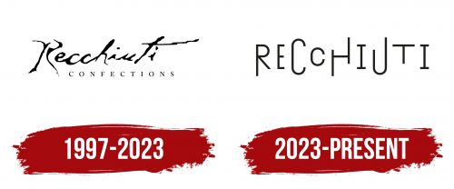
The logo showcases the company’s origins and reflects its beginnings, featuring the founder’s last name, Michael Recchiuti. This is crucial for the chocolate producer because it promotes his identity and adds significant value. Additionally, customers can get to know the master behind the craft products, allowing them to appreciate his professionalism and choose his signature items. Several principles were followed to achieve this.
- The logo is based on the chocolatier’s signature, enlarged and adapted to typography. This influenced the emblem’s design: it appears as a two-level inscription, with the upper part looking handwritten.
- A flowing, semi-connected, cursive script with a distinctive “R” consisting of two halves was used. The letters vary in height, which later served as the basis for the text in the subsequent logo.
To balance the handwritten text, a line with the word “Confections” was added at the bottom in a print font with wide letter spacing. The thin glyphs with short serifs are as elegant as the handwriting, combining well to form an ideal typographic balance.
Overall, the font style of the upper line resembles thin chocolate stripes on confectionery items, serving as a design decoration. The uneven lines, breaks, and varying thicknesses confirm this. The black-and-white color scheme adds an official strictness to the logo, making it a paragon of elegance. The text remains readable, and the logo’s individuality is preserved, enhancing brand recognition.
2023 – today
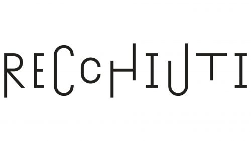
The joy of eating sweets is what the logo of the American company conveys. This elevated mood is created by bouncing letters of different shapes, sizes, and locations. They do not have uniform boundaries, which makes the lines uneven. Despite this, the emblem remains serious, balanced in color, and strict in lettering: all glyphs are black, thin, with straight edges. Some letters have elongated ends; others have serifs. For example, one stem of the letter “P” is shorter than the other, and the two neighboring letters “C” differ in height and width. There is adequate spacing between the letters.
The choice of black glyphs with thin, straight edges adds sophistication and seriousness, contrasting with the playful arrangement of the letters. This duality means that while the company’s products are fun and quirky, the business operates with precision and professionalism. The variety of letter shapes and sizes enhances the joy and unpredictability of eating sweets. The large spacing between the letters makes it easy to read and gives the design a modern and airy feel.


