![]()
Redacted, a leading tech company in AI and digital innovation, has unveiled a new visual identity that reflects its commitment to staying at the forefront of technology. This rebrand marks a shift as the company adapts to new challenges in AI and Web3.
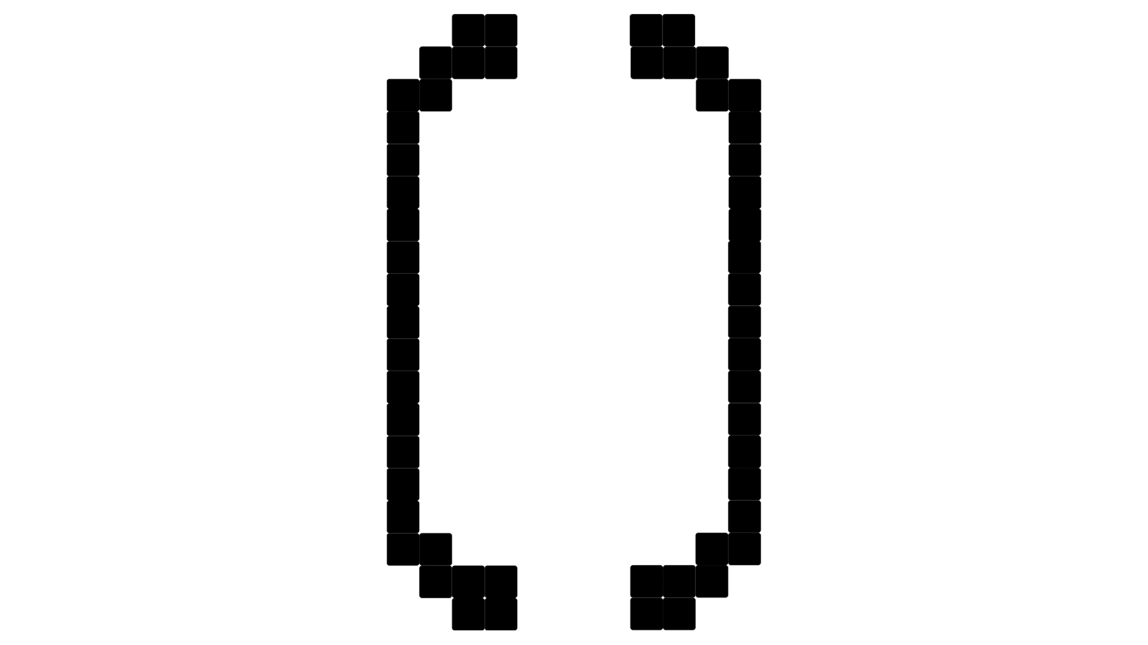
The previous logo featured a minimalist, pixelated design highlighting the company’s connection to digital technology. While functional, its geometric, simple font began to feel outdated in the rapidly evolving tech industry.
While retaining some of its original pixelated elements, the new identity takes on a more dynamic and modern approach. A bold green background now dominates the design, symbolizing fresh ideas and growth, particularly in AI and blockchain technology. The updated font remains simple and geometric, keeping ties to the company’s roots. Still, it has been refined with more contemporary positioning and colors, helping it stand out in a competitive market.
A key aspect of the new logo is how it reflects the company’s name, Redacted, implying confidentiality, privacy, and innovation. The design cleverly conveys these values, aligning with the company’s mission to provide advanced AI solutions while ensuring data protection and privacy. This balance of innovation and security is central to the brand’s identity, and the new design captures it.
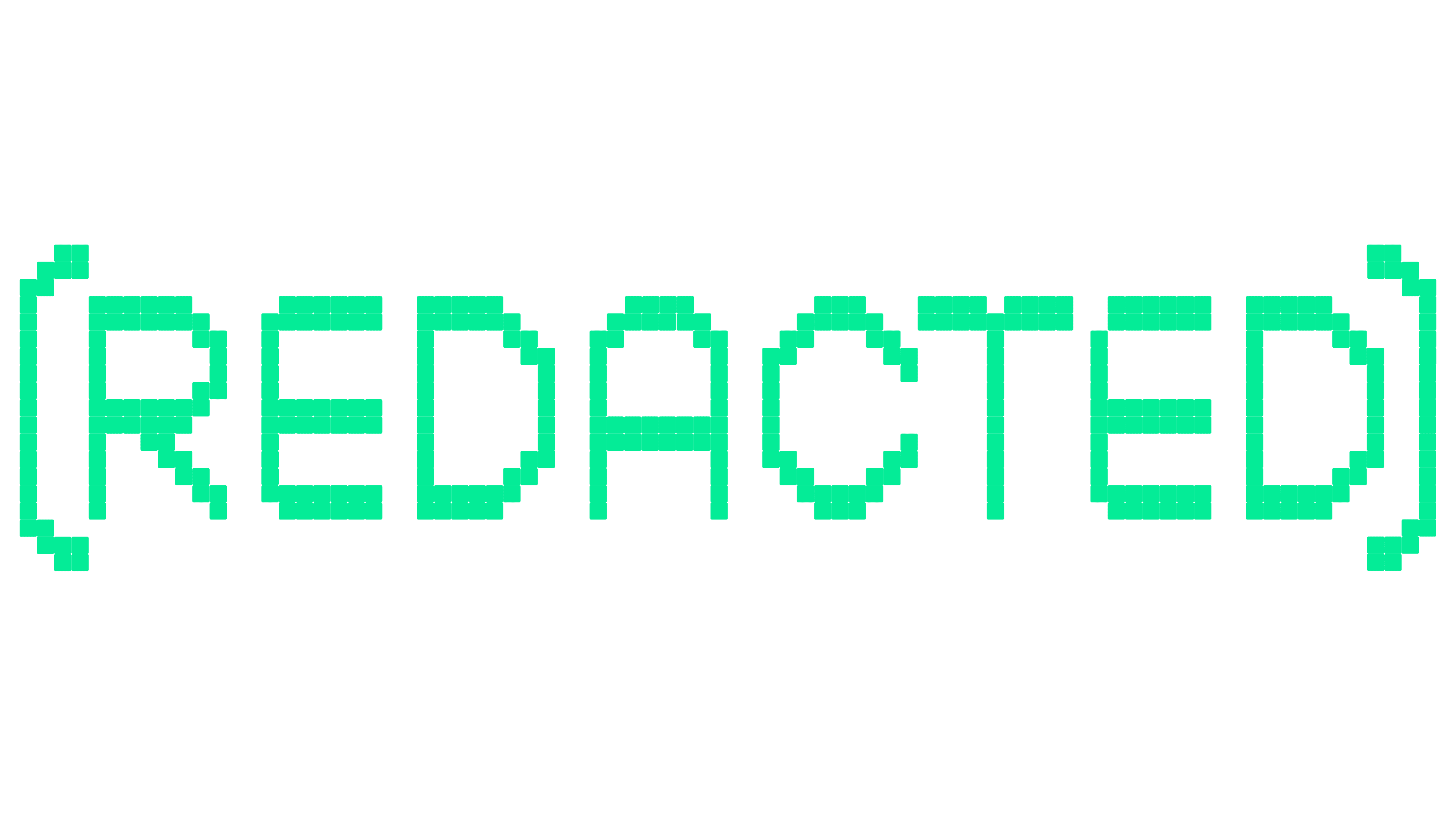
Fold7Design developed the new visual system, incorporating the logo’s fragmented blocks across various brand elements. These blocks symbolize the decentralized nature of Web3 communities, reinforcing the company’s vision of a future where individuals rather than corporations own technology.
As Redacted grows in the tech space, this refreshed identity will help communicate its forward-thinking vision of a decentralized, user-owned future.