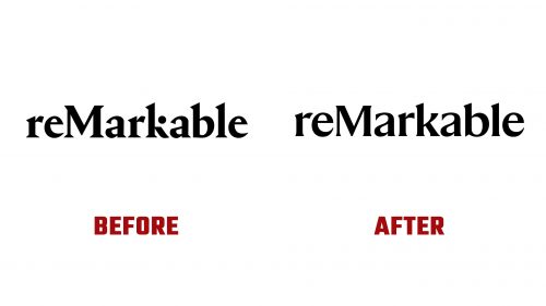
reMarkable, known for its digital writing and drawing devices, recently introduced the reMarkable Paper Pro and an updated logo. These changes reflect the company’s focus on growth while staying true to its minimalist and elegant roots.
The old logo used a serif typeface with unique details, like the dot above the letter “K,” making it distinctive and recognizable. The serif font gave a sense of creativity and precision, aligning with the brand’s reputation for high-quality products aimed at intellectual work and artistic expression. The design balanced professionalism with a touch of playfulness.
With the release of reMarkable Paper Pro, the logo was refined. The new design keeps the recognizable elements but introduces a smoother, more polished look. The most noticeable change is the removal of the dot above the “K,” giving the logo a more cohesive and minimalist appearance. The signature font remains, ensuring continuity and brand recognition, while the overall design feels more modern and balanced.
Keeping the logo in black reinforces the company’s commitment to simplicity and professionalism. Black, a timeless color, emphasizes the brand’s focus on clean, functional design—values central to its identity. The updated logo reflects the brand’s evolution toward a more sophisticated visual identity without losing its core values of simplicity, functionality, and attention to detail.
From the refined logo to product advancements, reMarkable prioritizes perfection, blending technology with a minimalist aesthetic that resonates with its users.


