


![]() Revenge Logo PNG
Revenge Logo PNG
Strange, mystical, rebellious – all that can be said about this brand. The Revenge logo confirms these words, representing an original alloy of creativity and protest against social norms. It contains a huge amount of energy that tears and twists the glyphs. The abundance of smooth lines and sharp ends indicates the desire for revenge.
Revenge began in 2016 in an East Los Angeles garage, created by two 19-year-olds known publicly as Garrett and Han. The brand first appeared on May 27, 2016, through an Instagram photo of a masked person wearing a shirt with the word “revenge.” The geotag read “Start,” with no website, press release, or formal launch.
Before the brand gained attention, Garrett worked as a graphic designer for XXXTentacion, an emerging SoundCloud rapper at the time. By late 2016 and early 2017, the connection turned into a public collaboration. The rapper wore Revenge pieces in photos, videos, and concerts. In June 2017, his XXL Freshman cover, featuring a Revenge hoodie, brought the brand to a much wider audience.
The main item from that period was the Kill hoodie, known for its cropped cut, missing drawstring, large back print, and gothic logo on the chest. It came in seven colors, including a neon version limited to 100 pieces. The drops sold out fast, while resale prices rose sharply. In June 2017, digital artist Wehadnoidea accused the brand of using his fan art without permission, creating its first major public dispute.
In 2018, Revenge worked with Juice WRLD, Ski Mask the Slump God, and other SoundCloud-era artists, adding boxy T-shirts and limited denim jackets. After the rapper’s death on June 18, 2018, resale prices for early pieces climbed, with Kill hoodies appearing on Grailed and Depop for $150 to $500 or more. By 2024, the brand marked its eighth year with an archive sale covering pieces from 2016 to 2024, while keeping its anonymous image, online drops, and rare pop-ups.
Meaning and History
![]()
This brand was incredibly mysterious from the very start. There’s little information about it: who the founder is and what they look like, where manufacturing is centered, who the current owner is, why rapper XXXTentacion severed ties with them, and why the company sells only online… nothing is known for sure. Whether this is bad or good, the fashion brand keeps its fans in suspense and actively sells its products, edging out long-established competitors.
However, it is certain that the name, incorporated into the logo, adorned the brand’s clothing from its debut on Instagram on May 27, 2016. Garette (the creator) placed it in the most visible spot on the sweatshirts and made it as large as possible so the inscription would be readable without looking vulgar. He put his desire to avenge those who treated him poorly into it. Therefore, for him, the brand’s success and recognition represent a harsh form of revenge.
What is Revenge?
Revenge is the most enigmatic fashion brand. It’s based in Los Angeles, U.S., and offers limited-edition clothing. Collections are sold solely online, as the company does not have a physical store. The range includes sweatshirts, hoodies, jeans, and T-shirts. The founder and owner of the fashion brand is Garette, who chose this way to retaliate against detractors and tormentors. The team also included rapper XXXTentacion. In 2017, graphic artist Stephen joined and took over design duties.
2016 – today
![]()
The Revenge logo is textual. It contains nothing but a provocative name. Its style is bold, gothic, and challenging. The inscription has an arch-like shape, although the curve is subtle. The arc effect arises from the varying lengths of the letters, which dip downwards. The closer to the edge, the more they protrude beyond the word’s boundaries, dropping lower than the rest. Conversely, the central glyphs are shorter than the side ones.
The letters feature serifs that look like spikes, needles, and hooks. This is the brand founder’s reaction to external irritants, people who have caused him considerable harm. They have a very interesting shape: they resemble knives, machetes, saws, sabers, and yataghans, which fit into the concept of revenge and resentment towards society.
The symbols are evenly colored, without contrasting points or gaps, which is characteristic of this style. However, they have tiny notches along the edges, like damaged blades. The glyphs are vertically elongated, uneven in width, and primarily lowercase (except “R,” since it is placed first).
Font and Colors
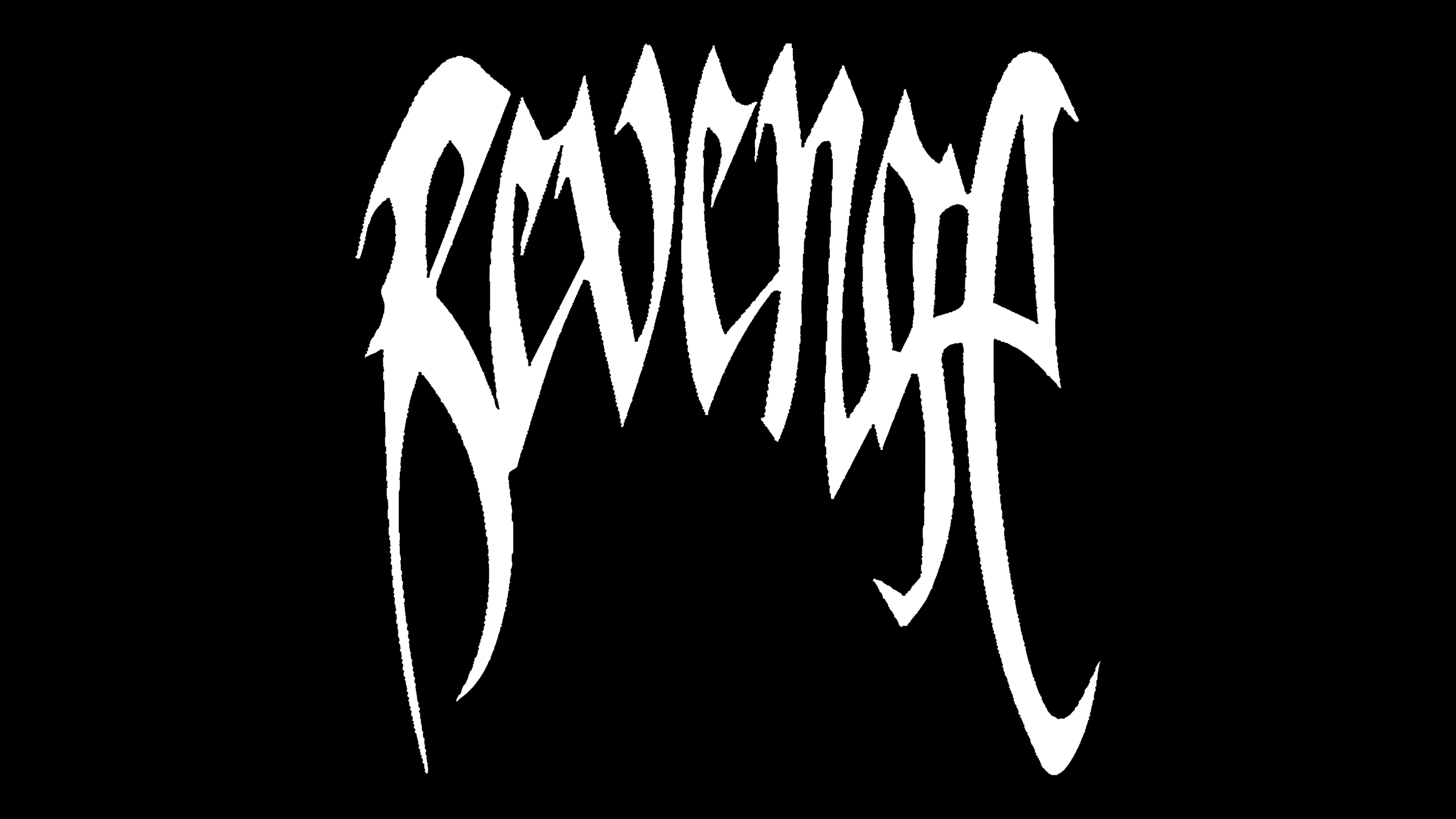
The brand’s logo features a custom typeface inspired by street graffiti. The letterforms resemble sharp blades or scratches made with sudden, forceful movements. This design style evokes street culture, rebellion, and the freedom of self-expression. In execution, the typeface resembles Horst Blackletter and Abaddon by The Scriptorium while retaining unique details and a distinct identity.
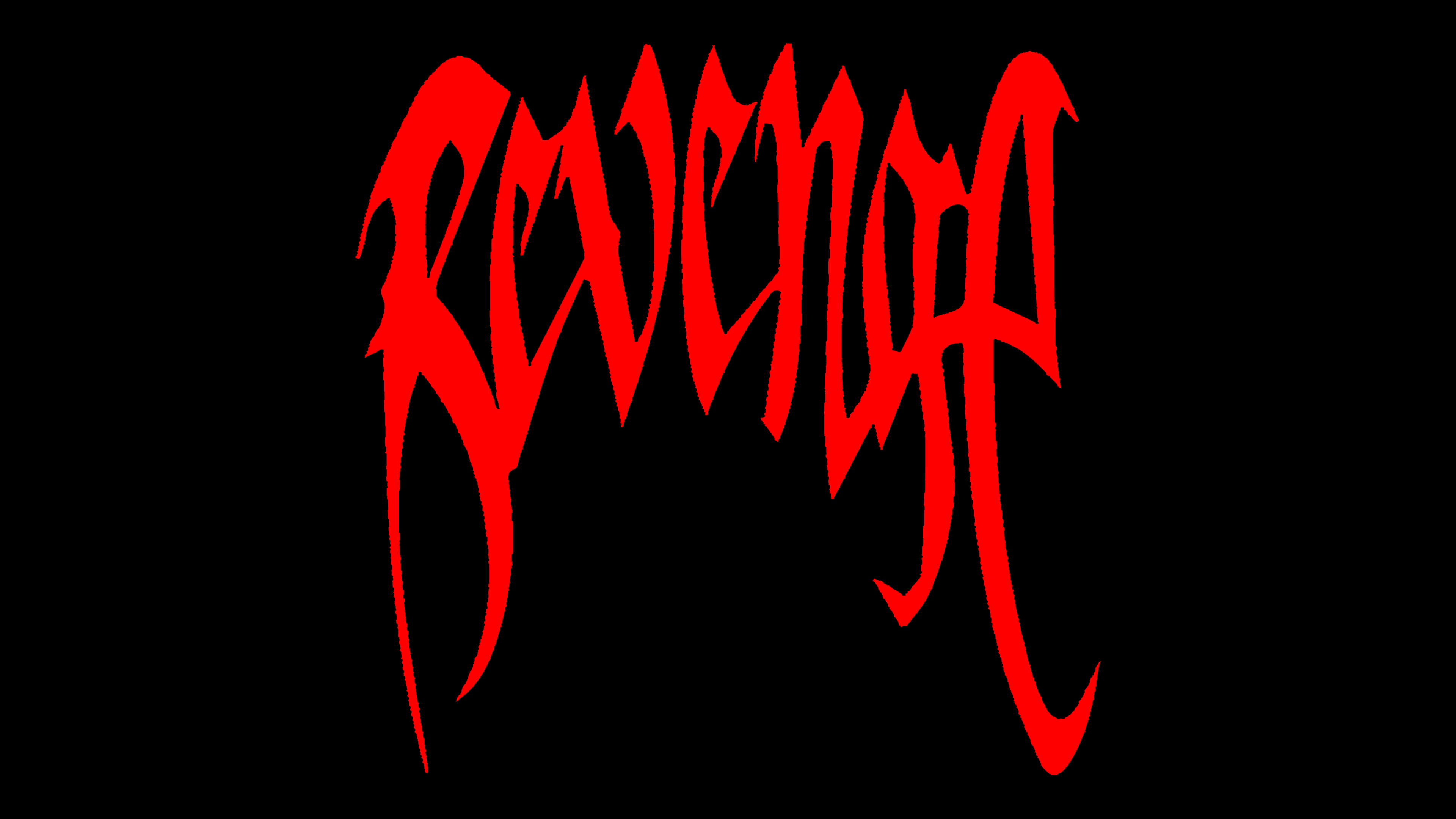
The brand’s color scheme relies on a stark black-and-white contrast. This pairing amplifies the sense of defiance, reinforcing the brand’s focus on protest and dissent. Through this simple yet bold visual approach, the brand presents a striking, impactful image firmly rooted in youth and street culture.