


![]() Rice University Logo PNG
Rice University Logo PNG
The Rice University logo reflects the most important thing: inner wisdom. It also signifies self-realization, luck, intuitive development, transformation, and change. This is important for an educational institution that ranks at the top and produces well-prepared specialists. The elements gathered in the emblem represent the main historical heritage.
Rice University is a higher education institution in Houston, Texas (United States). It is a research university of the highest category, R1. Its structure includes eight academic schools and one sports department, comprising 14 teams. The history of Rice University began in 1891 when businessman William Marsh Rice included plans in his will to create a high-quality educational institution in Houston, Texas. Following Rice’s murder in 1900 and a legal battle to secure his assets, the trustees appointed Edgar Odell Lovett from Princeton as the first president, who guided the creation of the university’s Mediterranean-style campus. The institution opened its doors in 1912 with high academic standards and tuition-free education until the 1960s. Initially known as the Rice Institute, it awarded its first doctorate in 1918 and emphasized strong programs in mathematics and the natural sciences. Despite financial challenges during the Great Depression and World War II, it grew, becoming Rice University in 1960 and officially integrating in 1965. The introduction of tuition allowed expanded research and faculty recruitment, particularly in space science, nanotechnology, and artificial intelligence. Global partnerships flourished in subsequent decades, and in recent years, the university has diversified its leadership, culminating in the appointment of its first African American president, Reginald DesRoches, in 2022. Today, Rice University maintains a 300-acre campus in central Houston, committed to academic excellence and innovation.
Meaning and History
![]()
The question of what to name the new university in Houston was never raised. It was clear to everyone that it would bear the name of the one who aspired to its opening and paid for it with his life. Businessman William Marsh Rice left a will to establish a free university of high standing, but died at the hands of a relative who coveted his fortune. Thus, in 1912, Rice University opened its doors.
The university’s entire visual identity is built around the image of a historical shield featuring an Athenian owl. The chevrons are the coats of arms of 16 families bearing the surname Rice and associated with Houston. Therefore, the shield is the brand’s key and most recognizable element. It is supplemented with a verbal sign – an original typographic inscription developed based on the Trajan font. The main task of the emblem is to convey the aspiration for self-development, wisdom, and influence. Its developer is Pierre de Chaignon la Rose of Cambridge, Massachusetts.
What is Rice University?
Rice University is an American educational institution of the highest category, R1. It appeared in 1912, built on the funds of local businessman William Marsh Rice, a real estate trader, cotton trader, and owner of a railroad-laying company. The university consists of eight schools: continuing education, business, architecture, music, and engineering, as well as social, humanities, and natural sciences. It has its own sports department, whose participants compete in 14 types of sports. The educational institution is located in the city of Houston, Texas.
before 2019
![]()
The key detail of the logo is a heraldic shield proposed in 1912 by Pierre de Chaignon la Rose of Cambridge. It consists of three corners and two roundings at the bottom. Almost all the space is occupied by Athenian owls, which have adorned the emblem since the university’s inception.
These are incredibly important details because they reflect the university’s historical roots, demonstrate its connection to the locality, and pay tribute to the institution’s founder. They are taken from the family coats of arms of Houston families. Two birds are at the top, and one is at the bottom. Between them is a right angle, pointed upwards. Two wide lines form it. The owls have a shadow, which makes them voluminous, and the shield has a sheen.
To the right is a single-line inscription executed in an individual font. All letters are uppercase, bold, high, and decorated with thin serifs resembling spikes. At the base, the glyph is wider than at the end. The right leg of the “R” is so elongated that it touches the neighboring “I.” The text is colored in blue.
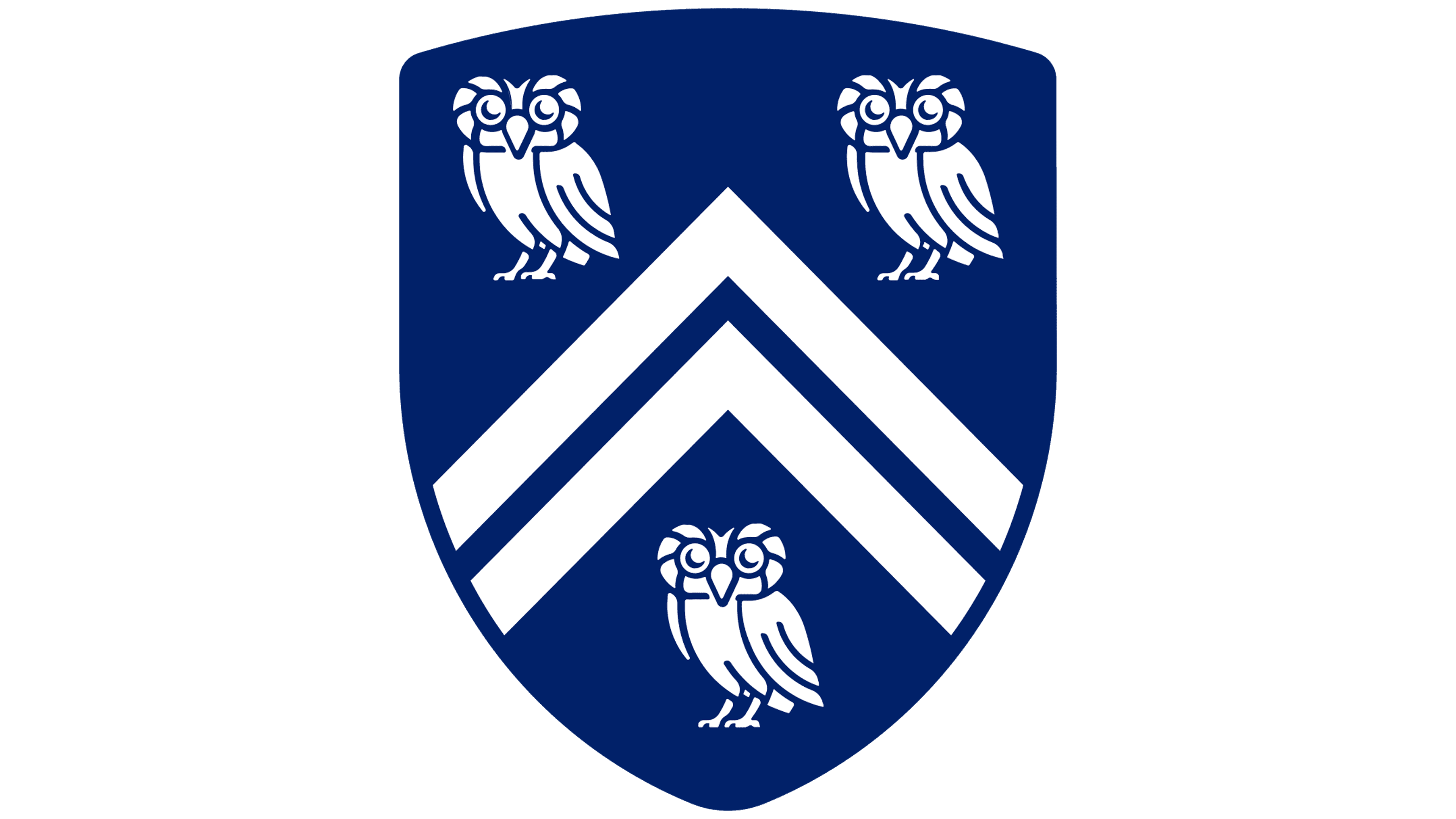
2019 – today
![]()
Designers have flattened the three-dimensional shield. This was necessary so that clear lines and simplicity allowed the logo to be used in typography, on websites, on patches, and in stencil printing, and to be conveyed without distortion on the displays of modern devices. The shield, Athenian owls, and the rectangle dividing them are now reduced in size. Birds and stripes have become white, the shield blue. There are no shadows, glares, or light transitions.
The university’s name remains on the right, but now it’s complete: “Rice University.” The font has been slightly modified, becoming a modern version of the Trajan typeface with Roman uppercase letters and sharpened serifs. At the junction of “R,” there’s a fusion with “I” and “S.” The other glyphs are placed at a slight distance from each other; however, the spacing between them is minimal.
The Seal
![]()
The entire visual identity of this higher educational institution is based on the shield and the Athenian owls, including the academic seal. It was approved in 1912 when it was first introduced by Pierre de Chaignon la Rose of Cambridge. The graphic artist pursued two goals: to show the university’s connection to its location and to emphasize the importance of education. After all, owls are not just a heraldic image. They also embody wisdom, knowledge, honor, luck, and self-realization.
The drawing is done with thin black lines on a white background. There’s no other color palette provided in the official symbol. The shield with three owls and a geometric figure with a right angle is located in the center. Also, horizontal stripes are running from top to bottom. Around them are curved tapes with the university’s slogan: “Letters, Science, Art.” There are several framing rings, including one wide one with the inscription “THE ACADEMIC SEAL OF RICE UNIVERSITY.” The frame is thin.
Font and Colors

The word part of the university logo and seal is set in bold uppercase. The letters are Roman: they have thin serifs. This style is reminiscent of the Trajan typeface, which underlies Rice University’s identity.
The palette is restrained, few, and not bright, just the kind to convey the seriousness of the educational process. It is represented by four colors: navy blue, silver, black, and white.