


 Robert Morris Colonials Logo PNG
The Robert Morris Colonials logo features the university’s letter mark and the team name, with a historical theme. The calm design conveys confidence and a stable playing style. The concept supports the aspiration to maintain a high level of performance.
Robert Morris University, founded in 1921 in Pittsburgh as the Pittsburgh School of Accountancy, began its organized athletic activities in 1963. The university chose the nickname “Colonials” to honor Robert Morris, an influential financier during the American Revolution.
In 1976, Robert Morris joined the National Association of Intercollegiate Athletics (NAIA), establishing formal competition and adding women’s basketball and baseball teams to its roster. A pivotal advancement occurred in 1981 when the university transitioned to NCAA Division I, followed by its membership in the ECAC Metro Conference (later renamed the Northeast Conference).
Facility developments included the opening of the Charles L. Sewall Center in 1985, providing improved basketball amenities. The men’s basketball team achieved its first Northeast Conference regular-season title in 1992, marking a notable athletic milestone.
The introduction of men’s hockey in 2004 and women’s hockey in 2010 further diversified the athletic program. The men’s basketball team made its inaugural NCAA Tournament appearance in 2010 and returned in 2015. The women’s hockey team won its first College Hockey America championship in 2014.
In 2019, the modern UPMC Events Center replaced the Sewall Center, improving the spectator and athlete experience. Robert Morris moved to the Horizon League in 2020, expanding competition opportunities.
By 2023, the university celebrated 60 years of athletics, featuring 15 NCAA Division I teams and continued success in basketball and hockey.
Meaning and History
What is Robert Morris Colonials?
Robert Morris University sports teams compete in NCAA Division I and are based in Moon Township, Pennsylvania, near Pittsburgh. Hockey teams play in College Hockey America and Atlantic Hockey, and the UPMC Events Center and RMU Island Sports Center host basketball, soccer, and hockey games. Bright blue and white colors and a mascot embodying the spirit of one of America’s founders attract loyal fans, and the teams’ participation in basketball and hockey has left a noticeable mark on Western Pennsylvania’s sports landscape.
1996 – 2002
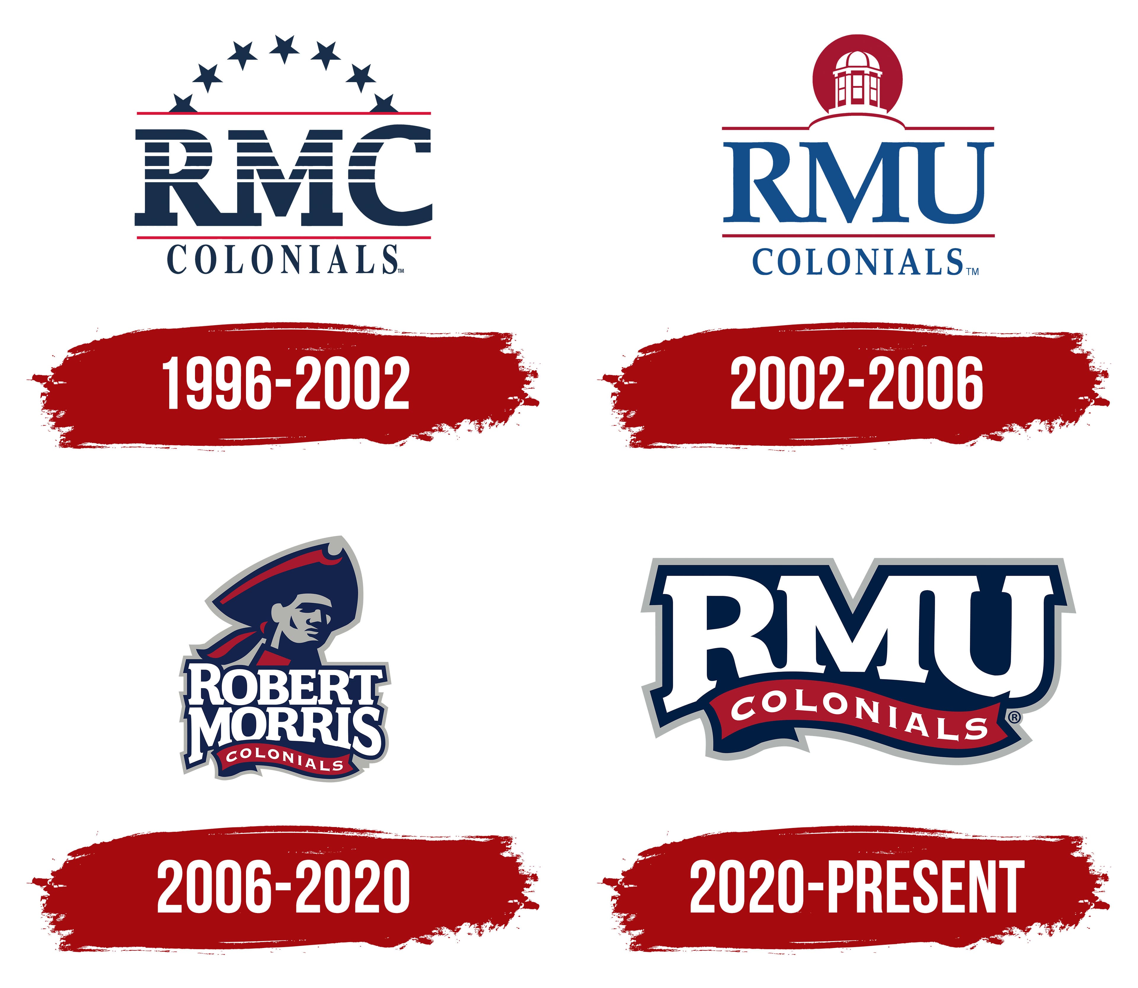
When the institution was known as Robert Morris College, its athletic teams competed under an emblem featuring the monogram “RMC,” set in a bold, dark blue sans-serif typeface. Horizontal lines crossed the upper parts of the letters, resembling elements of the national flag and emphasizing the image’s patriotic character.
Above the monogram was an arc of seven dark blue stars, reminiscent of symbols from early American history and the colonial period. This detail referred to the university’s team name, the “Colonials.”
Two horizontal red stripes unified the composition, placed above and below the abbreviation. The lower line separated the monogram from the word “COLONIALS,” written in large capital letters with a classic serif font.
2002 – 2006
After Robert Morris College officially became a university, the university introduced a new athletic logo on January 14, 2002. At the center appeared a large abbreviation, “RMU,” rendered in deep blue using a traditional serif typeface. These letters symbolized the institution’s new university status.
Above the abbreviation was a red circle featuring the dome of a campus building, highlighting the university’s recognizable architecture. Two horizontal red lines complemented the dome, one above and one below the monogram.
Below the letters was the word “COLONIALS” in blue, set in a classic serif font that recalled the historical heritage and regional traditions reflected in the athletic team name.
The logo appeared formal, concise, and emotionally expressive, underscoring the university’s transition to a new stage in its development.
2006 – 2020
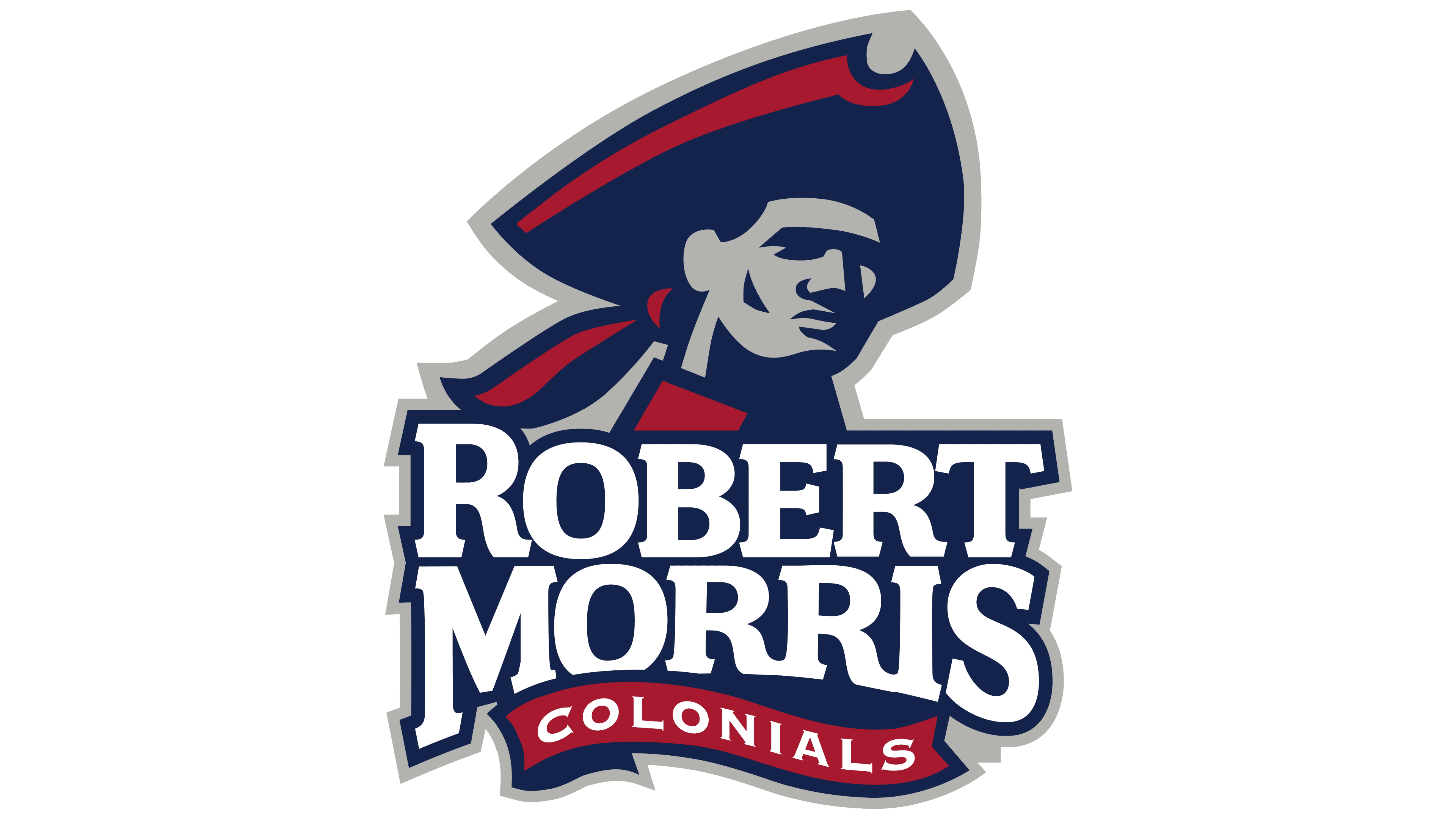
On April 19, 2006, Robert Morris University introduced an updated athletic logo created by Columbus, Ohio, studio Rickabaugh Graphics. The designers aimed to unite the university’s historical heritage and traditions into a single recognizable image.
At the center of the new emblem is the profile of a colonial soldier wearing a tricorn hat. Contrasting shadows define the character’s face, conveying a stern, serious expression. A red scarf under the collar completes the image, emphasizing the historical connection to military uniforms and referring to the team’s name.
Below the portrait, the name ROBERT MORRIS appears in a heavy serif typeface, white on a dark blue background. Beneath it, on a red ribbon, is the word COLONIALS, written in white letters and completing the overall composition.
The emblem’s colors are dark blue, red, and gray. Blue reflects the university’s academic character, red emphasizes its athletic and emotional aspects, and gray adds restraint and simplicity.
2020 – today
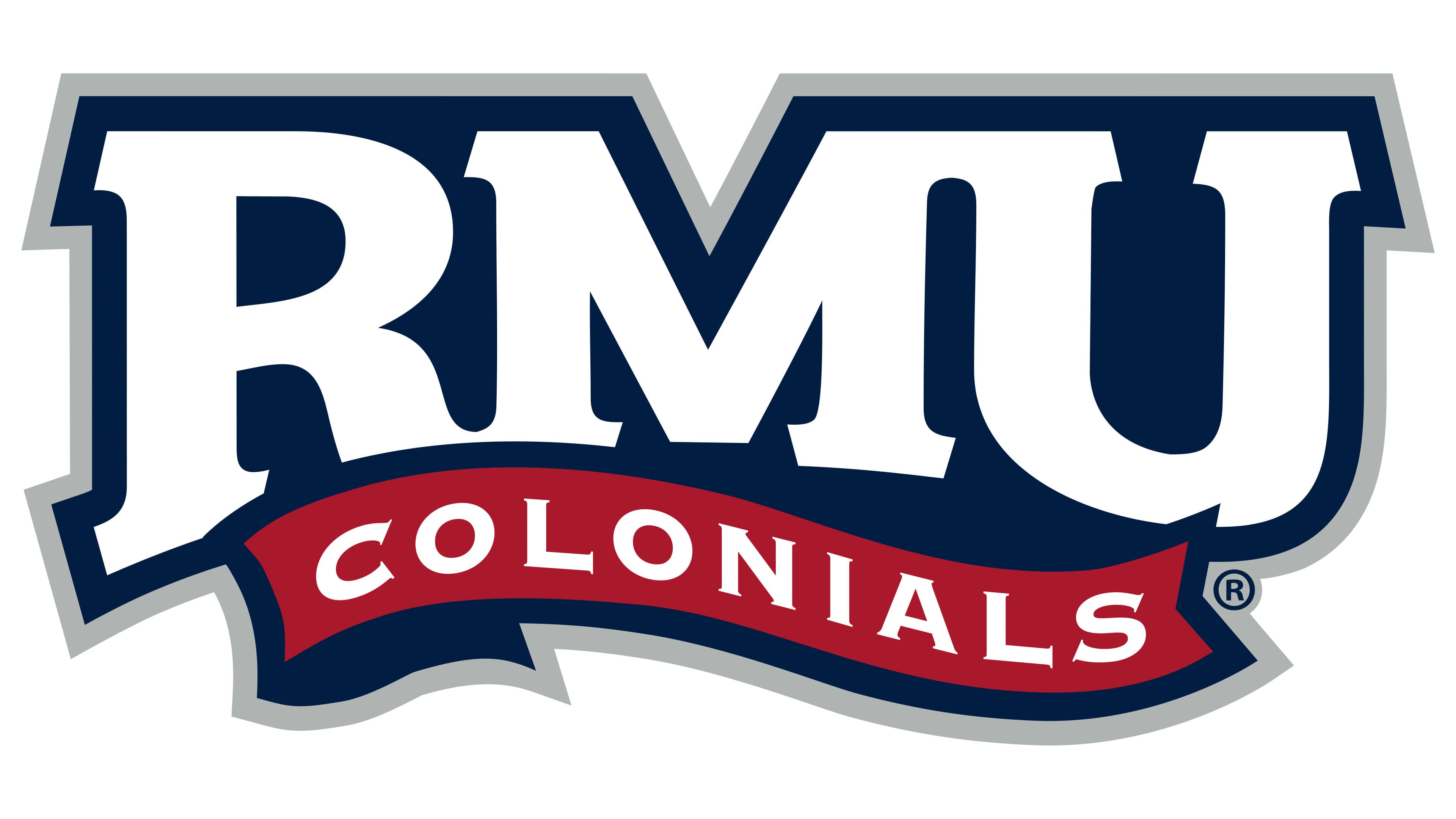
On September 16, 2020, Robert Morris University introduced a new athletic logo as part of the UNITE initiative, developed by the agency Old Hat Creative. Before creating the logo, the agency conducted research gathering opinions from students, faculty, fans, and residents living near the campus. The results helped clarify expectations for the future style of the university’s athletic teams.
In the updated logo, the central element is the large white abbreviation “RMU” set against a dark blue background.
Below it is a red ribbon with the inscription “COLONIALS,” followed by white text that curves along the ribbon. The entire logo is outlined in gray, adding depth to the composition.
The color scheme follows the university’s official colors: dark blue (PMS 282, #14234B), red (PMS 186), and gray (PMS 421).
The new logo style emphasizes modern typography, highlighting academic discipline and athletic focus, moving away from the complex imagery of previous years.