


 Saint Louis Billikens Logo PNG
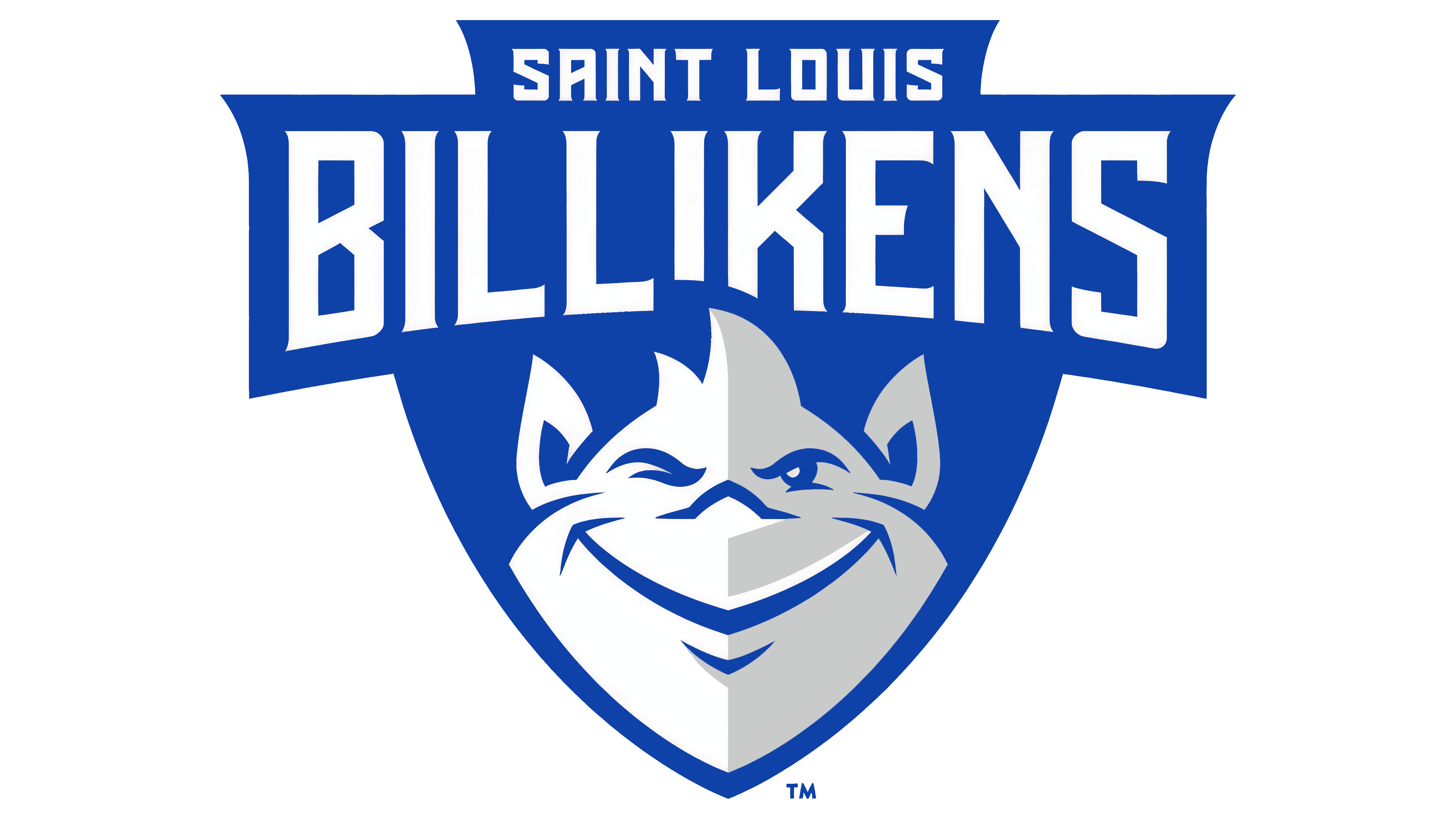
The Saint Louis Billikens logo includes a stylized image of the university’s mascot. It depicts a fictional character with a smile and lively expression, symbolizing optimism and good fortune. The mascot image, combined with bright blue and white, represents the athletic program’s positive attitude, energy, and team spirit.
Saint Louis University, founded in 1818, began its athletic legacy with the Billikens nickname, introduced in 1911 after football coach John Bender resembled the Billiken figurine, a popular good-luck symbol of the era. Basketball quickly became central to the school’s athletics, with the first official team formed in 1914.
Athletic expansion accelerated in the 1920s, notably with the opening of West Pine Gymnasium in 1923. Under Coach Eddie Hickey, the basketball program earned early national recognition in the 1930s and gained significant prestige by winning the National Invitation Tournament (NIT) in 1948, then considered more prestigious than the NCAA championship.
In the 1950s, the team consistently ranked among the nation’s best and made a notable appearance in the 1959 NCAA Final Four. Facilities continued to improve, including the opening of the Bauman-Eberhardt Center in 1967. Women’s sports grew significantly after Title IX took effect in the 1970s.
In 1995, Saint Louis became a founding member of Conference USA, coinciding with the opening of the 10,600-seat Chaifetz Arena in 1994. The university then joined the Atlantic 10 Conference in 2005, which boosted competition and prompted major facility upgrades.
By 2023, Saint Louis Billikens athletics had become a comprehensive NCAA Division I program with eighteen teams, with a notable focus on men’s basketball and women’s volleyball. The program marked its 205th anniversary by further expanding its support for student-athletes and athletic infrastructure.
Meaning and History
What are the Saint Louis Billikens?
These teams from Saint Louis University compete in the Atlantic 10 at the NCAA Division I level, bringing an unforgettable blue-and-white presence to Chaifetz Arena and Hermann Stadium. Known for strong results in basketball and football, these St. Louis-based teams stand out for their unique mascot, which has gained popularity for its image and historical origins as a symbol of good luck.
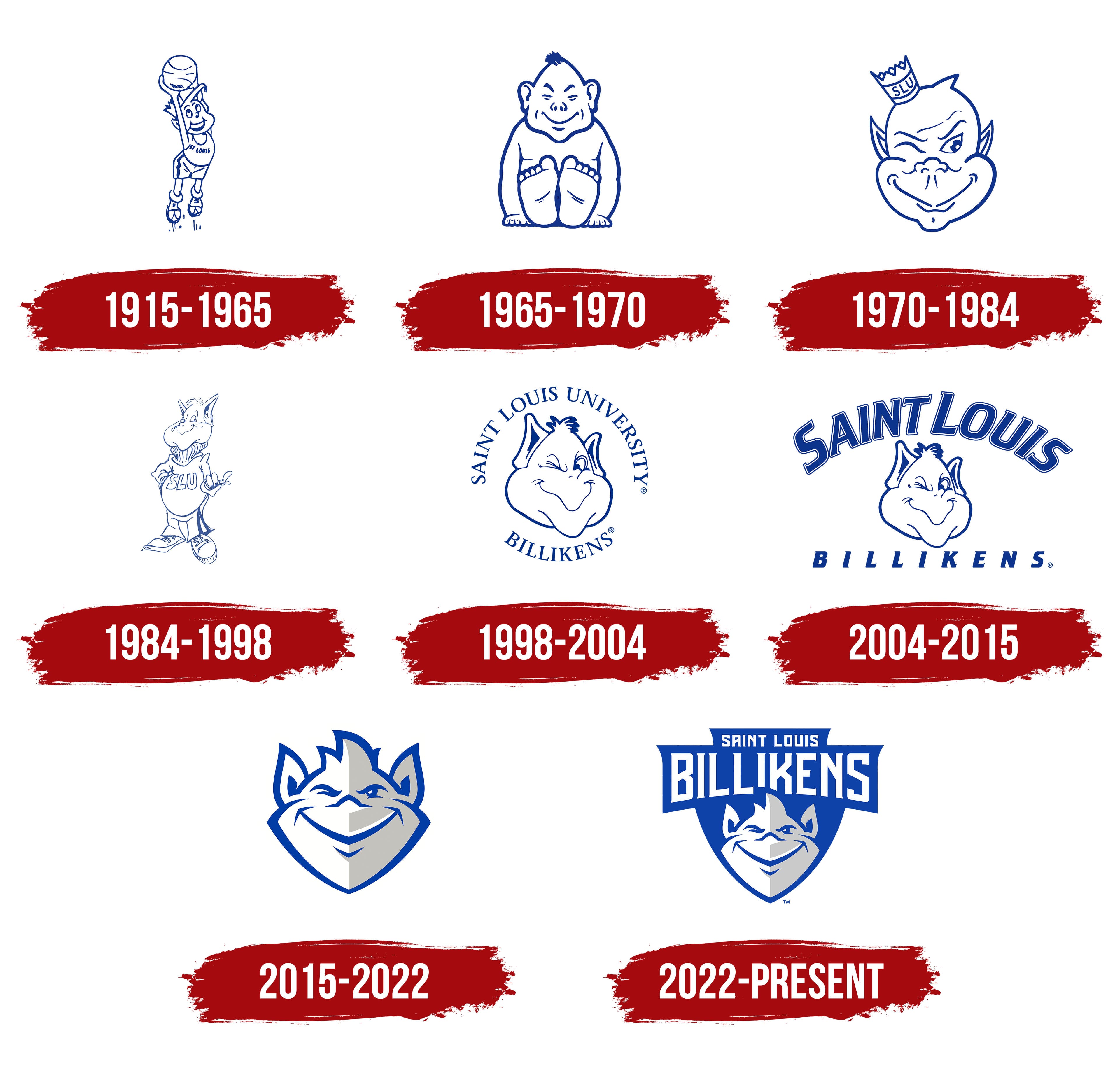
1915 – 1965

In Saint Louis University sports history, the Billiken holds a special place. Artist Florence Pretz first created the cheerful character in 1908. Originally, he was meant as a good-luck charm. By 1911, the name Billiken had become associated with the university teams, partly because journalists noted a humorous resemblance to coach John Bender.
In the logo, the Billiken is depicted as a basketball player jumping into the air, the ball raised in his hands. The character is drawn in a friendly, cartoon-like style with elongated limbs that emphasize lightness and positivity.
The character’s basketball uniform has the word “ST. LOUIS” on it, indicating a connection to the university. The font is simple. The character’s smile stands out as his defining feature. The lines under his feet suggest the Billiken has leaped upward, giving his image a light, carefree look.
The character has no aggressiveness. His purpose was to create positive emotions among spectators and to reflect the friendly atmosphere of university sports at the time.
1965 – 1970

In 1965, Saint Louis University introduced a new Billiken image style that differed greatly from previous versions. Instead of being an active basketball player, the character became a calm, seated figure with a friendly face.
The Billiken is drawn with simple, minimal lines, and the character has a slightly plump build. He sits on the floor with his legs stretched forward and his hands resting on the ground. The face is kind; the eyes are narrow, with a gentle smile and a small tuft of hair on top of the head.
The inscriptions “St. Louis U.” or “Billikens” sometimes accompanied the logo but were placed separately and used as decorative elements on uniforms or promotional materials. The color palette is calm, without bright details. The image was seen as a symbol of luck and well-being rather than competition.
1970 – 1984
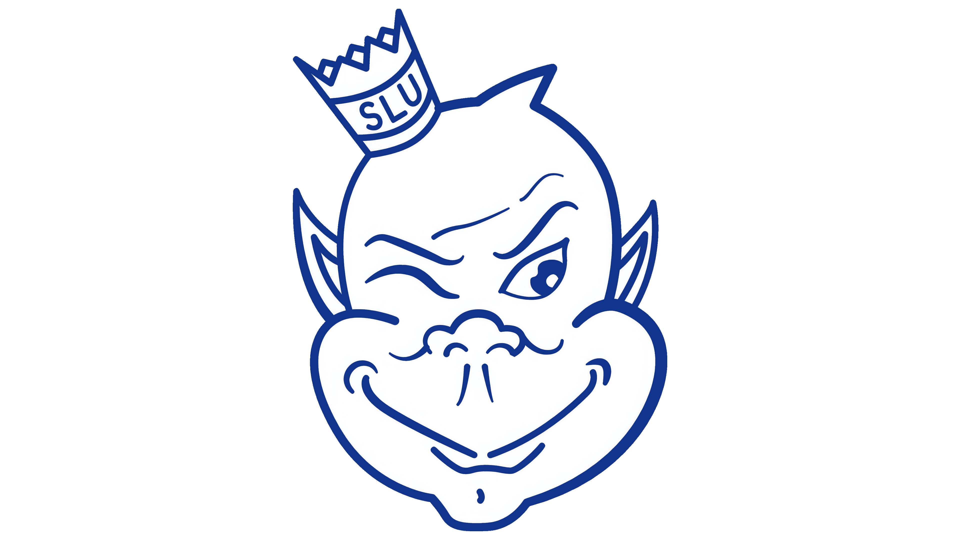
In 1970, Saint Louis University changed its sports team logo style to a simplified, expressive depiction of the Billiken. The logo included only the character’s head, with no athletic elements.
The drawing uses a soft, smooth style. The character’s face looks playful. One eye winks, the other is wide open, and the corners of the mouth turn up in a grin. The pointed ears enhance the character’s mischievous look.
The main feature is a tilted crown bearing the university’s abbreviation “SLU.” The crown adds irony and lightness to the academic image, making it more relatable to fans and viewers.
The overall style resembles a cartoon caricature, emphasizing the team’s positive spirit and openness. The logo feels friendly and non-aggressive, evoking sympathy and a smile.
1984 – 1998
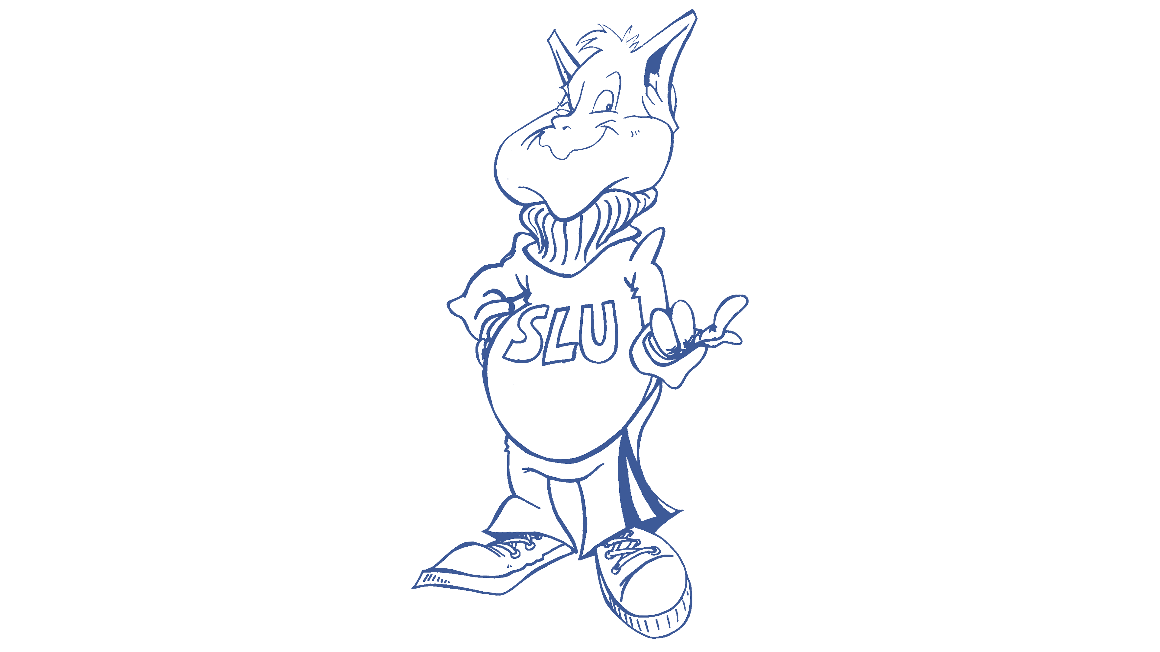
In the mid-1980s, the Saint Louis Billikens team logo once again depicted the character at full height, aligning with that era’s youth and student culture. The Billiken stands in a relaxed pose, slightly turned to the side. His right hand rests on his hip, and his left arm extends forward with an open palm, emphasizing the character’s free, playful attitude.
The figure is recognizable by his large head, wide, friendly smile, squinting eyes, and pointed ears. His face conveys kindness and humor. The character wears a loose sweater with “SLU” inscribed on the chest. The font is simple and matches the casual look. The look is completed with wide pants and large sneakers, typical of the time’s student fashion.
The drawing is neat, with clear lines and light shading reminiscent of mid-80s comic book style. The color scheme uses only white and blue.
1998 – 2004
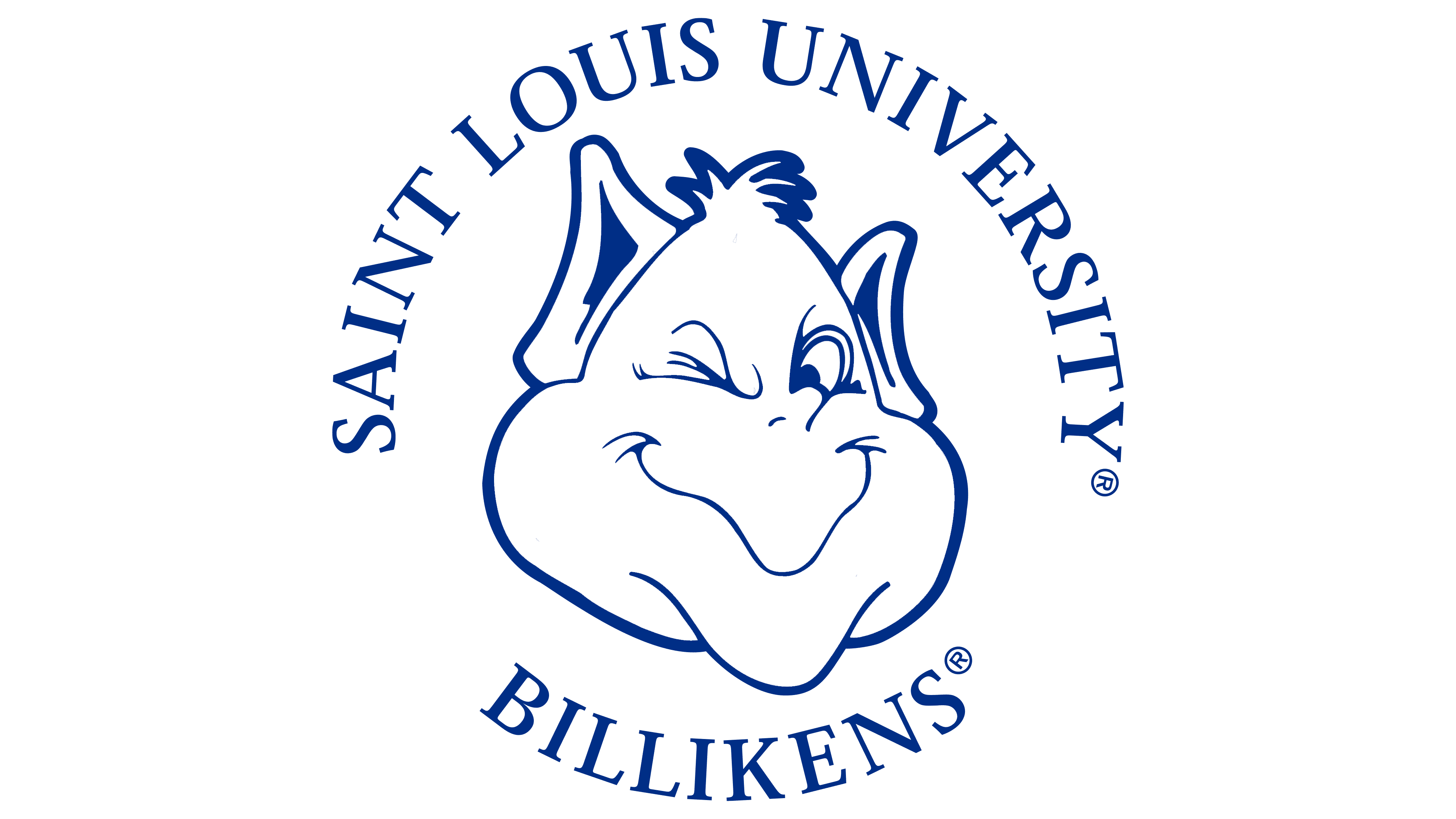
Since the late 1990s, the Saint Louis Billikens’ athletic teams have used a logo featuring only the mascot’s head, with text elements.
The character keeps his recognizable traits. These include a sly squint, raised eyebrow, and wide smile, complemented by pointed ears and tousled hair that make the image friendly and ironic.
Around the image is a circular inscription with “SAINT LOUIS UNIVERSITY” at the top and “BILLIKENS” at the bottom. The font is classic with serifs; the letters are capitalized and evenly spaced, forming a clean circle.
2004 – 2015
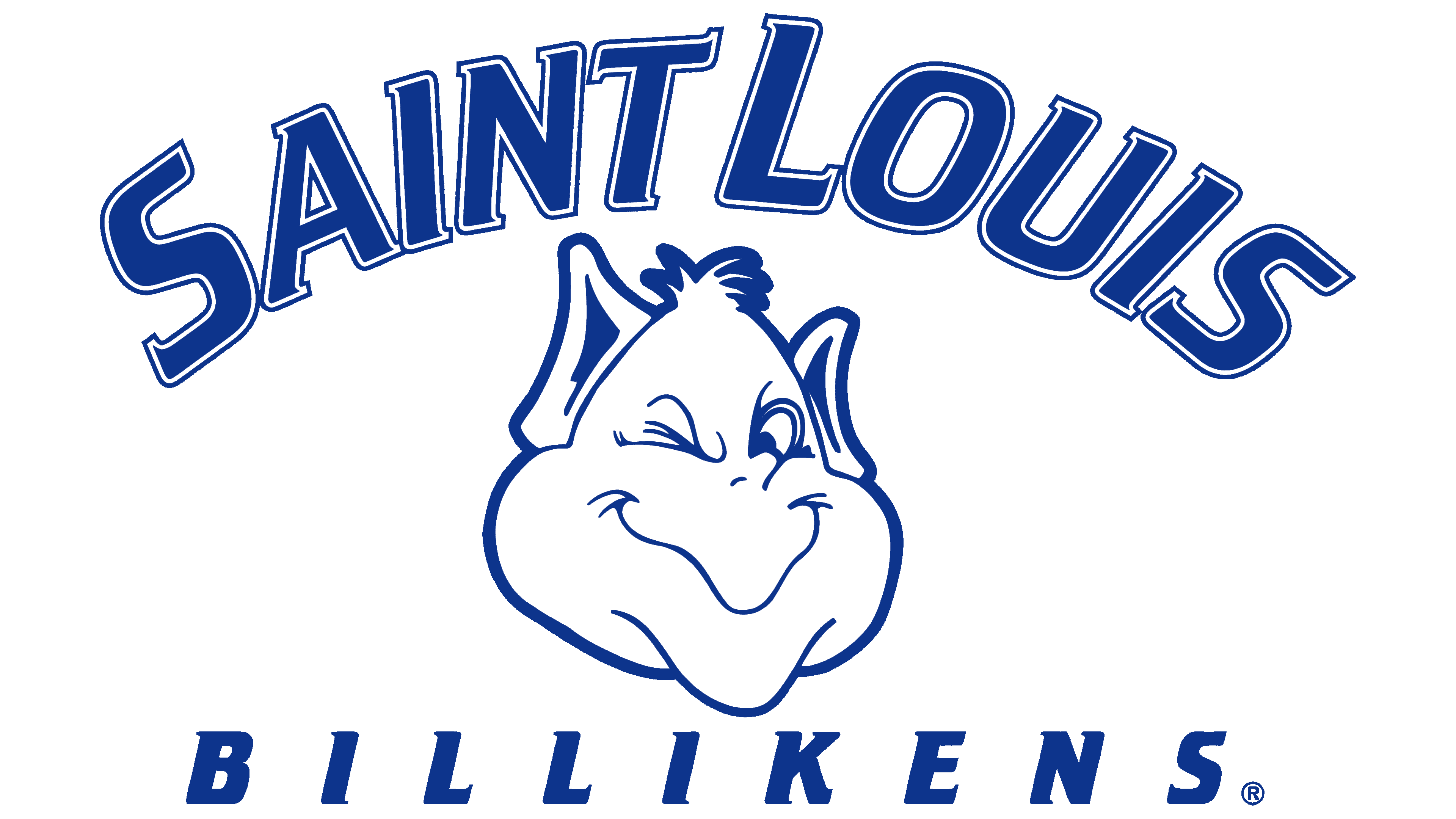
Since 2004, the Saint Louis Billikens athletic teams have used a logo based on the Billiken’s image. His familiar features remain unchanged: the mischievous look, wide smile, pointed ears, and distinctive tuft of hair. The overall design carries over from the previous version, with slightly bolder outlines.
The logo text became more formal and athletic. The name “SAINT LOUIS” is now written in large letters arranged in an arc. The letters have a blue outline and a white fill.
The lower inscription, “BILLIKENS,” is in a straight, horizontal font. The wide letter spacing gives the text a balanced, solid appearance.
The mascot and typography combine to create a cohesive, vivid logo that preserves the connection between generations of fans and reflects the spirit of Saint Louis University’s athletic teams.
2015 – 2022

On November 13, 2015, the Saint Louis Billikens athletic teams introduced a new logo version, developed by the Olson agency in collaboration with the university. The Olson agency redesigned the Billiken character with sharper, more modern features.
The logo now features only the character’s head, without additional elements such as a crown or text. Instead of the soft lines of earlier versions, the drawing uses sharp, bold outlines that emphasize the face’s geometry. The head is divided into two color zones. The left half is white, the right half is light gray, and the head is outlined in blue.
The character’s traits were preserved. The recognizable smile and winking eye remain, but the overall image became more restrained and formal, aligning with the modern style of athletic symbols. Angular lines and pointed ears heighten the logo’s energy and emotion, giving it the feel of a contemporary sports shield.
The team also created an exclusive “Billiken font” for use in sports uniforms, advertising, and university materials. The font comes in two weights and matches the mascot’s overall style.
The new logo is a standalone visual element that doesn’t require accompanying text. It is intended for use in contexts where the audience already knows the university, such as competitions or fan merchandise, in line with current trends in sports design.
2022 – today
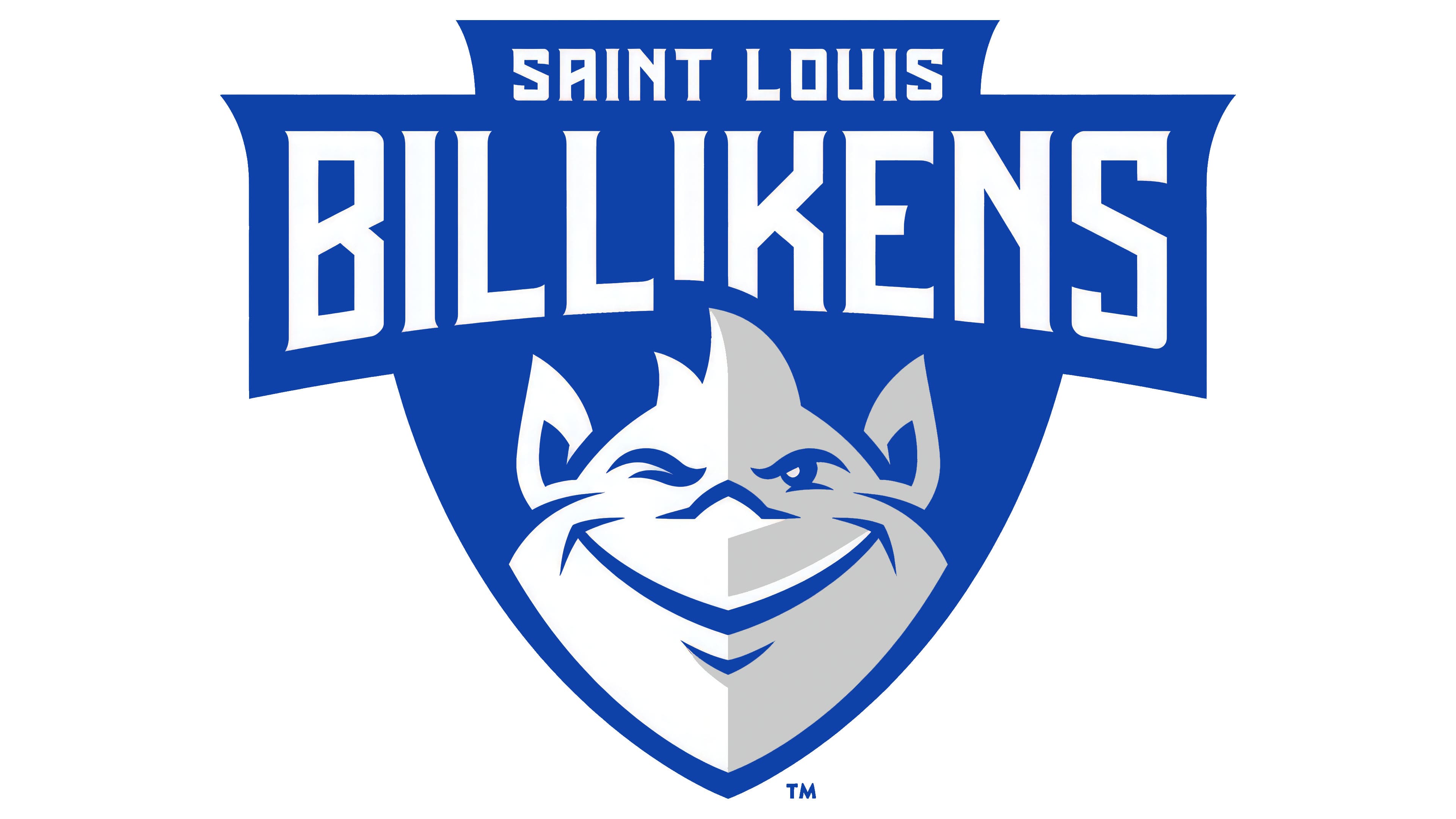
The updated Saint Louis Billikens logo, introduced in 2022, combined the mascot’s features with a modern sports aesthetic. The character, Billiken, retained his familiar traits, including a smiling face, a squinty eye, and a recognizable tuft of hair.
The main part of the logo is a blue shield in SLU Blue (Pantone 293C). The character’s face sits inside and is divided into white and gray halves, creating a dimensional visual effect.
At the top of the shield, the name “SAINT LOUIS” appears in a typeface created specifically for the team: Billiken Bold. The font is geometric and concise. Below it, the word “BILLIKENS” appears in large letters in the same typeface.
The Billiken Bold font appears on the logo, players’ uniforms, souvenirs, and other sports merchandise.
The color scheme uses blue, white, and gray (Cool Gray 3). The palette matches the university’s official colors, helping to identify the Saint Louis teams.