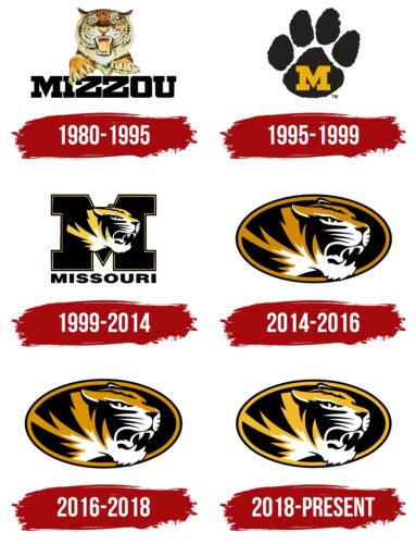
The Missouri Tigers logo is full of strength, passion, and drive. The emblem demonstrates nobility and willingness to fight with dignity in the sports arena for supremacy. The mark conveys the presence of a large number of victories.
Missouri Tigers: Brand overview
| Founded: | 1868 |
| Headquarters: | Columbia, Missouri, United States |
| Website: | mutigers.com |
The Missouri Tigers are the University of Missouri sports team in 13 sports. There are a total of 20 teams, including nine men’s and 11 women’s teams. The Missouri Tigers logo can be seen at SEC and NCAA competitions.
At least one team in each university-sponsored sport is represented among the NCAA (Division I) leaders. This is the only institution of higher education in the state that has achieved similar athletic success. The university regularly contributes prominent athletes to professional teams. The most famous is the varsity soccer team.
Meaning and History
The athletic field at the University of Missouri is actively developing. Over the past 40 years, its logo has changed several times. However, the tiger has always been part of the visual identity.
What are the Missouri Tigers?
An association of sports teams organized by MU students. Since 2021, the movement has been led by its first female director, Desiree Reed-Francois. The main mascot is the Truman tiger.
1980 – 1995
The team logo has the original name of the university and a picture of a real tiger looking out over the lettering.
The word Mizzou is an abbreviation of the state’s ancient name. The capital letters of the inscription show the importance the university plays in the community and the fame achieved through athletic victories.
The image of the tiger on the logo is related to the sports teams’ name, which they officially adopted in 1890. The decision was made to honor those who fought on behalf of the state in the war between the North and the Confederacy. A militia was organized in the county to defend against enemy incursions. It was called the Fighting Tigers of Columbia. Hence the name Tigers.
The animal on the emblem looks very belligerent and is ready to scratch anyone who approaches. It demonstrates students’ strength and readiness to defend the university’s honor on the athletic field.
1995 – 1999
In 1994, the basketball team became the leader of the Big Eight, and the players had a new coach, which was the reason for updating the visual sign in ’95.
The new sport symbol became softer. They removed the aggressive image of a tiger, leaving only a print of its paw, on which the letter M is written – the first letter in the university’s name. The print resembles a friendly greeting, is more in keeping with friendly student meetings, and presents athletes to the world as more friendly.
1999 – 2014
In ’99, the teams returned to the image of the tiger, but in an artistic style. The predator’s muzzle in profile retained its aggressiveness and “loud growl,” but the lack of eye contact directly reduced the sense of direct threat to the viewer. The image was so successful that it had been used in logos for the past 20 years.
The massive letter M with clear outlines increased the weight of the university in the logo, signifying the Missouri Tigers’ affiliation with the institution.
2014 – 2016
In 2013, the Tigers were ranked second nationally due to their participation in the SEC Championship. Their new visual sign showed the team’s growth, moving beyond “kids'” competition. The emblem lacks a hint of a university. The Tigers are known because of their athletic accomplishments, not because of the university. The logo shows some degree of independence from the university.
The head of the tiger looks out of the black oval window. The figure is a sign of harmony and perfection, pointing to the masters of their craft. The beast moves from the darkness into the light. From intramural games to a higher level, from obscurity to glory.
2016 – 2018
All further changes to the sign concerned the color scheme, leaving the image of the tiger in the oval constant. In 2016, the orange hue of the coat became closer to gold to match the team’s primary colors.
2018 – today
The Missouri Tigers logo, created in 2018, only has a color change from the previous version. It still consists of an image of a forest animal (tiger), which stands in an attacking pose. The new logo has a rich yellow color that is more vibrant than the previous version. In general, the logo design remains traditional and recognizable to the team’s fans.
Font and Colors
The athletic teams’ emblem is in the university’s primary colors of black and gold, with the addition of a small amount of white.
- Black – strength, impressive age of the sports movement, attachment to their land.
- Gold – victories, medals, leadership, elite.
- White – youthfulness of athletes, the opportunity to make a career, compliance with the rules.
The combination of colors speaks of nobility and confidence.
The font used in the Missouri Tigers logo is called “Mizzou” and was specially created for the University of Missouri. This font does not belong to any particular family, as it was designed to be a unique identifier for the university.
Missouri Tigers color codes
| Xanthous | Hex color: | #f1b82d |
|---|---|---|
| RGB: | 241 184 45 | |
| CMYK: | 0 24 81 5 | |
| Pantone: | PMS 1235 C |
| Black | Hex color: | #000000 |
|---|---|---|
| RGB: | 0 0 0 | |
| CMYK: | 0 0 0 100 | |
| Pantone: | PMS Process Black C |

