


![]() Nebraska-Omaha Mavericks Logo PNG
Nebraska-Omaha Mavericks Logo PNG
The modern logo of the Nebraska-Omaha Mavericks is abstract, minimalist lettering that emphasizes the team’s name and colors. Although the modern logo is far removed from the original emblem in shape, color, and detail, it still looks unusual among many other logos.
The Nebraska-Omaha Mavericks trace back to October 8, 1908, when Omaha University was founded. Early teams were known as the Cardinals, then as the Indians from 1939 to 1971, with the mascot Oompah. In 1971, after criticism, students voted 18–7 to drop the name, and the university senate confirmed it 27–0. A final vote among the Demons, Mavericks, Roadrunners, and Unicorns gave the Mavericks the win by 51 votes.
Football became the first major success. The program started in 1911 with a 25:0 win over Nebraska School for the Deaf. In 1954, under Lloyd Cardwell, the team went 10–0 and won the 1955 Tangerine Bowl against Eastern Kentucky, 7:6. It later claimed nine North Central Conference titles and reached the NCAA Division II playoffs ten times. Marlin Briscoe became the first Black starting quarterback in the American Football League with the Denver Broncos in 1968.
Softball added a national title in 1975, beating Northern Iowa 6:4, after frequent Women’s College World Series appearances from 1969 to 1979. Wrestling was the most successful program, winning NCAA Division II titles from 1991 to 2011, but was cut in 2011 as the program moved to Division I.
That same year, football was also discontinued due to costs. Nebraska-Omaha entered the Summit League in 2011–12. Hockey, founded in 1997, reached the NCAA tournament in 2006 and 2011, then advanced to the Frozen Four in 2015, competing against the Minnesota-Duluth Bulldogs and the Denver Pioneers.
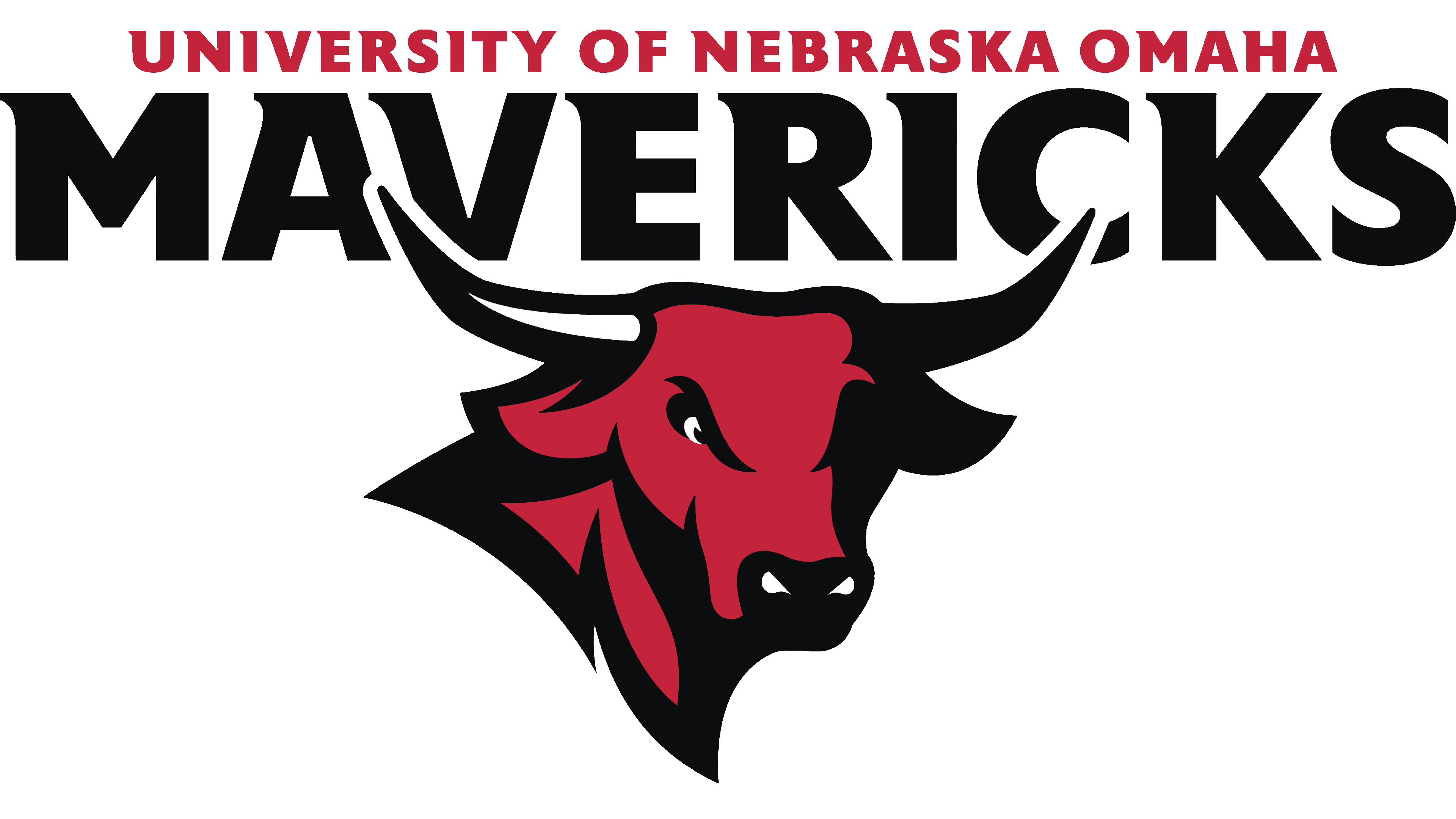
Meaning and History
![]()
Modern versions of university emblems were introduced in 1997, when an unbranded bull was chosen as the main element. This image was used for two periods until it received a new abstract design.
What is Nebraska-Omaha Mavericks?
The Nebraska-Omaha Mavericks (currently known as the Omaha Mavericks) is an athletic department that participates in intercollegiate programs on behalf of the University of Nebraska Omaha. The 16 student teams that make up the department compete in NCAA Division I and are members of The Summit League. The exception is the hockey team, which competes in the NCHC.
1997 – 2003
![]()
The logo of that time depicts a bull’s head with powerful horns. The bull’s expression is stern and grim, as evidenced by its furrowed brows and flared nostrils, as if it is preparing to attack or wants to scare the opponent with a menacing appearance. There are two inscriptions: in the first row, the name “University of Nebraska Omaha” in lowercase; in the second row, the nickname “Mavericks” in uppercase with a curved bottom. The main colors of the logo are red-raspberry, black, light blue, and white. There is also a gray frame.
2004 – 2010
![]()
In 2004, management decided to simplify the palette and abandoned most colors, leaving only dark raspberry, black, and white. They form a contrasting background and create an aura of tension. This is a psychological trick to intimidate the opponent. The style of the drawing also changed: the number of strokes and the number of small details decreased. The words have a dark frame.
2011 – today
![]()
An abstract version is now used, with only the brand palette retained from the previous logos. The design is shaped like the letter “O.” The inscriptions have disappeared.
Font and Colors
The modern version consists of two parts, combined into the shape of an “O.” They depict stylized horns with pointed ends. They do not intersect but run parallel and are directed inward. Moreover, one element is red, and the other is black. The background represents negative space formed by two closed lines.