


![]()
Robin is a UK legal technology platform that combines artificial intelligence and specialist expertise to analyze contracts. The service helps companies save time on document review and reduces the workload for lawyers. Over several years, Robin has expanded internationally and become a tool for large corporations working with vast volumes of contracts.
Previously, the design looked overly strict. The logo included a schematic image of a bird and a restrained typeface. It was neat but resembled a template solution, not reflecting the character of a company that aims to change the approach to legal processes.
![]()
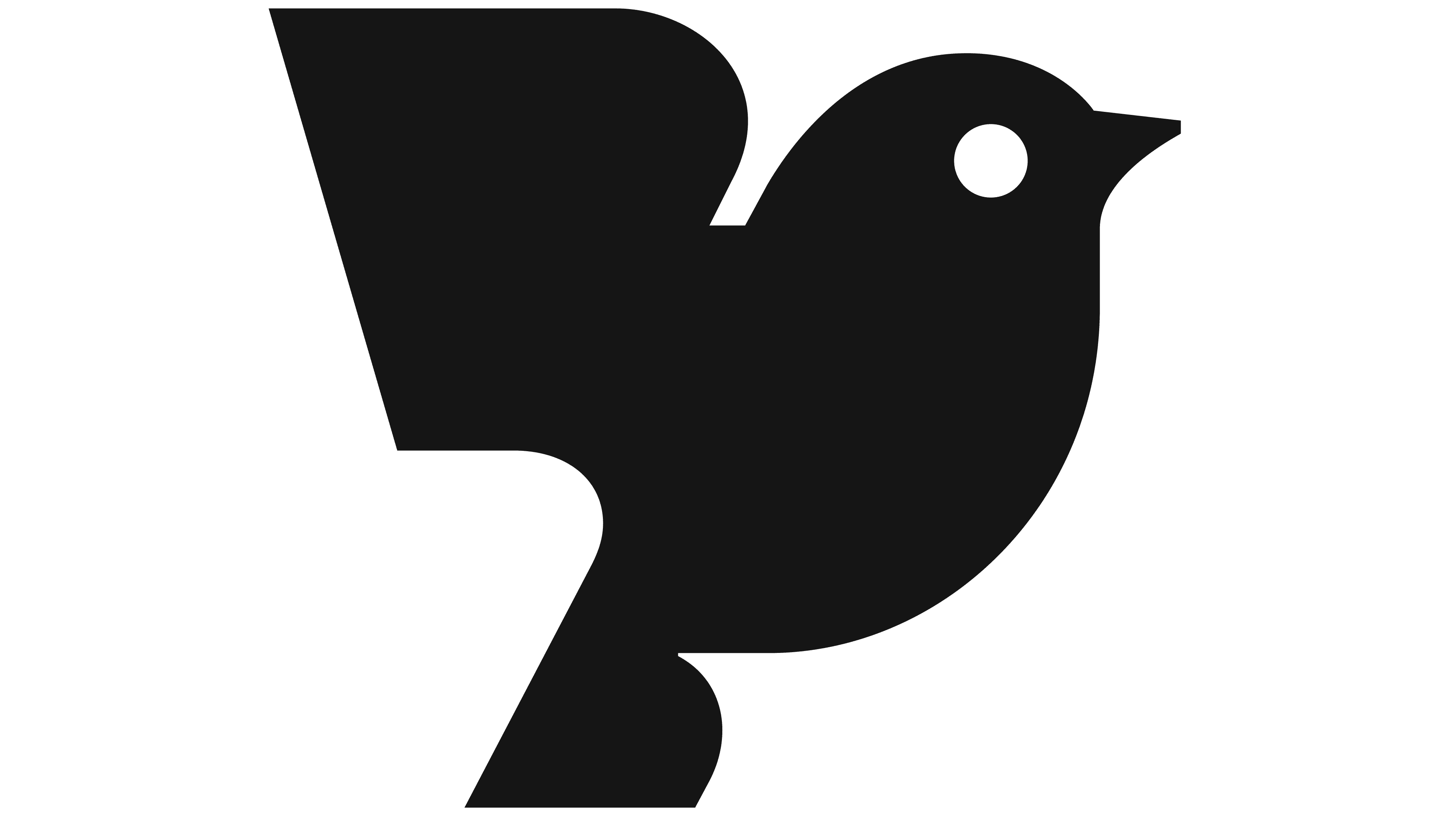
The redesign, created by the agency Otherway, offered a new interpretation of the image. At the center of the mark is now a robin, executed in a geometric style. Its graphics evoke references to traditional stamps or mid-20th-century engravings.
The brand name is now written in the Moret typeface. Its serifs resemble the shape of wings or feathers, creating a connection with the bird motif. For the legal industry, this style looks unusual and gives the brand character.
The company decided to drop the “AI” addition from its name. The platform has evolved beyond being associated solely with technology and has become a standalone brand that is understandable without further explanation.
The color system was updated. Instead of the standard blue, the approved shade is “red breast,” which is linked to the bird in the logo. The color builds a warm tone for the design.
Illustrations by artist Ariel Lee have taken a central role. She created a series of graphic images featuring natural motifs for use in presentations and digital materials. The illustrations are complemented by three-dimensional scenes that help explain the platform’s functionality and benefits.
![]()
Typography has also changed. Texts now use the Rhetorik typeface. Its graphics combine associations with the legal field and a modern technological character. The design appears both formal and contemporary.
As a result, the brand has acquired a visual system that reflects its mission: uniting lawyers and technology. The new style builds trust, demonstrates the company’s maturity, and shows its readiness to operate at an international standard.