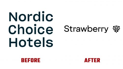
Strawberry, formerly known as Nordic Choice Hotels, has officially unveiled its new brand identity, heralding a new chapter for one of the largest hotel groups in the Nordic region. Since its establishment in 1990, the group has grown significantly, boasting over 225 hotels across Norway, Sweden, Denmark, Finland, and Lithuania. The rebranding comes after the company’s name change in 2023, moving away from its previous identity to embrace a fresher, more distinctive brand presence in the competitive hospitality industry.
The Strawberry logo, designed by Bold Scandinavia, marks a significant departure from its predecessor, aiming to balance playfulness with a corporate sensibility. This reimagining of the brand symbolizes Strawberry’s commitment to innovation and creativity, traits that are increasingly vital in attracting modern travelers looking for unique experiences. The new logo features an abstract representation of a strawberry, conveying seriousness while maintaining an element of fun, which is crucial for standing out in the hospitality market.
Strawberry’s rebranding effort is not just a superficial change but reflects a deeper transformation within the company. The new identity is designed to resonate with a broad audience, from business travelers to leisure guests, emphasizing the group’s diverse portfolio that includes well-known hotel brands such as Comfort Hotel®, Quality Hotel™, Clarion Hotel®, and Clarion Collection® Hotel, alongside more than 40 independent hotels under its subsidiary, Nordic Hotels & Resorts. Furthermore, the company’s expansive operations encompass 120 restaurants, 20 spas, gyms, meeting spaces, and arenas, employing nearly 17,000 people.
The strategic decision to adopt such an unconventional name in the corporate world is bold, reminiscent of other industry disruptors like Orange in telecommunications or Apple in technology. This uniqueness is further accentuated in the logo’s design, which opts for a sophisticated abstraction over a literal fruit depiction, avoiding clichéd associations and creating a distinctive visual identity.
The wordmark complements the logo’s iconography with a clean, serious sans serif font, punctuated by playful dots in the “r”s that echo the Strawberry’s seeds. This careful balance of elements contributes to a brand image that is both welcoming and professional, embodying the essence of modern hospitality.


