The Roche logo is associated with discoveries, research, and innovations, which are the company’s primary focus. It is versatile enough to represent both of the business’s directions: pharmaceutical manufacturing and the production of diagnostic materials.
Roche: Brand overview
Meaning and History
The company, a pioneer in synthetic vitamin C and a recognized leader in oncology has long searched for a visual style that would unify its various business directions. Though Roche was founded in 1896, its logo with the blue-and-white diamond only started being used in 1967. Since then, this symbol has appeared everywhere – from advertisements and business cards to stationery and packaging. It has become a well-known symbol in the healthcare industry as drug manufacturers continue to make discoveries in the pharmaceutical and biotechnological industries.
What is Roche?
Roche is a transnational company known for creating innovative cancer drugs. It is based in northwest Switzerland in Basel, the same city where Fritz Hoffmann founded it in 1896. The company has two major divisions: diagnostics and pharmaceuticals. The former focuses on developing tests, reagents, and equipment for laboratory research. The latter covers the production of drugs for oncological, metabolic, and viral diseases.
1896 – 1967
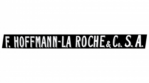
In 1896, Max Carl Traub left the company Hoffmann, Traub & Co. Fritz Hoffmann-La Roche became the sole owner and immediately renamed the brand in his honor. The inscription “F. Hofmann-La Roche & Co. S. A.” proudly adorned advertising signs, immortalizing the name of the Swiss businessman. One version of the logo was done in a retro sans-serif font. The diagonally cut ends of the strokes matched the fashion of the time. Most letters were in uppercase, except for the “o” in “Co.” The text appeared three-dimensional due to the contours thickened on the right and bottom. The impression was intensified by the color contrast: a dark background behind white glyphs created a sense of depth.
1967 – today
Since 1967, the company has incorporated the most well-known part of its name – the word “Roche” – into its logo. It is written in blue letters inside a white hexagon, symbolizing harmony and the universe. The geometric shape’s perfect symmetry demonstrates a commitment to balance in all aspects – from research activities to the production of medical drugs and diagnostic equipment.
Font and Colors
The name Roche is executed in a simple geometric sans-serif font. Its elongated letterforms resemble the Accidental Presidency Regular font by Tepid Monkey but with smoother and more rounded curves in the wordmark.
Both the inscription and the logo’s outlines are colored in bright blue (#007AC2). This color is traditionally used in medicine as a symbol of calmness, reliability, and trust. The inner space of the hexagon is white, a color typically associated with sterility and cleanliness.
