


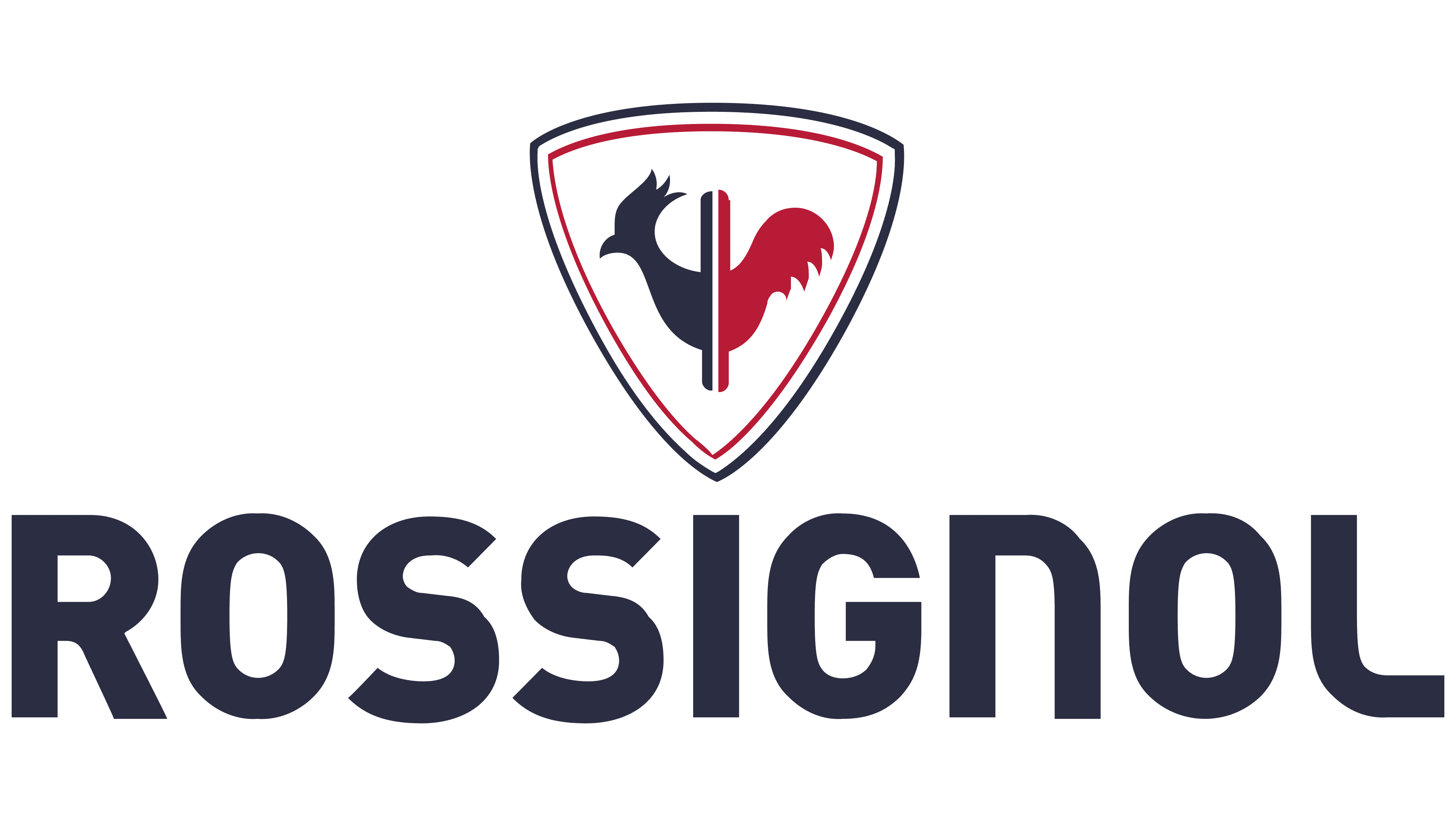
![]() Rossignol Logo PNG
Rossignol Logo PNG
The elegant Rossignol logo exemplifies a sophisticated French style. With soft lines and a suitable color palette, the designers conveyed the ideas of care, reliability, and safety. These are very important characteristics for a company that produces clothing and equipment for extreme sports.
Rossignol began in 1901 in Voiron, near Grenoble, where Abel Rossignol opened a workshop making wooden parts for the textile industry. A skier and skilled carpenter, he made his first pair of solid-wood alpine skis in 1907. The skis won first prize at a Touring Club de France contest. In 1911, he separated ski production into a separate line within the company.
For three decades, Rossignol produced solid-wood skis in growing volumes. In 1936, Émile Allais joined as a technical consultant and official tester. A year later, he won all three events at the World Championship in Chamonix: downhill, slalom, and combined, using Rossignol skis. In 1942, Abel patented the laminated wood Olympic 41, later used by Henri Oreiller for Olympic gold at St. Moritz in 1948.
By the mid-1950s, the decline of the textile industry put the factory at risk. In 1956, Laurent Boix-Vives bought the family business for $50,000 after support from Émile Allais. He stopped textile production and focused the company only on skis. At the time, the factory made 8,000 pairs a year.
Rossignol then moved into metal- and fiberglass skis. The Allais 60 brought Jean Vuarnet downhill gold at the 1960 Squaw Valley Winter Olympics, while Head was rising in the US market. In 1964, Strato became the first Rossignol fiberglass ski and passed one million pairs sold. Later, the group added Dynastar, Lange, and Look. Ownership passed to Quiksilver in 2005, Bruno Cercley in 2008, and Altor Equity Partners in 2013.
Meaning and History
![]()
For more than a century, the ski company’s logo has changed many times. Each rebranding marked a change of ownership and a new stage in business development.
What is Rossignol?
This is a brand specializing in gear and apparel for winter sports. It became well-known for its high-quality alpine and cross-country skis and snowboards, designed with years of expertise. In addition to ski equipment, the product range includes winter clothing, helmets, goggles, and accessories for enthusiasts and professionals. The Hero collections for athletes and the Experience line for active recreation are particularly popular. The brand also offers stylish après-ski clothing that combines modern technologies with elegant design, suitable for both the slopes and everyday life.
1907 – 1936
![]()
The company’s first logo is simple and concise. It is directly related to the creator’s type of activity. Abel Rossignol was a carpenter. He was engaged in woodworking: he made coils and other parts for fabric production and, simultaneously, wooden skis.
On his products, he affixed a seal in the form of two circles, one inscribed in the other. This trademark helped distinguish Rossignol products. The round shape was best suited for marking coils, and later it was transferred to skis.
The space inside the emblem remained transparent. As a background, a wooden base. This resembled wood burning.
In the strip between the circles, there are inscriptions: the manufacturer’s name and surname, plus the city and department where the product was produced: Voiron in Isère. No hidden ideas or subtext. Concise basic information.
1936 – 1956
![]()
Abel came to grips with skiing quite successfully. Under his leadership, a group was already working in a small production building. From the 36th year onward, the Olympic medalist Émile Allais, who wore Rossignol products in competitions, began advertising and representing the brand.
The logo of this period has changed dramatically. It represented the enterprise’s name: Établissements Abel Rossignol (Institution of Abel Rossignol). The word “institution” was shortened to the usual French abbreviation ETs.
The only similarity to the previous sign is its simplicity and conciseness. The main emphasis was placed on the owner’s name, which, at the time, was a guarantee of quality among customers. Neither sign gives a clear idea of what the company does.
The capital letters indicate the brand’s market weight; after a year into the contract, Allais won the world skiing championship over Abel. This increased the demand for the products. By 1956, up to 8,000 pairs per year were produced.
1956 – 1987
![]()
Laurent Boix-Vives acquired the company. The young businessman was passionate about skiing and helped develop Courchevel as a resort. He immediately abandoned Rossignol’s other woodworking areas and concentrated on skis. Over five years, Laurent increased production by more than sixfold.
The new logo, developed after the purchase, reflects the idea of development. The image is fresh and modern. And although it is still very concise, only the name Rossignol is more a common brand feature than a reflection of the owner’s ineptitude.
The founder’s name was removed from the title. Now, the brand for users was more closely associated with Nightingale (translated from French by Rossignol). Riding on the company’s skis is as comfortable and beautiful as a bird’s bewitching song. The nightingale resonates with nature, forests, outdoor walks, and good moods.
Bold font and capital letters are preserved. They are symbols of achievements and victories, both in business development and in sports, across brand products. The forward inclination of the inscription signifies movement, activity, and competitive spirit. The brand strives for the future and will not stop there.
1987 – 2006
![]()
By 1987, Rossignol had become the world leader in its sector. Up to 8,000 pairs are produced per day at the group’s factories. The company decided to expand the range and released the first snowboard.
The company logo becomes more presentable, and the inscription font changes. Loops and sharp bends of mountain routes can be traced in the letters. This similarity is reinforced by the emblem placed above the name.
It is made in Japanese style. This is a tribute to the Mitsui & Co group, of which I have been a member since 1972. It is a red circle with a white letter R that resembles a hieroglyph. Its curved right side is reminiscent of a slalom or snowboard downhill, while the left side is reminiscent of a springboard.
The white line also makes the emblem look like a Yin-Yang circle, the struggle of opposites. It embodies two areas of the company’s activity (luggage and snowboards), in each of which it achieved world leadership.
Red is a symbol of energy and pressure. In Japan, it symbolizes the rising of the sun. Therefore, for the brand, it predicts a rise to the heights and prosperity.
2006 – 2019
![]()
In 2005, Rossignol was bought by another sports firm, Quiksilver, and although the ownership did not last long – only three years – the change of ownership was reflected in the visual identity.
Large, flowing capital letters indicate well-crafted materials with a smooth, streamlined finish, essential for skis and snowboards. This is a tribute to fiberglass, which was used during production. Letter bends have retained their resemblance to mountain trails. But they have become closer to the main profile of the new owners’ water sports.
The red circle at the top remains, but the R has become increasingly sharp, evoking associations with samurai. This is due to the release of skis for Freeskiing, a sport that involves tricks, jumps, and obstacle courses. The owner of Quiksilver was fascinated by Japanese culture and designed his brand’s logo based on a painting by Katsushika Hokusai.
Therefore, he also retained the Japanese style in Rossignol’s emblem.
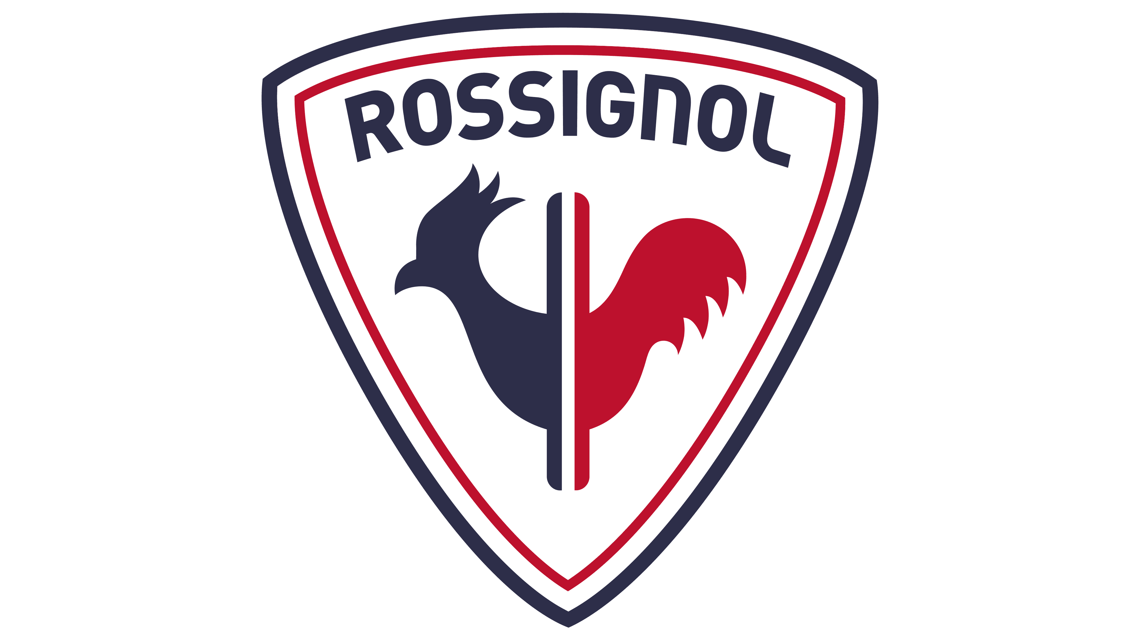
2019 – today
![]()
Altor Equity Partners has been the company’s main owner since 2012. However, the owners were in no hurry to change the visual identity. The image revision was required after adding another product type, bicycles, and a strong decline in sales. The owners had to come to grips with brand promotion to keep the company afloat.
The logo concept has been completely changed. The name Rossignol is placed in large letters at the beginning, and behind it is an emblem that is fundamentally different from the previous ones.
The triangle shape with rounded ends and double piping is reminiscent of a badge on sportswear. Inside it is a silhouette of a rooster, split in two. The bird is a symbol of France and is often featured in the emblems and uniforms of sports teams. Therefore, the image brings the logo closer to France and sports. The dividing line is associated with several items:
- Flag of the country: three stripes of unusual shades of blue, white, and red form the tricolor.
- Two skis of different colors are the main product from which production began.
- Tricolor snowboard.
- A bicycle wheel with a rooster inside moving forward.
- Three types of sports equipment are produced.
The fluttering feathers of the bird, like tongues of flame, demonstrate energy and the Olympic flame.
Font and Colors
Most of the Rossignol logos are in black. It is a symbol of strength and confidence. The first and last signs are made in dark blue-gray. It is softer, warmer, and more friendly. It is associated with winter sportswear. The latest emblems are complemented by red hues, demonstrating the brand’s love for its work, active movement, and the competitions it constantly sponsors.
The font is similar to DIN 2014 ExtraBold, but with modified N and L characters, stylized to resemble the smooth turns of ski slopes.