


![]() Rotary Logo PNG
Rotary Logo PNG
The Rotary logo designers encapsulated the organization’s core values, such as global cooperation and community service. Its unique shape symbolizes perpetual motion and energy, representing the unity of club members in achieving common goals.
Rotary International was founded on February 23, 1905, in Chicago by lawyer Paul Percy Harris, initially as a social and professional networking group. Harris, alongside three colleagues, envisioned regular meetings among business professionals that rotated between their offices, inspiring the name “Rotary.” Soon recognizing the potential for greater impact, Rotary expanded its mission to include community service, rapidly growing into an international humanitarian organization. As clubs opened across the U.S., Canada, and Europe, the organization took an active role in global initiatives, notably establishing the United Nations in 1945. Rotary further developed extensive youth and educational programs, introduced ethical guidelines such as the “Four-Way Test,” and launched PolioPlus, a monumental polio eradication campaign that reduced polio by over 99%. Today, Rotary International unites over a million professionals worldwide, continuously adapting its humanitarian projects to address contemporary challenges and foster international cooperation.
Meaning and History
![]()
The same logo featuring a wheel is used to identify all Rotary clubs and members worldwide. This emblem appeared simultaneously with the organization, but it wasn’t until 1924 that it received its permanent design when the Board approved its standard form. In the initial years, the wheel underwent continuous change, acquiring new details, many of which were incorporated into the final version.
The original logo was created in 1905 by Montague M. Bear, a Rotary member. He first depicted a wagon wheel with 13 spokes, but after complaints about its dullness and simplicity, he added clouds to make it appear as if it were rolling through the sky. Some members thought these were not clouds but dust, strangely rising from both sides, so Bear had to cover the bottom part of the emblem with the inscription “Rotary Club.”
In 1912, a conference in Duluth decided to add protruding teeth to the wheel’s outer edge, an element intended to complicate the design and create a sense of strength. The spokes’ thickness was increased to convey sturdiness. However, there was still no standard design: each club could interpret these requirements in its own way, so over the next six years, many different Rotary emblems were created with varying numbers of spokes and teeth, as well as various decorations. To address this, the Board tasked Oscar Bjorge from Duluth and Charles Mackintosh from Chicago to develop a standard design for all clubs.
What is Rotary?
Rotary is a humanitarian organization founded by Chicago lawyer Paul Percy Harris. Its first club opened in 1905, and by 1910, its number had increased to 15. They then united into the National Association of Rotary Clubs, later renamed Rotary International. Members participate in various charitable and educational projects to improve community life. These include, for example, fighting polio, providing the needy with drinking water and food, and caring for the environment.
1922 – 2013
![]()
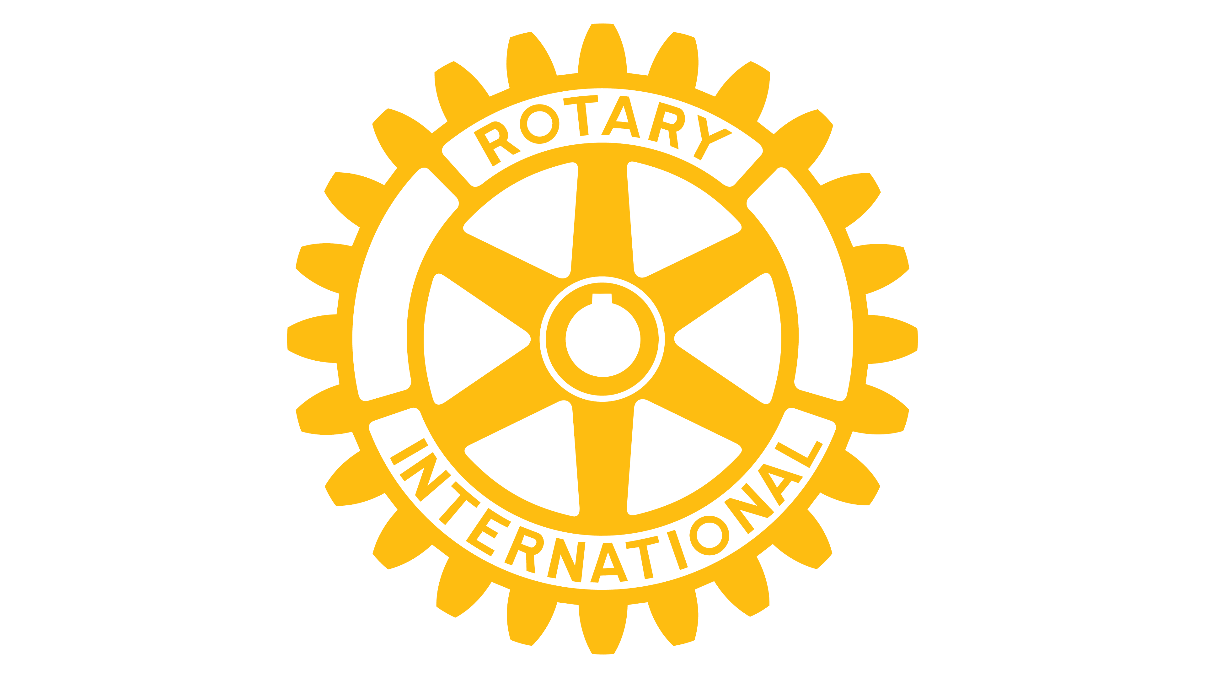
In 1919, the Board approved a logo design by Oscar Bjorge, and in 1921, this design was officially ratified at the next convention. According to the new rules, the logo contained a wheel with 24 teeth and six spokes. Their number didn’t symbolize anything, although it is now commonly believed that 24 and 6 represent time zones and continents, thus symbolizing Rotary’s global presence.
From an engineering perspective, the wheel was non-functional: it lacked a keyway to transmit power to the shaft. For Rotary, this was unacceptable as the organization needed to be associated with efficiency, strength, and effectiveness. Will R. Forker from Los Angeles proposed a revised version that added a keyway in the center. It became the official logo in 1924, but for the next five years, different clubs created their interpretations until the 1929 convention finally standardized its appearance.
Until 2013, an emblem with an orange wheel featuring blue elements was used. Inside was a ring inscribed “Rotary International,” with the first word arched and the second curved in the opposite direction. When the image was on a light background, it took on a blue outline.
2013 – today
![]()
In 2013, the organization introduced its new visual identity. As a result, the wheel became white and orange and was reduced in size to match the blue word “Rotary” positioned to the left. Interestingly, “rota” translates from Latin as “wheel,” which explains the choice of the logo. Modern club members have interpreted each part of the drawing:
- The keyway reflects the involvement of all Rotarians in a common cause.
- The six spokes represent the six continents where clubs have spread.
- The 24 teeth symbolize time zones.
- The wheel itself is a symbol of movement and civilization.
However, the creators of the emblem did not intend such meanings; they wanted to make the image realistic.
Font and Colors
The inscription in the Rotary logo is set in a simple, clean typeface without unnecessary decorative elements. The character style features rounded corners, slightly slanted lines, and vertical proportions, creating a friendly and balanced appearance.
The original typeface resembled Webnar Demi Bold, with straight, geometrically precise lines that visually echoed the shape of a gear, the organization’s symbol. Later, the design shifted: lowercase lettering replaced capital letters, with only the first letter capitalized. This gave the logo a softer tone while preserving its neat and open look.
The organization moved away from the official corporate typeface, Frutiger 77 Black Condensed, opting instead for a more neutral, accessible style that reflects its open, straightforward approach to its mission.
Regarding colors, they fully correspond to the organization’s brand palette. The emblem’s elements are gold (#F7A81B) and royal blue (#17458F). An alternative shade of blue azure (#005DAA) is also permitted.