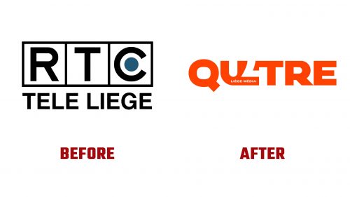
RTC Télé Liège, a regional media channel long trusted by the residents of Liège, has rebranded as Qu4tre. This change reflects the channel’s move toward a more modern, dynamic approach to media while keeping its strong connection to the Liège region. The rebrand is a response to the evolving media environment and the company’s goal of reaching a broader, younger audience.
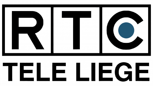
The previous logo of RTC Télé Liège was traditional, featuring large black letters “RTC” inside a frame, giving it a formal appearance. A small blue circle within the “C” added a minor visual element, but overall, the design felt static and dated compared to modern media brands. The lower part of the logo highlighted “TELE LIEGE,” reinforcing its regional focus, but it lacked the vibrancy needed in today’s media world.
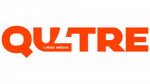
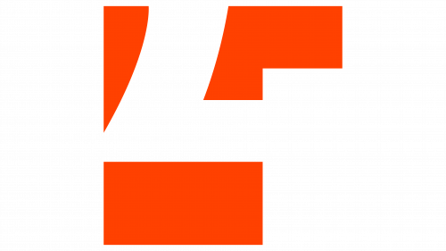
The new Qu4tre logo brings a bold, modern change. With bright, energetic orange as the dominant color, the logo conveys positivity and vitality, fitting the fast-paced digital media environment. The shortened name, Qu4tre, is punchier and more memorable. The typeface is large and smooth, demanding attention, with the stylized “4” nodding to the Liège region, where postcodes begin with the number four.
The color scheme has shifted from a basic black-and-white palette with a touch of blue to a vibrant orange inspired by the colors of the Province of Liège. This fresh palette sets the brand apart from competitors and creates a more dynamic, innovative image. The clean typography adds to the feeling of progress, making the brand appear more youthful and aligned with current trends.
The new logo represents the brand’s commitment to staying relevant and engaged with its audience. With this bold identity, Qu4tre is ready to redefine its role in the media world, blending regional pride with a modern touch.
