


 Samford Bulldogs Logo PNG
The Samford Bulldogs logo features a bulldog. For the team, it symbolizes strength, persistence, and endurance. The mascot emphasizes the university’s athletes’ determination and competitive spirit.
Samford University, originally established as Howard College in Marion, Alabama, in 1841, adopted the Bulldogs mascot in the early 1900s to reflect community resilience. Athletics formally began in the 1880s, with football debuting in 1902 and rapidly becoming central to the school’s identity.
Relocating to Birmingham in 1927 brought significant upgrades to the city’s sports facilities, thereby strengthening its baseball and basketball programs. Despite the Great Depression and a temporary halt during World War II, athletic growth resumed by the late 1940s, leading to the opening of a new athletic complex in 1957.
In 1965, the institution was renamed Samford University, coinciding with the introduction of women’s sports programs, which expanded significantly after the passage of Title IX in the 1970s. Joining the NCAA Division I and the Atlantic Sun Conference in 1988 marked a pivotal moment, raising the competitive profile.
Subsequent moves to the Ohio Valley Conference in 2003 and the historic Southern Conference in 2008 brought further national exposure. In 2017, the Sullivan-Cooney Family Field House opened, modernizing football facilities.
By 2023, the Bulldogs had fielded 17 NCAA Division I teams, and the football team had achieved notable success. That year, the university celebrated key athletic accomplishments and initiated major improvements to sports medicine and athlete support services.
Meaning and History
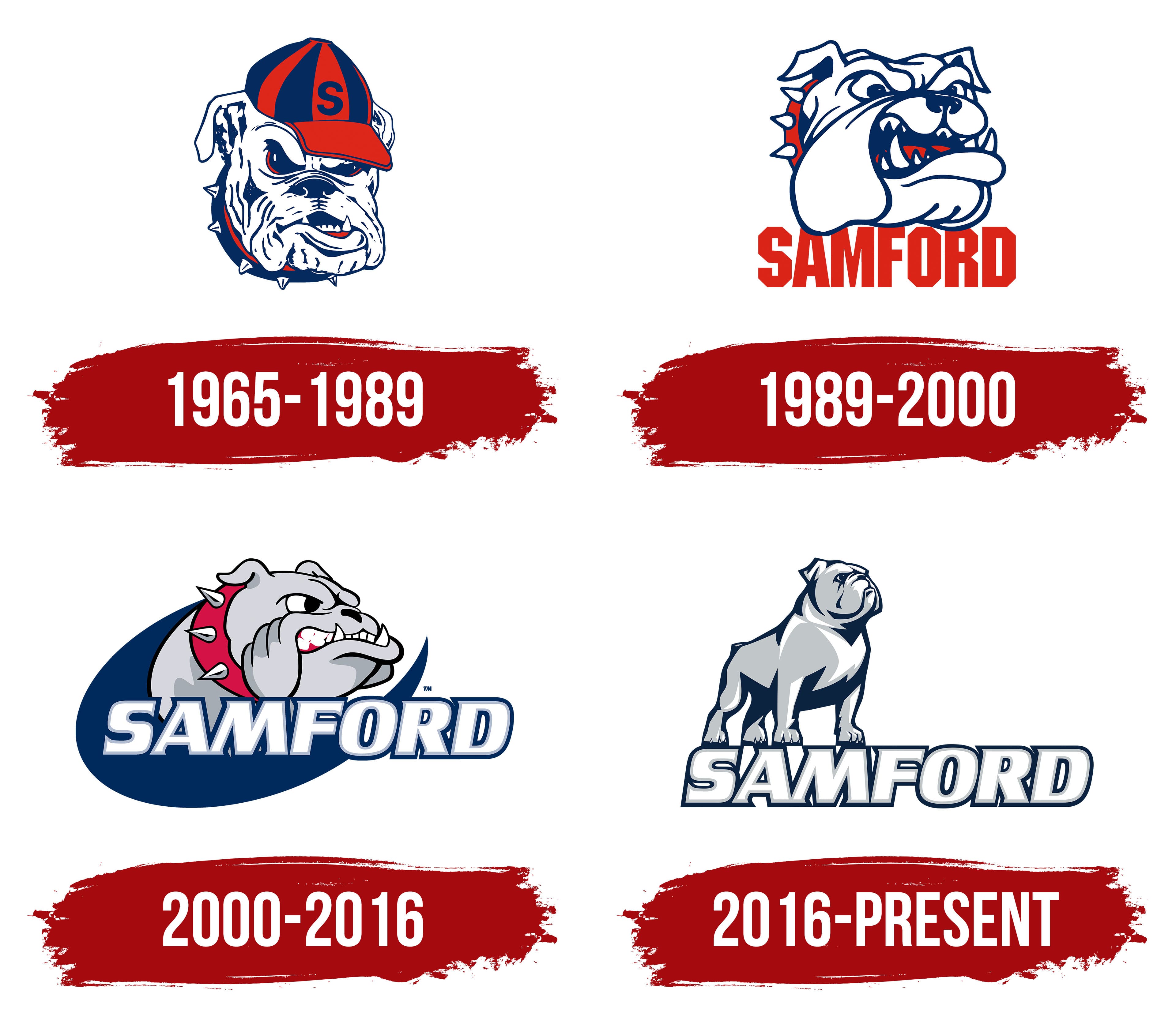
What is Samford Bulldogs?
These teams represent a private Christian university in Birmingham, Alabama, that competes in NCAA Division I as part of the Conference South. These passionate contenders, dressed in red and blue, are known for their achievements in football and basketball, and their home-arena events at the Pete Hanna Center have become a real celebration for the close-knit university community. Loud shouts of support fill every match, inspiring the players and emphasizing the pride with which the team represents the university.
1965 – 1989
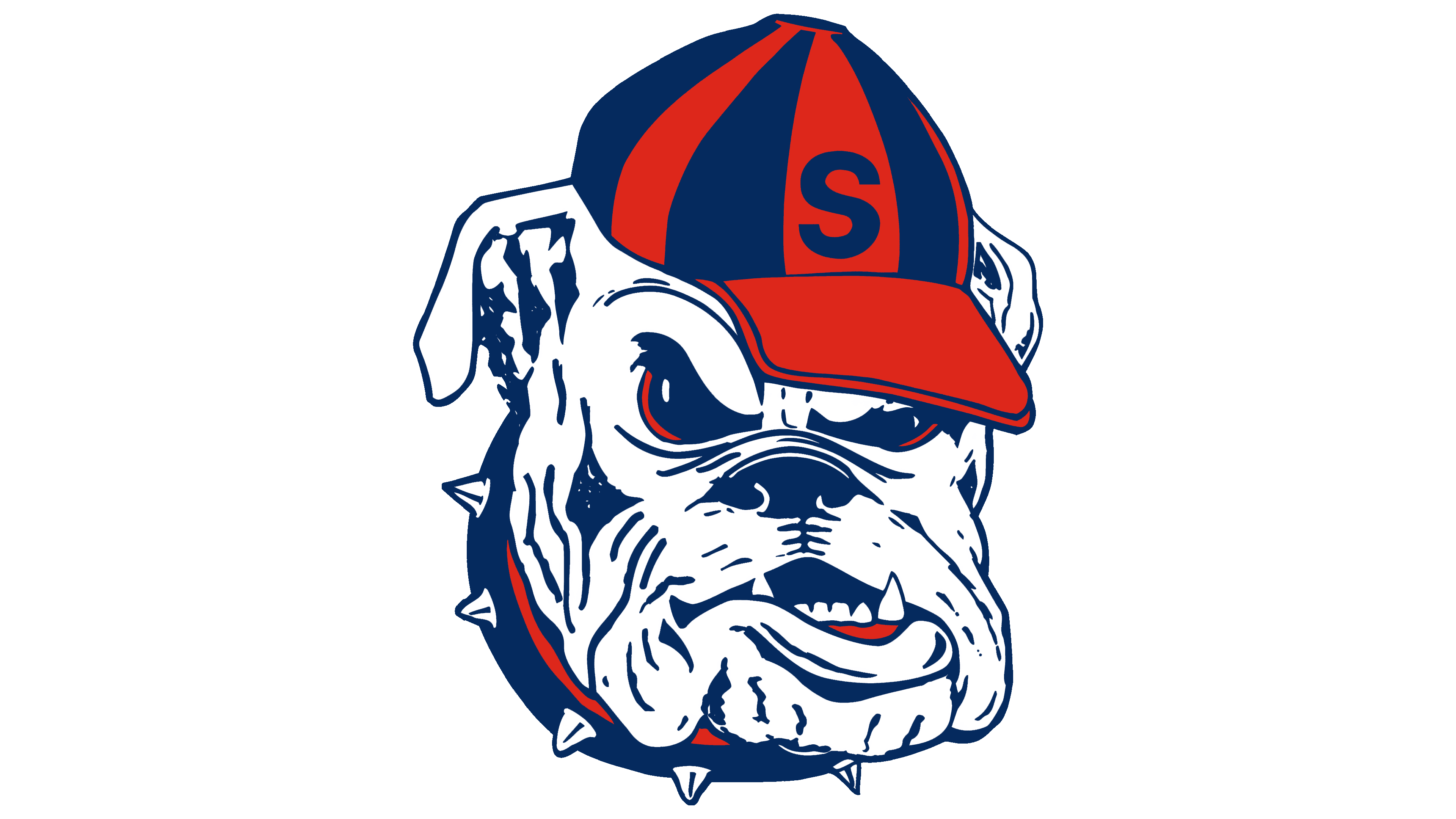
After Howard College was renamed Samford University in 1965, the institution introduced a logo for its athletic teams. The emblem featured a bulldog’s head, reflecting the new name and the university’s athletic spirit.
The animal’s image is rendered aggressively and boldly. The drawing’s lines are rough and angular, with detailed skin folds and tense facial muscles. The bulldog’s gaze is directed forward with anger and determination. The exposed teeth and furrowed brows create an image filled with the energy of athletic competition.
The color palette is based on the university’s official blue and dark red tones. White is the main color of the face. Red accents appear in the cap’s design, including vertical stripes and the spiked collar. The beanie features the letter S, emphasizing Samford University’s identity.
Although the image resembles the University of Georgia’s symbol, it differs in key ways. The Samford bulldog faces the opposite direction and differs in the details of the eyes, skin, and overall rendering. The clothing elements, such as the cap and spiked collar, add irony and highlight the team’s competitive spirit.
1989 – 2000
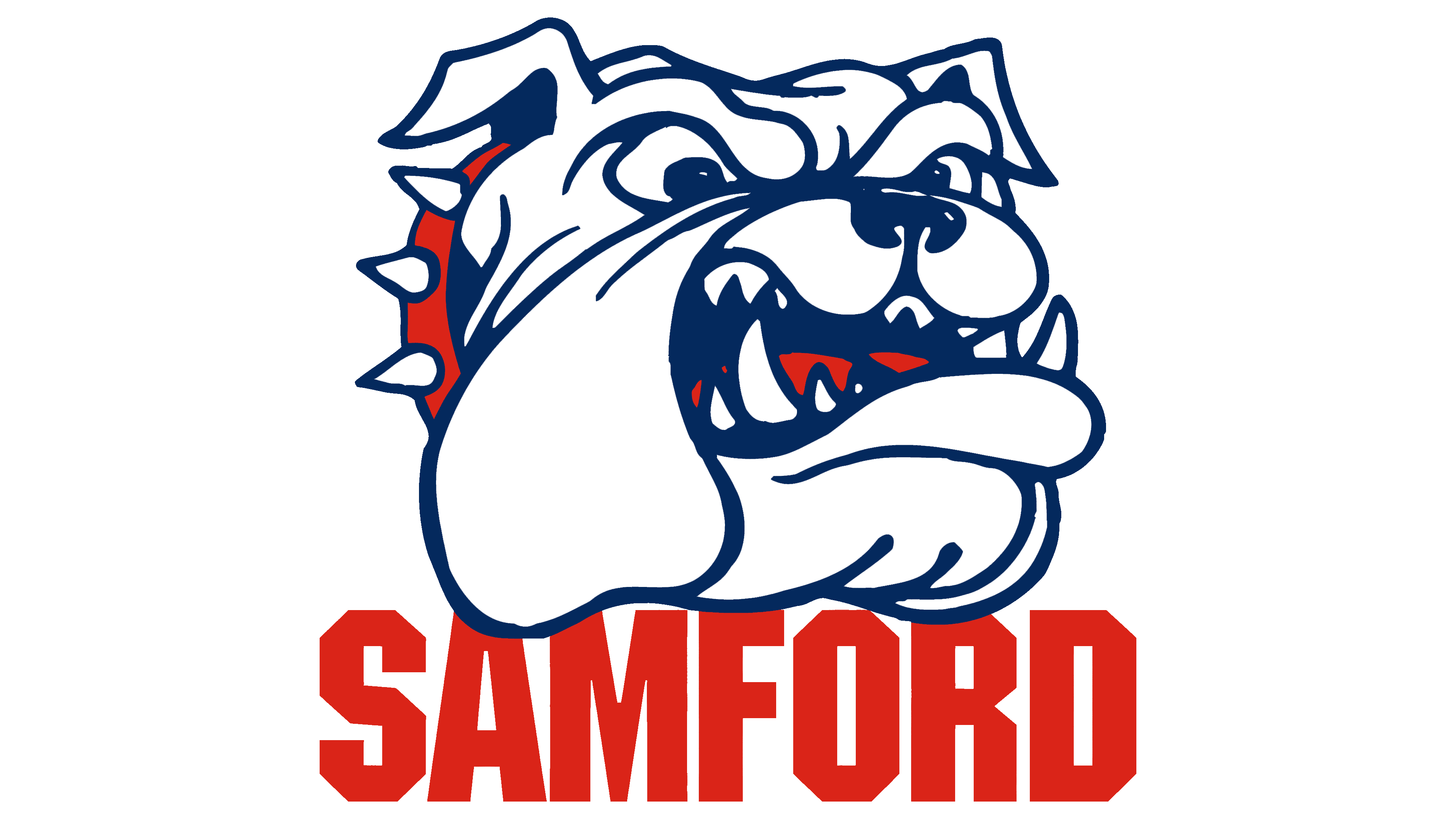
In 1989, Samford University introduced an updated Bulldogs logo, making the mascot’s image more aggressive and closer to a realistic portrayal. This version was created to create a more convincing, recognizable symbol for both opponents and fans.
At the center is the head of a bulldog with a fierce expression. Its mouth is wide open, showing sharp fangs and an intimidating look. Blue contour lines emphasize the muzzle’s folds and structure, creating a vivid, energetic impression. White serves as the design’s primary fill color.
The animal’s spiked collar is colored red and blue, adding a sense of athletic aggression to the image. Below the bulldog’s head is the large red inscription SAMFORD, rendered in a sans-serif typeface with straight, solid letterforms that emphasize strength and the team’s athletic attitude.
2000 – 2016

The updated Samford Bulldogs athletic logo was introduced on June 21, 2000, and drew attention from fans and students. The university’s designers, Scott Camp and Sharon Duckworth, created the design. In the new version, the designers developed a modern, energetic symbol that reflected the university’s renewed athletic direction and enhanced its recognition.
The logo’s foundation remains a stylized bulldog head, depicted in an expressive cartoon style that maintains athletic aggression. The gaze is directed to the right and conveys sternness; the jaws are tightly clenched, and the visible teeth emphasize the animal’s fighting attitude.
The color scheme uses shades of gray with smooth tonal transitions that add depth. A red collar with metal spikes emphasizes the bulldog’s athletic and combative spirit. A blue arc behind the head supports the composition and unites the individual elements.
The university name, SAMFORD, sits below the image in large white type, outlined in blue and filled with a gray inner shadow. A slight rightward tilt adds energy to the text.
2016 – today
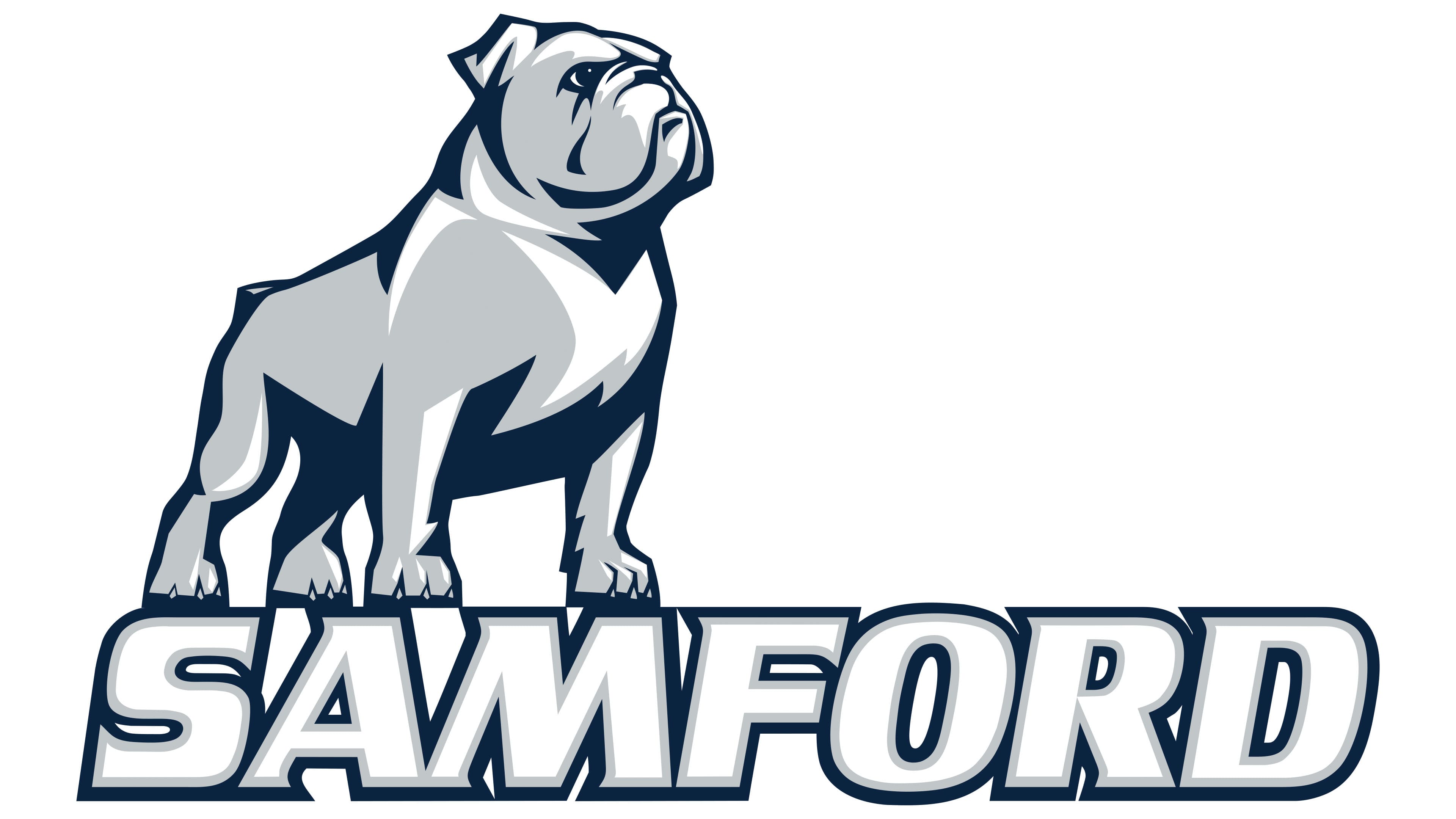
The current logo, introduced on November 12, 2016, resulted from a large-scale rebranding dedicated to the university’s 175th anniversary. The project was carried out in collaboration with Seattle-based Dartlet Inc. and included analysis of feedback from students, alumni, faculty, and residents of several American cities. As a result, the mascot took on a more balanced, noble appearance that reflects the university’s image of leadership.
The logo’s central figure is a full-body bulldog. It stands calmly, head raised. The entire figure conveys confidence and dignity. Unlike previous versions, it has no aggression. The image symbolizes inner strength and composure.
The color palette consists of shades of gray with dark blue accents that emphasize the figure’s volume.
Below the figure, the university name SAMFORD appears in large white letters with a double outline. The outer outline is dark blue, and the inner one is gray. The typeface was carried over from the previous version.