


![]() San Jose Earthquakes Logo PNG
San Jose Earthquakes Logo PNG
The San Jose Earthquakes logo embodies speed, energy, and rapid flight, which perfectly fit the concept of soccer, where quick reactions are necessary for victory. Additionally, the emblem symbolizes precision and accuracy, two extremely important qualities in sports.
San Jose Earthquakes trace their origins to 1974, when a NASL franchise was created in Silicon Valley. Businessman Milan Mandaric acquired the team, despite league pressure to brand it under San Francisco.
A naming contest funded by the San Jose Mercury News led to “Earthquakes,” a reference to the region’s seismic activity, though the choice drew criticism. On January 16, 1974, the club was announced, and by February, it secured approval to represent San Jose rather than San Francisco.
In 1983, the team was renamed the Golden Bay Earthquakes, then reverted to its original identity on October 27, 1984, following league changes. By 1988, following the collapse of the Western Soccer Alliance, the franchise suspended operations.
The club was revived on June 15, 1994, as San Jose Clash, joining MLS with backing from Anschutz Entertainment Group and a name influenced by Nike. In 2000, the Earthquakes’ name was restored.
In 2005, AEG relocated the team to Houston due to stadium issues and formed the Houston Dynamo, while the original identity remained in San Jose.
In 2007, investor Lewis Wolff regained the intellectual property and reestablished the franchise in MLS, continuing operations under Earthquakes Soccer, LLC.
Meaning and History
![]()
The original 1995 San Jose logo featured a stylish black-red scorpion with “Clash” in white. In 2000, it was replaced with a triangular shield. Before this, when the team was an NASL member, the word “Earthquakes” dominated the “San Jose Earthquakes” logo. A diagonal line from the capital “Q” down symbolized a crack splitting the ball into two.
What is San Jose Earthquakes?
The San Jose Earthquakes are a professional soccer team from San Jose, California. Founded in 1994, the team entered the MLS in 2016 as an expansion franchise. Its main rival is the “Los Angeles Galaxy,” and their confrontation is known as the “California Clasico.” The club is in the Western Conference and is one of Major League Soccer’s founding members. Its home stadium is “PayPal Park”.
1996 – 1999
![]()
Before becoming the “San Jose Earthquakes”, the team was called the “San Jose Clash”. This nickname was coined by Nike, which participated in branding. The original club logo depicted a pink scorpion with a yellow outline and a broad black frame. The curved tail was directed upwards, and the original inscription “Clash Jose Clash” was between the claws. The first word stood separately and resembled a bright neon sign. Against it, the city’s name almost disappeared: compared to “CLASH,” it was small and inconspicuous.
2000 – 2005
![]()
After rebranding, “San Jose Clash” was renamed “San Jose Earthquakes,” and its logo was updated. It featured an inverted triangular shield with truncated top corners. It was dominated by the official color palette: black-blue, complemented by white and silver.
A soccer ball was drawn in the lower part with light bursts on the hexagonal faces. From it, curved rays symbolizing the rising sun emanated. The logo was on a dark background, and the other elements were light. The top of the shield featured the words “San Jose,” and the bottom “Earthquakes.”
2005 – 2007
![]()
The new version of the “San Jose Earthquakes” logo only updated the color palette. The pale blue shade was darkened, and the rich black was diluted. Other details remained the same. The three-sided shield represented the largest Bay Area cities: Oakland, San Francisco, and San Jose.
The ball on the logo symbolizes the sun and is also used in city emblems. All words were printed in an artistic font: the letters had short, sharp serifs and symmetrical, uneven edges. An arched line was drawn through the word “Earthquakes” to symbolize a seismic wave.
2008 – 2013
![]()
In 2008, the team received a new logo. It was similar to the first two, but with minor details. The background was bright blue, and speckles of the same color appeared on the ball. The shield’s decorative protrusions were changed. The words “San Jose” were supplemented with smooth bends.
Developers experimented with the San Jose Earthquakes logo’s external lines, rendering them in black and white. They removed the broad contour around the word “Earthquakes” and the line symbolizing the seismogram. The team’s name was made white to contrast with the foreground.
2014 – today
![]()
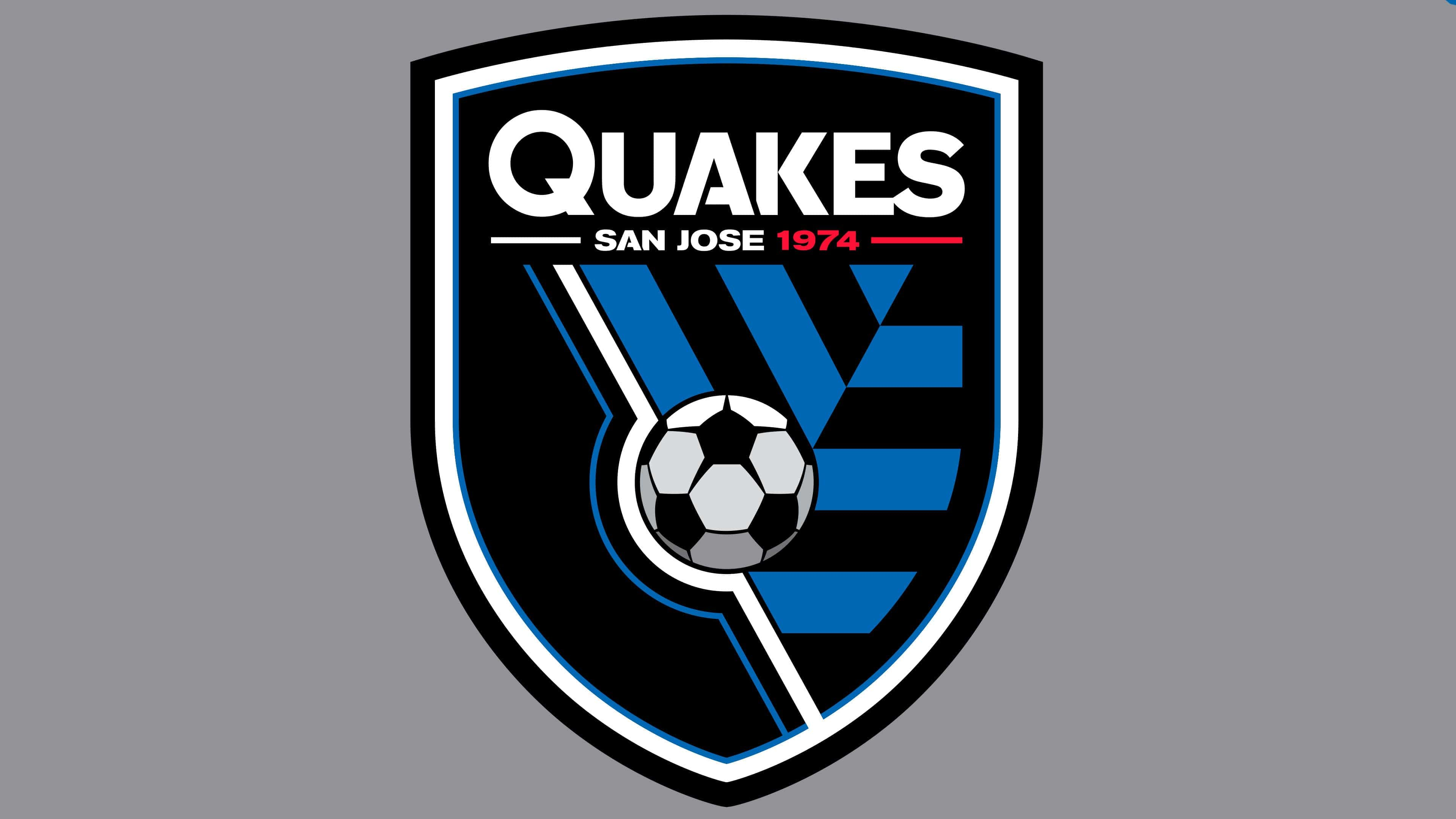
In 2014, the club underwent a rebranding that had been in the works for two years. A Portland-based art and design studio added elements from the past to the “San Jose Earthquakes” logo: the number “1974” (the year the NASL franchise was founded) and red (as in the first logo). The logo was presented on January 30 to celebrate the 40th anniversary of the “San Jose Earthquakes.”
The logo consists mainly of a triangular shield with black-and-white edging. In the center, a ball symbolizing an orbit is drawn. In the top-right corner, there are six blue geometric shapes. According to the designers’ concept, they should symbolize the movement of tectonic plates.
Font and Colors
Designers experimented with the nickname “Earthquakes” in various ways, achieving varying degrees of success. For example, from 2000 to 2007, emblems depicted a seismogram, a chart of the Earth’s crustal oscillations. The zigzag line crossed the word “EARTHQUAKES,” which was horizontally placed across the triangular shield.
In the modern logo, the essence of the nickname is reflected more abstractly. Artists chose to depict tectonic plates in motion as alternating black and blue geometric shapes. It is hard to judge how successfully this was achieved, as it does not evoke associations with earthquakes.
The emblem is complemented by the phrase “QUAKES SAN JOSE.” The first word is the largest: it’s located at the top of the shield and is immediately noticeable. The city’s name is slightly below and written in small letters. A sans-serif font was used for all inscriptions. It looks unusual because of the interrupted horizontal lines within the letter “A.”
White words are complemented by the red number “1974”. Designers specifically highlighted the club’s founding year to connect the logo to its history. The primary color of the shield is black. Against its background, blue elements are visible: the triangle, quadrilaterals, and a thin stripe wrapping the soccer ball on the left side. By the way, the ball is black and white, with a slight addition of gray.