


 Santa Clara Broncos Logo PNG
The Santa Clara Broncos logo is a monogram combining the letters “S” and “C” with the university’s name in signature maroon and gray tones. The monogram symbolizes unity and cohesion within the team, demonstrating its connection to the Santa Clara University community.
Santa Clara University, founded in 1851, began expanding its athletics programs in the late 1800s and adopted the Broncos mascot in 1923, reflecting California’s ranching traditions.
The football team was formed in 1905 and achieved national attention under coach Buck Shaw by defeating Louisiana State University in consecutive Sugar Bowls in 1937 and 1938. Despite early success, the football program ended in 1950 due to financial constraints.
Basketball became central to Santa Clara’s sports identity with its first NCAA Tournament appearance in 1952. The program regularly competed in national tournaments during the 1960s, and in 1969, Carol Killingsworth became one of its first African American student-athletes, helping to advance campus integration.
Basketball’s profile grew significantly in the 1980s with future NBA champion Kurt Rambis, known for his time with the Los Angeles Lakers. In the 1990s, Steve Nash, later a two-time NBA MVP, led the Broncos to three NCAA Tournament appearances, including a notable upset victory over Arizona in 1993.
In the early 2000s, women’s athletics gained significant prominence, with volleyball and soccer becoming regular participants in the NCAA Division I Women’s Basketball Tournament. The women’s soccer team reached the NCAA College Cup for the first time in 2005 and again in 2013. The Leavey Center, opened in 2012, further strengthened the university’s athletic facilities.
Between 2020 and 2023, Santa Clara maintained competitive strength across key programs, notably in men’s basketball, women’s volleyball, and soccer, consistently producing professional athletes and national tournament participants.
Meaning and History
What is Santa Clara Broncos?
Santa Clara University, a private Jesuit institution in the heart of Silicon Valley, fields teams that are a powerful force in NCAA Division I sports. These rivals are especially known for their basketball and football performances, maintaining the university’s long-standing traditions. At the West Coast Conference, their red-and-white uniform and mascot symbolize resilience and sportsmanship. Fans actively support home matches at the Leavey Center, and Buck Shaw Stadium has witnessed many memorable football victories.
1988 – 2004
The Santa Clara Broncos logo features a powerful, tense horse facing right. The composition shows part of the animal’s body, including the head, front legs, and torso. The figure appears determined and unstoppable. The horse’s white color contrasts with the maroon lines and background that outline the muscles and mane, enhancing the sense of energy and speed.
The horse is placed inside a diamond-shaped figure, turned so one corner points upward. The diamond’s background is maroon (maroon or cardinal red), symbolizing passion, energy, and the will to win.
Above the diamond is the inscription “Santa Clara,” written in italic letters of the same maroon color. The classic serif font with thick strokes emphasizes the emblem horse’s identity and reliability.
The horse’s sharp lines create a dynamic, emotional image. The finishing double outline around the diamond completes and unifies the entire emblem.
2004 – 2016
In the summer of 2004, the Department of Athletic Recreation at Santa Clara University introduced an updated team logo. It was based on a bronco’s head. The animal’s image became more serious and aggressive. The horse is shown in profile, with angular lines that emphasize tension and strength. The red eyes and fierce mouth intensify the emblem’s animal’s fighting spirit.
The horse’s color scheme was expanded to include gray and black, as well as maroon (“cardinal red”) and white. The main horse image is rendered in shades of gray with black outlines and mane details.
The inscriptions complement the composition and form part of it. At the top, the name “Santa Clara” is placed prominently aanimal’sly. The letters are designed in a geometric style with inner spaces and outlines, creating a sense of volume and strength. At the bottom, on a separate maroon panel, the word “animals” appears. It uses the logo’s white with a black outline, making it stand out clearly against the background.
2016 – to”ay
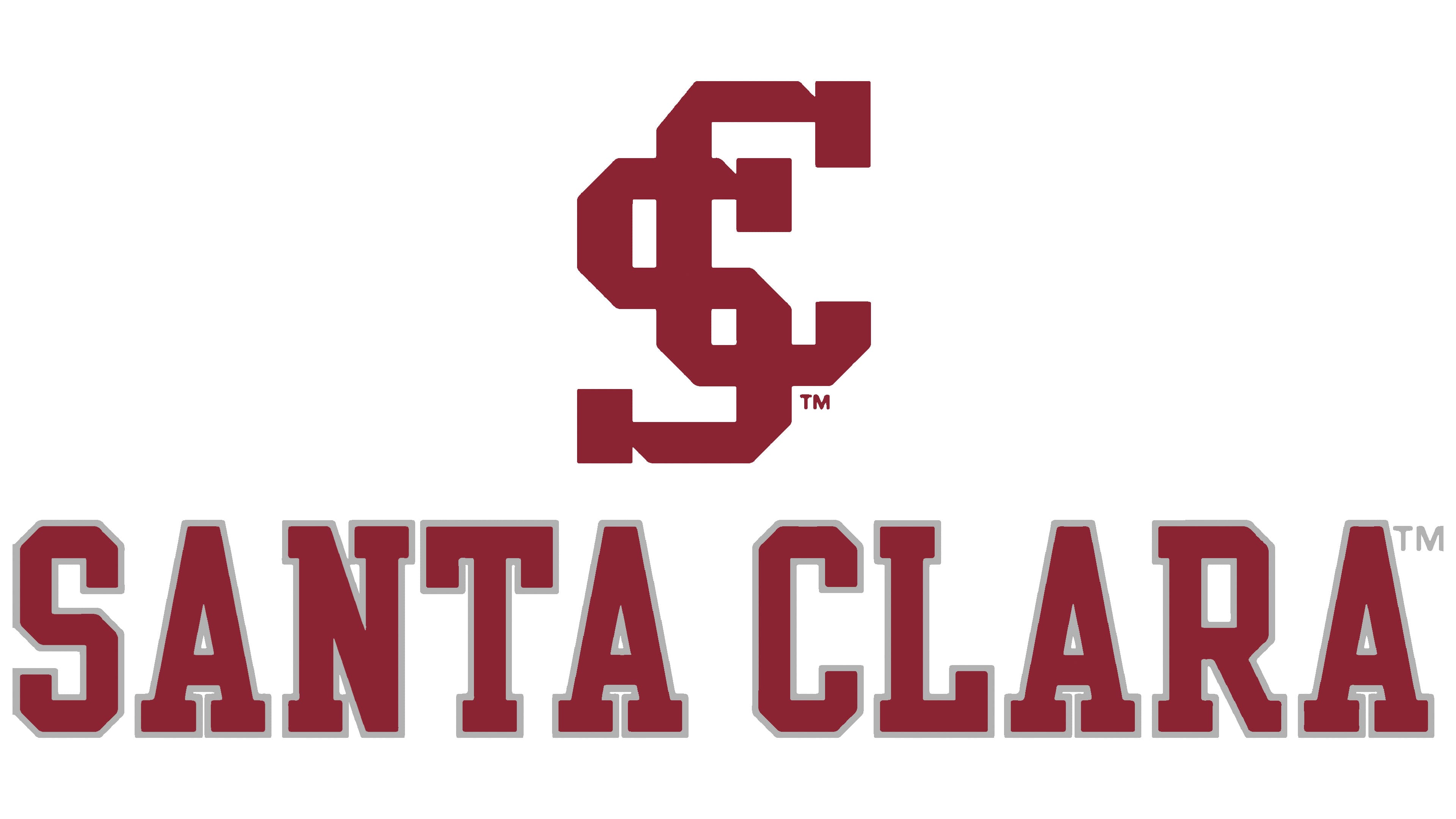
Since January 28, 2016, the Santa Clara Broncos have officially used an updated logo created in collaboration with Nike. Instead of the previous symbol, the team introduced a new monogram composed of the letters S and C. The monogram was adopted as part of a larger program to refresh Nike’s visual identity and athletic uniforms.
The monogram is strict in style. The interwoven letters are presented in the university’s maroon color. The letters’ lines are thick and pointed, conveying athletic energy and the strength of team unity. A similar monogram appeared earlier in university symbolism, but it has now become the Broncos’ main logo.
The university name is placed below the monogram in a large “college block” typeface. The letters are geometric and heavy, with straight lines and sharp angles. Nike’s outline surrounds the text, adding depth.