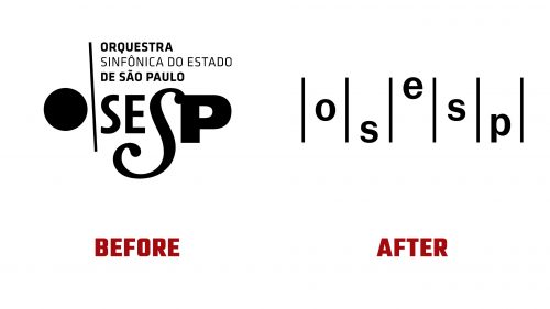
The São Paulo State Symphony Orchestra (Osesp) has introduced a new visual identity designed by Polar, reflecting a major shift in its aesthetic. The redesign modernizes the orchestra’s look while honoring its musical heritage.
The new logo’s standout feature is its simplicity. The previous design incorporated multiple treatments to individual letters, leading to a cluttered appearance. The new logo takes a minimalist approach, placing the letters of “Osesp” in vertical positions reminiscent of musical notes on a staff. This immediately creates a visual connection to sheet music, reinforced by the vertical bars used throughout the design. It subtly nods to classical music without overwhelming the viewer.
The typeface, Gal Gothic by Blackletra, brings warmth and approachability while maintaining the professionalism expected of a symphony orchestra. The clean, sans-serif font feels modern and timeless, allowing the orchestra to be seen as an evolving cultural institution. The typeface’s balance of structure and fluidity mirrors the precision and passion of musical performance.
The redesign emphasizes the relationship between structure and emotion. The vertical lines and clean typography reflect the order and rhythm of the music, while the logo’s flexibility hints at the emotional depth of Osesp’s performances. The arrangement of letters, like musical notes, is a metaphor for the journey classical music takes listeners on—from technical brilliance to deep emotional experiences.
Polar introduced a generative design system called “Instrument,” which produces abstract shapes responsive to auditory cues. These shapes are often ellipse and organic forms, and they visually interpret the music, aiming to capture the emotions that Osesp’s performances evoke. This approach adds depth to the brand’s adaptability and strengthens its connection to the music.
The diverse color palette allows the orchestra to adapt its branding for different projects and moods. This ensures consistency across platforms while allowing room for emotional expression that matches the orchestra’s wide repertoire.
The new logo positions Osesp as both a timeless and forward-thinking institution. Its simplicity and flexibility make it impactful across various mediums, whether on concert posters, programs, or digital platforms.


