


![]() Schalke 04 Logo PNG
Schalke 04 Logo PNG
The emblem’s elements show the team’s players’ greatest passion: the soccer ball. The time and rhythm of life are centered around training and mastering it. The Schalke 04 logo embodies passion and determination.
On May 4, 1904, teenagers from Schalke in Gelsenkirchen founded Westfalia Schalke. The city grew on coal mining, and football became part of the local identity. The team first played in red and yellow, while “04” marks the founding year.
In 1924, the football section split and became FC Schalke 04, switching to blue and white. Players and fans were known as “Knappen.” By the late 1920s, the club introduced the “Schalker Kreisel,” a fast-passing system. Promotion in 1927 led to national recognition, driven by Ernst Kuzorra and Fritz Szepan.
Schalke lost the 1933 final to Fortuna Düsseldorf, then won their first title in 1934 against 1. FC Nürnberg. In 1937, they claimed a historic double. From 1934 to 1942, the club won six championships, including a 9:0 final over Admira Vienna in 1939.
After the war, results declined. The last national title came in 1958 against Hamburger SV. Schalke joined the Bundesliga in 1963 but faced a match-fixing scandal and several relegations in the 1980s.
Under Huub Stevens, the team won the UEFA Cup in 1997 against Inter Milan on penalties, with Jens Lehmann decisive. In 2000–01, Schalke missed the title after Bayern Munich scored late against Hamburg.
They won the DFB-Pokal in 2001 and 2002, reached the Champions League semi-finals in 2010–11 against Manchester United, were relegated in 2021, returned in 2022, and dropped again in 2023.
Meaning and History
![]()
Early sports team logos were simple and lacking in ideology. They attempted to fit the club’s name and year of founding inside the circle. Everything changed in 1958 when the first emblem was dedicated to the coal mining industry.
The choice of topic is related to historical factors: active coal mining took place in Gelsenkirchen, and many miners were among Schalke 04’s supporters and players. Because of this, the teams received the nickname Die Knappen (The Miners), which ultimately formed the basis of the logo.
What is Schalke 04?
Schalke 04 or, more precisely, Gelsenkirchen-Schalke 04 e. A professional soccer team from Germany. It is located in the North Rhine-Westphalia region, in the city of Gelsenkirchen. The numbers in the name are related to the club’s founding year, 1904. Although it was at its heyday in the 1930s and 1940s, it still plays in the Bundesliga. In terms of membership, it ranks fourth in the world.
1919 – 1924
![]()
In 1919, Westfalia Schalke merged with Schalke Turnverein 1877 to form Turn- und Sportverein Schalke 1877. Its name was reflected in the time’s emblem: inside a wide yellow ring was the phrase “TURN-U. SPORT-VEREIN SCHALKE, ” in the middle of the white circle was a flag with the inscription” 1877 EV. ”
1929 – 1945
![]()
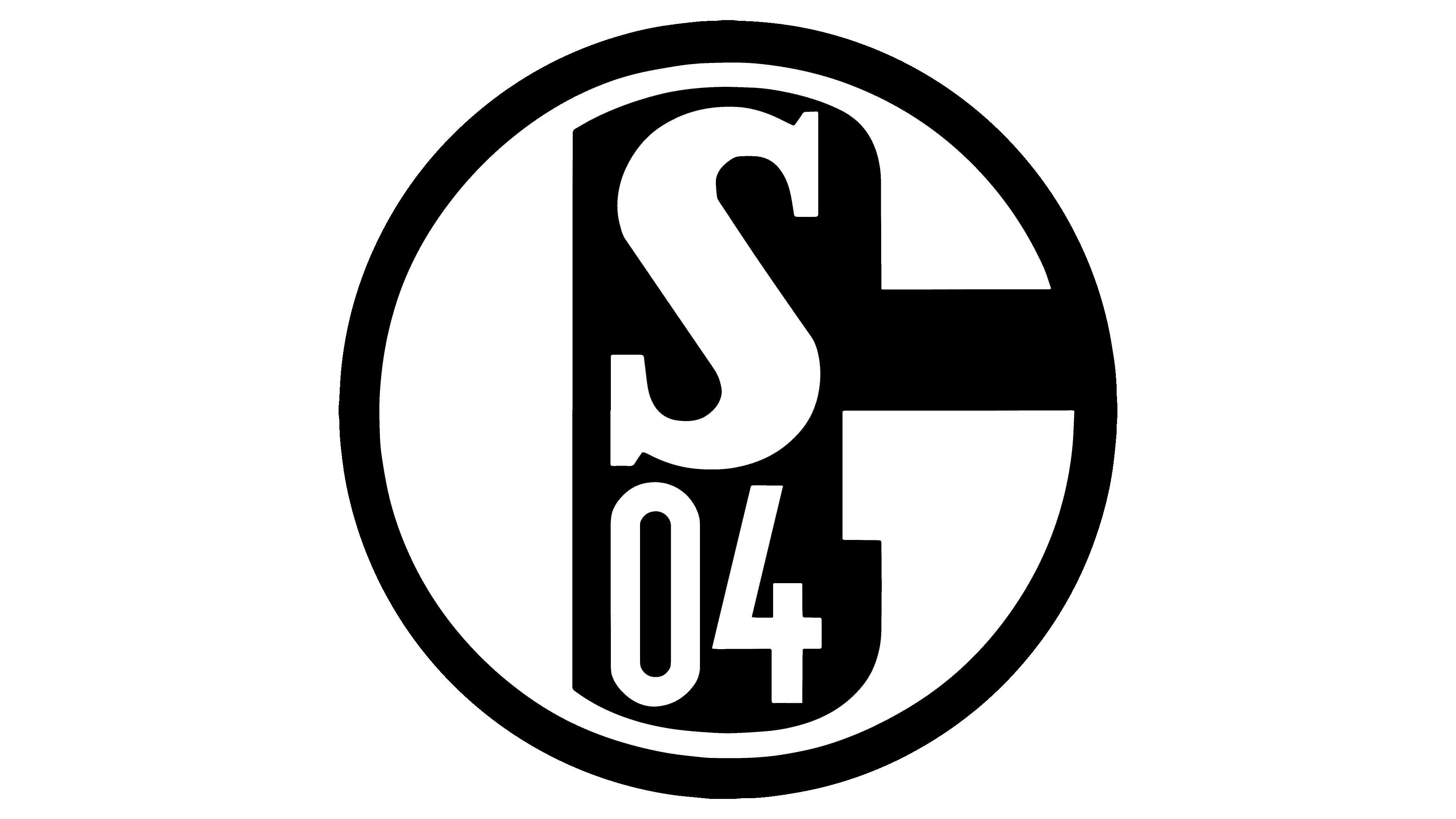
The team’s greatest success came in the 1930s and 1940s. At that time, they had already left the sports union and became known as the Fußball-Club Gelsenkirchen-Schalke 04 e.V. The new logo featured a circle with the numbers “04” and the letter “S”, the simplest you can think of.
1945 – 1958
![]()
After the war, Schalke 04 decided not to change its name, as did other sports clubs in Germany, but updated its emblem. It returned to the classic blue-and-white color scheme, moved the S 04 closer to the center, and added the letter G to indicate the city of Gelsenkirchen.
1958 – 1963
![]()
In 1958, the “G” was transformed, making the letter’s interior resemble a mining hammer. The colors are reversed: the main elements are white, and the background is blue.
1963 – 1965
![]()
The designers surrounded the logo with another white ring and opted for a lighter shade of blue. They also updated the fonts by adding serifs to the “S” and making the “G” a little thinner.
1965 – 1968
![]()
The outer white ring is gone. “G” is enlarged and occupies almost all the circle’s space. The “S” serifs are now rectangular, making the letter appear larger. The numbers “04” also look new: “0” is oval, “4” has a closed triangular top.
1968 – 1971
![]()
The inside of the circle is white, and the letters and numbers are dark blue. On the outside, the emblem is surrounded by a wide blue ring.
1971 – 1978
![]()
In 1971, the Schalke 04 logo underwent a significant change. For the first time in a long time, an inscription indicating the club’s name appeared on it. It sits at the top of the bezel, which is wider than usual. The center circle has been reduced, but the “S” has retained its original size.
1978 – 1995
![]()
In the late 1970s, the designers removed the large blue ring with the inscription “F.C.Schalke04”, leaving the edging of several narrow stripes. The originally designed letters “G,” the numbers “04,” and “S,” and the rectangular serifs are the same as on the previous emblem. The blue color is replaced with a rich purple.
1995 – today
![]()
The last club logo is very similar to the penultimate one. Only a few details differ: there are fewer edging rings, the number “4” has a sharp corner on the left side, and the font of the letter “S” has changed.
Font and Colors
The modern Schalke 04 emblem dates back to 1958, when the team presented its first icon dedicated to the Gelsenkirchen coal mining industry. The designers have played with the original hammer by connecting it to the letter “G.” The striking part of the instrument is at the center of the circle, forming an intra-letter space. The blue hammer serves as the backdrop for the club’s initials and the abbreviated year of its founding. This version of the logo was updated several times and was “overgrown” with edging rings until the final version without a frame appeared.
Although the Schalke 04 emblem has few inscriptions, they are immediately noticeable thanks to the original font. The letters have wide, rectangular serifs, with the “G” unusually stylized to resemble a miner’s hammer inside.
The logo’s color scheme changed several times, but always returned to the classic white-and-light-blue combination. This is the football team’s official palette, adopted in 1924 along with the name.