


 Scope Logo PNG
The Scope logo is hard to miss. It shines with its contrast. There is no excess or cluttered text. Everything is concise and clear, and the key aspects are presented in an accessible way. The logo has precise lines and shapes, using figures and symbols to harmonize all elements.
Professionals worked on creating the brand identity for Scope, a brand owned by the globally renowned company Procter & Gamble (P&G). They chose simple geometric forms that remain recognizable and make the brand popular over the years. Special attention was given to the color scheme. The light yet rich green background looks interesting, conveying natural harmony and purity. In this context, it means that health is priceless. The green color combined with white symbolizes the natural whiteness of teeth. The star in the center of the logo represents shine. All the elements together convey the main aspect of the company’s work: “Our mouth rinses are created for your health!”
The product that entered the market had significant competitive advantages. Compared to other mouth rinses, Scope stood out in several key ways. It did not contain alcohol, allowing for oral hygiene without unpleasant sensations or burning. This minimized discomfort, which greatly appealed to Americans.
Scope began in the 1960s, when P&G moved into the young mouthwash market. Development started in 1966 with a clear goal: create a rinse that fought bad breath without the harsh medicinal taste common in antiseptic products. By 1967, the final formula had a bright green color and a fresh mint flavor, giving the brand a more consumer-friendly position.
The product launched in the United States in 1968 as a “good-tasting mouthwash.” Advertising in the 1970s focused on breath freshness, including the slogan “Scope fights bad breath without medicine breath.” During the 1980s, the brand expanded into markets such as the United Kingdom and Canada, with campaigns adapted to local buying habits.
In the 1990s, the formula was updated to improve bad-breath protection, and in 1996 a revised version reached stores. The 2000s brought wider oral-care ambitions. Scope White appeared in 2005 for buyers interested in whitening, followed by Scope Outlast in 2007, promoted for longer-lasting freshness. In 2010, the brand entered the toothpaste market, and in 2012, Scope Dual-Blast combined plaque control with breath freshening.
Later releases kept the line active. Outlast Mouthwash + Toothpaste arrived in 2014, Classic Mint Sparkle in 2015, and Scope Advanced in 2016. From 2018, bottles began using recycled plastic, followed by alcohol-free rinses in 2019 and Teeth Whitening Mouthwash in 2020. In 2021, the range added more natural ingredients and more recycled packaging. Fresh Lock technology appeared in 2022, while 2023 brought products aimed at enamel strength and gum health.
Meaning and History
What is Scope?
It is a mouthwash brand owned by Procter & Gamble. It is designed to give fresh breath and improve oral hygiene by killing germs that cause bad breath. The rinse is known for its minty flavor, leaving a refreshing sensation in the mouth. The brand offers a variety of formulations, including those that provide additional benefits such as teeth whitening and plaque reduction. It is a popular choice for those who want to keep their mouth clean and fresh throughout the day. The product is widely available in supermarkets, pharmacies, and online stores.
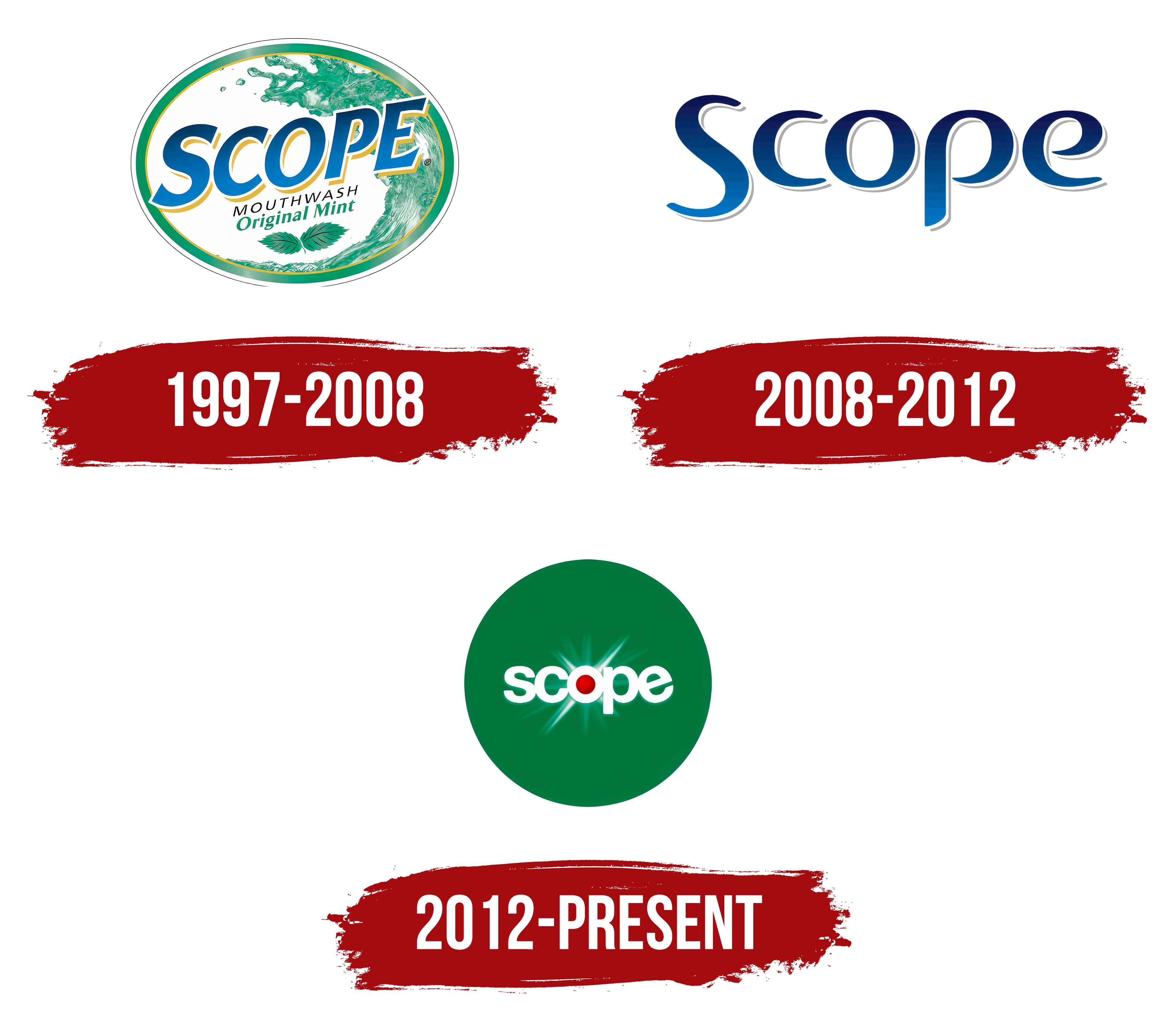
1997 – 2008
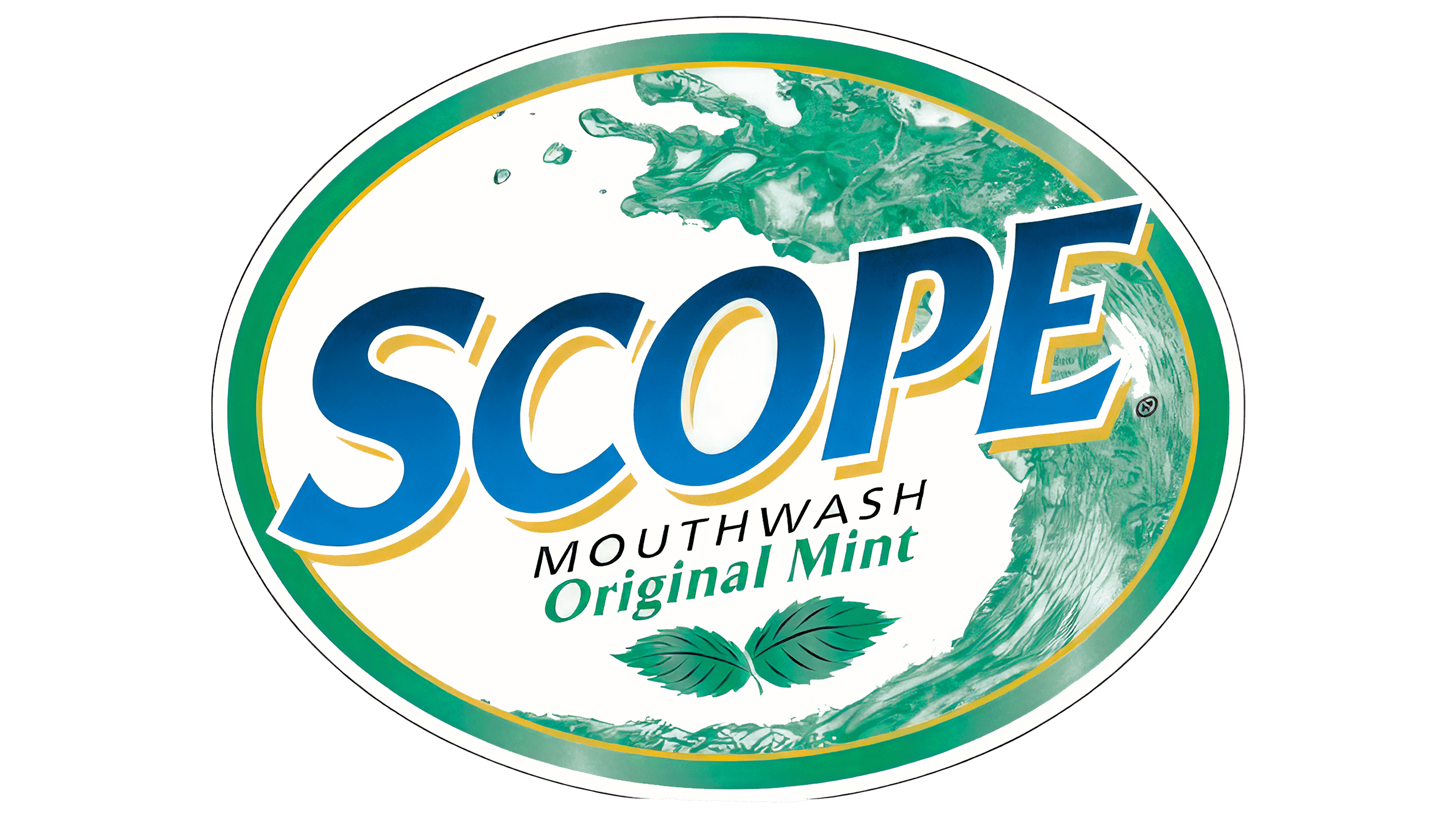
The manufacturer offered its potential customers only freshness. In the first version of the logo, the focus was on the unique properties of the mouth rinses. The goal was to convey to the consumer that hygiene procedures could be pleasant, painless, and effortless. The new product was created with this goal in mind, so the logo must be both attractive and informative. The result exceeded expectations.
One emblem created a whole chain of informational elements. The use of colors was particularly successful. White and green served as backgrounds for various image elements, associating with freshness and the whiteness of teeth. A wave and two mint leaves symbolize absolute purity and the product’s eco-friendliness. The elements clearly articulated the product’s essence and content.
The blue tone played a key role, highlighting the brand name with a bright sky color and emphasizing its market advantages. Reliability was also clearly demonstrated. The company succeeded in popularizing the brand and making its product one of the best-selling in America. Yellow was used only as a border for the brand. The italicized font enhanced the visual effect. The letters were larger than average, and the spacing between them was significant. Additions such as composition and flavor indications helped capture potential customers’ attention and interest.
2008 – 2012

The new logo, introduced in 2008, was characterized by specificity, minimalism, and the absence of images. The new era set different trends and priorities. The high demand for the product was the reason for the updates. There was no longer a need to attract attention and gain customer trust: many were already using mouthwashes, and newcomers, once they tried them, became regular customers. The goal was to present the new logo, remind customers of the brand, and repeatedly identify the product.
The logo’s transformation aimed to minimize perceived complexity, demonstrate product quality, and showcase the company’s reliability. Geometric shapes, complex backgrounds, and multifaceted color effects were removed. Only the brand name shone on a solid white background, looking like the center of the universe, like an island in the ocean. This transformation had an interesting effect.
The inscription, in a rich blue, appeared graceful. A white border enhanced the visual effect. Large and massive letters were arranged in a single line, with rounded corners on vowels and consonants.
When shoppers saw the well-known brand on store shelves, they made purchases without hesitation. The target audience grew significantly, including teenagers, adult men and women, and the elderly. Everyone was buying a product with natural ingredients that protected teeth and gums.
2012 – today
The next logo transformation took place in 2012. The identity created at that time is still in use today, which speaks to its originality and appeal. The logo has been functioning successfully for over ten years.
It features a return to some past motifs. A light green tone serves as the background for the main text. The brand used this shade because all green tones are associated with nature, tranquility, and calmness. It attracts attention and emphasizes that with quality mouthwashes, there is no need to worry about health.
The brand name is placed in medium-sized letters at the center, creating a positive perception of the information. The white and green colors are synchronized, making the logo stand out brightly. A red element, whether a dot or a circle, is a magnet for attention, drawing eyes to the logo. Other brands rarely use such a contrasting element, but as it did many years ago, Scope takes experimental steps, presenting what others dare not.