


![]() P&G Logo PNG
P&G Logo PNG
The designers created a universal P&G logo that fits all kinds of products. It is visually strong because Procter & Gamble Company products are highly effective. At the same time, the logo represents purity, health, and beauty.
Meaning and History
![]()
William Procter and James Gamble are immigrants from the United Kingdom who settled in Cincinnati, Ohio. One of them was born in England and worked as a candle maker; the other came from Ireland, where he was engaged in soap making. When they married the Norris sisters (Olivia and Elizabeth), Alexander Norris’ father-in-law persuaded them to open a joint company and continue doing what they were used to: candles and soap. So in 1837, P&G was born.
After 20 years, things went so well for them that their annual income reached $1 million. During the American Civil War, businesspeople received a contract from the Union Army to provide candles and soap to the military. As a result, many people learned about Procter & Gamble and its products. In the 1880s, the company introduced a new product to the market: floating soap, which also played a big role in its recognition among buyers.
Gradually, the demand for goods increased, and they became scarce. Then the owners decided to build factories in other locations in the United States and expand the product line. By 1921, this firm had become the largest international corporation with a huge range of soaps, food, and toiletries. To maintain visibility and attract buyers, she launched advertisements on the radio and, from 1932, became the most active sponsor of serials. That is why the term “soap opera” came to be used by viewers. It belongs to P&G.
Despite its long existence, the company’s visual identity has repeatedly changed. In the early years, it was almost fake because the workers on the cargo barge drew a cross on the boxes of candles to know where the Procter & Gamble merchandise was. Later, a round badge with one star appeared, then their number increased to thirteen five-pointed stars located next to the crescent. However, some interpreted the symbol as a “satanic mark,” which is why the company abandoned it in 1995 and switched to a text emblem that had appeared in the mid-1940s.
What is P&G?
P&G is the abbreviation for the American corporation Procter & Gamble. It produces and sells household goods, hygiene products, cosmetics, and food products. The company was founded in 1837 and initially produced candles and soap. Its founders are William Procter and James Gamble, after whom it was named. The head office is located in Cincinnati, Ohio.
1944 – 1953
![]()
The logo consisted of three parts and was made in printed characters. It was an abbreviation of the P&G company name, in which the connecting union replaced the ampersand (&) with “and.” The glyphs were all capital, bold, and smooth-edged, but the “P” and “G” were twice the size of the rest of the letters. The emblem was monochrome, so the company name stood out clearly on a white background.
1953 – 1989
![]()
After the redesign, the logo retained its original palette: black and white. Otherwise, adjustments were made: the union “and” was handwritten with a slight rightward slope, and “P” and “G” were rounded. At the same time, the designers made them thinner and decorated them with serifs. The bottom of the “P” leg was placed diagonally instead of horizontally.
1989 – 1998
![]()
In the late 80s of the last century, the P&G logo’s color scheme changed, marking the beginning of the blue emblem era. The inscription was printed, geometric, and chopped, so it looked businesslike and practical. The letters remained capitalized and bold, but the connecting union “and” disappeared. It was replaced by the ampersand (&), which looked more like an eight or an infinity sign than a text character.
1992 – 2003
![]()
The logo was completely redesigned: although it remained verbal, it radically changed the style. It featured updated letters with smooth lines, rounded corners, and a slight rightward slope. The “G” was depicted as a “C” with a miniature “T” at the curve. An ampersand was connected to it, with one end pointing downward and shaped like an inverted arch. The glyphs had small serifs.
2003 – today
![]()
Designers separated the “&” and “G,” shortened their curves, and shortened their long lines. In addition, the developers have replaced the cobalt color with classic blue. They made the print version in black and white.
2013 – today
![]()
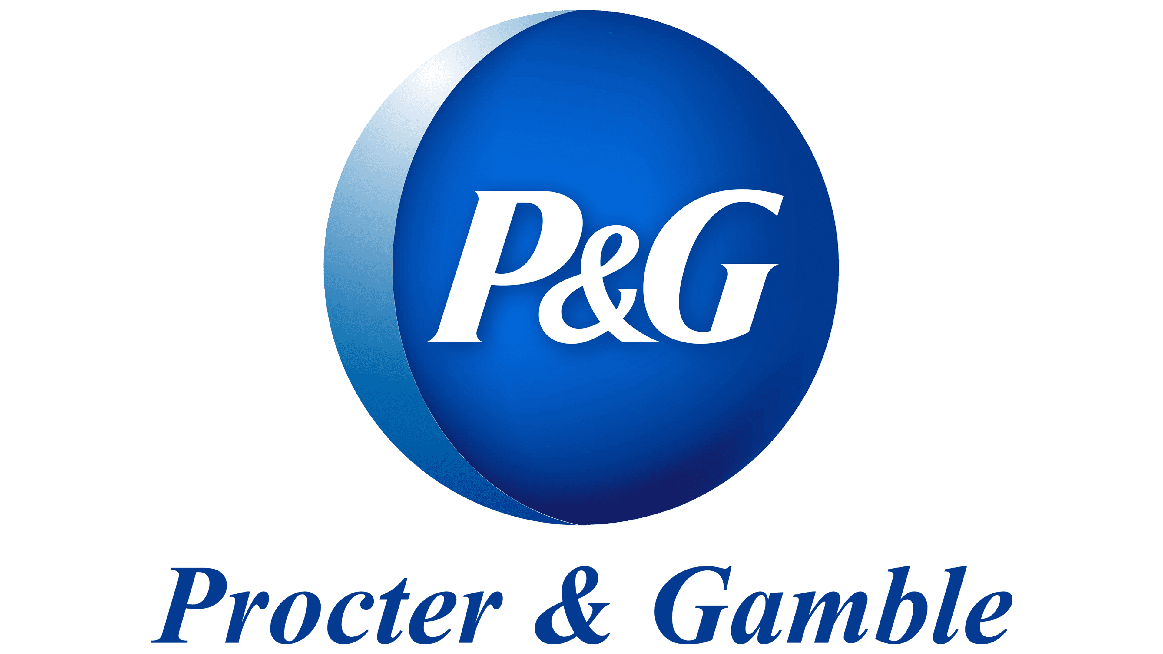
To modernize the Procter & Gamble logo, the developers used one of the earliest images – a circle with a crescent-shaped element on the side. The first represented the moon, and the second represented the crescent, which had previously been depicted together with the stars. But only now was their place taken by the company name’s abbreviation. That is, the central place is given to the inscription “P&G.” It is the same as in the previous version of the visual identity. Only the color has changed: the letters have become white, and the surrounding space is blue. But at the same time, the blue is not uniform but gradient, with a transition from the light part (in the middle) to the dark part (at the edges). On the left side of the circle is a blue crescent-shaped element with sharp ends.
Font and Colors
P&G’s debut logos featured a man’s face against a round moon backdrop. In front of him were thirteen small stars. They symbolized the first thirteen colonies of the United States. The emblem had no religious or occult overtones. Such a sign conveyed only the company’s history since the workers marked boxes with its products during transportation with a similar label. But later, competitors saw this as a “satanic sign,” and the corporation decided to use the text version of the logo.
After switching to a Word logo, designers paid much attention to typography. When modernizing the visual identity, they first changed the typeface. At different periods, analogs were used that approximately matched the fonts HeadlineNEWS Regular, Vremena Grotesk Medium, and Breve News Bold Italic. The modern minimalist sequin is reminiscent of Helvetica.
The corporate palette of the P&G emblem is always two-part: black and white or blue and white. True, the blue color has shades, from blue to cobalt.