


![]() Shake Shack Logo PNG
Shake Shack Logo PNG
The designers developed a savory burger with layered toppings for the fast-food chain that started with this popular dish. The Shake Shack logo is centered on this fast-food king. Graceful lines add sophistication to the emblem and to the food.
Shake Shack began in 2001 as a modest hot dog cart in Madison Square Park, New York City. This venture, initiated by restaurateur Danny Meyer of Union Square Hospitality Group, quickly shifted from a part of an art project to the seed of a future global phenomenon.
By 2004, the cart’s popularity led to the establishment of a permanent kiosk in the park, marking the official birth of Shake Shack. The expanded menu now includes burgers, fries, and milkshakes. This change solidified Shake Shack’s place in New Yorkers’ hearts, as evidenced by the long lines and dedicated following it had garnered by 2010.
The period from 2010 to 2015 was significant for Shake Shack as the brand ventured beyond New York. It opened locations across the United States and took its first step into international markets with a store in Dubai. The momentum continued, and in 2015, Shake Shack went public via an IPO, with its stock jumping over 130% on the first day, signaling strong investor enthusiasm.
Following its IPO, Shake Shack didn’t pause its expansion efforts. By the end of 2021, the brand celebrated over 350 locations worldwide, maintaining its commitment to quality ingredients and eco-friendly practices. Shake Shack has been recognized for its use of antibiotic-free beef and its efforts toward environmental sustainability, including eco-friendly packaging and community sourcing.
In recent years, Shake Shack has embraced digital innovation. The brand launched a mobile app and forged delivery partnerships, adapting to customer needs and the challenges of the COVID-19 pandemic. This period underscored Shake Shack’s adaptability, as it focused on outdoor dining, delivery, and drive-thru services to stay connected with its customer base.
Meaning and History
![]()
All restaurants in the network share a common branding. As is already known, it was developed by the design company Pentagram. But only a few people know she had a hand in previous Shake Shack logos. The fact is that Madison Square Park is located across the street from its main office in New York City, so Danny Meyer could not help but go there.
What is Shake Shack?
Shake Shack is a fast-food restaurant chain that operates far beyond the US. Its head office is located in New York City, and the very first location, opened in 2004, is still located in Madison Square Park. The company’s founder is Danny Meyer.
2004 – 2008
![]()
You must delve into the network’s history to understand why Shake Shack’s debut logo looks the way it does. In 2004, the Madison Square Park Conservancy completed the restoration of the park. Danny Meyer was one of its founders, and he wanted to open a restaurant that would fit perfectly into the surrounding landscape. A team of architects led by James Wines implemented the idea. They stylized the building as a 1960s kiosk, added sharp corners, and decorated it with ivy.
From this, Pentagram started when they created the first sign for Shake Shack. The specialists also considered many design studios; developing typography corresponding to the creative district was important. As a result, the logo featured the fast-food chain’s name, set in the Art Deco style and evoking classic bar-counter inscriptions. The phrase was not separated by a space and consisted of thin black sans-serif glyphs. On the building, the letters looked especially impressive because they were enlarged and made of stainless steel.
Paula Scher was involved in branding and managed the project for free because it was part of the Madison Square Park restoration campaign. She ensured that the Shake Shack logo’s design did not clash with the surrounding landscape and chose the modern Neutra font.
2008 – 2010
![]()
A new stage in Shake Shack’s identity began in 2008. This was due to the company’s unexpected expansion. When launching his first restaurant, Danny Meyer did not even consider creating a fast-food chain. But his business proved so profitable that in 2006 he decided to open a second location. The old sign no longer fit the style, as it was planned to extend beyond the park zone. The restaurateur turned to Pentagram again and asked to adapt the logo for the urban environment to look more traditional without losing its original aesthetics. Paula Scher was again involved in the rebranding – this time not for free, although she later noted that the payment was insufficient.
Under her leadership, the design team developed the idea of a mid-century burger, changing it to modern realities. As a result, the Galaxie Cassiopeia font was chosen for the inscription, which mimics handwriting. According to Paula, it looked like it was about to glow, like a 1950s neon sign. All letters except “S” and “h” were connected.
The curly inscription was combined with an icon resembling a hamburger. The designers placed the drawing in the center to separate the words “Shake” and “Shack.” It consisted of four white elements outlined in green. On top was a semicircle that imitated the top of a cut bun. Below it was a lettuce leaf shaped like a wavy line, and then two rectangles with rounded corners. One of them imitated a cutlet; the second, the bottom of the roll.
2010 – today
![]()
In 2010, the restaurant chain expanded beyond New York City. Naturally, such an expansion entailed another change in the logo. However, no new elements appeared in it. The modern version combines an old wordmark with a 2008 hamburger icon. Designers at Pentagram combined them, placing the drawing in its usual spot to separate the two words in the brand name.
Font and Colors
As the history of Shake Shack revealed, the logo of these restaurants has always adapted to its environment, first to the park’s landscape and then to modern city streets. That’s why it looks so versatile. Its main element is a schematic representation of a hamburger. The wavy stripe creates a dynamic that strict angular letters lack.
The Neutra font used for the inscription “SHAKE SHACK” belongs to the geometric grotesque category. The horizontal strokes can be recognized as shifted downwards. It was created in 2002 by the American typographer Christian Schwartz and is based on the work of the famous Austro-American architect Richard Neutra. For the 2008 wordmark, Galaxie Cassiopeia, an equally authentic font with wavy and rounded lines, was chosen.
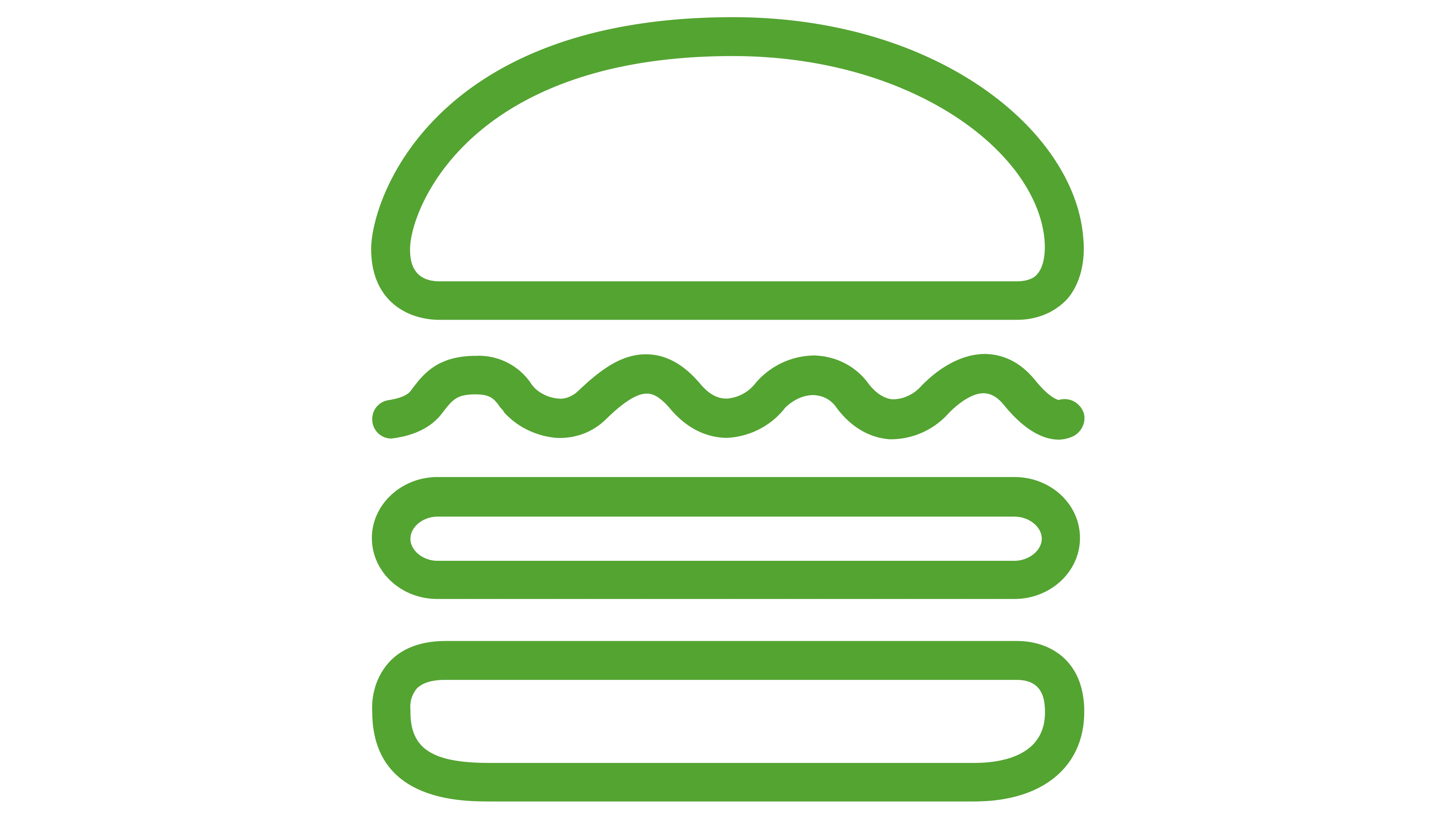
Designers from Pentagram made the brand name black. The hamburger outlines have a light green tint (#6CB33F). The background and the inner parts of the logo’s drawing elements in the main version are painted white.
FAQ
What is the Shake Shack slogan?
Shake Shack’s slogan, “Stand For Something Good,” tells us much about its values. It shows that it cares a lot about the quality of its food, supporting the community, and being kind to the environment. This idea guides everything it does.
Shake Shack is serious about ensuring its food benefits you and the planet. Its burgers use 100% natural Angus beef, and its potato buns and chicken are all-natural, too. Its focus is on making food that’s tasty, healthy, and made the right way.
“Stand For Something Good” is Shake Shack’s way of saying it’s committed to making a difference with its food and in every part of its business. They promise to keep working hard to make a positive impact on their customers, employees, and the places they serve.
What is Shake Shack font?
Shake Shack’s logo uses the Neutraface Text Demi font from House Industries. This choice reflects the brand’s personality and the image they want to present. Neutraface is recognized for its clean lines and modern look, which suit Shake Shack’s modern, inviting image.
Using Neutraface Text Demi helps make Shake Shack easily recognizable. For Shake Shack, Neutraface Text Demi conveys simplicity and friendliness, showing the brand’s focus on quality food from simple, high-quality ingredients. The modern, stylish font supports Shake Shack’s image as an updated “roadside” burger stand, offering a new twist on classic fast food. Shake Shack’s use of Neutraface Text Demi is a well-thought-out branding move.
Is Shake Shack a brand?
Shake Shack is a brand known worldwide. It started small, similar to the High Line project in New York, and grew big thanks to a smart design by the firm Pentagram. It all began with a hot dog cart in Madison Square Park in 2001, part of an art project. The cart was so loved that by 2004, it had become a permanent kiosk. This marked the beginning of Shake Shack’s journey from a local NYC cart to an international chain.
Shake Shack has grown worldwide, opening stores in big cities from London to Tokyo and Dubai to Seoul. Even with its global expansion, Shake Shack ensures every new location retains the quality and experience customers expect. This has made Shake Shack a New York brand now loved worldwide.
What is so special about Shake Shack?
Shake Shack shines in fast-casual dining because it’s all about quality. They get their beef from Pat LaFrieda Meat Purveyors, known for top-notch meat, showing how serious they are about good food. Mark Rosati, the Culinary Director, says getting the best beef is key.
At Shake Shack, the quality of the beef and everything else is very important. Their burgers are 100% all-natural Angus beef, with no hormones or antibiotics. This matters to people today who care about where their food comes from and its environmental impact. Shake Shack also cares about the vibe of its places, blending fast-food speed with a nice place to eat. This mix of good food, mindful attention to the planet, and a great place to eat makes them stand out.