


The world of athletic footwear boasts many memorable logos. Imagine the instantly recognizable Nike mark or the dynamic cat silhouette of Puma. With many choices, a sports shoe enthusiast will likely easily recall and draw a few logos.
A logo is a crucial brand tool, especially in athletic footwear. It sets a company apart in a highly competitive market. However, for a logo to take its rightful place, it must be visually appealing and evoke an emotional response in consumers.
This positioning of emblems makes them even more important in the sneaker industry. Emblems are not limited to product packaging or online sites. They are intricately woven or printed directly on the shoes. Consequently, these symbols must make consumers feel connected to them and wear them with pride.
So, what magic do athletic shoe companies use to ensure their customers wear their emblems as a sign of loyalty? Let’s dive into the world of famous athletic shoe brands and examine some of the most influential logos that mesmerize and educate audiences.
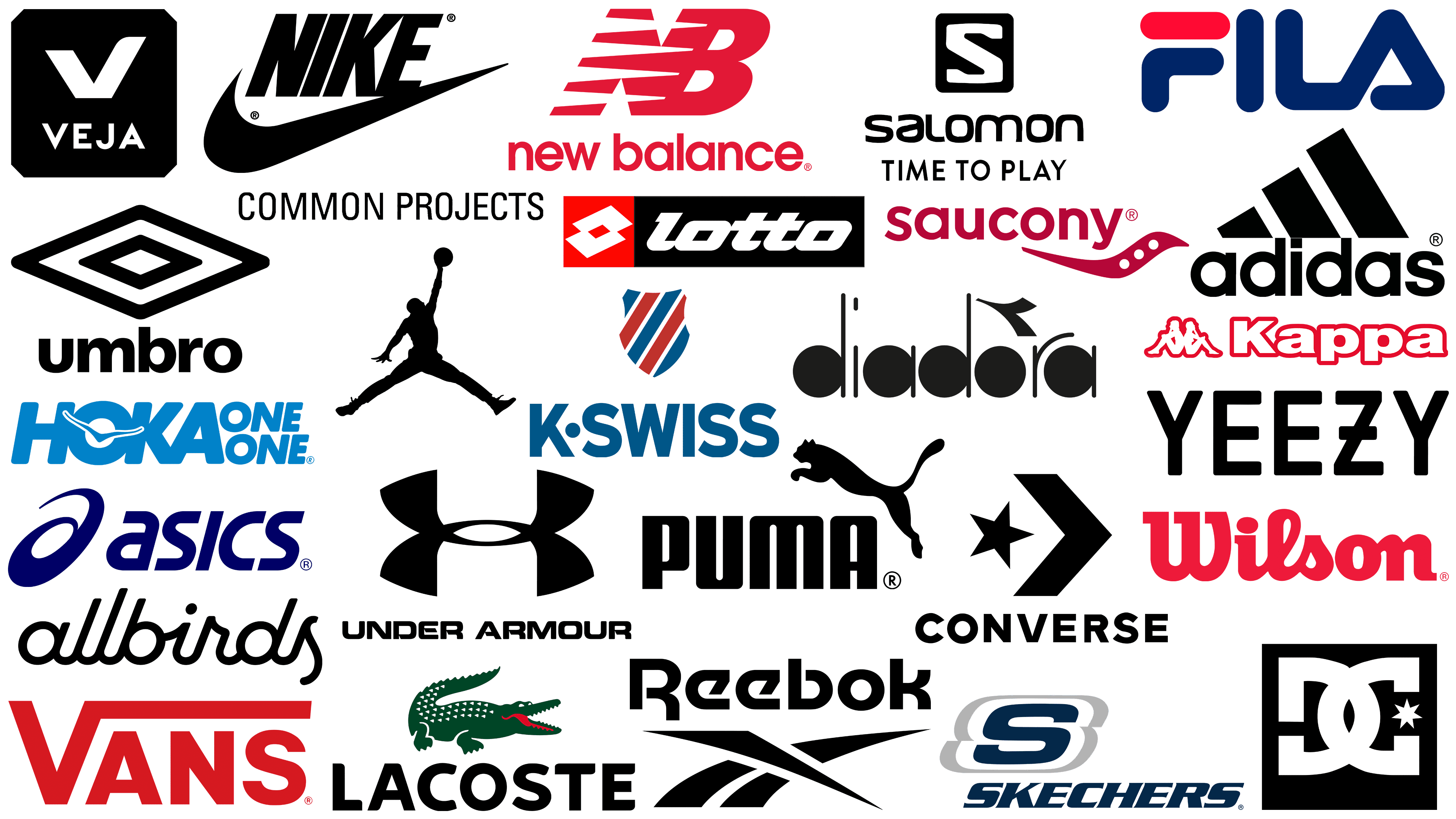
Famous sneaker brands: The top sneaker brand logos
Some logos become recognizable symbols across continents in the vast world of athletic shoes. These symbols have taken their place by captivating audiences from different cultures and walks of life.
A closer look reveals that, despite each logo’s uniqueness in reflecting the brand’s ethics and vision, common principles underlie its design. One of the most important aspects is the logo’s practical application to the product. With its varying sizes and limited surface area, the very nature of footwear requires logos to be simple and uncomplicated. Minimalism is often favored not only for its aesthetic appeal but also for its functional adaptability across different shoe sizes.
The choice of color palette further emphasizes this principle of adaptability. Monochrome schemes, especially black-and-white, dominate the logo designs of many sneaker brands. There are two reasons behind this trend. First, these colors have a timeless appeal, allowing the logo to remain stylish through different fashion cycles. Second, given the shoes’ bright, varied color schemes, the logo must maintain its individuality without overshadowing or conflicting with the shoes’ design.
The combination of design simplicity and a versatile color palette allows logos to blend seamlessly into the product while maintaining their iconic status. As we delve deeper into sneaker brands, this balance between brand personality and product harmony becomes increasingly apparent.
Adidas
![]()
The history of the Adidas emblem dates back to 1924. Adolf Dassler’s entrepreneurial journey began in a rather unassuming place, his mother’s laundry room. From this humble space, Dassler set out to create athletic shoes that would soon gain worldwide recognition. The original Adidas logo design was quite intricate, but over time, it evolved into the iconic three stripes now recognizable worldwide.
The evolution of the Adidas logo reflects a deeper meaning than just aesthetics. The emblem, which resembles the outline of a mountain, represents the challenges, aspirations, and pinnacles of success that athletes strive for. Wearing Adidas is not just a fashion statement but a symbol of striving to overcome challenges and achieve greatness.
The logo’s adaptability, showcased across various color palettes and sizes on Adidas shoes, further underscores the brand’s universal appeal and versatility. While maintaining the core design, each iteration of the logo introduces a new approach, keeping Adidas modern, relevant, and at the forefront of sports fashion.
Air Jordan
![]()
Emerging under the globally recognized Nike brand umbrella, Air Jordan has carved out its own identity, closely associated with basketball legend Michael Jordan. The Air Jordan logo stands out among many sneaker brand symbols, depicting Michael Jordan’s silhouette in mid-jump and capturing the essence of his athletic prowess.
The depth and intricacy of this emblem are not often seen in the sneaker world. The carefully crafted design details showcase the craftsmanship and resonate powerfully with the audience. The emblem acts as a conduit, fostering a deep connection between the person wearing the shoe and the legendary athlete they admire.
Allbirds
![]()
Originally from New Zealand, Allbirds is a prominent name in the global footwear industry. It is renowned for its wide range of footwear and apparel and distinctive business ethics. The brand’s choice of luxurious yet eco-friendly materials reflects its desire for sustainability.
Allbirds has opted for a ‘direct-to-consumer’ approach, bypassing traditional wholesale. It offers a wide range of products exclusively through its official websites and retail stores, providing customers with a consistent brand experience. The Allbirds logo reflects the brand’s philosophy: simplicity combined with sophistication. Using a flowing italic sans-serif font, the logo exudes elegance. Using lowercase letters throughout the logo, the brand successfully conveys a sense of accessibility and warmth, inviting consumers to become part of a community that values style and sustainability.
Asics
![]()
Founded in 1949, Asics is a well-known Japanese corporation specializing in the design and manufacture of a wide range of sports equipment. The brand’s name is not just a random word; it comes from a Latin expression that encapsulates the idea of harmony between physical and mental well-being.
The Asics shoe emblem is a unique execution of the letter “A,” depicted in a graceful swirl, and the brand name, printed in a modern sans-serif font. This font is not just flat; it is slightly slanted to the right, symbolizing dynamism, agility, and a relentless desire for athletic excellence.
Common Projects
![]()
Characterized by luxury, Common Projects is more than just a name in the sneaker world. It stands out from the crowd, especially among fans of high-end collections and those who strive for high quality. Over the years, the brand has catered to an elite clientele, including celebrities and athletes of the highest caliber.
The splendor of the Common Projects logo lies in its understated elegance. The brand takes a minimalist approach to design, eschewing flashy symbols and other elements. The typography evokes a sense of uniformity and solidity, as it is written only in capital letters. Each letter is carefully crafted, spaced, and aligned, emphasizing the brand’s precision and reliability.
Converse
![]()
Globally recognized for its iconic logo and name, Converse has cemented its reputation as a leading manufacturer of canvas shoes. Available in various styles, these shoes cater to today’s consumers. While many consider Converse an independent company, it should be noted that the brand has been under Nike’s management for several years.
The Converse branding is an exercise in elegance and simplicity. The brand’s emblem is in a sans-serif font, boldly displaying the brand name in uppercase. This simple lettering is complemented by a distinctive graphic element: a star connected to an arrow. This design is not just eye-catching but embodies the essence of progressiveness and cutting-edge innovation that the brand constantly strives for.
One of the interesting aspects of Converse’s approach to branding is the adaptability of the logo application. Often, the only graphic image seen on the canvas of Converse shoes is a star with an arrow. This symbol’s appearance emphasizes the emblem’s power and suggests that the brand is confident in its unmistakable uniqueness, even without a full word mark.
DC
![]()
DC Shoes, a formidable name in action sports apparel, has successfully established itself, especially in snowboarding and skateboarding. Originating in 1994, the brand has, over time, become a symbol of style intertwined with functionality. Although the initials “DC” often appear in the brand name, few know they originally stood for “Droors Clothing.”
The DC Shoes emblem stands out thanks to an artfully crafted monogram. The letters “D” and “C” are intertwined, reminiscent of the strength and unity of a chain’s interconnected links. An intriguing addition to this design is a star subtly inscribed between the curves of the letter “C.” This element conveys the brand’s vibrant, adventurous nature, reflecting its commitment to creating functional yet energetic, energizing products for action sports enthusiasts.
Diadora
![]()
Founded as an Italian giant in the sportswear and footwear industry, Diadora has a special place in sneaker brand logos. Offering a diverse collection, the company produces everything from jackets, sweatshirts, and leggings to shorts, catering to various sports and casual wear needs.
The Diadora logo uniquely combines minimalist design elements with a twist. Including circles in the letters stands in contrast to thin, streamlined lines, creating an impression beyond traditional word marks. Above the letter “O,” an additional design element, a mesmerizing stroke, is strategically placed, further enhancing its appeal and adding to its Italian sophistication.
Fila
![]()
Emerging in Italy in 1911, Fila quickly gained popularity and loyalty from consumers seeking comfort and affordable footwear. As the brand expanded worldwide, it gained admiration and patronage in many regions, largely due to its innovative, modern approach to footwear aesthetics.
Like the design of its products, Fila’s emblem echoes the brand’s contemporary ethos. A close look at the details reveals a unique relationship between the letters “L” and “A” in the emblem. This subtle relationship gives the brand name a distinct personality. Similarly, an intriguing facet of the design represents the letter “F.” The intentional separation of the two stripes evokes an equal sign, perhaps symbolizing balance or equilibrium. Every aspect, from the shoe design to the emblem, demonstrates Fila’s dedication to ideas, comfort, and style.
Hoka One One
![]()
Hoka One One, a well-known French manufacturer of athletic shoes for running enthusiasts, has carved a niche for itself by introducing designs with unusually pronounced elements, especially on the back of the shoe, that attract attention and redefine standard design.
The Hoka One One logo sets it apart from many contemporary brands. While many shoe brands use word markings in their logos predominantly, Hoka One One takes it further. The logo subtly incorporates the silhouette of a bird gracefully gliding over the letter “O” in the word “Hoka.” This design choice is not just aesthetically pleasing but also symbolic. The inclusion of the bird alludes to notions of freedom, limitless horizons, and the vigor of unrestrained movement.
Kappa
![]()
Originating in Italy in 1978, Kappa quickly became a recognizable name in sportswear. From rowers and hockey players to basketball players, Kappa’s extensive product line caters to a wide range of sports enthusiasts, so there’s something for everyone. One of the hallmarks of Kappa footwear, particularly sneakers, is the preference for symbolic imagery over the brand’s full-text logo.
Kappa’s visual identity combines modern design and symbolic representation. The sleek sans-serif font in the logo stands out, especially when rendered in strict white and highlighted with a bold red border. This color choice emphasizes the brand name and ensures its memorability in a competitive market. The emblem beside the word mark sets the Kappa logo apart from many others. This silhouette of two people sitting side by side goes beyond mere aesthetics. Design elements like this seamlessly communicate the brand’s style, allowing it to resonate with a global audience.
K-Swiss
![]()
K-Swiss was founded in the bustling city of Los Angeles, California, by a pair of enterprising Swiss siblings, which is unequivocally reflected in the brand name. The company is constantly evolving, creating a wide range of footwear and sportswear designed for professionals in various sports.
The K-Swiss logo sets it apart in the vast sea of sneaker brands. Embodying a vibrant color palette, the brand features a shield-shaped emblem painted in red, white, and blue. In addition to the emblem, the brand’s name is boldly engraved in upper case in a clear sans-serif font. These elements combine to create a brand that is progressive in its approach.
Lacoste
![]()
Originating from France, the Lacoste brand has built its global reputation since its inception in 1933. The brand has expanded its range as the brainchild of renowned tennis pro René Lacoste and businessman André Gillier. Initially, the brand specialized in tennis clothing, but later expanded into a wide range of clothing and sporting goods, among which sneakers hold a special place.
Lacoste’s logo is one of the few, like Puma’s, that prominently features an animal emblem. The iconic crocodile emblem has historical significance for the brand. During his brilliant tennis career, René Lacoste was given a nickname synonymous with this ferocious reptile. This nickname later served as the basis for the symbolism now synonymous with the brand’s identity, demonstrating a history in which sport and fashion merge.
Lotto
![]()
Lotto, officially known as Lotto Sport Italia, originated in Italy and is a world-renowned sports equipment brand. For over eight decades, this iconic company has consistently met consumers’ fashion and sports needs worldwide with a wide range of casual apparel, innovative soccer boots, modern sneakers, and other essential sporting goods.
The Lotto logo radiates dynamism and vibrancy. In line with the trends of many sneaker brands, the logo has a distinctive rightward slant, a subtle hint of dynamism, and agility. Further enriching the brand’s visual identity is the diamond emblem, created by intertwining two “L” letters. This intricate design emphasizes the brand’s originality and commitment to unity and innovation. Together, these elements create a logo that reflects Lotto’s rich heritage and visionary approach to sports fashion.
New Balance
![]()
Founded in 1906, New Balance is an iconic name in the world of sneakers, especially in America. Since William J. Riley founded the company, its emblem has largely retained its original essence.
The New Balance emblem elegantly depicts the brand’s name in unassuming lowercase letters, indicating the company’s humble origins. The emblem is complemented by a clear monogram, “NB.” The letters are crafted with elegance, so they combine organically. The slight tilt to the right of this monogram subtly hints at the brand’s dynamism, agility, and constant pursuit of innovative design and technology in the sneaker industry.
Nike
![]()
Athletic footwear is rife with symbols, but a few logos have no trouble gaining worldwide recognition. Nike’s “swoosh” stands out, epitomizing premium footwear and an icon of the brand’s craftsmanship. The logo traces its roots back to Nike’s goddess wing, often associated with triumph and impetuosity, and evokes a sense of achievement and agility.
In addition to its mythical origins, the logo design bears a striking resemblance to the checkmark. This resemblance reinforces the connotation of success and forward movement. Behind this world-famous logo is a humble beginning. Created by Carolyn Davidson, it was purchased for only $35.
The Nike Swoosh is a testament to the power of minimalist design. It emphasizes that, in branding, less is often more. A design doesn’t have to be intricate to be effective; sometimes, a simple Nike emblem with deep meaning can resonate across generations and geographies, embodying a brand’s core values and aspirations.
Puma
![]()
Emerging from the shadow of Adidas, Puma has made its mark on the annals of sneaker history. Founded by Rudolf Dassler, the sibling of Adidas founder Adolf Dassler, Puma has had an interesting journey since its inception in 1948. The brand has undergone various metamorphoses over the decades, but one element remains consistently recognizable: its emblematic animal logo.
Puma’s choice of the leaping puma as its symbol is not just an aesthetic decision. This agile and fast creature symbolizes the dynamism, speed, and agility inherent in the sport and reflects the qualities that Puma strives to instill in its owners. The puma’s twisted image captures the essence of movement, resonating with athletes and everyday users alike.
Puma chose a sans-serif font that reflects modernity and simplicity. This choice complements Puma’s streamlined design, ensuring the two elements coexist harmoniously. Although the full Puma logo combines the word mark and the Puma image, the brand sometimes shows the cat separately, demonstrating its independence and the deep recognition it has earned over the years.
Reebok
![]()
Founded in 1895, Reebok has over a century of heritage, making it a veteran in the sneaker industry. Over the years, the brand has become a prominent figure in global sports circles, being widely recognized for its iconic sneakers and symbolic logo.
The Reebok logo is a word mark with traditional capitalization. This choice gives the brand elegance while maintaining its athletic roots. The logo uses an eye-catching modern sans-serif font. In addition to the word mark, Reebok utilizes a distinctive emblem of intersecting lines. This design element embodies the essence of athletic dynamism, challenge, and a relentless competitive spirit.
Salomon
![]()
Salomon is significant in the industry, having emerged from many footwear brands. Operating under the umbrella of Amer Sports, Salomon has carved out a niche for itself, primarily in skiing. The company’s expertise is not limited to ski equipment; it boasts a diverse range of sneakers to suit different athletic needs.
The Salomon emblem embodies the essence of the brand in a striking design. The dominant emblem is a white “S” that stands out sharply against the deep black background. This bold “S” is eye-catching and symbolizes strength and stability. Complementing this design element is the brand name just below. The distinctive feature of the text, set in a clean sans-serif font, is its uniformity: all letters are carefully crafted and have the same height, with no variation. This design choice creates a sense of balance and harmony in their products.
Saucony
![]()
Saucony may not immediately catch the eye in the vast universe of athletic brands like some iconic sneaker brands. However, it is steadily climbing the popularity ladder, especially in the US, and has gained recognition in many corners of the globe.
Saucony is not limited to footwear. Under the brand umbrella lies an impressive array of products, from diverse clothing lines to a wide range of footwear, each designed to meet specific athletic needs and lifestyle choices.
Saucony’s defining feature is undoubtedly its logo. Unlike the flashy designs often seen in the sneaker world, Saucony’s emblem is a masterclass in subtlety and precision. The company’s moniker, rendered in a streamlined sans-serif font, exudes modernity. The abstract motif below the name is eye-catching: a smooth, wavy line complemented by a trio of pure white dots. This remarkable logo embodies the essence of Saucony – distinctive, reliable, and in tune with current trends.
Skechers
![]()
Founded in 1992, Skechers USA carved out a niche in the footwear market through its commitment to producing sneakers that emphasize flexibility, cost-effectiveness, and user comfort. The brand’s journey has not been linear. The company has faced challenges and controversies, but has shown resilience by dedicating its resources to charity.
The Skechers logo is a testament to the brand’s ethics. Its design is characterized by a pronounced uppercase font with a slight rightward slant, symbolizing dynamism and speed. A huge letter “S” often catches the eye, periodically colored in different shades, adding variety to the brand’s footwear assortment.
Umbro
![]()
Originating in the UK, Umbro has established itself as a leader in sportswear and training footwear, earning worldwide recognition for its high-quality products. This fame has allowed the brand to expand beyond the country’s borders, and its products are now available in over 90 countries. Umbro currently operates under the Iconix brand umbrella and continues to thrive.
The Umbro logo, distinguished by a horizontally arranged double diamond, is designed to evoke a sense of superiority and distinction among customers. This emblem is sometimes accompanied by the brand’s name, which is somewhat unusual for a sports brand that uses entirely lowercase lettering. This design choice allows for a different perspective, deviating from the usual trend of capital letters in sports brand logos.
Under Armour
![]()
Under Armour has firmly established itself as a leader in American sportswear. The brand has made significant strides in a competitive market by offering a wide range of products, from athletic footwear to casual wear. The company’s distinctive feature is its focus on sustainability, which is evident in its practices and collaborations with renowned organizations.
The Under Armour logo has been widely recognized. Following the example of many famous sneaker brands, Under Armour uses a combination mark in its logo. It has a bold sans-serif font word mark, representing the brand’s unwavering self-confidence. An additional element of the emblem is the monogram “UA,” in which the letter “U” is elegantly intertwined with the letter “A” to form a distinctive, easily recognizable design.
Vans
![]()
Vans was founded in 1966 in the dynamic atmosphere of California and positioned itself as a brand that resonated with the skateboarding subculture. Initially aimed primarily at skateboarders, the brand soon won the hearts of a wider audience, many of whom were attracted to the comfort and original design of Vans shoes.
Van’s emblem epitomizes the brand’s bold spirit. Its appearance is closely connected with the brand’s roots in skateboarding. Created by the company’s president’s offspring, the emblem was designed as a unique mark for skateboards. This individual design element later evolved into a globally recognized brand symbol.
The distinctive features of the Vans logo are its strict sans-serif font, which exudes confidence and energy. All letters in the logo are in upper case, further emphasizing its assertiveness. Particularly notable is the elongated line of the letter “V,” which extends behind the subsequent letters, reminiscent of a skateboard’s trajectory.
From its humble beginnings as a homemade skateboard sign to its transformation into a recognized symbol, the Vans logo tells a story of adaptability and unwavering uniqueness to core principles.
Veja
![]()
Originally from France, footwear brand Veja is also recognized as “Vert” in some parts of the world. Founded in 2004, Veja doesn’t limit itself to just shoes but produces a variety of product lines, including handbags, sneakers, and even premium leather goods.
Veja’s reputation is based on its unwavering commitment to quality. The brand carefully selects the highest-quality materials, ensuring that each product reflects the essence of luxury and sophistication. The brand’s logo further emphasizes this principle. The logo is the brand’s name, written in capital letters and typed in a modern sans-serif font. Next to it is a distinctive feature, a slightly nonstandard letter “V” that gives the whole design its uniqueness.
An elegant and modern Veja emblem is the best way to decorate shoes, seamlessly aligning with the brand’s concept of creating elegant, functional products.
Wilson
![]()
The American company Wilson Sporting Goods has gained a reputation as a manufacturer of sports equipment. The company participates in many sports, including American soccer, baseball, and basketball, but its offerings are not limited to equipment: its wide range of products also includes athletic footwear.
Wilson’s logo has an unexpected elegance, something not often associated with sports brands. The choice of cursive font gives the brand sophistication and a unique charm. In a world of sports branding dominated by black, Wilson boldly chooses red, giving its identity an energetic, passionate feel. This conscious choice of red sets the brand apart and symbolizes the company’s enthusiasm and dedication to the world of sports.
Yeezy
![]()
This shoe brand, created by multifaceted artist Kanye West and inspired by the pseudonym “Yeezy,” has achieved extraordinary recognition over the years. It has a special resonance among fans of the music craft. Yeezy has collaborated with leading sportswear brands such as Adidas and Nike to create premium footwear that combines style and comfort.
The Yeezy logo is a harmonious blend of simplicity and charm. Created to emphasize the significance of West’s popular nickname, the symbol is prominently featured in various Yeezy merchandise. The emblem is predominantly typographic, utilizing uppercase letters in a modern sans-serif font. An intriguing element is the artful twist of the letter “Z,” which gives the emblem character and emphasizes the brand’s penchant for individuality.
Conclusion of Popular Sneaker Logos
In the dynamic fields of fashion and sports, distinctive sneaker logos have value beyond mere differentiation. These symbolic images are essential for companies to resonate with their audiences and foster brand loyalty.
An eye-catching sneaker logo doesn’t just sit on the shelf; it adorns the feet of enthusiasts and regular users alike. By wearing these emblems, customers unwittingly become brand ambassadors, demonstrating their loyalty and promoting the brand’s presence to a wider audience. This organic advertising and endorsement explain the shoe companies’ considerable efforts and creativity in designing logos that leave an indelible mark on consumers’ psyches. Finding the perfect emblem is not just about aesthetics; it’s about creating connections and building brand affection in an ever-competitive market.