


![]()
The Snuggle brand has been on the market for four decades. It is known for its fabric softener. The brand’s mascot is a plush teddy bear. His image has become a symbol of softness and comfort, helping the brand establish itself in a category where products from different manufacturers are similar. To remain relevant and meet new demands, Snuggle turned to the agency Bulletproof to create a renewed style.
The previous logo featured rounded letters and an image of the bear with a towel. The mascot looked friendly, but was too static and resembled characters from a past generation. The visual system did not match the opportunities opening up for the brand.
![]()
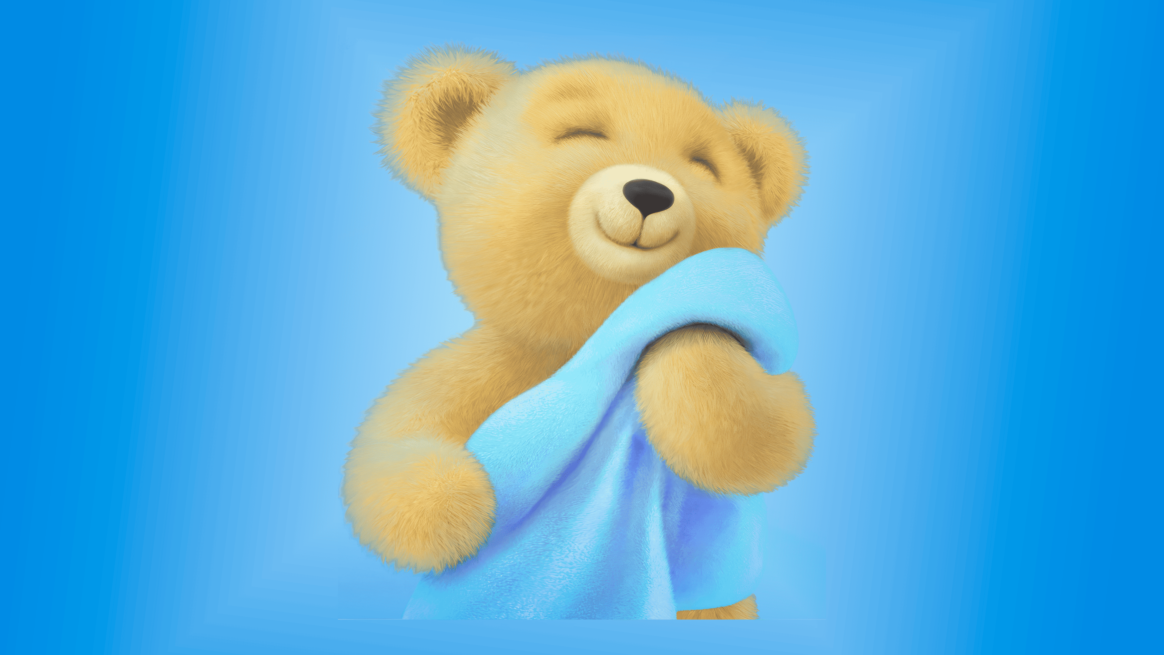
In the new design, the bear has undergone a change in its appearance. His image has become three-dimensional, created as a 3D illustration. Artist Kim Neill did the work. The mascot appears relaxed, with closed eyes and a contented expression. He holds a towel in his paws, the color of which can change depending on the specific fragrance of the product. This adaptability enables the image to be easily used across various fabric softener lines.
The logo received an updated typeface. The letters are larger and placed closer together, creating a visual effect of softness. The blue shade has become darker and more saturated, making the lettering more expressive while maintaining continuity. The name and the mascot now form a single whole: the bear is positioned above the letters, and the typography supports his shape.
The packaging was also redesigned. The main color palette is based on cool blue shades complemented by white highlights. The palette creates an atmosphere of cleanliness and freshness. The structure became more organized: the logo, the bear image, and decorative accents now interact in a more cohesive composition.
The photographic style was updated: images of towels and laundry have become more realistic, with a stronger focus on texture and sensory impressions. The visual language conveys a feeling of softness and enhances the perception of the product as a comfort-oriented solution.
![]()
The updated brand retained the bear as its main symbol but made it modern and more vibrant. In the new visual system, he plays a key role, remaining the “voice” of Snuggle through which the company communicates with consumers.
Snuggle has shown that even a brand with a long history can evolve without losing recognition. The new style conveys warmth and comfort, while modern packaging and the adaptable mascot image draw the product closer to its audience, including young families seeking reliable laundry care solutions.