 Society for Environmental Graphic Design (SEGD) Logo PNG
The Society for Experiential Graphic Design (SEGD) logo is a compelling visual element that conveys the organization’s leadership in merging art and technology. This logo demonstrates that the client is working with an innovative organization that sets industry standards for creativity and quality. The logo is an elegant expression of SEGD’s mission to advance the design community through interdisciplinary collaboration and education. It serves as an acronym for the transformative power of design, revealing the organization’s goal to shape the future of visual experience.
SEGD: Brand overview
In 1973, John Berry and Richard Burns created a specialized association for those involved in environmental graphic design in an effort to increase the recognition and application of this design specialty. In the 1970s and 1980s, SEGD’s role became evident in creating a unique niche for environmental graphic design, placing it on par with architecture, visual communication, and industrial design. In 1987, SEGD introduced one of the first accreditation systems for EGD, setting a new bar for the industry.
In the 1990s, SEGD expanded its horizons by opening offices in Canada, Europe, and Japan. Over time, SEGD continued to support EGD by issuing white papers, promoting education, and recognizing outstanding contributions to the industry with awards. Notable achievements during this period include the release of an ADA White Paper on accessible navigation aids in 1993 and the launch of the Universal Symbols in Healthcare program along with the Hablamos Juntos program in 2010.
SEGD now has over 2,200 members with 46 global chapters, emphasizing the importance of designing objects that meet human needs in built spaces. Celebrating its 50th anniversary in 2023, SEGD highlights the legacy left by EGD’s pioneering members over half a century. By highlighting its history, SEGD serves as a dominant figure and resource center for EGD professionals worldwide.
Meaning and History
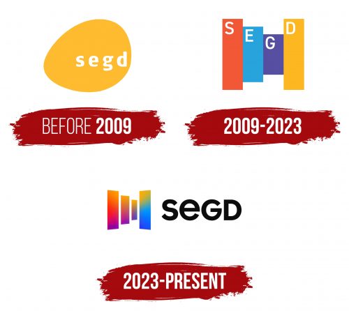
Before 2009
2009 – 2023
2023 – today
Despite the huge significance of the name of this multidisciplinary society explaining its concept, the logo is not purely textual. It depicts four vertically arranged rainbow stripes, reflecting the energy with which designers around the world are willing to change the perception of visual identity. The lines are of varying thicknesses and heights, which contributes well to the dynamic. The first three elements are in warm colors, and the last three are in cool colors. On the right side is the name of the society, consisting of upper and lower case letters. The font is black, bold, and rounded.
The use of rainbow stripes is a bold design move that sets the society apart and speaks to its openness and inclusiveness. The varying thickness and height of the stripes create a sense of movement and energy, indicating the dynamism and constant evolution of the organization. The choice of black, bold, and rounded font for the name aims for readability while making the design modern and friendly.


