


![]() Space Operations Command Logo PNG
Space Operations Command Logo PNG
The Space Operations Command logo accurately conveys the organization’s mission and purpose. The emblem is filled with themes of space, military ships, and patrolling the starry skies.
The history of U.S. Space Operations Command, known as SpOC, is tied to the creation of the U.S. Space Force. On December 20, 2019, President Donald Trump signed the defense appropriations law that established the Space Force as the sixth independent branch of the U.S. Armed Forces, placed under the Department of the Air Force.
SpOC’s direct predecessor was Air Force Space Command, or AFSPC, created in 1982 as a major command of the U.S. Air Force. It operated military satellites, missile warning systems, and related space infrastructure from Peterson Air Force Base in Colorado Springs, Colorado, a location later inherited by the new command.
After the Space Force was formed, its leaders began building an internal structure. On October 21, 2020, Space Operations Command was officially activated as the successor to AFSPC, taking over much of its personnel, infrastructure, and missions. Its first commander was Lieutenant General Stephen Whiting, who later became head of U.S. Space Command in 2024.
SpOC became the first of three field commands in the Space Force, followed in 2021 by Space Systems Command and STARCOM. Its role covers daily operation of satellite communications, navigation, missile warning, space domain awareness, and related cyber functions. The command replaced the Air Force wing model with space deltas and includes garrison commands, as well as SpOC West at Vandenberg Space Force Base in California. Comparable foreign structures include the Space Forces of the Russian Aerospace Forces and France’s Space Command, known as CDE.
Meaning and History
![]()
The unit was created as Space Command (1982) and, during its existence, underwent several name changes and jurisdiction transfers, from Air Force Space Command (1985) to the United States Space Force (2020). However, the existence of the 14th Air Army was discussed as early as 1943.
What is Space Operations Command?
The central unit of the United States Space Force was established in 2020 during the reformation. It deals with field command, intelligence, and cyber operations. It is stationed at Peterson Space Base.
2020 – today
![]()
The organization’s logo remains constant and reflects the direction of its activities.
The logo is modeled after a spacecraft. It resembles a fighter jet and has a deltoid shape. It is similar in form to the previous 2020 logo, when the organization was called the United States Space Force.
In the lower part of the image are inscriptions. In the center is “Space,” and along the tail edge is “Operations Command.” The emblem depicts a spacecraft protecting America’s space domain.
Inside the flying machine is a star map, where thin lines following the spacecraft’s contours denote the trajectories of smaller spacecraft.
There are four in total. One maintains a straight course and is a smaller metallic replica of the emblem itself. The other three, emerging from the lower-left corner of the map and passing through a common point, follow their routes through space. Behind each of the three spacecraft, its flight trajectory is drawn.
The logo shows that the celestial space is divided into sectors, protected, and under constant surveillance. All flying machines have a single command and deployment point. Within SpOC, this is the 24/7 Space Operations Center.
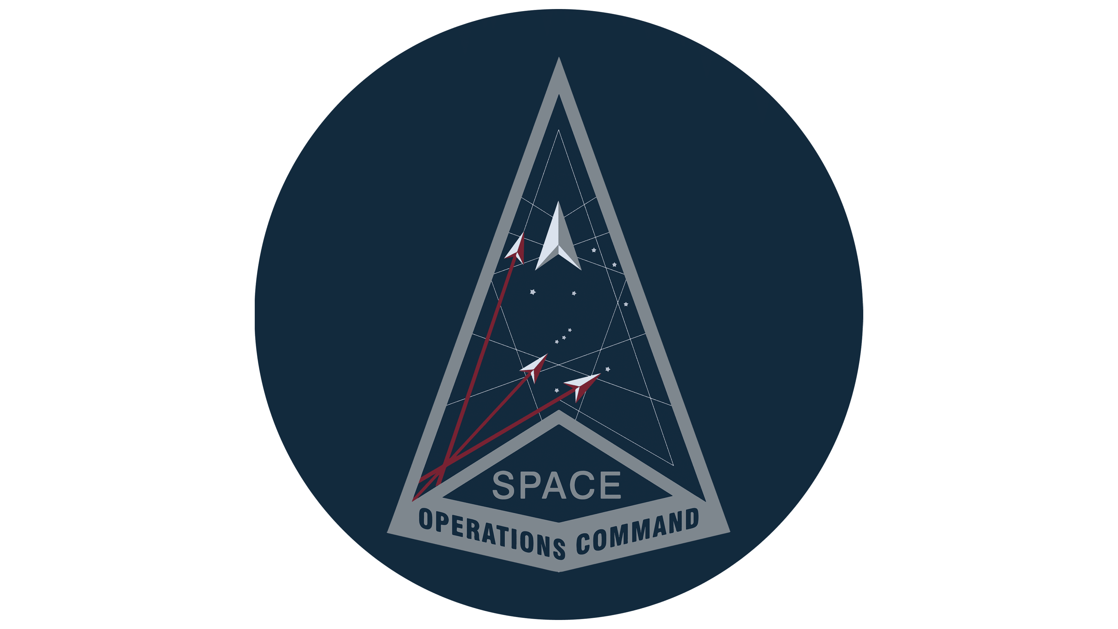
The absence of inscriptions outside the drawing emphasizes the symbol’s compactness and the organization’s minimal attachment to Earth. All necessary equipment is carried with the flying machines. They are highly mobile and independent.
The nose of the flying machine points upward, indicating ascension into space and evoking the vertical rocket launch that overcomes Earth’s gravity.
The emblem exhibits dynamics and speed. It demonstrates readiness to react quickly to any threats and to move to the necessary quadrants instantly.
The constellation Orion is clearly visible on the celestial canvas, one of the most famous and recognizable. It can be observed in the United States for most of the year. In mythology, the warrior figure was considered the Great Hunter, the embodiment of the King of Stars. In one hand, he holds a shield or a bow, and in the other, a club or a sword. However, in all versions, it is a celebrated and strong character.
The image of Orion emphasizes SpOC’s military orientation and its ability to read star maps and navigate space easily.
Moreover, most theories about the existence of extraterrestrial civilizations are associated with the Hunter constellation, demonstrating that the organization is prepared to confront even extraterrestrial threats.
Each Delta mission has its own logo while retaining the spacecraft’s overall image.
Font and Colors
The primary colors are dark blue and gray. These are not flashy, business-like, and serious shades.
- Dark blue is a color close to outer space, but warmer. It is akin to the hue of combat aircraft and camouflage suits. It demonstrates the organization’s military orientation.
- Gray conveys the color of metal, the main component of weapons and equipment.
Some details on the emblem are done in white and red. Red represents speed, the ability to quickly get into combat readiness and fly out on a mission. White shows the unit’s good intentions: an exclusively protective direction without any aggressive or invasive goals.
The font is simple but light and thin, Nimbus Sans Korean Medium, so as not to “pull” the spacecraft towards Earth.