Since 1902, Spain has hosted the world’s largest match – El Clasico (The Classic), when the world of football stops waiting for the winner – Barcelona or Real Madrid. This year, the 247th official edition will take place, under which La Liga has prepared a complete rebranding, developed by the Barcelona Vasava. In the history of world football, this match is the most stable confrontation between teams. The rivalry is fueled not only by sports. These important and ancient cities represent two “Spain,” differing lifestyles, political views, cultures, and history. Today El Clasico has grown far beyond the top professional football division. The term now includes all matches between clubs in different championships. Each game attracts five times more spectators than the Super Bowl.
The adopted brand project reflects the essence of the event, its historical “DNA,” symbolizing rivalry and strength, passion and technology, innovation and dynamism, productivity and globality, scale. As a leader in entertainment and innovation, La Liga makes its new image an additional asset that will add value to the brand, the competition itself, and its clubs. The created visual identity reflects the present and the future, united by their stories.
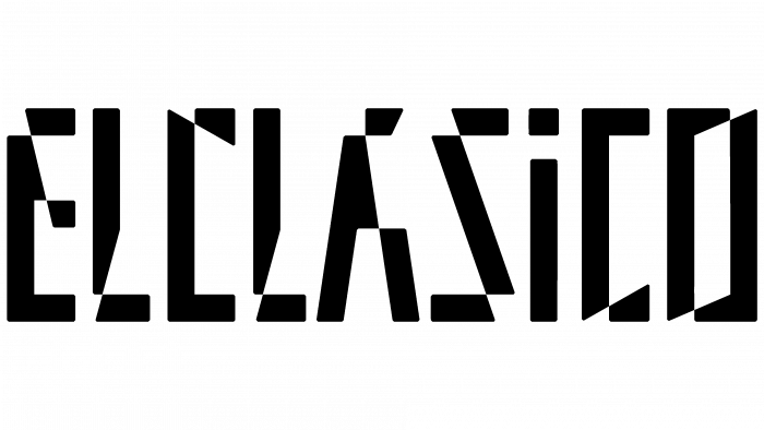
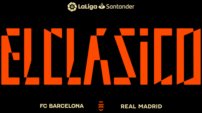
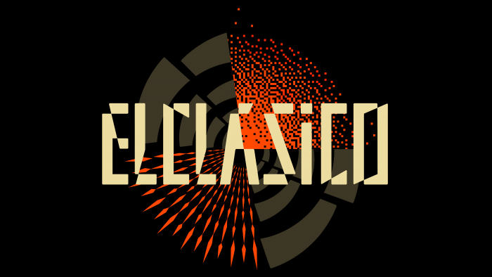
The logo design was inspired by the emotions that characterize both players and fans. Visualization unites everyone who takes part in this sports event, regardless of which side they are on, allowing everyone, without exception, to feel that they are an important element of the game. The graphics of the logo are notable for their energy, which is conveyed by sharp corners and the strict verticality of the constituent letters. The presence of dynamics and movement and the demonstration of the digital basis of the construction of the name add spectacularity to the visual perception of the entire composition.
The logo used the Halunke font, which Elena Schneider specially designed. The studio has reworked the central letter “A,” making it accent and harmonious with all the name letters. At the same time, the uppercase “i” sets the most convenient rhythm for perceiving the composition of the whole word. The greenish-golden color that prevails in the palette is the embodiment of tradition and a demonstration of the nobility of both historical opponents. The richness of orange gives the emblem energy and alertness.
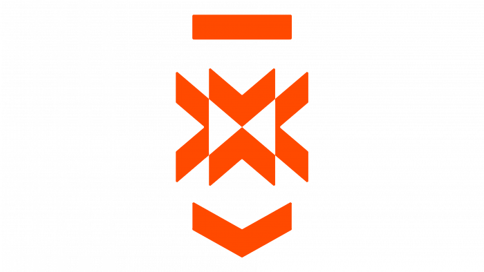
This monogram will become a sign that will replace the text “vs.,” previously placed between the names of teams, separating them. Now there will be ElClasico in small print in lowercase letters. The new sign combines elements of heraldry with the minimalist trends of our time. It symbolizes strength, rivalry, opposition. The ridge consists of several overlapping arrows, the tips of which are directed in different directions. This provides an insight into the tension and strength of the rivalry.
